Here is an account of some of the CSS concepts that I got to learn till now.
z-index
z-index is a property that is used to add another dimension to the app, as the name suggests - (z). The viewport has width and the height but z-index gives it a sense of depth.
For length, we have relative as well as absolute units - px that can define how many pixels should the length cover but in case of depth it is impossible to define it in terms of pixels, for obvious reasons, so we define it relatively. Relative here means relative to each other i.e, whether we want a particular element to be above or below the other element.
This relation is defined by assigning absolute digit as a value to the z-index property. Even though these digits are absolute, they are used relative to each other. But what exactly do I mean by each other.
Stacking context
Here comes the concept of stacking context. What is stacking context? Upon bifurcating the words, we get stacking and context. Stacking means placing things on top of other things (you must have used stack as a data structure) and context is a particular setting or an environment. We can create several stacks of HTML elements on the same page, each of them having their own context. The z-index of an element would hold its meaning or value only in the context that this particular element is in. Here is the code to get a clearer picture.
<body>
    <div id="parent1"></div>
    <div id="parent2"></div>
</body>
/* for now, focus only on z-index */

#parent1 {
  position: absolute;
  z-index: 1;
  width: 200px;
  height: 200px;
  background-color: lightblue;
}

#parent2 {
  position: absolute;
  z-index: 2;
  top: 100px;
  width: 200px;
  height: 200px;
  background-color: lightcoral;
}

As it can be seen, I have created a stacking context inside body with parent1 and parent2 as two child nodes. Their respective z-index give us the outcome where parent2 is overlapping parent1.
Now let's create another stacking context, nested inside parent2.
<div id="parent1"></div>
<div id="parent2">
  <div id="child1"></div>
  <div id="child2"></div>
</div>
#parent2 > #child1 {
  position: absolute;
  top: 0;
  z-index: -1; /* negative z-index */
  width: 50px;
  height: 50px;
  background-color: lightgreen;
}

/* no z-index */
#parent2 > #child2 {
  position: absolute;
  top: 0;
  width: 50px;
  height: 50px;
  background-color: lightyellow;
}
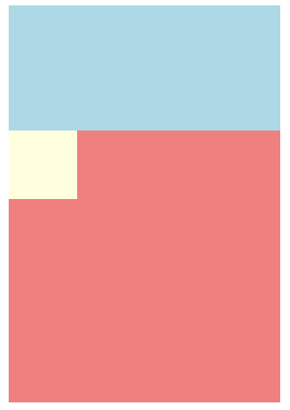
Here you see only child2 because z-index of child1 is -1. Now, seeing only the code you might think that because of negative z-index, child1 will be at the bottom of all elements but it does not go below parent2 because -1 only has any meaning inside the stacking context of parent2.
Stacking order
Stacking order is the order in which the elements are placed in a context. As you saw in the above example, browser determined the order of elements based on their z-index.
One rule is important to get a better grasp on stacking order. Going from the bottom to top, this is how elements are stacked( excluding the float elements which deserve a separate blog). Positioned element with negative z-index, un-positioned element, positioned element with no z-index and positioned element with positive z-index.
/* unpositioned element */
div#one {
  background-color: lightblue;
}

/* positioned with -ve z-index */
div#two {
  position: absolute;
  top: 15px;
  z-index: -1;
  background-color: lightcoral;
}

/* positioned with no z-index */
div#three {
  position: absolute;
  top: 0px;
  background-color: lightgreen;
}

/* positioned with +ve z-index */
div#four {
  position: absolute;
  top: -10px;
  z-index: 1;
  background-color: lightgrey;
}

Overflow and sticky
Here is the scenario,
<div id="app">
      <div id="menu">
        <ul>
          <li></li>
          <li></li>
          <li></li>
          <li></li>
          <li></li>
          <li></li>
          <li></li>
        </ul>
      </div>
#menu {
  height: 200px;
  width: 200px;
  position: sticky;
  top: 0;
  overflow-y: auto;
  background-color: lightgreen;
}

Expected behavior is that the menu should stick to the top of page when top: 0. But here, it does not. I had faced this issue when I was creating a side menu. The first thing I had realized was that for overflow to work I needed to give it a height. The second realization was that sticky and overflow cannot go together on the same element.
Now, I change one thing.
#app {
  position: sticky; /*sticky moved to parent element*/
  top: 0;
}

#menu {
  height: 200px;
  width: 200px;
  overflow-y: auto;
  background-color: lightgreen;
}

I have given the sticky position to menu's parent and now it works just fine.
Holy grail layout
This layout has header, main content, aside and footer. One way to achieve this layout using grids is to divide the page in certain columns and rows using grid-template-columns or grid-template-rows. Then, for each of the above mentioned elements, we assign them a cell or an area using grid-column-start and grid-column-end and similarly for rows.
To make it responsive, we'll have to change their cells/area positions in the grid using the same properties mentioned before.
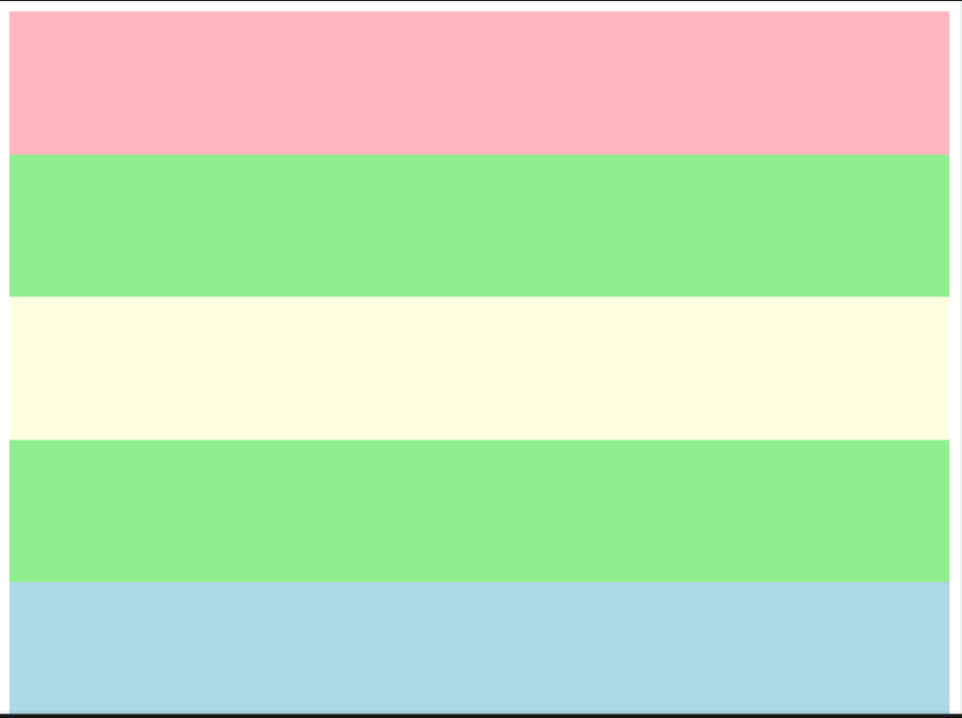
An alternative to this is grid areas. Firstly, here is how the layout looks.

On smaller screens, it changes to this.
Now, let's look at the code.
<body>
    <header></header>
    <aside id="left"></aside>
    <aside id="right"></aside>
    <main></main>
    <footer></footer>
</body>
body {
  display: grid;
  grid-template-areas:
    "header header header"
    "aleft main aright"
    "footer footer footer";
/*no. of strings defines the rows and no. of words
in each string defines the columns*/
  height: 100vh;
}

header {
  grid-area: header;
  background-color: lightpink;
}

aside#left {
  grid-area: aleft;
  background-color: lightgreen;
}

main {
  grid-area: main;
  background-color: lightyellow;
}

aside#right {
  grid-area: aright;
  background-color: lightgreen;
}

footer {
  grid-area: footer;
  background-color: lightblue;
}
grid-template-areas is the property which accepts a set of strings. This set of strings represent the blueprint of the layout.
The words present in these strings are to be defined as the value of grid-area property for the respective child elements. For example, in the code you can see header is the grid-area for <header></header>element.
Now, to add responsiveness, all i have to do is change the strings defined in grid-template-areas. Here's the code.
body {
    grid-template-areas:
      "header"
      "aleft"
      "main"
      "aright"
      "footer";
  }
These were some of the things that I wanted to share with you all. Hope it helps. Thanks for reading.

Top comments (0)