In this post, I will cover how you can create a bar chart that has both grouped and stacked bars using plotly. It is quite easy to create a plot that is either stacked or grouped, as both are covered in the tutorial at https://plot.ly/python/bar-charts/. However, if you want to have both you need to dig through the API documentation. Well, not anymore as I have done it for you. I will assume you have a basic understanding of plotly, like understanding the tutorial linked above. Finally, if you just want to check out the finished code you can find it at the end of the post.
Example Data
To start with, I want to have an example to illustrate the use-case. In this example, we have a project on GitHub with different types of issues e.g. feature, bug or documentation. From this project, we have taken some issues and created a system to automatically classify them. It has two parts, model 1 and model 2. If model 1 fails to make a prediction model 2 is used.
Model 1 could be a simple rule-based model, where if any of the classes appear in the text of the issue it is classified as that class. For example, if the word bug is written it is classified as a bug or if feature appears it is classified as a feature. If none of the words appears it hands the issue to model 2 which uses a machine learning model to make the prediction and always produces a classification.
Below I have defined a dictionary with some data I have created based on this example. Note that all lists have the same length and could be represented as a pandas dataframe. Original is how many of each type of issue exists in the dataset, based on the actual labels on GitHub Issue Tracker. Model_1 is the predictions of the rule-based model and model_2 the predictions of the machine learning model. Finally, as the total number of issues doesn't change, the sum of all values in original is the same as the sum of all values in model_1 and model_2 combined.
data = {
    "original":[15, 23, 32, 10, 23],
    "model_1": [4,   8, 18,  6,  0],
    "model_2": [11, 18, 18,  0,  20],
    "labels": [
        "feature",
        "question",
        "bug",
        "documentation",
        "maintenance"
    ]
}
Plot
We will use this data to create the plot. First, we need to import graph_objects from plotly which contains everything we will need. We can also write out the standard scaffold of a plotly graph that uses the Figure object.
from plotly import graph_objects as go

fig = go.Figure(
    data = [

    ],
    layout=go.Layout(
        title="Issue Types - Original and Models",
        yaxis_title="Number of Issues"
    )
)
In each step of the tutorial, we will add a graph object to the data parameter in the Figure constructor. We won't make any changes to the existing objects. Each of these will be an instance of the Bar class and use labels from the example data as the x-axis.
Step 1
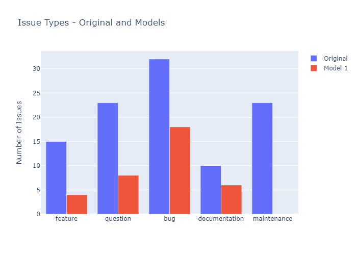
In this first version of the plot, we will just show the values of original as the y-axis. The only difference from the plotly tutorial for bar charts is the offsetgroup parameter, which we set to zero. This doesn't have any visible effect at the moment but is important for later.
fig1 = go.Figure(
    data = [
        go.Bar(
            name="Original",
            x=data["labels"],
            y=data["original"],
            offsetgroup=0,
        ),
    ],
    layout=go.Layout(
        title="Issue Types - Original and Models",
        yaxis_title="Number of Issues"
    )
)
fig1.show()

Step 2
For the next step, we add a Bar object using the data for model_1 as the y-axis. We also set the offsetgroup to 1 for this graph. This creates a bar chart with grouped bars. The result looks like the grouped bars from the tutorial but will allow us to, in the next step, add the next set of bars on top of these.
fig2 = go.Figure(
    data=[
        go.Bar(
            name="Original",
            x=data["labels"],
            y=data["original"],
            offsetgroup=0,
        ),
        go.Bar(
            name="Model 1",
            x=data["labels"],
            y=data["model_1"],
            offsetgroup=1,
        ),
    ],
    layout=go.Layout(
        title="Issue Types - Original and Models",
        yaxis_title="Number of Issues"
    )
)
fig2.show()
Step 3
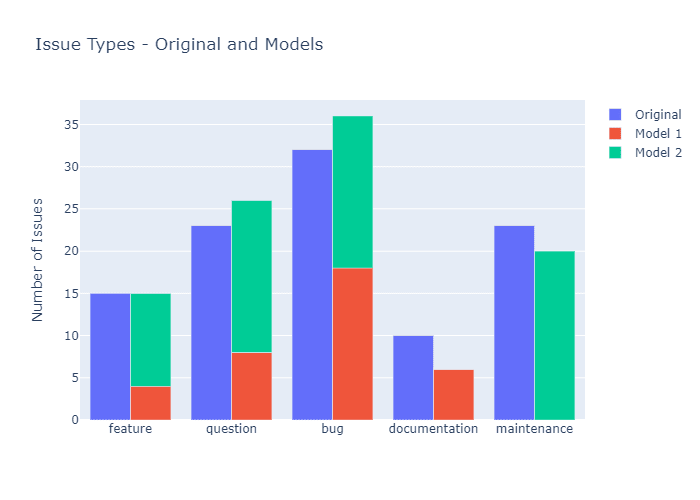
Now for the final step, we will add a Bar with the data for model_2 as the y-axis, stacking them on top of the bars for model_1. First, we give them the same position on the x-axis by using the same offsetgroup value, 1. Secondly, we offset the bars along the y-axis by setting the base parameter to the model_1 list. That is it, now we have our grouped and stacked bar chart.
fig3 = go.Figure(
    data=[
        go.Bar(
            name="Original",
            x=data["labels"],
            y=data["original"],
            offsetgroup=0,
        ),
        go.Bar(
            name="Model 1",
            x=data["labels"],
            y=data["model_1"],
            offsetgroup=1,
        ),
        go.Bar(
            name="Model 2",
            x=data["labels"],
            y=data["model_2"],
            offsetgroup=1,
            base=data["model_1"],
        )
    ],
    layout=go.Layout(
        title="Issue Types - Original and Models",
        yaxis_title="Number of Issues"
    )
)
fig3.show()
Entire Example
from plotly import graph_objects as go

data = {
    "original":[15, 23, 32, 10, 23],
    "model_1": [4,   8, 18,  6,  0],
    "model_2": [11, 18, 18,  0,  20],
    "labels": [
        "feature",
        "question",
        "bug",
        "documentation",
        "maintenance"
    ]
}

fig = go.Figure(
    data=[
        go.Bar(
            name="Original",
            x=data["labels"],
            y=data["original"],
            offsetgroup=0,
        ),
        go.Bar(
            name="Model 1",
            x=data["labels"],
            y=data["model_1"],
            offsetgroup=1,
        ),
        go.Bar(
            name="Model 2",
            x=data["labels"],
            y=data["model_2"],
            offsetgroup=1,
            base=data["model_1"],
        )
    ],
    layout=go.Layout(
        title="Issue Types - Original and Models",
        yaxis_title="Number of Issues"
    )
)

fig.show()

Latest comments (8)
This worked perfectly in Jupyter Notebooks but I'm trying to return the fig in a Dash Plotly callback. Right now, it is not appearing. Do you have any tips?
Hello!
I haven't actually used dash myself before. I was able to get this up and running using the example in the documentation here: dash.plotly.com/layout. Swapping out their variable fig for the fig variable used in this post. It seems to work. Are you encountering some other issues?
Here features of model 2 are 11 but while hovering the column it shows 15 i.e. the sum of model 1 features (4) and model 2 features(11)!! How to show only the number of features of model 2 in hovering template ??
I tried to find a solution using the
hovertemplateparameter, but I couldn't find how to access the actual value. However, I found one solution usinghovertext= [f'Count: {val}' for val in data["model_2"]]for the Model 2 bar chart. This adds a row to the hove with Count: where value is the actual data value.Hi Let say if I have more than 2 elements to stack, how do I get about doing it ?
I having problem doing a 3 elements stack. The stacked chart does not give me the correct value.
Hello!
I have adapted my example for using 3 elements in the stack. I pasted the entire code here in the comment. But what you need to focus on is how you add on mode go.Bar object. It should have the same offset group but the base must be a list where each element is the sum of the two previous bars at the same position. Here I use a list comprehension for this,
[val1+val2 for val1, val2 in zip(data["model_1"],data["model_2"])]Hello Fredrik,
Thanks for the pointer. Did not expect that I need to use list comprehension for base that have more than 3 elements to stack.
Yeah, this cleared my doubt.
Thanks
No problem! Glad I could help 😄
Some comments may only be visible to logged-in visitors. Sign in to view all comments.