Flutter is great and building beautiful Uľ's is a breeze. In this tutorial I will show you how to get the Apple Music Card look with the colored drop shadow. Let's get started!
Note this isn't a Apple Music UI replication, but simply Apple Music inspired.
shadowColor vs. boxShadow
The Material Widget has a shadowColor property, but it doesn't have the same look
property.
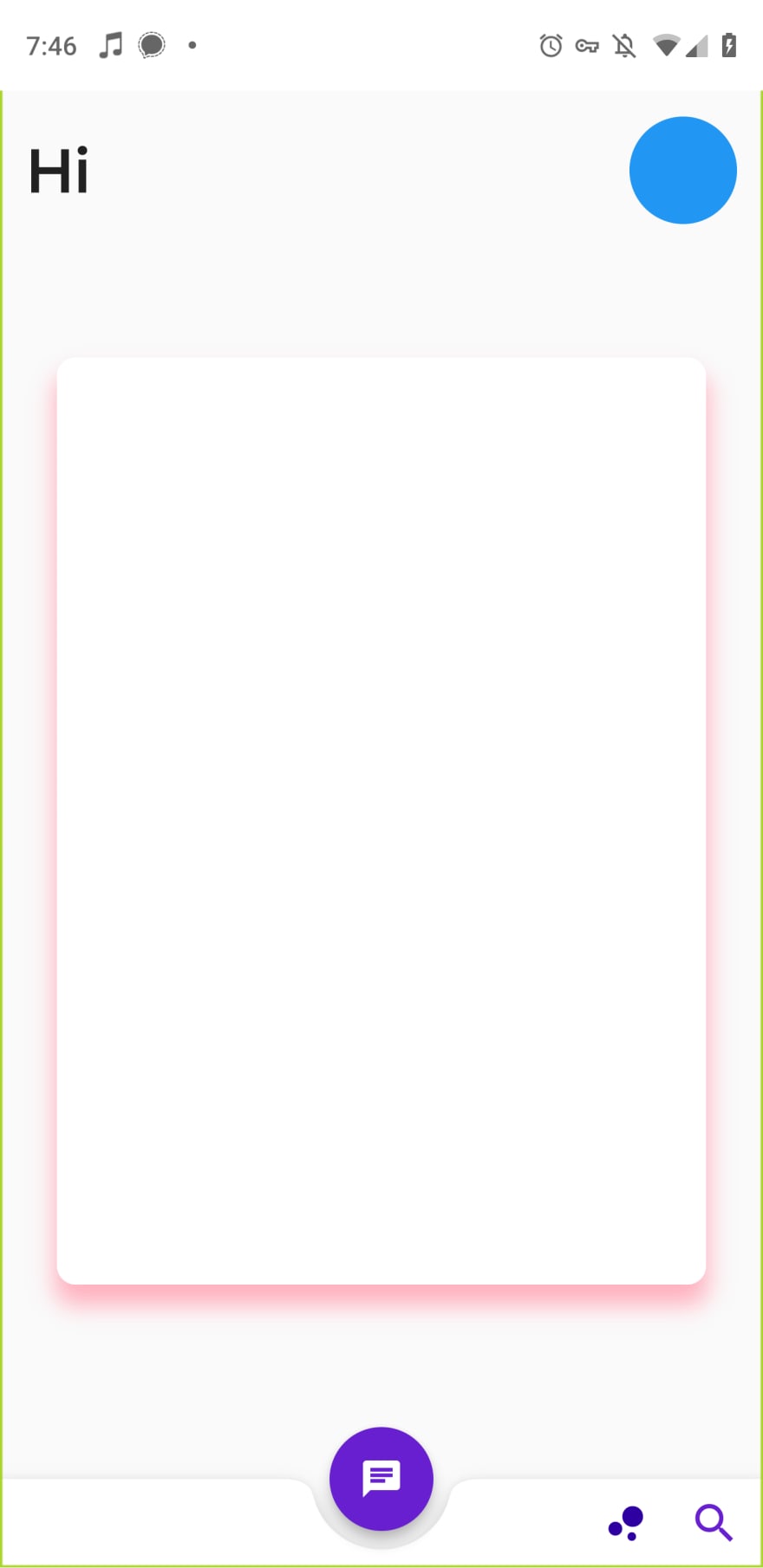
Here's how it looks!
This is what our card looks like now! You can customize this to fit your app’s theme by changing the blur and spread radius as well as the color.
Let's change some properties...
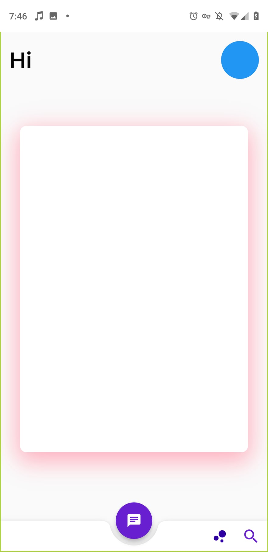
Let's change the blurRadius: 30.0 and the spreadRadius: 4.0 and see how it looks.
As we can see the spreadRadius broadened up the shadow and the blurRadius increase made for a more fuzzy cotton candy look.
Conclusion
Today I showed you a brief overview of the boxShadow property in which to show you how to make colorful Cards come to life. In essence you can tweak the settings to your liking and wahlah!


Top comments (0)