
Component libraries are naturally one of the first things developers reach for when starting a React Native project. There's something slightly underwhelming about being excited to start a new project, only to find yourself building the same type of component over and over again.
When picking a component library, there are a few things to consider.
- How friendly is the API? It’s easy to get caught up in the look and feel of a component library. However, any well developed component library should be relatively easy to customize to your liking. What’s perhaps more important is how comfortable you are with the API. Do you agree with the decisions made by those who made the library? Does it feel natural when using it for a bit? Or do you find yourself struggling to implement it, even after reading the docs and getting a better understanding? Always experiment with a few component libraries, to see which suits you best (that's what we'll be doing in this article : ) ).
- Do you like the base design provided? Some React Native component libraries, such as material kit react native are very opinionated with the out-of-the-box styling they provide. Others, such as native base don't focus too much on the styling. Rather, they just provide a set of basic components. Leaving the composition and styling of components up to you. Different requirements call for different component libraries.
The goal of this article is not to answer these questions for you. Instead, we'll explore a few different React Native component libraries, in a way that'll allow you to answer these questions for yourself. We'll build a Card component, which is very common in any code-base. By constructing the Card component, we'll interact with the API directly. Allowing us to determine how much we enjoy working with the component libary. Upon completion, we can take a step back and see if we agree with the base design provided.
Native Base
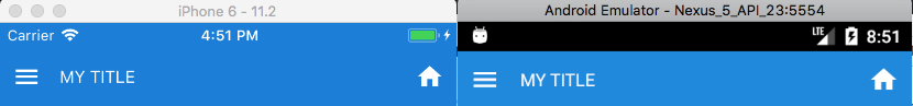
Native Base is a component library with a focus on a cross-platform "native" feel. Instead of making fancy design decisions for you, Native Base provides a set of basic components which are styled specifically to their platform.
For example, check out what a "Header" component looks like on iOS vs Android.
Note: The original version of this article includes an embedded snack. Since dev.to does not have expo snack support, we've modified this version to just have a link.
View the Snack
React Native Elements
React Native Elements is a component library that's 100% community driven. It provides over 20 basic components, suitable to bootstrap any project. The components provided appear the same regardless of the platform. For example, a Header component looks the same on both iOS and Android.
Notice the difference in the React Native Elements Card below, compared to NativeBase above. In the React Native Elements Card Component, there's a built in
Imageprop. This automatically inserts the image at the top of the card. There are ways to make our Card identical to the one we built above. However, let's not try and force a specific design. Instead, let's embrace the differences between the two packages. Allowing us to get a better feel for the API & design decisions made.Note: The original version of this article includes an embedded snack. Since dev.to does not have expo snack support, we've modified this version to just have a link.
View the Snack
UI Kitten
UI Kitten is a component library with a strong emphasis on theming and design systems. All of this is highly configurable, but it comes at a cost. When setting up UI Kitten on your react native app, there are additional steps involved to integrate the component library. You must wrap your app in an ApplicationProvider component. This is where you define the theme in which it will be using. UI Kitten allows you to use their very own "Eva" theme, or a "Material" theme. Both come with light & dark versions as well.
Additionally, the documentation for UI Kitten is beautiful and has live previews every step of the way. The live previews even allow you to switch between themes and light/dark mode. Check out the Card component documentation, for example. And of course, check out the Card component we made below 🤓
Note: The original version of this article includes an embedded snack. Since dev.to does not have expo snack support, we've modified this version to just have a link.
View the Snack
More component libraries being added soon!
You can expect this post to be updated with more component libraries as time passes. We will be updating this regularly : )
Want to be notified whenever we add more component libraries? Subscribe here.
Have a React Native component library you'd like added here? Drop us a message

Top comments (0)