Introduction
Portuguese version: Biblioteca de componentes React e typescript, parte 3: testes unitários com Jest e testing library
In part three of the series, the library will be enhanced with the definition of unit tests using Jest and Testing Library. The idea is to focus more on the practical aspect of adding this in the article. For those who want to understand more deeply how it works in general, I wrote the article Setup Jest, Babel and testing library for unit testing in React regarding the setup part, and the article Unit tests in React with Jest and Testing Library that covers the general approach to writing tests and how they work.
Reason for unit tests
Since a component library is being created, the main goal is to ensure that each component made available has its integrity validated in isolation.
Libs
Jest: it's a testing framework created by Facebook, with simple configuration and usage, allowing tests to be run in isolation
Testing library: a lightweight library that allows simulating interactions with the components of the application
jest-styled-components: a library that facilitates testing of components styled with styled-components
Setup Jest
Addition of the main libraries to configure Jest:
yarn add jest jest-environment-jsdom @babel/core @babel/preset-env @babel/preset-react @babel/preset-typescript --dev
-
jest-environment-jsdom: simulates a DOM environment as if it were in the browser -
@babel/preset-env: it allows you to use the latest version of JavaScript without needing to define which syntax transformation is necessary to be compatible with the environment to be used -
@babel/preset-react: allows compiling React code -
@babel/preset-typescript: allows the transpilation of typescript -
@babel/core: brings the base of Babel to application
At the time of writing this article, the following versions were generated:
"@babel/core": "^7.26.10",
"@babel/preset-env": "^7.26.9",
"@babel/preset-react": "^7.26.3",
"@babel/preset-typescript": "^7.26.0",
"jest": "^29.7.0",
"jest-environment-jsdom": "^29.7.0"
Two configuration files will be added to the root of the project:
- babel.config.js
module.exports = {
  presets: [
    ["@babel/preset-env", {targets: {node: "current"}}],
    "@babel/preset-typescript",
    "@babel/preset-react"
  ],
};
Where the added preset libraries are being used.
- jest.config.js
module.exports = {
  testEnvironment: "jsdom",
  testMatch: [
    "**/src/components/**/*.test.tsx",
  ],
};
In testEnvironment, it is being defined to use the jsdom testing environment, which comes from the jest-environment-jsdom library. And in testMatch, it is defining where the test files will be located. Since the tests will be created inside each component's folder, the path is defined above.
Setup testing library
Addition of the main libraries:
yarn add @testing-library/react @testing-library/dom @testing-library/jest-dom @types/react @types/react-dom @types/jest --dev
-
@testing-library/react: adds the testing-library for use in React applications -
@testing-library/dom: peer dependencie of@testing-library/react -
@testing-library/jest-dom: brings additional matchers for Jest tests, making them more declarative -
@types/react: types definition for React -
@types/react-dom: types definition for react-dom -
@types/jest: types definition for jest
At the time of writing this article, the following versions were generated:
"@testing-library/dom": "^10.4.0",
"@testing-library/jest-dom": "^6.6.3",
"@testing-library/react": "^16.2.0",
"@types/jest": "^29.5.14",
"@types/react": "^19.0.10",
"@types/react-dom": "^19.0.4",
Setup jest-styled-components
In both reference articles I mentioned in the introduction, this library was not covered, so I’ll explain a bit about what it does in this article. This library aims to simplify testing for components that use styled-components. To remind you of the components created in the library:
- Text.tsx
import React from "react";
import styled from "styled-components";

export interface TextProps {
  children: React.ReactNode;
  color?: string;
  weight?: "normal" | "bold";
  fontWeight?: number;
  fontSize?: string;
  fontFamily?: string;
}

export interface StyledTextProps {
  $color?: string;
  $weight?: "normal" | "bold";
  $fontWeight?: number;
  $fontSize?: string;
  $fontFamily?: string;
}

export const StyledText = styled.span<StyledTextProps>`
  color: ${(props) => (props.$color ? props.$color : "#000")};
  font-size: ${(props) => (props.$fontSize ? props.$fontSize : "16px")};
  font-weight: ${(props) =>
    props.$fontWeight
      ? props.$fontWeight
      : props.$weight
        ? props.$weight
        : "normal"};
  font-family: ${(props) => (props.$fontFamily ? props.$fontFamily : "Arial")};
`;

const Text = ({
  children,
  color,
  weight,
  fontWeight,
  fontSize,
  fontFamily,
}: TextProps) => (
  <StyledText
    $color={color}
    $weight={weight}
    $fontWeight={fontWeight}
    $fontSize={fontSize}
    $fontFamily={fontFamily}
  >
    {children}
  </StyledText>
);

export default Text;
- Tag.tsx
import React from "react";
import styled from "styled-components";
import Text from "../Text/Text";

export interface TagProps {
  type?: "default" | "success" | "alert" | "error";
  text: string;
  textColor?: string;
  textWeight?: "normal" | "bold";
  textFontWeight?: number;
  textFontSize?: string;
  textFontFamily?: string;
  backgroundColor?: string;
  format?: "default" | "semiRounded" | "rounded";
  borderRadius?: string;
  size?: "small" | "medium" | "large";
  padding?: string;
}

export interface StyledTagProps {
  $type?: "default" | "success" | "alert" | "error";
  $textColor?: string;
  $textWeight?: "normal" | "bold";
  $textFontWeight?: number;
  $textFontSize?: string;
  $textFontFamily?: string;
  $backgroundColor?: string;
  $format?: "default" | "semiRounded" | "rounded";
  $borderRadius?: string;
  $size?: "small" | "medium" | "large";
  $padding?: string;
}

export const StyledTag = styled.div<StyledTagProps>`
  border: none;
  padding: ${(props) =>
    props.$padding
      ? props.$padding
      : props.$size === "large"
        ? "15px 20px"
        : props.$size === "medium"
          ? "10px 12px"
          : "7px"};
  background-color: ${(props) =>
    props.$backgroundColor
      ? props.$backgroundColor
      : props.$type === "error"
        ? "#e97451"
        : props.$type === "alert"
          ? "#f8de7e"
          : props.$type === "success"
            ? "#50c878"
            : "#d3d3d3"};
  pointer-events: none;
  border-radius: ${(props) =>
    props.$borderRadius
      ? props.$borderRadius
      : props.$format === "rounded"
        ? "30px"
        : props.$format === "semiRounded"
          ? "5px"
          : "0"};
  width: fit-content;
`;

const Tag = ({
  text,
  type,
  textColor,
  textWeight,
  textFontWeight,
  textFontSize,
  textFontFamily,
  backgroundColor,
  format,
  borderRadius,
  size,
  padding,
}: TagProps) => (
  <StyledTag
    data-testid="tag"
    $type={type}
    $backgroundColor={backgroundColor}
    $format={format}
    $borderRadius={borderRadius}
    $size={size}
    $padding={padding}
  >
    <Text
      color={textColor || "#fff"}
      weight={textWeight}
      fontWeight={textFontWeight}
      fontSize={textFontSize}
      fontFamily={textFontFamily}
    >
      {text}
    </Text>
  </StyledTag>
);

export default Tag;
In both components, the styling properties are defined using styled-components: StyledText and StyledTag, where there are some default properties if no props are passed to the components, or the properties vary if props are passed. The jest-styled-components library provides a matcher called toHaveStyleRule, which validates whether, given a passed prop, the expected styling for the component is applied via styled-components.
Addition of the library:
yarn add jest-styled-components --dev
At the time of writing this article, the following version was generated:
"jest-styled-components": "^7.2.0"
Adding Tests
Once the libraries have been added and configured, unit tests will be added for the two components, inside the folder where the component itself is defined.
- Text.test.tsx
import React from "react";
import "@testing-library/jest-dom";
import "jest-styled-components";
import { render, screen } from "@testing-library/react";

import Text from "./Text";

describe("<Text />", () => {
  it("should render component with default properties", () => {
    render(<Text>Text</Text>);

    const element = screen.getByText("Text");

    expect(element).toBeInTheDocument();
    expect(element).toHaveStyleRule("color", "#000");
    expect(element).toHaveStyleRule("font-size", "16px");
    expect(element).toHaveStyleRule("font-weight", "normal");
  });

  it("should render component with custom color", () => {
    render(<Text color="#fff">Text</Text>);

    expect(screen.getByText("Text")).toHaveStyleRule("color", "#fff");
  });

  it("should render component with bold weight", () => {
    render(<Text weight="bold">Text</Text>);

    expect(screen.getByText("Text")).toHaveStyleRule("font-weight", "bold");
  });

  it("should render component with custom weight", () => {
    render(<Text fontWeight={500}>Text</Text>);

    expect(screen.getByText("Text")).toHaveStyleRule("font-weight", "500");
  });

  it("should render component with custom font size", () => {
    render(<Text fontSize="20px">Text</Text>);

    expect(screen.getByText("Text")).toHaveStyleRule("font-size", "20px");
  });

  it("should render component with custom font family", () => {
    render(<Text fontFamily="TimesNewRoman">Text</Text>);

    expect(screen.getByText("Text")).toHaveStyleRule(
      "font-family",
      "TimesNewRoman",
    );
  });
});
- Tag.test.tsx
import React from "react";
import "@testing-library/jest-dom";
import "jest-styled-components";
import { render, screen, within } from "@testing-library/react";

import Tag from "./Tag";

describe("<Tag />", () => {
  it("should render component with default properties", () => {
    render(<Tag text="Tag" />);

    const element = screen.getByTestId("tag");

    expect(element).toBeInTheDocument();
    expect(element).toHaveStyleRule("background-color", "#d3d3d3");
    expect(element).toHaveStyleRule("border-radius", "0");
    expect(element).toHaveStyleRule("padding", "7px");
    expect(within(element).getByText("Tag")).toHaveStyleRule("color", "#fff");
  });

  it("should render component with success type", () => {
    render(<Tag text="Tag" type="success" />);

    const element = screen.getByTestId("tag");

    expect(element).toHaveStyleRule("background-color", "#50c878");
    expect(within(element).getByText("Tag")).toHaveStyleRule("color", "#fff");
  });

  it("should render component with alert type", () => {
    render(<Tag text="Tag" type="alert" />);

    const element = screen.getByTestId("tag");

    expect(element).toHaveStyleRule("background-color", "#f8de7e");
    expect(within(element).getByText("Tag")).toHaveStyleRule("color", "#fff");
  });

  it("should render component with error type", () => {
    render(<Tag text="Tag" type="error" />);

    const element = screen.getByTestId("tag");

    expect(element).toHaveStyleRule("background-color", "#e97451");
    expect(within(element).getByText("Tag")).toHaveStyleRule("color", "#fff");
  });

  it("should render component with custom background color", () => {
    render(<Tag text="Tag" backgroundColor="#fff" />);

    expect(screen.getByTestId("tag")).toHaveStyleRule(
      "background-color",
      "#fff",
    );
  });

  it("should render component with semi rounded format", () => {
    render(<Tag text="Tag" format="semiRounded" />);

    expect(screen.getByTestId("tag")).toHaveStyleRule("border-radius", "5px");
  });

  it("should render component with rounded format", () => {
    render(<Tag text="Tag" format="rounded" />);

    expect(screen.getByTestId("tag")).toHaveStyleRule("border-radius", "30px");
  });

  it("should render component with custom border radius", () => {
    render(<Tag text="Tag" borderRadius="20px" />);

    expect(screen.getByTestId("tag")).toHaveStyleRule("border-radius", "20px");
  });

  it("should render component with medium size", () => {
    render(<Tag text="Tag" size="medium" />);

    expect(screen.getByTestId("tag")).toHaveStyleRule("padding", "10px 12px");
  });

  it("should render component with large size", () => {
    render(<Tag text="Tag" size="large" />);

    expect(screen.getByTestId("tag")).toHaveStyleRule("padding", "15px 20px");
  });

  it("should render component with custom size", () => {
    render(<Tag text="Tag" padding="20px 10px" />);

    expect(screen.getByTestId("tag")).toHaveStyleRule("padding", "20px 10px");
  });

  it("should render component with custom text color", () => {
    render(<Tag text="Tag" textColor="#000" />);

    const element = screen.getByTestId("tag");

    expect(within(element).getByText("Tag")).toHaveStyleRule("color", "#000");
  });

  it("should render component with bold text font weight", () => {
    render(<Tag text="Tag" textWeight="bold" />);

    const element = screen.getByTestId("tag");

    expect(within(element).getByText("Tag")).toHaveStyleRule(
      "font-weight",
      "bold",
    );
  });

  it("should render component with custom text font weight", () => {
    render(<Tag text="Tag" textFontWeight={200} />);

    const element = screen.getByTestId("tag");

    expect(within(element).getByText("Tag")).toHaveStyleRule(
      "font-weight",
      "200",
    );
  });

  it("should render component with custom text font size", () => {
    render(<Tag text="Tag" textFontSize="30px" />);

    const element = screen.getByTestId("tag");

    expect(within(element).getByText("Tag")).toHaveStyleRule(
      "font-size",
      "30px",
    );
  });

  it("should render component with custom text font family", () => {
    render(<Tag text="Tag" textFontFamily="Times New Roman" />);

    const element = screen.getByTestId("tag");

    expect(within(element).getByText("Tag")).toHaveStyleRule(
      "font-family",
      "Times New Roman",
    );
  });
});
In both test files, the first test checks the default properties of the component. The other tests validate the properties after passing props that impact them, whether they are predefined or customizable properties.
package.json
For now, the package.json should look something like the below:
{
  "name": "react-example-lib",
  "version": "0.2.0",
  "main": "dist/cjs/index.js",
  "module": "dist/esm/index.js",
  "types": "dist/index.d.ts",
  "files": [
    "dist"
  ],
  "license": "MIT",
  "repository": {
    "type": "git",
    "url": "https://github.com/griseduardo/react-example-lib.git"
  },
  "scripts": {
    "build": "rollup -c --bundleConfigAsCjs",
    "lint-src": "eslint src",
    "lint-src-fix": "eslint src --fix",
    "format-src": "prettier src --check",
    "format-src-fix": "prettier src --write"
  },
  "devDependencies": {
    "@babel/core": "^7.26.10",
    "@babel/preset-env": "^7.26.9",
    "@babel/preset-react": "^7.26.3",
    "@babel/preset-typescript": "^7.26.0",
    "@eslint/js": "^9.19.0",
    "@rollup/plugin-commonjs": "^28.0.2",
    "@rollup/plugin-node-resolve": "^16.0.0",
    "@rollup/plugin-terser": "^0.4.4",
    "@rollup/plugin-typescript": "11.1.6",
    "@testing-library/dom": "^10.4.0",
    "@testing-library/jest-dom": "^6.6.3",
    "@testing-library/react": "^16.2.0",
    "@types/jest": "^29.5.14",
    "@types/react": "^19.0.10",
    "@types/react-dom": "^19.0.4",
    "eslint": "^9.19.0",
    "eslint-plugin-react": "^7.37.4",
    "jest": "^29.7.0",
    "jest-environment-jsdom": "^29.7.0",
    "jest-styled-components": "^7.2.0",
    "prettier": "^3.4.2",
    "react": "^19.0.0",
    "react-dom": "^19.0.0",
    "rollup": "^4.30.1",
    "rollup-plugin-dts": "^6.1.1",
    "rollup-plugin-peer-deps-external": "^2.2.4",
    "styled-components": "^6.1.14",
    "typescript": "^5.7.3",
    "typescript-eslint": "^8.23.0"
  },
  "peerDependencies": {
    "react": "^19.0.0",
    "react-dom": "^19.0.0",
    "styled-components": "^6.1.14"
  }
}
Script will be added to execute unit tests test. Additionally, the version will be changed to 0.3.0, as a new version of the library will be released:
{
  "name": "react-example-lib",
  "version": "0.3.0",
  "main": "dist/cjs/index.js",
  "module": "dist/esm/index.js",
  "types": "dist/index.d.ts",
  "files": [
    "dist"
  ],
  "license": "MIT",
  "repository": {
    "type": "git",
    "url": "https://github.com/griseduardo/react-example-lib.git"
  },
  "scripts": {
    "build": "rollup -c --bundleConfigAsCjs",
    "lint-src": "eslint src",
    "lint-src-fix": "eslint src --fix",
    "format-src": "prettier src --check",
    "format-src-fix": "prettier src --write",
    "test": "jest"
  },
  "devDependencies": {
    "@babel/core": "^7.26.10",
    "@babel/preset-env": "^7.26.9",
    "@babel/preset-react": "^7.26.3",
    "@babel/preset-typescript": "^7.26.0",
    "@eslint/js": "^9.19.0",
    "@rollup/plugin-commonjs": "^28.0.2",
    "@rollup/plugin-node-resolve": "^16.0.0",
    "@rollup/plugin-terser": "^0.4.4",
    "@rollup/plugin-typescript": "11.1.6",
    "@testing-library/dom": "^10.4.0",
    "@testing-library/jest-dom": "^6.6.3",
    "@testing-library/react": "^16.2.0",
    "@types/jest": "^29.5.14",
    "@types/react": "^19.0.10",
    "@types/react-dom": "^19.0.4",
    "eslint": "^9.19.0",
    "eslint-plugin-react": "^7.37.4",
    "jest": "^29.7.0",
    "jest-environment-jsdom": "^29.7.0",
    "jest-styled-components": "^7.2.0",
    "prettier": "^3.4.2",
    "react": "^19.0.0",
    "react-dom": "^19.0.0",
    "rollup": "^4.30.1",
    "rollup-plugin-dts": "^6.1.1",
    "rollup-plugin-peer-deps-external": "^2.2.4",
    "styled-components": "^6.1.14",
    "typescript": "^5.7.3",
    "typescript-eslint": "^8.23.0"
  },
  "peerDependencies": {
    "react": "^19.0.0",
    "react-dom": "^19.0.0",
    "styled-components": "^6.1.14"
  }
}
CHANGELOG file
For now, the CHANGELOG.md is as follows:
## 0.2.0

_Fev. 24, 2025_

- setup typescript-eslint and prettier
- add custom rules

## 0.1.0

_Jan. 29, 2025_

- initial config
Since a new version will be released, information about what was modified will be added in the file:
## 0.3.0

_Mar. 24, 2025_

- setup jest and testing-library
- add components tests

## 0.2.0

_Fev. 24, 2025_

- setup typescript-eslint and prettier
- add custom rules

## 0.1.0

_Jan. 29, 2025_

- initial config
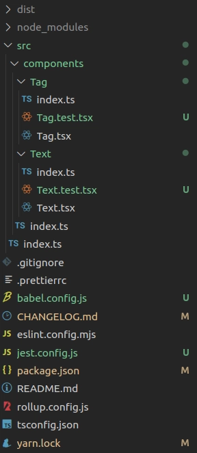
Folder structure
The folder structure is as follows, with modifications to some files, as well as the addition of two test configuration files and two new component test files:
Publication of a new version
The first step to be performed is to check if the rollup execution runs successfully. To do this, yarn build will be executed in the terminal, as defined in package.json.
If it executes successfully, proceed with publishing the new version of the library: npm publish --access public
Conclusion
The idea of this article was to set up and create unit tests for the components using Jest, Testing Library and jest-styled-components, with a more practical approach to application. To understand how the structure and execution of tests work, the previous articles mentioned in the introduction aim to explain these points in more detail.
Here is the repository on github and the library on npmjs with the new modifications.

Top comments (0)