
Given the success of Plotly Dash and Plotly Express, it's easy to forget that Plotly's rise to success began with a product that was neither of these household names. Dash has cornered the interactive dashboard market, while Plotly Express has become the defacto Python library generating inline charts, particularly for Jupyter notebooks. What we don't get from either of these tools is a way to create data visualizations for any other scenario, such as creating a single chart to serve publicly as an image or interactive plot.
Plotly Chart Studio shines as a tool to instantly create cloud-hosted data visualizations. The syntax will appear familiar to those who have used Plotly Express (or any other Python data vis library), but Plotly Chart Studio stands alone how these charts are created: on a publicly accessible cloud. With a Chart Studio account, each chart you plot is saved to a public chart studio profile, like mine:

Each chart in my profile is publicly accessible as your choice of an embedded plot, an image, raw HTML, etc. Here's an example chart as an iFrame (sorry dev.to fam, but I don't think iFrames are supported here):
https://plotly.com/~toddbirchard/403/
Every chart created with Plotly studio automatically generates interactive plots along with static image varieties like PNGs. This opens the door to possibilities for us to create charts on demand, like creating dumb Discord bots, for example:

This tutorial will demonstrate plot creation in Chart Studio with a fairly common real-life scenario. We'll be fetching stock price data from IEX Cloud, transforming the data in a Pandas DataFrame, and outputting a Candlestick chart. This same workflow can be applied to create any of Plotly's many chart types.
Getting Set Up
The two Plotly-related libraries we need are plotly and chart-studio. We'll install these along with the usual suspects for Python data analysis:
$ pip install requests pandas plotly chart-studio python-dotenv
Accounts & Configuration
You can create a Plotly Chart Studio account here; get yourself set up and grab an API key. I'm also using an API key to access data from IEX, which can be substituted for whichever API credentials you happen to need:
"""Configuration via environment variables."""
from os import environ, path
from dotenv import load_dotenv

# Load values from .env
basedir = path.abspath(path.dirname( __file__ ))
load_dotenv(path.join(basedir, '.env'))

# API
IEX_API_TOKEN = environ.get('IEX_API_TOKEN')
IEX_API_BASE_URL = 'https://cloud.iexapis.com/stable/stock/'

# Plotly
PLOTLY_API_KEY = environ.get('PLOTLY_API_KEY')
PLOTLY_USERNAME = environ.get('PLOTLY_USERNAME')
Save your secrets in a .env file as always. If you're not sure what this means, please stop coding and Google what environment variables are. Seriously, stop DMing me that my code is "broken" because you didn't create a .env file, or take 5 minutes to grasp what that even means.
What were we talking about, again? Right, charts.
Initializing Chart Studio
chart_studio is a standalone Python library to serve the sole purpose of saving charts to Plotly Chart Studio. We need to authenticate with Plotly once upfront before we chart anything, which we can do by importing the set_credentials_file function and passing our Plotly username and API key :
from chart_studio.tools import set_credentials_file
from config import (
    PLOTLY_USERNAME,
    PLOTLY_API_KEY
)

# Plotly Chart Studio authentication
set_credentials_file(
    username=PLOTLY_USERNAME,
    api_key=PLOTLY_API_KEY
)
We'll come back to this later. Let's get some data.
Fetching & Preparing Data
Beautiful charts need beautiful data. We're going to get some beautiful data using two libraries you should hopefully be sick of by now: requests and Pandas.
Fetch Data from an API
Let's GET this bread! Below is a function called fetch_stock_data(), which constructs a GET request to our API. In my example, we're fetching 1-month's worth of stock price data for a given stock symbol:
"""Fetch data from third-party API."""
import requests
from config import IEX_API_BASE_URL, IEX_API_TOKEN


def fetch_stock_data(stock_symbol: str):
    """Fetch stock data from API"""
    params = {'token': IEX_API_TOKEN, 'includeToday': 'true'}
    url = f'{IEX_API_BASE_URL}/{stock_symbol}/chart/1m'
    req = requests.get(url, params=params)
    data = req.content
    return data
This is a straightforward GET request made to a REST API endpoint. The above effectively constructs and hits this URL:
https://cloud.iexapis.com/stable/stock/net/chart/1m?token=sk_54632753687697685697456&includeToday=true
If everything goes correctly, req.content should spit out some raw JSON. Here's a glance at what that looks like:
[
    ...
    {
        "date": "2020-08-20",
        "open": 39.28,
        "close": 40.31,
        "high": 40.44,
        "low": 39.12,
        "volume": 3953482,
        "uOpen": 39.28,
        "uClose": 40.31,
        "uHigh": 40.44,
        "uLow": 39.12,
        "uVolume": 3953482,
        "change": 1.02,
        "changePercent": 2.5961,
        "label": "Aug 20",
        "changeOverTime": 0.059674
    },
    {
        "date": "2020-08-21",
        "open": 40.45,
        "close": 38.92,
        "high": 40.49,
        "low": 38.9,
        "volume": 3271742,
        "uOpen": 40.45,
        "uClose": 38.92,
        "uHigh": 40.49,
        "uLow": 38.9,
        "uVolume": 3271742,
        "change": -1.39,
        "changePercent": -3.4483,
        "label": "Aug 21",
        "changeOverTime": 0.023134
    }
    ...
]
This response might seem daunting at first glance, but it's exactly what we're looking for. We just need a little help from an old friend...
Parsing with Pandas
It's time for some mo effin' Pandas! We're going to take the data we fetched from our API request and pass it into a new function called parse_data(), which will load our data into a Pandas DataFrame. Shoutout to the beautiful new Pandas method called read_json():
"""Parse raw API data into Pandas DataFrame."""
import pandas as pd


def parse_data(data) -> pd.DataFrame:
    """Parse JSON as Pandas DataFrame."""
    stock_df = pd.read_json(data)
    stock_df = stock_df.loc[stock_df['date'].dt.dayofweek < 5]
    stock_df.set_index(keys=stock_df['date'], inplace=True)
    return stock_df
It's important to note that we pass in req.content from our request - not req.json(). req.json() renders JSON as a Python dictionary, which you could load into Pandas with from_dict(), but whatever. Stick with me here.
Create a Chart with Plotly Studio
Let's handle this one part one step at a time. There are three things we need to do here:
- Create a Plotly chart with the data from our Pandas DataFrame.
- Adjust aspects of our chart's layout (such as title, color, etc.).
- Saving our chart to Plotly's cloud.
Each step above is nice and easy. Here's step 1 :
"""Plotly chart creation."""
import plotly.graph_objects as go
import chart_studio.plotly as py
from chart_studio.tools import set_credentials_file
from pandas import DataFrame
from config import PLOTLY_API_KEY, PLOTLY_USERNAME


# Plotly Chart Studio authentication
set_credentials_file(
    username=PLOTLY_USERNAME,
    api_key=PLOTLY_API_KEY
)

def create_chart(stock_df: DataFrame, symbol: str) -> py.plot:
    """Create Plotly chart from Pandas DataFrame."""
    fig = go.Figure(data=[
        go.Candlestick(
            x=stock_df.index,
            open=stock_df['open'],
            high=stock_df['high'],
            low=stock_df['low'],
            close=stock_df['close'],
        )],
    )
If you've ever used Plotly or Plotly Dash, this syntax should look familiar! go.Figure() is a Python class used to create charts/plots/figures/whatever. We're passing data as a keyword argument, which is actually just one of 3 notable arguments we could pass:
-
data : Accepts one or multiple "trace" types. A "trace" refers to the data on our plot; in other words, we could easily chart different types of data on the same plot, such as a combination of line chart data (
go.Line) and bar chart data (go.Bar) on the same plot. In our case, we're sticking with a single candlestick trace, where we pass in columns of our Pandas DataFrame for each valuego.Candlestick()expects. - layout : A plot's layout gives us the power to change anything and everything about our chart's appearance. This could be background color, trace color, plot title, margins, and so much more. Just look at all the ways we can customize our plot - it's almost ridiculous!
-
frames : Apparently, we could animate our charts by passing multiple frames of changing data into the
frameskeyword argument. That's just fuckin bonkers imo and not something we should worry about until we're older.
Anyway, on to step 2 : customizing our layout:
...
def create_chart(stock_df: DataFrame, symbol: str) -> py.plot:
"""Create Plotly chart from Pandas DataFrame."""
fig = go.Figure(data=[
go.Candlestick(
x=stock_df.index,
open=stock_df['open'],
high=stock_df['high'],
low=stock_df['low'],
close=stock_df['close'],
)],
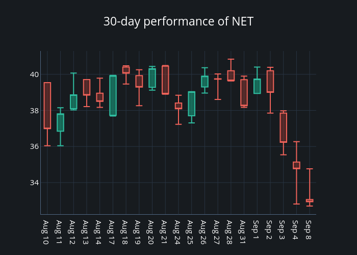
layout=go.Layout(
title=f'30-day performance of {symbol.upper()}',
xaxis={
'type': 'date',
'rangeslider': {
'visible': False
},
},
)
)
We pass layout into our figure immediately after passing data. As we've already established, there's a shit ton of possibilities we could get deep into here. I'm keeping things modest by setting a chart title and making sure the x-axis knows it's a range of dates.
We can finally save our hard work with step 3 : saving our plot to the cloud:
...

def create_chart(stock_df: DataFrame, symbol: str) -> py.plot:
    """Create Plotly chart from Pandas DataFrame."""
    fig = go.Figure(data=[
        go.Candlestick(
            x=stock_df.index,
            open=stock_df['open'],
            high=stock_df['high'],
            low=stock_df['low'],
            close=stock_df['close'],
        )],
        layout=go.Layout(
            title=f'30-day performance of {symbol.upper()}',
            xaxis={
              'type': 'date',
              'rangeslider': {
                  'visible': False
              },
            },
        )
    )
    chart = py.plot(
        fig,
        filename=symbol,
        auto_open=False,
        fileopt='overwrite',
        sharing='public'
    )
    return chart
The options we're passing to py.plot() are pretty straightforward:
- Setting the filename.
- Handling file clashes by overwriting preexisting charts with the same name.
- Making the chart available to the public
So, what does chart actually output? Here's what a print() would reveal:
https://plotly.com/~toddbirchard/466/
print(chart)It's a link to our chart! But wait, what if I don't want to view my chart in on Plotly's site? What if I want an image? Check out what chart[:-1] + '.png' gives you:
https://plotly.com/~toddbirchard/466.png
Which is a URL to...

WE DID IT!
Organizing Our Work
Throughout this tutorial, you've kinda just been watching me dump random code blocks one-by-one. If this confuses the shit out of you, it'll probably help to know that this is how I chose to structure my project:
/plotly-chartstudio-tutorial
├── /plotly_chartstudio_tutorial
│   ├── __init__.py
│   ├── api.py
│   ├── chart.py
│   ├── data.py
│   └── log.py
├── config.py
├── main.py
├── requirements.txt
└── .env
"That doesn't tell me shit," you might exclaim. Luckily, that was just a set up to tell you that the source code for this tutorial is available for up on Github. Enjoy:
 hackersandslackers
/
plotly-chartstudio-tutorial
hackersandslackers
/
plotly-chartstudio-tutorial
📈 📊 Create Cloud-hosted Charts with Plotly Chart Studio.
Plotly Chart Studio Tutorial


Use Pandas and Plotly to create cloud-hosted data visualizations on demand in Python. Source for the accompanying tutorial: https://hackersandslackers.com/plotly-chart-studio/
Installation
Installation via requirements.txt:
$ git clone https://github.com/hackersandslackers/plotly-chartstudio-tutorial.git
$ cd plotly-chartstudio-tutorial
$ python3 -m venv myenv
$ source myenv/bin/activate
$ pip3 install -r requirements.txt
$ python3 main.py
Installation via Pipenv:
$ git clone https://github.com/hackersandslackers/plotly-chartstudio-tutorial.git
$ cd plotly-chartstudio-tutorial
$ pipenv shell
$ pipenv update
$ python3 main.py
Installation via Poetry:
$ git clone https://github.com/hackersandslackers/plotly-chartstudio-tutorial.git
$ cd plotly-chartstudio-tutorial
$ poetry shell
$ poetry update
$ poetry run
Hackers and Slackers tutorials are free of charge. If you found this tutorial helpful, a small donation would be greatly appreciated to keep us in business. All proceeds go towards coffee, and all coffee goes towards more content.

Top comments (0)