
Disclaimer: I am not opposed to using red colour for reporting errors or bad performance. I use it all the time. However, what I am trying to convey in this article is that we should keep an open mind to things that deviate from our normal expectation. There might be a good reason for it.
This article is an expansion of my thoughts about a discussion, I was having on Linkedin regarding correct colour choices we should make to represent HTTP response codes and performance. The discussion was around using red colour to represent HTTP 5XX response code and high response time. My opinion was that we shouldn't be too rigid and view everything as either black or white. That is, everything that is HTTP 5XX shouldn't automatically be represented in red and anything HTTP 2XX be represented in green. There is more to it than just associating a specific colour to a specific response code type or performance.
As a performance tester, you deal with all sorts of raw data (server logs, access logs, database query result, network logs and so forth). Data that is structured, unstructured or semi-structured in nature. Raw data is hard to comprehend so in most cases we use data visualizations to make data easier to understand. Also, visualization (use of colours and different charts) makes it easier to detect patterns, trends, and outliers in groups of data.
Multiple studies have shown the impact of colours on the human brain and what kind of emotions are associated with them. For example, the red colour is described as warm, vibrant and intense. It is normally used to grab attention, associated with good luck and to signal danger. Green colour has the opposite effect to that of red. It is normally associated with a calming effect, safety and passivity.
In performance testing, we associate red colour with unacceptable or bad performance and green colour with good performance or acceptable performance. However, I believe we shouldn't restrict ourselves to these norms, if we come across something that doesn't meet our expectations.
Here are my reasons why we shouldn't judge colour choices made to visualize data.
Know the Context
Understand the context in which the data was presented before making a judgment call.
Below is the text and graph in question that started the whole discussion on Linkedin. You need to understand the context in which the graph was presented by the author (Stephen Townshend).
"Performance is not looking so hot today! The numbers in the legend are HTTP status codes - all the colours of the rainbow! #performancetesting"
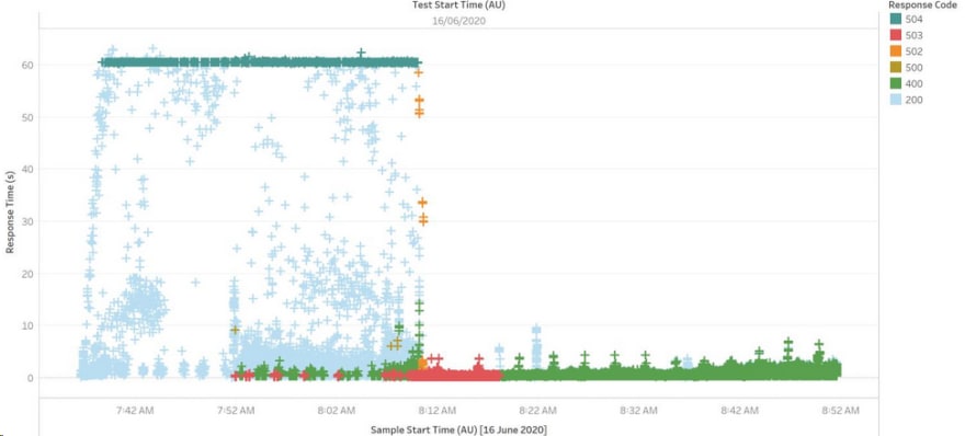
This is how I interpreted the text and someone else might have interpreted it differently.
I think Stephen wasn't necessarily trying to highlight 5XX is an unacceptable performance or 2XX is acceptable performance. What I think he might have been trying to convey is that something is seriously wrong here that he is getting all sorts of HTTPS response codes and when you plot them on a graph, they look like rainbow colours (pun intended). Maybe he wasn't too concern about the colour choices he made but the message behind it.
Colour Blindness
A couple of years ago, I was using traffic light colours to report system health to our stakeholders. After a couple of reports, one of the stakeholders approached me and requested I use a different colour instead of red or green. I curiously asked, why? The answer was that he was colour blind and couldn't distinguish between red and green. They looked the same to him. This had a profound impact on me and I made sure, I take that into account when creating charts.
In his paper Dashboard Design for Real-Time Situation Awareness, Stephen Few reminds us that the first risk of using red and green as colours on any report for decision making is that 10% of the male population and 1% of the female population is colour blind. They can’t distinguish between red and green. And these are the two colours we use to represent acceptable and unacceptable performance (/errors).
This is how red, yellow and green looks like to people who are colour blind.
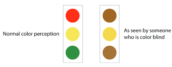
Maybe, next time, if you get a figure that represents errors in a different colour other than red you don't get alarmed and instead ask the author, the reason behind their choice. Potentially colour blindness was the reason for the choice, something else or no reason at all. In the last case, you might want to suggest to them that they use red colour instead.
Telling a Story and our own Bias
Finally, you might have charts with right colours and think that your stakeholders can infer the points you are trying to make from the charts; second, that they can rapidly process complex visualizations and understand the key trends and relationships that are shown. However, neither of these assumptions are true. Not everyone will have the same technical background as you do. Not everyone will know what HTTP 500/502/503/504 is, let alone also decipher the colour choices you made.
Some might conclude that the stakeholders are not very smart or just not that into the science of colour and visualization. I think that’s exactly the wrong message. They might be simply too busy. Also colour perception is very subjective, different people have different ideas about and responses to colours. Multiple factors such as stakeholder age, gender and culture can influence their perception. Along with these there are other factors such as overloading your stakeholder senses with too much information in the chart.
Even if you have correct colours in the chart and get their attention, it doesn’t mean anything, if they can’t understand what it the means, how it impacts them and their decision. You should be able to tell a story using charts. Use colours & charts to enhance your message.
Conclusion
Different colours entice different emotions in the human brain and there are studies to prove that different people have different ideas about and responses to colours. We should use general colour principles to help guide us in creating charts but also accept, there will be times when those principles will be challenged due to our confirmation bias.
I am curious about colour psychology and also how to apply it in performance testing and engineering field. If any of this is of interest to you, I would love to hear your thoughts.
Thanks for reading!
If you enjoyed this article feel free to share on social media 🙂
Say Hello on: Linkedin | Twitter | Polywork
Github: hseera

Top comments (0)