Forms on every website most crucial. The reason is simple they bring the business. If you are an e-commerce website then people would be using it to place orders, or do payment. If you are an education website then people would be using it to fill the admission forms. etc.
A non-accessible form simply means a loss in the business.
Today we are going to learn what makes the forms non-accessible
Common Mistakes:
1) Using only colors for errors and success
Many times UX designers decide to use the colors to communicate the state of the submission of the form - success or errors. This is not accessible by screen readers as well as to the folks who have color blindness problem. Always provide a clear and descriptive reason why the form is not getting submitted successfully.
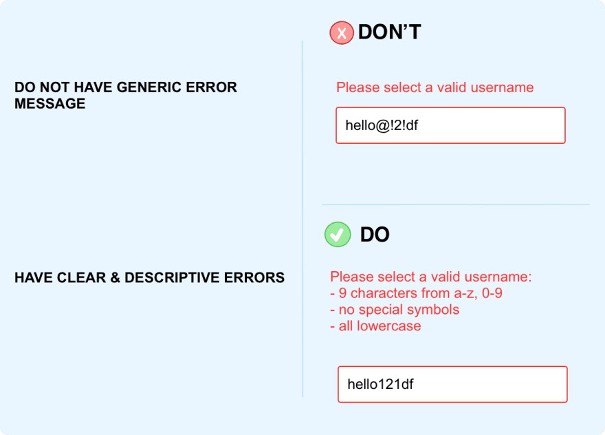
2) No descriptive errors
As stated above, always provide descriptive and clear error states. I have seen the errors like: "Please correct the errors", "Please enter valid username", .etc. Form author needs to clearly explain what do you mean by 'valid', which error to be corrected, and what to be corrected?
3) Missing descriptive helper text
To have accessible forms it is mandatory to provide the descriptive and clear helper text. This will help the users to understand the expected input and they can enter without any mistake. Eg: if the expected password is 9 characters without any special symbol then do mention is clearly before the user enters the input.
4) No labels of the form
Another common mistake folks do with forms is they do not keep labels separate from the input fields. This is in fact very common and I would say the very favorite style of the UX folks to have labeled as placeholders or as Material design system has label overlapping input fields.
Both are incorrect, reason, labels are important for the screen readers, folks suffering from cognitive, folks who are new to web and need to understand which field is related to what?
The best practice to always have labels.
Read more at a11ytips.dev


Top comments (0)