
Have you ever gone on a website and thought to yourself: “Wow this needs a little more life in it!” I say it more often than not and it was probably my biggest fear when it came down to developing my own web apps.
I wanted a web app that looked dynamic and caught your attention. Thats when I stumbled on this beautiful animation created by Kome on codepen.io: (https://codepen.io/hoangdacviet/pen/GRWvWmg)
Step 1: HTML Set-up
First things first is to create some divs in the body of your html file that will contain the class names of all our items.
<div class="container">
    <div class="bird-container bird-container--one">
        <div class="bird bird--one"></div>
    </div>

    <div class="bird-container bird-container--two">
        <div class="bird bird--two"></div>
    </div>

    <div class="bird-container bird-container--three">
        <div class="bird bird--three"></div>
    </div>

    <div class="bird-container bird-container--four">
        <div class="bird bird--four"></div>
    </div>
</div>
Step 2: What is a sprite?
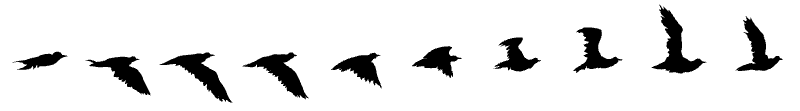
The first that you should know is what kind of image you’re actually working with. An image sprite is a collection of images put into a single image. In other words our animation is actually a strip of bird images that are on a constant rotation. In order for the sprite to rotate follow along with the code below:
.bird {
  background-image: url(https://s3-us-west-2.amazonaws.com/s.cdpn.io/174479/bird-cells.svg);
  background-size: auto 100%;
  width: 88px;
  height: 125px;
  will-change: background-position;
  -webkit-animation-name: fly-cycle;
          animation-name: fly-cycle;
  -webkit-animation-timing-function: steps(10);
          animation-timing-function: steps(10);
  -webkit-animation-iteration-count: infinite;
          animation-iteration-count: infinite;
}
Step 2: Time Your Birds!
This step is SUPER important if you want your animation to look more realistic and dynamic! Imagine if you work hard to create an animation and it looks like the birds just follow the same path the whole time……yea that’s a no from me! Essentially what you’re looking for is that the animation for each individual bird starts at various times and lasts varying amounts of times, so that it looks like birds are trailing each other and flying at different speeds. Here’s how you do it:
.bird--one {
  -webkit-animation-duration: 1s;
          animation-duration: 1s;
  -webkit-animation-delay: -0.5s;
          animation-delay: -0.5s;
}
.bird--two {
  -webkit-animation-duration: 0.9s;
          animation-duration: 0.9s;
  -webkit-animation-delay: -0.75s;
          animation-delay: -0.75s;
}
.bird--three {
  -webkit-animation-duration: 1.25s;
          animation-duration: 1.25s;
  -webkit-animation-delay: -0.25s;
          animation-delay: -0.25s;
}
.bird--four {
  -webkit-animation-duration: 1.1s;
          animation-duration: 1.1s;
  -webkit-animation-delay: -0.5s;
          animation-delay: -0.5s;
}
Make sure to also add animation delays and durations to the bird-containers since they will be in charge for actually moving the birds across the screen:
.bird-container {
  position: absolute;
  top: 20%;
  left: -10%;
  -webkit-transform: scale(0) translateX(-10vw);
          transform: scale(0) translateX(-10vw);
  will-change: transform;
  -webkit-animation-name: fly-right-one;
          animation-name: fly-right-one;
  -webkit-animation-timing-function: linear;
          animation-timing-function: linear;
  -webkit-animation-iteration-count: infinite;
          animation-iteration-count: infinite;
}
.bird-container--one {
  -webkit-animation-duration: 15s;
          animation-duration: 15s;
  -webkit-animation-delay: 0;
          animation-delay: 0;
}
.bird-container--two {
  -webkit-animation-duration: 16s;
          animation-duration: 16s;
  -webkit-animation-delay: 1s;
          animation-delay: 1s;
}
.bird-container--three {
  -webkit-animation-duration: 14.6s;
          animation-duration: 14.6s;
  -webkit-animation-delay: 9.5s;
          animation-delay: 9.5s;
}
.bird-container--four {
  -webkit-animation-duration: 16s;
          animation-duration: 16s;
  -webkit-animation-delay: 10.25s;
          animation-delay: 10.25s;
}
Step 3: Fly!
The most exciting part! Time to fly! Now the most important part for creating any animation with css is understanding the concept of keyframes. When you specify CSS styles inside the @keyframes rule, the animation will gradually change from the current style to the new style at certain times. These changes occur across “waypoints”, which are defined by percentages. In our case, the birds will be changing their location on the screen as defined by their given x and y axis. Also we adjusted their scale to make it look like they’re flying closer to the viewer or further away. Here’s what the code looks like:
@-webkit-keyframes fly-cycle {
  100% {
    background-position: -900px 0;
  }
}

@keyframes fly-cycle {
  100% {
    background-position: -900px 0;
  }
}
@-webkit-keyframes fly-right-one {
  0% {
    -webkit-transform: scale(0.3) translateX(-10vw);
            transform: scale(0.3) translateX(-10vw);
  }
  10% {
    -webkit-transform: translateY(2vh) translateX(10vw) scale(0.4);
            transform: translateY(2vh) translateX(10vw) scale(0.4);
  }
  20% {
    -webkit-transform: translateY(0vh) translateX(30vw) scale(0.5);
            transform: translateY(0vh) translateX(30vw) scale(0.5);
  }
  30% {
    -webkit-transform: translateY(4vh) translateX(50vw) scale(0.6);
            transform: translateY(4vh) translateX(50vw) scale(0.6);
  }
  40% {
    -webkit-transform: translateY(2vh) translateX(70vw) scale(0.6);
            transform: translateY(2vh) translateX(70vw) scale(0.6);
  }
  50% {
    -webkit-transform: translateY(0vh) translateX(90vw) scale(0.6);
            transform: translateY(0vh) translateX(90vw) scale(0.6);
  }
  60% {
    -webkit-transform: translateY(0vh) translateX(110vw) scale(0.6);
            transform: translateY(0vh) translateX(110vw) scale(0.6);
  }
  100% {
    -webkit-transform: translateY(0vh) translateX(110vw) scale(0.6);
            transform: translateY(0vh) translateX(110vw) scale(0.6);
  }
}
@keyframes fly-right-one {
  0% {
    -webkit-transform: scale(0.3) translateX(-10vw);
            transform: scale(0.3) translateX(-10vw);
  }
  10% {
    -webkit-transform: translateY(2vh) translateX(10vw) scale(0.4);
            transform: translateY(2vh) translateX(10vw) scale(0.4);
  }
  20% {
    -webkit-transform: translateY(0vh) translateX(30vw) scale(0.5);
            transform: translateY(0vh) translateX(30vw) scale(0.5);
  }
  30% {
    -webkit-transform: translateY(4vh) translateX(50vw) scale(0.6);
            transform: translateY(4vh) translateX(50vw) scale(0.6);
  }
  40% {
    -webkit-transform: translateY(2vh) translateX(70vw) scale(0.6);
            transform: translateY(2vh) translateX(70vw) scale(0.6);
  }
  50% {
    -webkit-transform: translateY(0vh) translateX(90vw) scale(0.6);
            transform: translateY(0vh) translateX(90vw) scale(0.6);
  }
  60% {
    -webkit-transform: translateY(0vh) translateX(110vw) scale(0.6);
            transform: translateY(0vh) translateX(110vw) scale(0.6);
  }
  100% {
    -webkit-transform: translateY(0vh) translateX(110vw) scale(0.6);
            transform: translateY(0vh) translateX(110vw) scale(0.6);
  }
}
@-webkit-keyframes fly-right-two {
  0% {
    -webkit-transform: translateY(-2vh) translateX(-10vw) scale(0.5);
            transform: translateY(-2vh) translateX(-10vw) scale(0.5);
  }
  10% {
    -webkit-transform: translateY(0vh) translateX(10vw) scale(0.4);
            transform: translateY(0vh) translateX(10vw) scale(0.4);
  }
  20% {
    -webkit-transform: translateY(-4vh) translateX(30vw) scale(0.6);
            transform: translateY(-4vh) translateX(30vw) scale(0.6);
  }
  30% {
    -webkit-transform: translateY(1vh) translateX(50vw) scale(0.45);
            transform: translateY(1vh) translateX(50vw) scale(0.45);
  }
  40% {
    -webkit-transform: translateY(-2.5vh) translateX(70vw) scale(0.5);
            transform: translateY(-2.5vh) translateX(70vw) scale(0.5);
  }
  50% {
    -webkit-transform: translateY(0vh) translateX(90vw) scale(0.45);
            transform: translateY(0vh) translateX(90vw) scale(0.45);
  }
  51% {
    -webkit-transform: translateY(0vh) translateX(110vw) scale(0.45);
            transform: translateY(0vh) translateX(110vw) scale(0.45);
  }
  100% {
    -webkit-transform: translateY(0vh) translateX(110vw) scale(0.45);
            transform: translateY(0vh) translateX(110vw) scale(0.45);
  }
}
@keyframes fly-right-two {
  0% {
    -webkit-transform: translateY(-2vh) translateX(-10vw) scale(0.5);
            transform: translateY(-2vh) translateX(-10vw) scale(0.5);
  }
  10% {
    -webkit-transform: translateY(0vh) translateX(10vw) scale(0.4);
            transform: translateY(0vh) translateX(10vw) scale(0.4);
  }
  20% {
    -webkit-transform: translateY(-4vh) translateX(30vw) scale(0.6);
            transform: translateY(-4vh) translateX(30vw) scale(0.6);
  }
  30% {
    -webkit-transform: translateY(1vh) translateX(50vw) scale(0.45);
            transform: translateY(1vh) translateX(50vw) scale(0.45);
  }
  40% {
    -webkit-transform: translateY(-2.5vh) translateX(70vw) scale(0.5);
            transform: translateY(-2.5vh) translateX(70vw) scale(0.5);
  }
  50% {
    -webkit-transform: translateY(0vh) translateX(90vw) scale(0.45);
            transform: translateY(0vh) translateX(90vw) scale(0.45);
  }
  51% {
    -webkit-transform: translateY(0vh) translateX(110vw) scale(0.45);
            transform: translateY(0vh) translateX(110vw) scale(0.45);
  }
  100% {
    -webkit-transform: translateY(0vh) translateX(110vw) scale(0.45);
            transform: translateY(0vh) translateX(110vw) scale(0.45);
  }
}
Conclusion
Whew this is a lot of code for four little birds! But ultimately they’re SO worth it and have honestly become a calling card of mine amongst my colleagues. I’ve used this animation for a web app that focused on eco-friendliness and another web app focused on travel. I encourage you to find other ways to utilize it and maybe even add different image sprites! While I did not add too much information on how each action works. Other my demo: https://codepen.io/hoangdacviet/pen/zYZdwzg
Geek: Web Design Mobile App Marketing ❤️ Startup Smarthome IoT
Money motto: Love People ❤️ Cloud
Life motto: ✔️NO PAIN NO GAIN
Business: http://svtre.com https://kami.vn http://kome.top

Top comments (0)