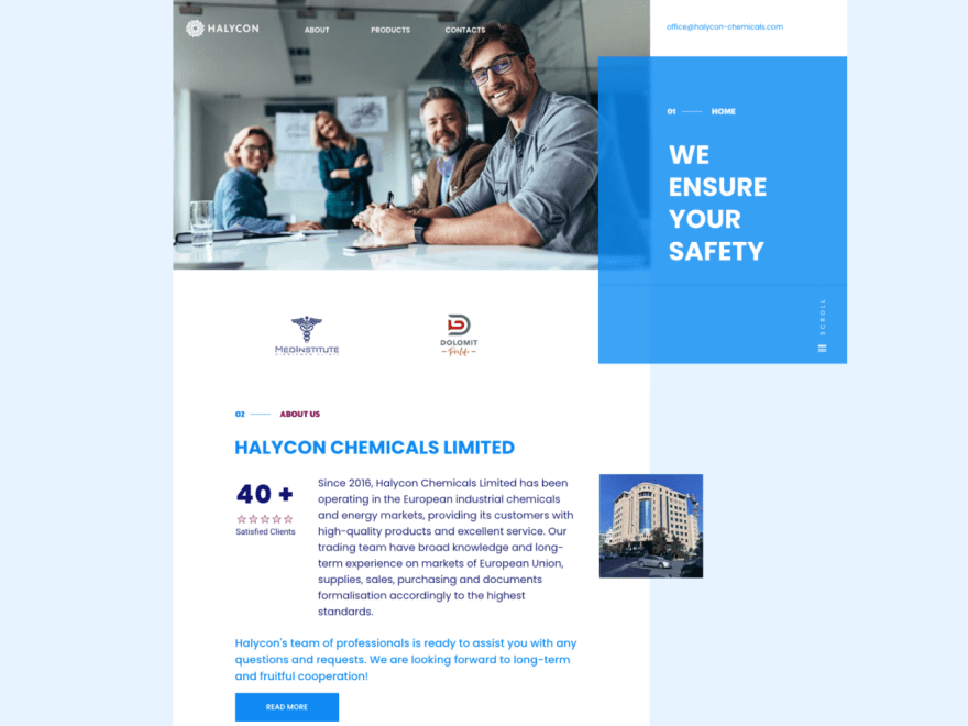
Hotsnow designed and implemented the website for Halycon Chemicals limited. We created the identity and developed the website.
Client: Halycon Chemicals Limited
Site launch: Halycon Chemicals Limited
Hotsnow designed and implemented the website for Halycon Chemicals Limited. Our team created the identity and design of the website. The project's schedule was urgent.
The client needed this website urgently to showcase their services and products. Halycon Chemicals is a midsize trade and consultancy company specializing in chemicals, energy, and food commodities.
The Brief
Halycon was scheduled to launch its products and services on the market with a significant high-end disinfectants brand of Dolomit Oil Pro-Life, distributed in the EU. The market leader's CEO set the design brief to the Board of Directors at the beginning of the year. Our brief was to take a high-end chemicals brand and create a comprehensive website that would stand out in a sea of cookie-cutter, generic e-commerce sites. Our team started working with the Marketing team to make the customer experience. The brief was to create a brand identity that would give the brand a personality and create a dialogue with the customer.
The Process
What did you do in the first 30 days? To fulfill this challenge, we worked in a two-phase approach. First, we worked on identity. The goal was to create the logo and color palette for all the company's visual assets. In the second phase, the team was focused on the company's website. The next task was to create a site's architecture and fill the content for all the website sections. What was the most challenging part of the project? The most difficult part was finding to create the product catalog in a brief timeframe. Due to the short timeframe and the project's urgency, there were very few opportunities to train people to use the tool.
The Outcome
1.The website is vibrant and clear with a lot of life and interactivity. The bold and inspiring identity concept and the unique design language have built a powerful connection with the audience. We successfully got a good amount of coverage for the launch through social media and email communication.
2.Being a new kid in the website world, the site was heavy on content, and we tried to be as informative as possible. This approach made the user experience smoother and faster.
3.The catalog is a phenomenal asset to the site. It is rich with well-designed and relevant content.
Conclusion
The ease of interaction with the project team allowed us to work with individuals with different backgrounds and methods. This communication was constructive. The fact that the project was challenging and demanding made it memorable and fun.
Learn more about our skills in web design and about our other services on our website.


Top comments (0)
Some comments may only be visible to logged-in visitors. Sign in to view all comments.