
Need compelling JS charts for your website or app? Start with the basics! Complete this quick data visualization tutorial and you'll learn how to easily create JavaScript column and bar charts that will look great in any HTML5-based project, allowing for easy comparisons. Chart examples to be built and demonstrated in this tutorial will be visualizing the latest novel coronavirus cases data from JHU CSSE as COVID-19 is the most topical issue nowadays. Keep reading and you'll see JS charting is actually very simple. Especially if you have at least a very basic understanding of programming (more than that is awesome but far from necessary).
How to Build a Basic JavaScript Column Chart
Generally, it takes four simple steps to make a JS chart of almost any basic type, and a column chart is not an exception:
- Create a web page.
- Reference necessary files.
- Set the data.
- Code the chart.
Let's take them now one by one and then proceed to a bit more advanced customization for better illustration.
1. Create a web page
First, create an HTML page where you want to build the chart. Add a block-level HTML element that will be a container for the chart and specify its ID. To make the chart fill the entire page, set the width and height parameters at 100%. So the entire HTML page can look like this:
    <!DOCTYPE html>
    <html>
      <head>
        <title>JavaScript Chart on COVID-19 Data</title>
      </head>
      <body>
        <div id="container" style="width: 100%; height: 100%;"></div>
      </body>
    </html>
2. Reference necessary files
Second, include all necessary scripts to build the chart — in the <script> tag inside of the <head> section. The chart being built along this tutorial will be powered by the AnyChart JavaScript charting library which is easy to use and flexible and has a detailed documentation with many samples. So, include its base module from the CDN right there. The chart code itself will go to the <script> tag inside of the <body> section.
    <!DOCTYPE html>
    <html>
      <head>
        <title>JavaScript Chart on COVID-19 Data</title>
        <script src="https://cdn.anychart.com/releases/8.7.1/js/anychart-base.min.js"></script>
      </head>
      <body>
        <div id="container" style="width: 100%; height: 100%;"></div>
        <script>
          // The chart code will be written here.
        </script>
      </body>
    </html>
3. Set the data
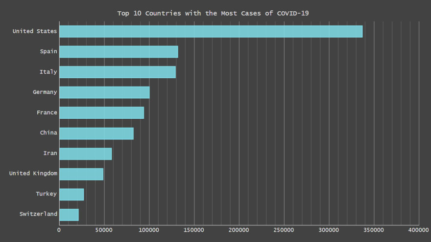
Third, you should add the data you want to visualize. Basically, there are many ways to load data to charts. This tutorial describes how to create a simple chart so let's arrange simple data. Currently, the novel coronavirus pandemic is the number one topic all over the world. Let's make a JavaScript column chart visualizing the top 10 countries with the highest number of confirmed COVID-19 cases as of yesterday, April 5, 2020. Data will be taken from the data repository of the Johns Hopkins University Center for Systems Science and Engineering (JHU CSSE) known to contain trustful statistics. According to it, the list of top 10 countries by confirmed COVID-19 cases as of April 5 looks as follows:
Country — Number of cases
United States — 337,072
Spain — 131,646
Italy — 128,948
Germany — 100,123
France — 93,773
China — 82,602
Iran — 58,226
United Kingdom — 48,436
Turkey — 27,069
Switzerland — 21,100
Let's convert this data into a JavaScript object with a data array and header settings:
    var data = {
      header: ["Country", "Number of cases"],
      rows: [
        ["United States", 337072],
        ["Spain", 131646],
        ["Italy", 128948],
        ["Germany", 100123],
        ["France", 93773],
        ["China", 82602],
        ["Iran", 58226],
        ["United Kingdom", 48436],
        ["Turkey", 27069],
        ["Switzerland", 21100]
    ]};
4. Code the chart
Finally, now that you've got a page, scripts and data, you are all set for the final step — start coding. Remember to include the chart code inside of the <script> tag in the <body> section of the HTML page. To begin with, add the anychart.onDocumentReady() function so the chart loads when the page is ready:
    <script>
      anychart.onDocumentReady(function() {
        // The main chart code goes here.
      });
    </script>
Then, add the data:
    anychart.onDocumentReady(function() {

      var data = {
        header: ["Country", "Number of cases"],
        rows: [
          ["United States", 337072],
          ["Spain", 131646],
          ["Italy", 128948],
          ["Germany", 100123],
          ["France", 93773],
          ["China", 82602],
          ["Iran", 58226],
          ["United Kingdom", 48436],
          ["Turkey", 27069],
          ["Switzerland", 21100]
      ]};

    });
Next, define the chart type. (You can find the full list of the chart types available in AnyChart out of the box in the list of Supported Charts.) In this chart, the column chart type is to be picked, with the data specified in the data variable:
    // create the column chart
    var chart = anychart.column();

    // add the data
    chart.data(data);
Let's also add a title for the chart to show what it is about at a glance:
chart.title("Top 10 Countries with the Most Cases of COVID-19");
The last thing to do is to set the container and command to draw the chart:
    // set the container
    chart.container("container");

    // draw the chart
    chart.draw();
Done! Check out the result below:

For your convenience, this JS/HTML5 column chart is available on AnyChart Playground where you can see its interactive live version (for example, hover over the columns and tooltips with the exact numbers will show up), play with the code and visualization to continue mastering this technique on your own. Just in case, the full HTML/JS code is also provided below:
    <!DOCTYPE html>
    <html>
      <head>
        <title>JavaScript Chart on COVID-19 Data</title>
        <script src="https://cdn.anychart.com/releases/8.7.1/js/anychart-base.min.js"></script>
      </head>
      <body>
        <div id="container" style="width: 100%; height: 100%;"></div>
        <script>
    anychart.onDocumentReady(function() {

      // create the data
      var data = {
        header: ["Country", "Number of cases"],
        rows: [
          ["United States", 337072],
          ["Spain", 131646],
          ["Italy", 128948],
          ["Germany", 100123],
          ["France", 93773],
          ["China", 82602],
          ["Iran", 58226],
          ["United Kingdom", 48436],
          ["Turkey", 27069],
          ["Switzerland", 21100]
      ]};

      // create the column chart
      var chart = anychart.column();

      // add the data
      chart.data(data);

      // set the chart title
      chart.title("Top 10 Countries with the Most Cases of COVID-19");

      // set the container
      chart.container("container");

      // draw the chart
      chart.draw();

    });
        </script>
      </body>
    </html>
Looks pretty simple and neat, doesn't it? Now, let's see how to modify such a JavaScript column chart in case you want it.
Chart Customization
Switch the chart type (to horizontal bars)
There are many chart types for data visualization out there, and sometimes you may need to change one you picked first for a better, more insightful view of your data. For example, here's how you can switch the column chart type to the bar chart type — transform (vertical) columns into (horizontal) bars — by simply changing anychart.column() to anychart.bar():
var chart = anychart.bar();
That's it! Now this JavaScript column chart is a JS bar chart — check it out on the playground:

Set a theme
You can customize the look of your charts in a number of ways. However, to quickly change the appearance, it may be convenient to choose from pre-built chart design themes. For example, let's pick one called Dark Turquoise. This can be done in two quick steps. First, reference it in the <script> tag inside of the <head> section:
<script src="https://cdn.anychart.com/releases/8.7.1/themes/dark_turquoise.min.js"></script>
Second, apply it to the chart like this:
anychart.theme(anychart.themes.darkTurquoise);

Enable grid lines
It is not too easy to intuitively recognize the values represented by the bar lines in such a data visualization. So you may want to add grid lines to facilitate the perception. Before actually enabling the grid, let's determine the desired tick intervals — on every 50,000 cases, with minor ticks on every 10,000. Then, simply add the corresponding grid lines.
    // add ticks
    chart.yScale().ticks().interval(50000);
    chart.yScale().minorTicks().interval(10000);
    // add grid lines
    chart.yGrid().enabled(true);
    chart.yMinorGrid().enabled(true);
Note that in AnyChart, bar charts are implemented as vertical JavaScript column charts. As a result, the horizontal axis in bar charts is Y, and the vertical axis in bar charts is X. So don't get confused with what you see in the code snippet above — everything is absolutely correct there. Here's the result of this step:
Turn on the animation
Finally, let's turn on the bar chart animation on load as a simple, yet cool visual effect:
chart.animation(true);
It's the final chart for this tutorial — the result of all the described transformations implemented one by one! You can easily integrate it into your web project. Remove all the comments and you'll see that it is created in less than 30 lines of pure JavaScript code. Here's the full code of this final interactive JS bar chart we've come to from the basic JS column chart:
<!DOCTYPE html>
<html>
  <head>
    <title>JavaScript Chart on COVID-19 Data</title>
    <script src="https://cdn.anychart.com/releases/8.7.1/js/anychart-base.min.js"></script>
    <script src="https://cdn.anychart.com/releases/8.7.1/themes/dark_turquoise.min.js"></script>
  </head>
  <body>
    <div id="container" style="width: 100%; height: 100%;"></div>
    <script>
anychart.onDocumentReady(function() {

  // create the data
  var data = {
    header: ["Country", "Number of cases"],
    rows: [
      ["United States", 337072],
      ["Spain", 131646],
      ["Italy", 128948],
      ["Germany", 100123],
      ["France", 93773],
      ["China", 82602],
      ["Iran", 58226],
      ["United Kingdom", 48436],
      ["Turkey", 27069],
      ["Switzerland", 21100]
  ]};

  // create the chart
  var chart = anychart.bar();

  // set the theme
  anychart.theme(anychart.themes.darkTurquoise);

  // add the data
  chart.data(data);

  // set the chart title
  chart.title("Top 10 Countries with the Most Cases of COVID-19");

  // add tick intervals
  chart.yScale().ticks().interval(50000);
  chart.yScale().minorTicks().interval(10000);
  // add grid lines
  chart.yGrid().enabled(true);
  chart.yMinorGrid().enabled(true);

  // turn on the chart animation
  chart.animation(true);

  // set the container
  chart.container("container");

  // draw the chart
  chart.draw();

});
    </script>
  </body>
</html>
Conclusion
As you see, creating JavaScript column and bar charts is not difficult at all. If you want to know how to make some further modifications to the data visualizations from this tutorial or create other charts, visit the documentation and get inspired by demos in the gallery. Feel free to ask questions if any.
UPD: Decided to update the cover image with the most actual data chart.
See also: Creating a JavaScript Bar Chart_

Top comments (0)