Table of Contents
- Goal
- Technologies Used
- End User and User Stories
- Initial Wireframe
- Break the app up into CSS Grid sections
- Break sections into components and code one at a time
- Done
Goal
A while back a mentor and I went hiking at a local state park. It was one of the best mentoring experiences I've ever had. We had a long conversation about my career goals, the technologies I was learning, and my passions.
Now I'm a teacher assistant in the Launch Code boot-camp and this article is to give aspiring developers a hint at building a landing page. This is a peek at my planning and development methods. Please remember, there are 100 ways to a solution. This is one of many paths to a good solution.
Technologies Used
First consider what technology you will use. I am using React for the presentation and functionality (HTML, JavaScript, CSS). GitHub, GitKraken, Chrome, Adobe XD, and Visual Studio Code is my tools.
End User and User Stories
Next, spend time thinking of user stories. For this project, my end user should be one of my boot-camp students who I am mentoring.
- The user should read convincing text to understand why they should take this opportunity.
- The user should be able to click on a button to see potential dates.
- The user should be able to click on a button to proceed to sign up.
- The user should be able to join the Slack channel.
- The user should be able to contact me via email.
Initial Wireframe
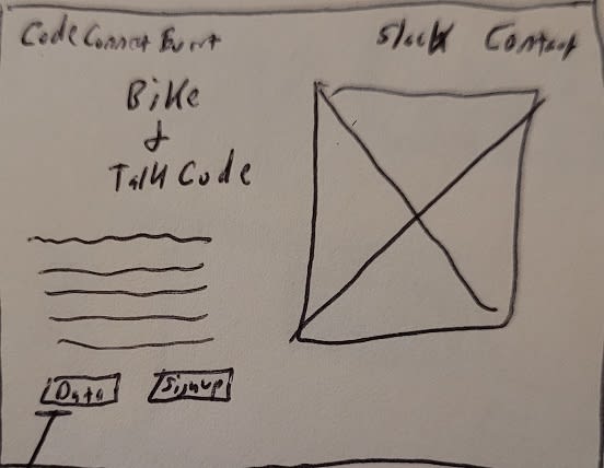
I'm a firm believer in starting with the end goal in mind. So a paper drawing based on the goal and user stories is a must.

The next step is to create a digital copy of the paper drawing so I can:
- Finalize the idea
- Include UI/UX concepts
- Add colors
- Ability to export the wireframe into an image and share with others to get first impressions before I start coding.
My favorite resource for wireframing is Adobe XD. It's free and it rocks. I also always start with a black and white illustration so I can focus on the UI/UX. Afterward, I add the color.

My favorite resource for free images is undraw.com.
Break the app up into CSS Grid sections
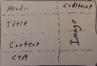
Some of the best advice I have been given is to learn responsive design CSS technologies Flexbox and CSS Grid. Now, I start each project off by drawing a "Grid" overview of the web page.

This is the first preview of the app. As you can see, its color-coded and broken up by CSS Grid sections.
Here is some quick CSS Grid resources:
Break sections into components and code one at a time
My opinion is to code one section or functionality/user story at a time. Since I am building in React, I started my project by creating a folder for each component I expected to build.
Done
While it's not perfect, I got in a day of coding practice..


Top comments (0)