At conferences, I always gravitate towards accessibility talks. I think the subject is super interesting and I always come out wanting to be an advocate. Unfortunately, these feelings of inspiration have always been fleeting and I've never actually taken any action. Or remembered much.
UNTIL..
Google I/O. While I'm sure they mentioned the updated audit tab in Chrome DevTools during the developer keynote...
...I didn't learn about it until I walked into their accessibility tent. There, I met Dirk, a ux engineer, and I asked him what his part of the tent was 'all about.' This is where I learned about the new audit tab that quickly told me all the things that make dev.to not accessible. Dirk was incredibly patient and did an entire walkthrough with me. Below were some of my takeaways from auditing dev.to:
Why the audit tab is wonderful
- It's fast.
- You can run an audit without downloading any extensions or turning to the command line.
- The report tells you exactly where your elements are failing, and why it's important for them to pass.
- It has me coming back for more. I want to see my score increase as I make changes to the site.
Things I Learned
-
altattributes are crucial. Visually-impaired users rely on screen readers to navigate the web. If your image contains important info, the screen reader won't be able to determine the context unless you add an alt-tag. - If you don't have an alt tag, it'll read the name of the image. How many images do you have titled
17942/28acb955-1ad6-4290-9404-3bb3c360ecb7.jpg? Yeah, probably a lot. And now, your user needs to hear that string dictated at them. - For decorative images (images that don't add informational content), you can leave the attribute empty, i.e.
alt="". - Color contrast: I learned that our mint green buttons with white text didn't offer enough contrast, which makes it difficult for users to read. At Saron Yitbarek's talk at Signal, I learned that 1 in 12 men are colorblind. That's a lot of people.
- If you're failing the color contrast test, try using this tool that lets you play around with your colors to find your closest options.
How To Audit Your Site
- If you don't have it already, download Chrome Canary, the chrome browser for devs and early adopters. The audit tab should be coming to all chrome browsers soon, but they're still working out some kinks.
- Once you're in Canary, visit your site, and go into devtools.
- Navigate to the
audittab. - Choose accessibility, and click audit!
You'll see something like this:

And you can click into the report to see which elements are failing:

Going Further
If the audit doesn't inspire you to take action, try navigating your site with a screen reader. On macs, this would be system preferences -> accessibility -> enable voiceover. You'll quickly learn what the user experience is like for some of your users.
I also learned about screen magnifiers today and recommend everyone to check out Frederik Creemer's post, How to Make Your Website Accessible to People Who Use a Screen Magnifier.
Additional Resources
- Google's overview of accessibility for devs
- Udacity's Course for Web Accessibility
Thanks for reading
I hope I've encouraged you to run an accessibility audit and I'm happy to share that we've created issues to address the tests that failed on dev.to 😊


Top comments (5)
Thanks for mentioning my post! I haven't opened Canary in quite a while, so I'll definitely check that out.
Apart from testing web sites for accessibility, it's also a good idea to test out the (transactional) emails that your app or site sends. Often, people use images as buttons, without descriptive alt text.
2 small corrections: The link to Saron Yitbarek's talk at Signal is currently incorrectly formatted, and I think it might be good to link to the download page for canary so people who are inspired cna quickly go and download it.
Great call, I added the Canary link and fixed the link to Saron's talk.
If users want to grab this accessibility check without having to grab the dev version of Chrome, they can use Google Lighthouse. It's the same tech :)
or grab aXe which is what powers the accessibility bit of Lighthouse :)
deque.com/products/axe/
Thank you so much for caring Jess!
This made my day and teaching Devs about Accessibility really worthwhile :-)
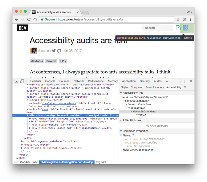
Let's not forget the Accessibility inspector tab:


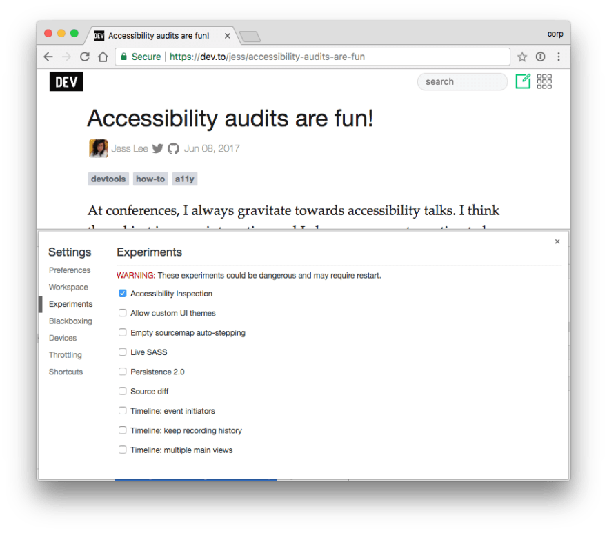
And this is how you can activate it: