What Is Accessibility?
Accessibility tends to be a word that's easily thrown into conversations to convey a sense of inclusivity but oftentimes comes with a lack of understanding. Accessibility, often shortened to A11Y, shouldn't be confused with usability. Usability refers to how a product is used by its users to achieve certain goals - effectively, efficiently, and with a sense of satisfaction. Accessibility, on the other hand, is the design of products such that it is usable by people with a wide range of abilities. In a nutshell, everyone (and by everyone I really do mean every one) should be able to use it.
It's currently 2020, and a time where many issues have been magnified, highlighted and brought to the forefront of society's landscape. You name it. The BLM movement, sexism, lack of access to affordable healthcare amidst a global pandemic. The core of every single one of those issues is inclusivity and the fact that many systems focus on the majority without concern for the rest. In a world of millions of perspectives and lived experiences, the extra effort to include everyone should be done, no question.
I confess that I did not know much about accessibility, for software development. It was a topic that was not covered, or mentioned in my Bootcamp, but a topic I find to be critically important as I continue to move forward in this space, even as a new developer. I am currently learning, as we all are.
I hope to delve deeper into this topic in my later blog posts, but for now, here are some quick, and simple tips to keep in mind the next time you write that image tag without that descriptive alternate text, or create a form/input field with no labels for it.
There are a few different groups of disabilities to keep in mind: visual, hearing, motor, and cognitive. Today's tips will be more visual-focused.
Visual
The ones that often and easily come to mind are visual - people who are blind, or have a visual impairment and have low visual acuity. Keyboard navigation is crucial for addressing these issues. Additionally, with visual disabilities, developers should not rely on color as the sole navigational tool or indication of different items. Namely, do not solely depend on the colors red, and green to indicate bad or good - why? Color blindness! Now, I'm not saying to not use color - use it! It makes the world come to life! But please add icons, text, and other elements to reinforce the content. Check your color contrast also - a low contrast can prove difficult to read for users. Lastly, some people prefer a large print text or magnification to help read content, so design the page in mind to allow for a zoomed-in lens with clear communication of the page's content.
If images are included, and they often are, be sure to include alternative text in the markup/code! It's simple addition while you're writing the code- it's right there. A caption or descriptive summary close to the image are also helpful additions. Users with visual impairments rely on assistive tools, like screen readers, to get information from the page. Screen readers will read out the alt text.
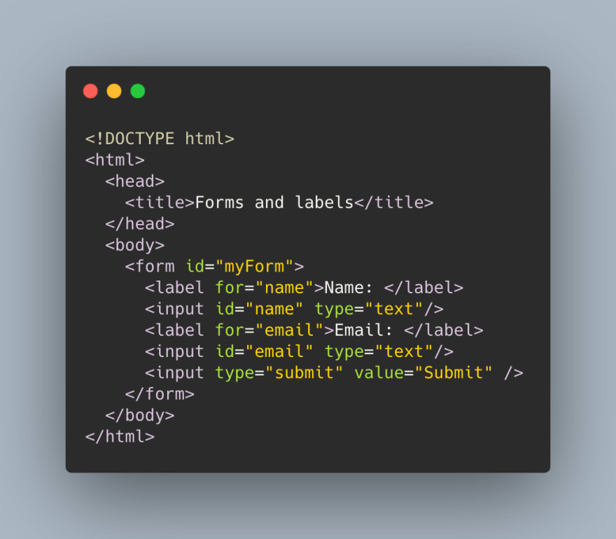
Additionally, let's say you're incorporating a form onto the page. For each input field, have a label attached such that if a user were to click the label, the corresponding input field will focus. This is called an accessibility tree, something that screen readers utilize. It informs the user of various properties of the element (like the type, name, and state!) This way the connection between the label and input field element is clear and helps the user know what they're answering.
Lastly, using proper HTML semantic tags where necessary helps the user understand - and the screen reader! - what elements they can interact with. They're semantic for a reason! Use proper heading tags, <h1>, <h2>. If you have a button, use the <button> tag.
Hearing
If there are videos on the page, provide some form of visual access to the audio information! This can be done through captioning or providing a transcript of the full conversation.
TLDR: Bullet Point Version
- Keyboard Navigation: all interactive elements of your page should be accessible by keyboard. By using Tab and Shift + Tab keys, a user should be able to interact with the elements that require a user's input. Most of these are done by default, but something to keep in mind.
- Don't Depend Solely on Color: Using color is fine, and adds dimension to the page, but add icons, text, or other elements to reinforce the meaning! Use external sites to confirm color contrast etc.
- Don't Skip Out on Alt Text: plain and simple- go the extra 5 seconds, and add alt text to help out users with screen readers to understand the image you used for the content.
- Add Those Labels To Your Inputs!: Adding labels to input fields helps screen readers to show the connection between text and input. Clicking on the label will move focus to the corresponding input for the user.
- Use Those Semantic HTML Tags: Don't use a div for a button, when you can just use the button tag. It's called semantic for a reason!
- Using Videos? Share The Text: If you're using videos on your page, allow for captioning or provide the transcript so people who can't play the audio (disability or not) can understand the content of the conversation.
Conclusion
I myself have a lot to learn about accessibility and hope to continue to learn and incorporate it in my day to day with my projects. If you have any resources to share, don't hesitate to let me know! I hope to chat about this topic more in-depth in later posts, so stay tuned.


Top comments (0)