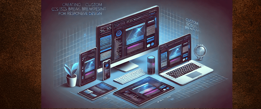
In modern web development, responsive design ensures a seamless user experience across different screen sizes. SCSS provides a powerful way to manage breakpoints efficiently with mixins. In this blog, we will explore how to create custom SCSS breakpoints using mixins for flexible and maintainable styles.
Why Use Custom SCSS Breakpoints?
Using custom breakpoints in SCSS allows you to:
Maintain cleaner and more readable code.
Apply media queries efficiently without repetition.
Easily adjust styles for different screen sizes by reusing mixins.
Creating the Custom SCSS Breakpoints
We will define two mixins: one for minimum-width breakpoints and another for maximum-width breakpoints.
SCSS Mixin for Min-Width Breakpoints
This mixin applies styles when the viewport is at least a specified width.
@mixin breakpoint-min($width) {
    @media only screen and (min-width: $width) {
        @content;
    }
}
SCSS Mixin for Max-Width Breakpoints
This mixin applies styles when the viewport is at most a specified width.
@mixin breakpoint-max($width) {
    @media only screen and (max-width: $width) {
        @content;
    }
}
Using the SCSS Breakpoint Mixins
Now, let’s see how we can use these mixins to apply responsive styles.
Example: Styling for Mobile and Tablet Screens
@include breakpoint-max(767px) {
    body {
        background-color: lightgray;
    }
}
@include breakpoint-max(991px) {
     body {
        background-color: recebapurple;
    }
}
Example: Applying Min-Width Breakpoints
@include breakpoint-min(1024px) {
    .navbar {
        display: flex;
    }
}
- Applies Styles at 1024px and Above – The mixin ensures the styles inside it take effect only when the screen width is 1024px or larger.
- Uses a Custom Mixin – Calls breakpoint-min(1024px), which generates a min-width media query.
- Enables Flexbox for Navbar – The .navbar gets display: flex, making it a flexbox container for better alignment.
- Supports Responsive Design – Helps transition from a mobile-friendly layout to a more structured navbar on larger screens.
- Keeps Code Clean & Reusable – Using mixins avoids repetition and makes managing breakpoints easier and more maintainable.
Benefits of Using SCSS Breakpoint Mixins
Reusability: Define breakpoints once and use them throughout your stylesheets.
Readability: Improves code organization and avoids redundant media queries.
Maintainability: Easily modify breakpoints in a single place without affecting multiple files.
Conclusion
Using SCSS mixins for breakpoints enhances your workflow and helps maintain a scalable and well-structured codebase. Implementing custom breakpoint mixins ensures consistency and flexibility in your responsive designs.
Give these mixins a try in your next project and experience the benefits of writing cleaner, more efficient SCSS!

Top comments (0)