
This is the latest in my series of screencasts demonstrating how to use the tidymodels packages, from just getting started to tuning more complex models. Today’s screencast focuses only on data preprocessing, or feature engineering; let’s walk through how to use dimensionality reduction for song features sourced from Spotify (mostly audio), with this week’s #TidyTuesday dataset on Billboard Top 100 songs. 🎵
Here is the code I used in the video, for those who prefer reading instead of or in addition to video.
Explore data
Our modeling goal is to use dimensionality reduction for features of Billboard Top 100 songs, connecting data about where the songs were in the rankings with mostly audio features available from Spotify.
library(tidyverse)

## billboard ranking data
billboard <- readr::read_csv("https://raw.githubusercontent.com/rfordatascience/tidytuesday/master/data/2021/2021-09-14/billboard.csv")

## spotify feature data
audio_features <- readr::read_csv("https://raw.githubusercontent.com/rfordatascience/tidytuesday/master/data/2021/2021-09-14/audio_features.csv")
Let’s start by finding the longest streak each song was on this chart.
max_weeks <-
  billboard %>%
  group_by(song_id) %>%
  summarise(weeks_on_chart = max(weeks_on_chart), .groups = "drop")

max_weeks


## # A tibble: 29,389 × 2
## song_id weeks_on_chart
## <chr> <dbl>
## 1 -twistin'-White Silver SandsBill Black's Combo 2
## 2 ¿Dònde Està Santa Claus? (Where Is Santa Claus?)Augie Rios 4
## 3 ......And Roses And RosesAndy Williams 7
## 4 ...And Then There Were DrumsSandy Nelson 4
## 5 ...Baby One More TimeBritney Spears 32
## 6 ...Ready For It?Taylor Swift 19
## 7 '03 Bonnie & ClydeJay-Z Featuring Beyonce Knowles 23
## 8 '65 Love AffairPaul Davis 20
## 9 '98 Thug ParadiseTragedy, Capone, Infinite 5
## 10 'Round We GoBig Sister 2
## # … with 29,379 more rows
Now let’s join this with the Spotify audio features (where available). We don’t have Spotify features for all the songs, and it’s possible that there are systematic differences in songs that we could vs. could not get Spotify data for. Something to keep in mind!
billboard_joined <-
  audio_features %>%
  filter(!is.na(spotify_track_popularity)) %>%
  inner_join(max_weeks)

billboard_joined


## # A tibble: 24,395 × 23
## song_id performer song spotify_genre spotify_track_id spotify_track_pr…
## <chr> <chr> <chr> <chr> <chr> <chr>
## 1 ......An… Andy Will… .....… ['adult stand… 3tvqPPpXyIgKrm4… https://p.scdn.c…
## 2 ...And T… Sandy Nel… ...An… ['rock-and-ro… 1fHHq3qHU8wpRKH… <NA>
## 3 ...Baby … Britney S… ...Ba… ['dance pop',… 3MjUtNVVq3C8Fn0… https://p.scdn.c…
## 4 ...Ready… Taylor Sw… ...Re… ['pop', 'post… 2yLa0QULdQr0qAI… <NA>
## 5 '03 Bonn… Jay-Z Fea… '03 B… ['east coast … 5ljCWsDlSyJ41kw… <NA>
## 6 '65 Love… Paul Davis '65 L… ['album rock'… 5nBp8F6tekSrnFg… https://p.scdn.c…
## 7 'til I C… Tammy Wyn… 'til … ['country', '… 0aJHZYjwbfTmeyU… https://p.scdn.c…
## 8 'Til My … Luther Va… 'Til … ['funk', 'mot… 2R97RZWUx4vAFbM… https://p.scdn.c…
## 9 'Til Sum… Keith Urb… 'Til … ['australian … 1CKmI1IQjVEVB3F… <NA>
## 10 'Til You… After 7 'Til … ['funk', 'neo… 3kGMziz884MLV1o… <NA>
## # … with 24,385 more rows, and 17 more variables:
## # spotify_track_duration_ms <dbl>, spotify_track_explicit <lgl>,
## # spotify_track_album <chr>, danceability <dbl>, energy <dbl>, key <dbl>,
## # loudness <dbl>, mode <dbl>, speechiness <dbl>, acousticness <dbl>,
## # instrumentalness <dbl>, liveness <dbl>, valence <dbl>, tempo <dbl>,
## # time_signature <dbl>, spotify_track_popularity <dbl>, weeks_on_chart <dbl>
Some of the features we now have for each song are characteristics of the song like the time signature (3/4, 4/4, 5/4) and the tempo in BPM.
billboard_joined %>%
  filter(tempo > 0, time_signature > 1) %>%
  ggplot(aes(tempo, fill = factor(time_signature))) +
  geom_histogram(alpha = 0.5, position = "identity") +
  labs(fill = "time signature")

Pop songs like those on the Billboard chart are overwhelming in 4/4!
There are other features available from Spotify as well, such as “danceability” and “loudness.”
library(corrr)

billboard_joined %>%
  select(danceability:weeks_on_chart) %>%
  na.omit() %>%
  correlate() %>%
  rearrange() %>%
  network_plot(colours = c("orange", "white", "midnightblue"))
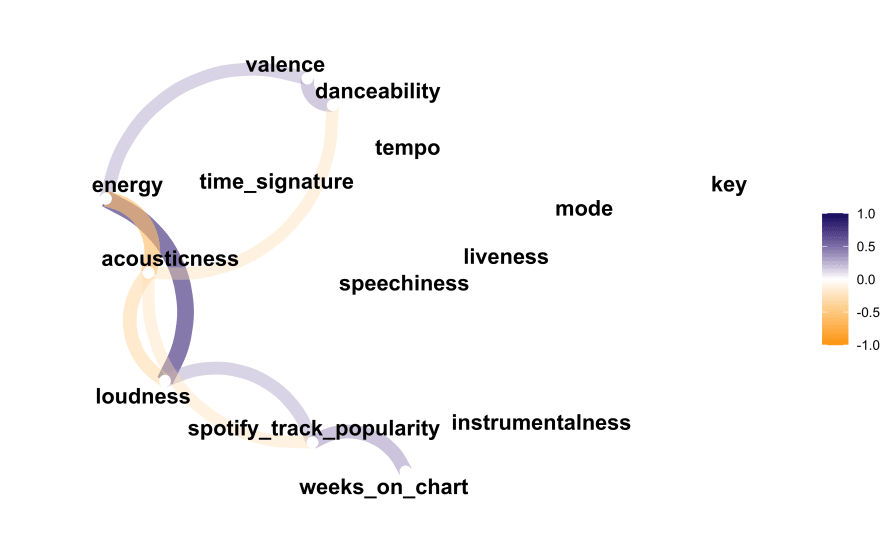
It looks like only spotify_track_popularity is really at all correlated with weeks_on_chart. That popularity metric isn’t really an audio feature of the song per se, but it might be helpful to have such a feature as we understand more how dimensionality reduction works.
Dimensionality reduction
In our book Tidy Modeling with R, we recently published a chapter on dimensionality reduction. My post today walks through a more brief and basic outline of some of the material from that chapter. Within the tidymodels framework, dimensionality reduction is a feature engineering or data preprocessing step, so we use recipes to implement this kind of analysis. I typically show how to use a data preprocessing recipe together with a model, but in this post, let’s just focus on recipes and how they work.
Let’s still start by splitting our data into training and testing sets, so we can estimate or traing our preprocessing recipe on our training set, and then apply that trained recipe onto a new set (our testing set).
library(tidymodels)

set.seed(123)
billboard_split <- billboard_joined %>%
  select(danceability:weeks_on_chart) %>%
  mutate(weeks_on_chart = log(weeks_on_chart)) %>%
  na.omit() %>%
  initial_split(strata = weeks_on_chart)

## how many observations in each set?
billboard_split


## <Analysis/Assess/Total>
## <18245/6084/24329>


billboard_train <- training(billboard_split)
billboard_test <- testing(billboard_split)
Now let’s make a basic starter recipe that we can work off of.
billboard_rec <-
  recipe(weeks_on_chart ~ ., data = billboard_train) %>%
  step_zv(all_numeric_predictors()) %>%
  step_normalize(all_numeric_predictors())

rec_trained <- prep(billboard_rec)
rec_trained


## Data Recipe
##
## Inputs:
##
## role #variables
## outcome 1
## predictor 13
##
## Training data contained 18245 data points and no missing data.
##
## Operations:
##
## Zero variance filter removed no terms [trained]
## Centering and scaling for danceability, energy, key, loudness, ... [trained]
When we prep() the recipe, we use the training data to estimate the quantities we need to apply these steps to new data. So in this case, we would, for example, compute the mean and standard deviation from the training data in order to center and scale. The testing data will be centered and scaled with the mean and standard deviation from the training data.
Next, let’s make a little helper function for us to extend this starter recipe. This function will:
-
prep()the recipe (you canprep()an already-prepped recipe, for example after you have added new steps) -
bake()the recipe using our testing data - make a visualization of the results
library(ggforce)

plot_test_results <- function(recipe, dat = billboard_test) {
  recipe %>%
    prep() %>%
    bake(new_data = dat) %>%
    ggplot() +
    geom_autopoint(aes(color = weeks_on_chart), alpha = 0.4, size = 0.5) +
    geom_autodensity(alpha = .3) +
    facet_matrix(vars(-weeks_on_chart), layer.diag = 2) +
    scale_color_distiller(palette = "BuPu", direction = 1) +
    labs(color = "weeks (log)")
}
PCA
Let’s start with principal component analysis, one of the most straightforward dimensionality reduction approaches. It is linear, unsupervised, and makes new features that try to account for as much variation in the data as possible. Remember that our function estimates PCA components from our training data and then applies those to our testing data.
rec_trained %>%
  step_pca(all_numeric_predictors(), num_comp = 4) %>%
  plot_test_results() +
  ggtitle("Principal Component Analysis")

This looks a bit underwhelming in terms of the components being connected to weeks on the chart, but there is a little bit of relationship.
We can tidy() recipes, either as a whole or for individual steps, and either before or after using prep(). Let’s tidy() this recipe to find the features that contribute the most to the PC components.
rec_trained %>%
  step_pca(all_numeric_predictors(), num_comp = 4) %>%
  prep() %>%
  tidy(number = 3) %>%
  filter(component %in% paste0("PC", 1:4)) %>%
  group_by(component) %>%
  slice_max(abs(value), n = 5) %>%
  ungroup() %>%
  ggplot(aes(abs(value), terms, fill = value > 0)) +
  geom_col(alpha = 0.8) +
  facet_wrap(vars(component), scales = "free_y") +
  labs(x = "Contribution to principal component", y = NULL, fill = "Positive?")
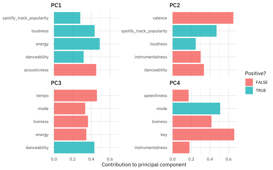
I’ve implemented PCA for these features before. The results this time for a different sample of songs aren’t exactly the same but have some qualitative similarities; we see that the first component is mostly about loudness/energy vs. acoustic while the second is about valence, where high valence means more positive, cheerful, happy music.
PLS
Partial least squares is a lot like PCA but it is supervised ; it makes components that try to account for a lot of variation but also are related to the outcome.
rec_trained %>%
  step_pls(all_numeric_predictors(), outcome = "weeks_on_chart", num_comp = 4) %>%
  plot_test_results() +
  ggtitle("Partial Least Squares")
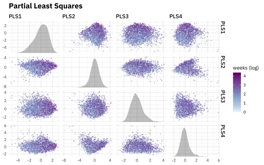
We do see a stronger relationship to weeks on the chart here, like we would hope since we were using PLS.
rec_trained %>%
  step_pls(all_numeric_predictors(), outcome = "weeks_on_chart", num_comp = 4) %>%
  prep() %>%
  tidy(number = 3) %>%
  filter(component %in% paste0("PLS", 1:4)) %>%
  group_by(component) %>%
  slice_max(abs(value), n = 5) %>%
  ungroup() %>%
  ggplot(aes(abs(value), terms, fill = value > 0)) +
  geom_col(alpha = 0.8) +
  facet_wrap(vars(component), scales = "free_y") +
  labs(x = "Contribution to PLS component", y = NULL, fill = "Positive?")

The Spotify popularity feature, which like we said before is not really an audio feature, is now a big contributor to the first couple of components.
UMAP
Uniform manifold approximation and projection (UMAP) is another dimensionality reduction technique, but it works very differently than either PCA or PLS. It is not linear. Instead, it starts by finding nearest neighbors for the observations in the high dimensional space, building a graph network, and then creating a new lower dimensional space based on that.
library(embed)

rec_trained %>%
  step_umap(all_numeric_predictors(), num_comp = 4) %>%
  plot_test_results() +
  ggtitle("UMAP")
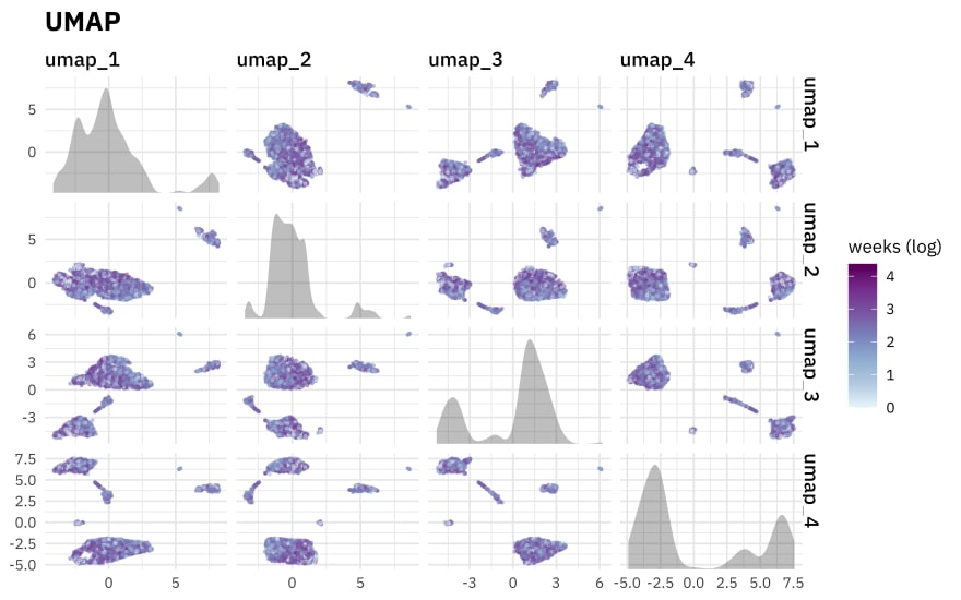
UMAP is very good at making little clusters in the new reduced space, but notice that in our case they aren’t very connected to weeks on the chart. UMAP results can seem very appealing but it’s good to understand how arbitrary some of the structure we see here is, and generally this algorithm’s limitations.

Top comments (0)