
Flexbox
The Flexbox , makes it easier to design flexible responsive layout structure without using float or positioning.
Before the Flexbox, there were four layout modes:
- Block, for sections in a webpage
- Inline, for text
- Table, for two-dimensional table data
- Positioned, for explicit position of an element
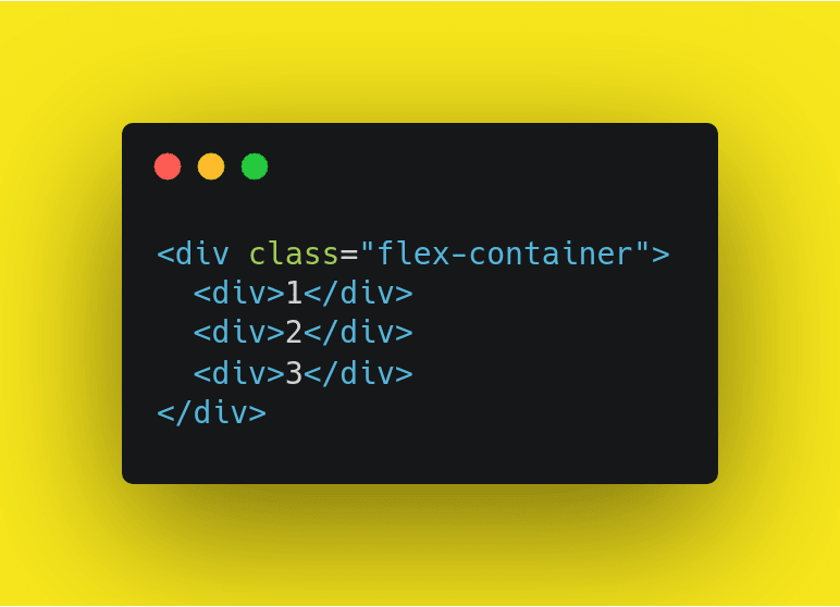
Example:
HTML:
Css:

Parent Element (Container)
The flex container becomes flexible by setting the display property to flex

Flexbox consists of two parts:
°container properties(parents)
°item properties(Children)
The flex container properties are:
flex-direction
flex-wrap
flex-flow
justify-content
align-items
align-content
The flex item properties are:
order
flex-grow
flex-shrink
flex-basis
flex
align-self
container properties(parents)
Align-content
 °align-content: stretch;
 °align-content: flex-start;
 °align-content: flex-end;
 °align-content: center;
 °align-content: space-between;
 °align-content: space-around;
The align-content property is a sub-property of the Flexbox.
It helps to align a flex container's lines within it when there is extra space in the cross-axis, similar to how justify-content aligns individual items within the main-axis.
1- Stretch (default)
lines stretch to take up the remaining space.
HTML

Css

2- Flex-start
lines packed to the start of the container.
HTML
Css

3- Flex-end
lines packed to the end of the container.
HTML
Css

4- Center:
lines packed to the center of the container.
HTML
Css

5- Space-between
lines evenly distributed; the first line is at the start of the container while the last one is at the end.
HTML
Css

6- Space-around
lines evenly distributed with equal space between them.
HTML
Css

Align-items
 *align-items: stretch;
 *align-items: flex-start;
 *align-items: flex-end;
 *align-items: center;
 *align-items: baseline;
This defines the default behavior for how flex items are laid out along the cross axis on the current line.
1- Stretch (default)
stretch to fill the container.
HTML

Css

2- Flex-start
items are placed at the start of the cross axis.
HTML
Css

3- Flex-end
items are placed at the end of the cross axis.
HTML
Css

4- Center
items are centered in the cross-axis.
HTML
Css

5- Baseline
items are aligned such as their baselines align.
HTML
Css

flex-wrap
*flex-wrap: nowrap;
*flex-wrap: wrap;
*flex-wrap: wrap-reverse;
By default, flex items will all try to fit onto one line.
1- Nowrap (default)
all flex items will be on one line.
HTML

Css

2- Wrap
flex items will wrap onto multiple lines, from top to bottom.
HTML
Css

3- Wrap-reverse
flex items will wrap onto multiple lines from bottom to top.
HTML
Css

justify-content
*justify-content: flex-start;
*justify-content: flex-end;
*justify-content: center;
*justify-content: space-between;
*justify-content: space-around;
This defines the alignment along the main axis. It helps distribute extra free space leftover when either all the flex items on a line are inflexible, or are flexible but have reached their maximum size. It also exerts some control over the alignment of items when they overflow the line.
1- Flex-start (default)
tems are packed toward the start of the flex-direction.
HTML

Css

2- Flex-end
items are packed toward the end of the flex-direction.
HTML
Css

3- Center
items are centered along the line
HTML
Css

4- Space-between
items are evenly distributed in the line; first item is on the start line, last item on the end line.
HTML
Css

5- Space-around
items are evenly distributed in the line with equal space around them.
HTML
Css

Flex-direction
*flex-direction: row;
*flex-direction: row-reverse;
*flex-direction: column;
*flex-direction: column-reverse;
1- Row (default)
left to right in ltr; right to left in rtl.
Example
HTML

Css

2- Row-reverse
right to left in ltr; left to right in rtl.
Example
HTML
Css

3- Column
same as row but top to bottom.
Example
HTML
Css

4- Column-reverse
same as row-reverse but bottom to top.
Example
HTML
Css

item properties(Children)
Flex-shrink
*flex-shrink: 1;
*flex-shrink: 0;
*flex-shrink: 2;
This defines the ability for a flex item to shrink if necessary.
The value is number but negative numbers only.
Example:

Align-self
*align-self: auto;
*align-self: stretch;
*align-self: flex-start;
*align-self: flex-end;
*align-self: center;
*align-self: baseline;
This allows the default alignment to be overridden for individual flex items.
1- Auto will make the item perfectly centered in both axes.
see the align-items explanation to understand the available values
Example:

Flex-basis
*flex-basis: auto;
*flex-basis: 80px;
This defines the default size of an element before the remaining space is distributed.
1- Auto (default)
2- Length (e.g. 20%, 5rem, etc.)
Example:

order
*order: 0;
*order: 1;
*order: -1;
*order: 9;
By default, flex items are laid out in the source order.
Example:

Perfect Centering
Set the (justify-content) and (align-items) properties to center, and the flex item will be perfectly centered.
Example
HTML

Css

More Examples:
Important examples for all items ⬇️
https://codepen.io/enxaneta/full/adLPwv
https://codepen.io/rikstar/post/flexbox
Follow me on my Instagram account
https://www.instagram.com/karimcoda
Social media:
http://linktr.ee/karimcoda2

Top comments (0)