Original date: July 25, 2020
Today’s Topic: Comps & Wireframes
In my SkillCrush course, this particular module is in the Web Design Fundamentals Course.
The focus was on creating a wireframe for a personal portfolio page.
Main Notes:
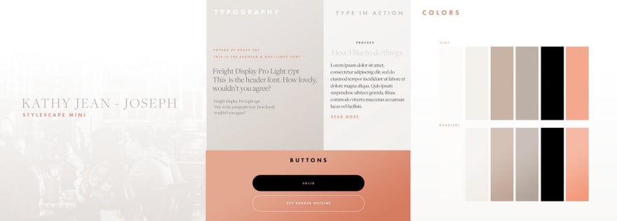
I created a style tile to guide the design with typography, colors, gradients and buttons.
I create a lo-fi wireframe via Photoshop.
I made a hi-fi wireframe via Photoshop.
Main Takeaways:
I really like web design.
I don’t mind making web comps but making them intuitively and with a higher grade of discernment of usability and simplicity is going to have to be the next focus.
I’m partial on lo-fi wireframes.
It’s a little harder for me to visual what I need with a lo-fi wireframe and maybe that’s just because I haven’t seen lo-fis in the brainstorming process with like a team but on my own, probably not my go-to thing.
Making the wireframe, I realized I may be handing my developer a headache.
The thought came to mind that I may be designing something with functionality and intention but I have to be aware of the languages that my team and company are currently using to know whether we have the bandwidth to create certain features.
Beyond the course:
Download Photoshop:
https://adobe.com
Cool Stylescape Tutorials (YouTube):
Find Me Elsewhere:
If you’re new here to the #kathycodes journey, let me start off by saying Welcome! 🎉
This is my first round of #100daysofcode so I’m starting off as a beginner and I’m learning with Skillcrush — Break into Tech course
I’ll be documenting my journey in several ways, if you want tidbits find me on twitter at @kathyjeanjoseph to view my to the day updates of my journey.
Visual? I’m on YouTube and view me in action and a less detailed version of my problems, solutions and takeaways.


Top comments (0)