
Introduction
In this blog post, we are going to implement the volume control component. This blog is part of my How I Build a YouTube Video Player with ReactJS series do check it out here. I do recommend you guys go through the series so that you can get the full grasp of this blog.
So without further ado let us get started.
Prerequisites
Make sure to go through the previous blogs of this series along with the following topics:
- Typescript
- Advanced React concepts such as useImperativeHandle hook
- styled-components
- CSS pseudo-elements and transition property.
Building the VolumeControl structure
If you have followed the previous blogs from the series then you might know that we are building a control toolbar component. Each control performs a certain function that updates the video’s state. In this section, we will be implementing the VolumeControl.
The purpose of the VolumeControl is to provide two sub-controls:
- A button control that helps you to mute/unmute the video
- A slider that helps you control the volume of the video.
It acts as a container component for the above sub-controls. Here is what these sub-controls will look like:

To create the VolumeControl component, create a folder named VolumeControl inside the components folder and create a file named index.tsx in it. Paste the following piece of code in it:
import styled from 'styled-components';
import MuteButton from './MuteButton';
import VolumeSlider from './VolumeSlider';

const StyledVolumeControl = styled.div`
    width: 20%;
    display: flex;
`;

const VolumeControl = () => {
    return (
        <StyledVolumeControl className="volume-control">
            <MuteButton />
            <VolumeSlider />
        </StyledVolumeControl>
    );
};

export default VolumeControl;
This is a simple component that Holds the MuteButton and VolumeSlider components.
NOTE: Don’t try to run this code directly since we have not implemented the above two components
Building the MuteButton sub-control component
Let us start building our first sub-control component which is the MuteButton. Create a file named MuteButton.tsx inside the VolumeControl folder and paste the following code in it:
import { useContext } from 'react';
import styled from 'styled-components';
import { PlayerContext, PlayerDispatchContext } from '../../context';
import { ON_MUTE } from '../../context/actions';
import { StyledIconButton } from '../../utils';

type VolumeProps = {
    volume: number;
    muted?: boolean;
};

const StyledOuterBar = styled.path<VolumeProps>`
    opacity: ${(props) => (props.volume <= 0.5 ? 0 : 1)};
    transition: opacity 0.4s ease;
`;

const StyledInnerBar = styled.path<VolumeProps>`
    opacity: ${(props) => (props.volume <= 0.3 ? 0 : 1)};
    transition: opacity 0.4s ease;
`;

const StyledMutePath = styled.path<VolumeProps>`
    opacity: ${(props) => (props.volume < 0.09 || props?.muted ? 1 : 0)};
    d: ${(props) => (props.volume < 0.09 || props?.muted ? "path('M 1,1 L 45,50')" : "path('M 1,1 L 0,0')")};
    transition:
        d 0.4s ease,
        opacity 0.4s ease;
`;

const MuteButton = () => {
    const { muted, volume } = useContext(PlayerContext);
    const dispatch = useContext(PlayerDispatchContext);

    const handleMuteClick = () => {
        dispatch({
            type: ON_MUTE,
            payload: !muted,
        });
    };

    return (
            <StyledIconButton onClick={handleMuteClick} className="control--mute-button">
                <svg
                    stroke="currentColor"
                    fill="currentColor"
                    strokeWidth="0"
                    viewBox="0 0 45 24"
                    height="24px"
                    xmlns="http://www.w3.org/2000/svg"
                >
                    <StyledOuterBar
                        className="outer-bar"
                        d="M16 21c3.527-1.547 5.999-4.909 5.999-9S19.527 4.547 16 3v2c2.387 1.386 3.999 4.047 3.999 7S18.387 17.614 16 19v2z"
                        volume={volume}
                    />
                    <StyledInnerBar
                        className="inner-bar"
                        d="M16 7v10c1.225-1.1 2-3.229 2-5s-.775-3.9-2-5z"
                        volume={volume}
                    />
                    <path d="M4 17h2.697L14 21.868V2.132L6.697 7H4c-1.103 0-2 .897-2 2v6c0 1.103.897 2 2 2z" />
                    <StyledMutePath stroke-width="2" volume={volume} muted={muted} />
                </svg>
            </StyledIconButton>
    );
};

export default MuteButton;
There are two things that this MuteButton should take care of which are:
- The volume bars should appear whenever the volume is increased and should disappear whenever the volume is decreased.

- On this mute button it should show a backward slash whenever the volume turns to 0. This slash should also appear whenever the button is clicked. This signifies that the video is being muted and unmuted.


To achieve this we will make use of the transition CSS property. We won’t go through all the sections of the above code since some of it is self-explanatory but we will look closely at how we will be doing this animation:
- First, we add the SVG element as mentioned in the above code.
- Next, we make use of the styled-components to create a component
StyledOuterBar. It will have all the attributes as mentioned in the above code it’s just that we are going to change the opacity with the following CSS:tsx const StyledOuterBar = styled.path<VolumeProps>` opacity: ${(props) => (props.volume <= 0.5 ? 0 : 1)}; transition: opacity 0.4s ease; `;So now we have an opacity CSS property that depends on thevolumeprop. The default opacity value is 1, but whenever the volume goes down below 0.5 then we tell the browser to turn the opacity to 0 but do it slowly i.e. with 0.4 seconds. This is what the line:transition: opacity 0.4s ease;does for us it tells the browser not to make this change immediately but to do it in this duration. - We do the same thing for the inner bar. Take a look at the StyledInnerBar styled component.
- Next, to create the backward slash as mentioned above we again make use of the styled component and create a component:
StyledMutePathwith the following CSS:tsx const StyledMutePath = styled.path<VolumeProps>` opacity: ${(props) => (props.volume < 0.09 || props?.muted ? 1 : 0)}; d: ${(props) => (props.volume < 0.09 || props?.muted ? "path('M 1,1 L 45,50')" : "path('M 1,1 L 0,0')")}; transition: d 0.4s ease, opacity 0.4s ease; `; - In this CSS, along with opacity we also add the
dattribute to the transition CSS property. A thing to note here is that we have added the opacity property to the transition because we don’t want even the small dot that gets painted due toL 0,0in thedattribute to appear on the screen when the volume is less than0.09 - If you would like to learn more about how this path definition is created then I highly recommend you guys to read this article.
Building the Slider component
If we observe, any video player has a slider for its seek bar and another slider for changing the volume of the video. Here we see that a slider component can be regarded as a reusable component. Hence I have decided to create a common component named slider. This slider will be used for both controlling the volume and in the seekbar.
Before we start jumping into building this component, let us first understand some terminologies that I have used in the component. This will help us understand this component clearly.
NOTE: The below implementation is inspired by the video mentioned on the vidstack.io

As you can see above the slider component is divided into multiple parts which are as follows:
- slider-fill
- slider-thumb
- slider-track
Slider-track
This part of the slider represents the total width on which the progress will be happening. This part is generally in the lighter shade and acts as a base on which the slider will make progress.
Slider-fill
This represents the actual progress made on the slider. If 20% of the slider is consumed/completed then slider-fill represents that amount.
Slider-thumb
A small knob is present in front of slider-fill that is used to increase and decrease the width of the slider-fill. This is an interactive element that helps to change the state of the slider component. The thumb is draggable as well as clickable along the slider-track component. We will look into this closely while we are implementing this component
Working of slider-component
The working of this component is very simple. From above we know that slider-fill represents the current state of the slider for example, if a slider has a value of 50 that means it is 50% consumed and this is represented by showing slider-fill having a width of 50% of the slider track.
That’s right the current state of the component is set as the width of the slider-fill component which is equal to % width of the total slider-track.
While interacting with the knob we simply change the width of the slider-fill to represent the current state.

So in short, changing the position of the slider-thumb along the track determines the width of the slider-fill.
Implementing the slider component
To implement this component we need to have the following functionalities:
-
divelements that represent the above track, fill, and thumb components of the slider. - On dragging of the thumb, the fill width should increase
- On click of the track, the position of the thumb along with the width of the fill should get updated to the current click’s location.
So let's implement these functionalities one by one by starting with implementing the basic structure of the slider with everything static no dragging or fancy stuff.
Building the basic structure of the component
Let us start by creating a folder named common inside the components folder. Then create a new folder named Slider inside the common. Then create an index.tsx file for the same inside the slider folder.
Next, place the following context inside the newly created index.tsx file:
const Slider = () => {
  return (
    <div className="slider">
      <div className="slider-track"></div>
      <div className="slider-fill"></div>
      <div className="slider-thumb"></div>
    </div>
  );
};

export default Slider;
Now let us add some styles to these div's such that it will represent one static slider. To do that follow the below steps:
- Create a new styled component named:
StyledContainerand have the following CSS for it:tsx const StyledContainer = styled.div` position: relative; height: 30px; display: flex; flex-direction: column; justify-content: center; `; -
Next, create another styled component named:
StyledTrackwith the following CSS for it:const StyledTrack = styled.div` width: 100%; height: 5px; background-color: #cacaca; position: absolute; pointer-events: auto; `;- A thing to note here is that we enable the pointer events for the track because we want the entire slider to be clickable.
-
Next, we create another styled component named:
StyleSliderFillfor the slider-fill component with the following CSS:const StyledSliderFill = styled.div` height: 5px; background-color: red; width: 25%; position: absolute; pointer-events: none; `;- A thing to note here is that we disabled the pointer events for the fill because we wanted to prioritize the click events that were triggered for the track component rather than the fill component. Since the fill overlaps on the track component clicking on the fill would trigger the event from the fill component but this is what we want. We only want to click events from the track and hence we have added the
pointer-events: none.
- A thing to note here is that we disabled the pointer events for the fill because we wanted to prioritize the click events that were triggered for the track component rather than the fill component. Since the fill overlaps on the track component clicking on the fill would trigger the event from the fill component but this is what we want. We only want to click events from the track and hence we have added the
-
Finally, we create our last styled component:
StyledThumbfor the slider-thumb component. Add the following CSS for it:const StyledThumb = styled.div` height: 15px; width: 15px; border-radius: 50%; background-color: red; position: absolute; bottom: 35%; left: 25%; transform: translate(-50%, 15%); `;- A thing to note here is that we make use of
[translate](https://developer.mozilla.org/en-US/docs/Web/CSS/transform-function/translate)to position the center of the thumb at the end of the fill component.
- A thing to note here is that we make use of
We now have all our styled components in place. It is time for us to use them in the component. Modify the Slider component such that it makes use of the above styled components:
import styled from "styled-components";
const StyledContainer = styled.div`
position: relative;
height: 30px;
display: flex;
flex-direction: column;
justify-content: center;
`;
const StyledTrack = styled.div`
    width: 100%;
    height: 5px;
    background-color: #cacaca;
    position: absolute;
    pointer-events: auto;
`;
const StyledSliderFill = styled.div`
  height: 5px;
  background-color: red;
  width: 25%;
  position: absolute;
  pointer-events: none;
`;
const StyledThumb = styled.div`
  height: 15px;
  width: 15px;
  border-radius: 50%;
  background-color: red;
  position: absolute;
  bottom: 35%;
  left: 25%;
  transform: translate(-50%, 15%);
`;
const Slider = () => {
return (
<StyledContainer className="slider">
<StyledTrack className="slider-track"></StyledTrack>
<StyledSliderFill className="slider-fill"></StyledSliderFill>
<StyledThumb className="slider-thumb"></StyledThumb>
</StyledContainer>
);
};
export default Slider;
Once this is done, our output will look like below:

Awesome, we now have a basic slider component. However, it is not functional. Let's make it functional as well.
Making the Slider interactive
Interactivity in the slider component happens in two ways as discussed above:
- Movement of the slider-thumb
- On click of the slider-track
The interaction that happens does only one thing which is to change the state of the slider component. The state of the component is represented by the slider-fill’s width with respect to the slider-track.
So from this, we can conclude that dragging of slider thumb and on click of the slider track correlates to the change in the slider-fill’s width.
We make use of the CSS custom variables concept to manage the slider-fill’s width. I choose this approach because then I don’t need to maintain the width of the fill component in a state of the component but instead, I can just refer to it in any desired component that I need and use it.
We create 4 CSS custom variables that will be initialized in the StyledContainer of the Slider:
-
--slider-pointer: This represents the percentage width at which the mouse is hovered on the slider-track. -
--slider-fill: Represents the slider-fill component’s width. -
--slider-track-bg-color: Track background color. -
--slider-fill-color: Slider-fill component’s background color.
We will take a closer look at all these custom variables in the later section of the blog post.
Let us now make the slider-thumb interactive.
Make slider-thumb draggable
To make the slider-thumb draggable we make use of the onMouseDown, onMouseMove and onMouseUp event handlers. The dragging mechanism is very simple, we update the left CSS property of the slider-thumb whenever the mouse button is down and when the mouse is moving.
We add the code of updating the left property in the onMouseMove handler but just adding this handler will cause the property to update even when the mouse button is not down. To avoid this we make sure that we add data-dragging="true" attribute to the StyledContainer component when the mouse is down. Once the mouse is up we remove this attribute.
Inside the mousemove handler, we always check if the StyledContainer has the data-dragging="true" or not, if it has only then do we update the left property, or else we don’t update it.
NOTE: I have chosen this approach rather than adding draggable="true" attribute to the slider-thumb element because this approach gives more flexibility in terms of customization.
Now that we know what we need to do, let us start with its implementation:
-
Create a reference to the
StyledContainerasrootRefand attach it as a ref attribute to the containerconst Slider = () => { const rootRef = useRef<HTMLDivElement>(null); return ( <StyledContainer className="slider" ref={rootRef}> <StyledTrack className="slider-track"></StyledTrack> <StyledSliderFill className="slider-fill"></StyledSliderFill> <StyledThumb className="slider-thumb"></StyledThumb> </StyledContainer> ); }; -
Create a new function:
handleThumbMouseDownand bind it to theonMouseDownevent of theStyledThumb:const Slider = () => { const rootRef = useRef<HTMLDivElement>(null);
const handleThumbMouseDown = () => {
if (rootRef.current) rootRef.current.setAttribute("data-dragging", "true");
};
return (
className="slider-thumb"
onMouseDown={handleThumbMouseDown}
>
);
}
- Next, create a new function: `handleContainerMouseUp`, and bind it to the `onMouseUp` event of the `StyledContainer`:
```tsx
const Slider = () => {
const rootRef = useRef<HTMLDivElement>(null);
const handleContainerMouseUp = () => {
if (rootRef.current) rootRef.current.removeAttribute("data-dragging");
};
const handleThumbMouseDown = () => {
if (rootRef.current) rootRef.current.setAttribute("data-dragging", "true");
};
return (
<StyledContainer
className="slider"
onMouseUp={handleContainerMouseUp}
ref={rootRef}
>
<StyledTrack className="slider-track"></StyledTrack>
<StyledSliderFill className="slider-fill"></StyledSliderFill>
<StyledThumb
className="slider-thumb"
onMouseDown={handleThumbMouseDown}
></StyledThumb>
</StyledContainer>
);
};
```
- Note: Here we are removing the data-dragging attribute on the `mouseup` event of `StyledContainer` because we also need to handle scenarios where the user might be dragging the slider-thumb but the mouse pointer is not on the thumb but may be on the slider track or the entire container. So to provide an optimal experience the mouse up handler is added to the container
- We create another handler: `handleContainerMouseMove` and attach it to the `onMouseMove` event of the `StyledContainer` for the same reasons as above:
```tsx
import { useRef } from "react";
import styled from "styled-components";
const StyledContainer = styled.div`
--slider-fill: 0%; // <--------- 1
position: relative;
height: 30px;
display: flex;
flex-direction: column;
justify-content: center;
width: 680px;
`;
const StyledTrack = styled.div`
width: 100%;
height: 5px;
background-color: #cacaca;
position: absolute;
pointer-events: auto;
`;
const StyledSliderFill = styled.div`
height: 5px;
background-color: red;
width: var(--slider-fill, 0%); // <--------- 2
position: absolute;
pointer-events: none;
`;
const StyledThumb = styled.div`
height: 15px;
width: 15px;
border-radius: 50%;
background-color: red;
position: absolute;
bottom: 35%;
left: var(--slider-fill, 0%); // <--------- 3
transform: translate(-50%, 15%);
`;
// <------- 4
const computeCurrentWidthFromPointerPos = (
xDistance: number,
left: number,
totalWidth: number
) => ((xDistance - left) / totalWidth) * 100;
const Slider = () => {
const rootRef = useRef<HTMLDivElement>(null);
const handleContainerMouseUp = () => {
if (rootRef.current) rootRef.current.removeAttribute("data-dragging");
};
const handleThumbMouseDown = () => {
if (rootRef.current) rootRef.current.setAttribute("data-dragging", "true");
};
// <------- 5
const updateSliderFillByEvent = (e: React.MouseEvent<HTMLDivElement>) => {
const elem = rootRef.current;
if (elem) {
const rect = elem.getBoundingClientRect();
const fillWidth = computeCurrentWidthFromPointerPos(
e.pageX,
rect.left,
680
);
if (fillWidth < 0 || fillWidth > 100) {
return;
}
rootRef.current?.style.setProperty("--slider-fill", `${fillWidth}%`);
return fillWidth;
}
};
// <------- 6
const handleContainerMouseMove = (e: React.MouseEvent<HTMLDivElement>) => {
if (rootRef.current?.getAttribute("data-dragging")) {
updateSliderFillByEvent(e);
}
};
return (
<StyledContainer
className="slider"
onMouseUp={handleContainerMouseUp}
onMouseMove={handleContainerMouseMove} // <------- 7
ref={rootRef}
>
<StyledTrack className="slider-track"></StyledTrack>
<StyledSliderFill className="slider-fill"></StyledSliderFill>
<StyledThumb
className="slider-thumb"
onMouseDown={handleThumbMouseDown}
></StyledThumb>
</StyledContainer>
);
};
export default Slider;
```
This change is a bit tricky so let us go through it step-by-step. Follow the numbering of the comments mentioned in the above code:
- In the `StyledContainer` component, we initialize the custom CSS variable: `--slider-fill` with the value of 0%. We initialize it in the container so that this value gets available to all the children elements.
```tsx
const StyledContainer = styled.div`
--slider-fill: 0%; // <--------- 1
...
`;
```
- Next, we make use of this variable inside the `StyledSliderFill` component with the help of var CSS function. The second argument is nothing but a default value. `--slider-fill` variable is used here because we want to increase the width of the slider-fill component whenever the `--slider-fill` changes.
```tsx
const StyledSliderFill = styled.div`
...
width: var(--slider-fill, 0%); // <--------- 2
...
`;
- We also make use of this variable inside the
StyledThumbcomponent. We use it here because we want to move theslider-thumbwhenever the variable changes.tsx const StyledThumb = styled.div` ... ... left: var(--slider-fill, 0%); // <--------- 3 ... `; -
Next, we create a utility function:
computeCurrentWidthFromPointerPosthe purpose of this function is to compute the current width from the current mouse pointer position. We will see its usage in themousemoveevent:const computeCurrentWidthFromPointerPos = ( xDistance: number, left: number, totalWidth: number ) => ((xDistance - left) / totalWidth) * 100;The function returns the width in percentage. It takes the following parameters:
xDistance- clientX or pageX of the current mouse pointer event.left- Distance of the left edge from the viewport i.e. getClientBoundingRect().lefttotalWidth- total width of the slider track-
Next, we create a new function:
updateSliderFillByEvent. The purpose of this function is to set the CSS variable’s value.const updateSliderFillByEvent = ( variableName: SliderCSSVariableTypes, e: React.MouseEvent<HTMLDivElement> ) => { const elem = rootRef.current; if (elem) { const rect = elem.getBoundingClientRect(); const fillWidth = computeCurrentWidthFromPointerPos( e.pageX, rect.left, 680 ); if (fillWidth < 0 || fillWidth > 100) { // limit return; } rootRef.current?.style.setProperty(variableName, `${fillWidth}%`); } };A thing to note here is that we need to limit the execution of this function when the
mousemoveevent occurs. That means if the mouse pointer moves outside the bounds of the slider track i.e. when it goes below 0 or above 100 then we don’t need to set the CSS variable and exit out of the function which we have done in the above code annotated with the comment limit. -
Next, we create the event handler for
mousemoveevent:handleContainerMouseMove. Inside this, we call theupdateSliderFillByEventfunction only whendata-draggingattribute is present in theStyledContainer:const handleContainerMouseMove = (e: React.MouseEvent<HTMLDivElement>) => { if (rootRef.current?.getAttribute("data-dragging")) { updateSliderFillByEvent("--slider-fill", e); } }; Lastly, we bind this function to the
StyledContainerwith theonMouseMoveevent.
Our results will look like below:

Make slider-track clickable
To make slider-track clickable all we need to do is to bind an event handler to the onClick event of the StyledTrack component. The event handler should make sure that it calls the updateSliderFillByEvent function.
const handleClick = (e: React.MouseEvent<HTMLDivElement>) => {
    if (rootRef.current) {
      updateSliderFillByEvent("--slider-fill", e);
    }
  };

...
...
...

return <StyledContainer ...>
                    <StyledTrack onClick={handleClick}/>
                        ...
                        ...
                </StyledContainer>
This is how the slider track becomes clickable.

Styling and refactoring the slider component
Now that our basic functionality is implemented, now let us start adding some sugar coating to this component with styling. Here are some styles and animation that are expected from this component:
- The slider thumb should only be visible when it is hovered

- While dragging the slider thumb, the thumb should have a diffused background ring of the same color.

Let's begin with these styling:
-
Make slider-thumb visible only on hover:
- Here it is important to understand that the thumb will only be visible when we hover on the entire slider. So whenever the slider is hovered we make the thumb visible.
- To achieve this we need to toggle the opacity of the slider-thumb.
- Initially, the opacity will be 0 but when it is hovered we will turn its opacity to 1.
- Let us add initial styles to the
StyledThumbcomponent: ``tsx const StyledThumb = styled.divheight: 15px; width: 15px; border-radius: 50%; background-color: red; position: absolute; bottom: 35%; left: 25%; transform: translate(-50%, 15%);
z-index: 1;
opacity: 0;
transition: opacity 0.2s ease;
`;Here we added the transition property that tells that whenever the opacity changes, do it with the easing function with an animation duration of 0.2s. - Inside the `StyledContainer`, we add the CSS which makes sure that the opacity is 1 whenever we hover over this container: ```tsx const StyledContainer = styled.div` --slider-fill: 0%; position: relative; height: 30px; display: flex; flex-direction: column; justify-content: center; width: 680px; // Show the thumb on hover &:hover { & .slider-thumb { opacity: 1; } } `;- Our result will be something like below:

-
Add a diffused background ring when the slider-thumb is getting dragged:
- The ring that we are talking about here is something that looks like below:

- To achieve this, we make use of the before CSS psuedo element. We need to style this element a bit differently. It's going to be the same as the slider-thumb but slightly bigger in radius.
- Add the below CSS to
StyledThumb:
const StyledThumb = styled.div` height: 15px; width: 15px; border-radius: 50%; background-color: red; position: absolute; bottom: 35%; left: var(--slider-fill, 0%); transform: translate(-50%, 15%); z-index: 1; opacity: 0; transition: opacity 0.2s ease, box-shadow 0.2s ease; // slider thumb background ring &::before { content: " "; display: inline-block; background-color: red; height: 24px; width: 24px; border-radius: 50%; opacity: 0; transition: opacity 0.2s ease; filter: opacity(0.5); transform: translate(-18%, -18%); } `;- Now if you try to drag the thumb you still won’t see the background ring because the
::beforeelement’s opacity is 0 initially and would get set to 1 when the actual dragging happens. - To enable this ring only while dragging, we make use of the
data-draggingattribute that gets enabled/added to theStyledContainerwhenever themousedownevent is happening. We add the following CSS to achieve the same to theStyledContainercomponent:
- The ring that we are talking about here is something that looks like below:
const StyledContainer = styled.div`
  --slider-fill: 0%;
  position: relative;
  height: 30px;
  display: flex;
  flex-direction: column;
  justify-content: center;
  width: 680px;

  // For animating ring behind the thumb; <-----------
  &[data-dragging] {
    & .slider-thumb::before {
      opacity: 1;
    }
  }

  // Show the thumb on hover
  &:hover {
    & .slider-thumb {
      opacity: 1;
    }
  }
`;
- This helps us to achieve the following thing:

Cleaning up the code
-
If you have observed carefully we are making use of static width of 680px in the above Slider component i.e the width of 680px in the StyledContainer. This should be dynamic so that the slider can be of any size. Let’s make sure that the component accepts a prop that determines the total width of the slider.
- Let us create an interface that mandates a prop named $total
tsx interface SliderProps { $total: number; } - Now enable the
StyledContainerto accept the$totalprop by passing the interface to the component:
const StyledContainer = styled.div<SliderProps>` --slider-fill: 0%; position: relative; height: 30px; display: flex; flex-direction: column; justify-content: center; width: ${(props) => props.$total}px; <----------- // For animating ring behind the thumb; &[data-dragging] { & .slider-thumb::before { opacity: 1; } } // Show the thumb on hover &:hover { & .slider-thumb { opacity: 1; } } `;- We also make sure that we extract this
totalprop from the main Slider component like below:
const Slider = (props: SliderProps) => { const { $total } = props; // <---------------- ... ... ... ... const updateSliderFillByEvent = ( variableName: SliderCSSVariableTypes, e: React.MouseEvent<HTMLDivElement> ) => { const elem = rootRef.current; if (elem) { const rect = elem.getBoundingClientRect(); const fillWidth = computeCurrentWidthFromPointerPos( e.pageX, rect.left, $total // <---------------- ); if (fillWidth < 0 || fillWidth > 100) { return; } rootRef.current?.style.setProperty(variableName, `${fillWidth}%`); } }; ... ... ... ... return ( <StyledContainer className="slider" onMouseUp={handleContainerMouseUp} onMouseMove={handleContainerMouseMove} ref={rootRef} $total={$total} // <---------------- > ... ... ... ... </StyledContainer> ); };- We make sure that we accept the total prop from the slider component and also pass it on to the
StyledContainerto set its width. We also update the same in theupdateSliderFillByEventso thatcomputeCurrentWidthFromPointerPostakes in the$totalvalue. - Now we have completed the change let us test it out. Render a couple of slider components in our Main app with different widths and observe the change:
tsx
const App = () => {
return (
<>
<Slider total={300} />
<Slider total={400} />
<Slider total={500} />
</>
);
};
- Let us create an interface that mandates a prop named $total
-
Let us also add a new prop named
$fillColor. The purpose of this prop is to make sure that the Slider component can have a different set of fill colors. This fill color will be applied to the slider-fill and the slider-thumb.- Add prop in the
SliderPropsinterface:
interface SliderProps { $total: number; $fillColor?: string; }- Accept the same prop in
Slidercomponent and pass it on toStyledContainer:tsx const StyledContainer = styled.div<SliderProps>` --slider-fill: 0%; --slider-fill-color: ${(props) => props.$fillColor}; // <----------- position: relative; height: 30px; display: flex; flex-direction: column; justify-content: center; width: ${(props) => props.$total}px; &[data-dragging] { & .slider-thumb::before { opacity: 1; } } &:hover { & .slider-thumb { opacity: 1; } } `; const Slider = (props: SliderProps) => { const { $total, $fillColor='white' } = props; // <--- ... ... ... return ( <StyledContainer className="slider" $fillColor={$fillColor} onMouseUp={handleContainerMouseUp} onMouseMove={handleContainerMouseMove} ref={rootRef} $total={$total} > ... ... ... </StyledContainer> ); }; - We set the
$fillColorto the custom CSS variable:--slider-fill-color, so that it can be used byStyledSliderFillandStyledThumbcomponents like below: ``tsx const StyledSliderFill = styled.divheight: 5px; background-color: var(--slider-fill-color); // <--------- width: var(--slider-fill, 0%); position: absolute; pointer-events: none; `;
- Add prop in the
const StyledThumb = styled.div`
...
...
background-color: var(--slider-fill-color); // <---------
...
...
// slider thumb background ring
&::before {
...
...
background-color: var(--slider-fill-color); // <---------
...
...
...
}
`;
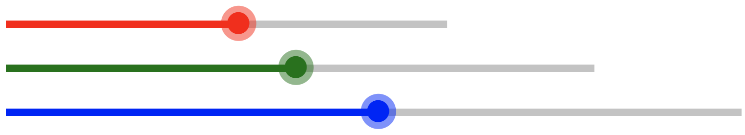
  * This yields the following results:
   ```tsx
const App = () => {
  return (
    <>
      <Slider total={300} $fillColor="red" />
      <Slider total={400} $fillColor="green" />
      <Slider total={500} $fillColor="blue" />
    </>
  );
};
- Our final Slider component will look like below: ```tsx import { useRef } from "react"; import styled from "styled-components";
interface SliderProps {
total: number;
$fillColor?: string;
}
const StyledContainer = styled.div`
--slider-fill: 0%;
--slider-fill-color: ${(props) => props.$fillColor};
position: relative;
height: 30px;
display: flex;
flex-direction: column;
justify-content: center;
width: ${(props) => props.total}px;
// For animating ring behind the thumb;
&[data-dragging] {
& .slider-thumb::before {
opacity: 1;
}
}
// Show the thumb on hover
&:hover {
& .slider-thumb {
opacity: 1;
}
}
`;
const StyledTrack = styled.div
  width: 100%;

  height: 5px;

  background-color: #cacaca;

  position: absolute;

  pointer-events: auto;
const StyledSliderFill = styled.div
  height: 5px;

  background-color: var(--slider-fill-color);

  width: var(--slider-fill, 0%);

  position: absolute;

  pointer-events: none;
const StyledThumb = styled.div`
height: 15px;
width: 15px;
border-radius: 50%;
background-color: var(--slider-fill-color);
position: absolute;
bottom: 35%;
left: var(--slider-fill, 0%);
transform: translate(-50%, 15%);
z-index: 1;
opacity: 0;
transition: opacity 0.2s ease, box-shadow 0.2s ease;
// slider thumb background ring
&::before {
content: " ";
display: inline-block;
background-color: var(--slider-fill-color);
height: 24px;
width: 24px;
border-radius: 50%;
opacity: 0;
transition: opacity 0.2s ease;
filter: opacity(0.5);
transform: translate(-18%, -18%);
}
`;
const computeCurrentWidthFromPointerPos = (
xDistance: number,
left: number,
totalWidth: number
) => ((xDistance - left) / totalWidth) * 100;
export type SliderCSSVariableTypes = "--slider-fill" | "--slider-pointer";
const Slider = (props: SliderProps) => {
const { total, $fillColor = "white" } = props;
const rootRef = useRef(null);
const handleContainerMouseUp = () => {
if (rootRef.current) rootRef.current.removeAttribute("data-dragging");
};
const handleThumbMouseDown = () => {
if (rootRef.current) rootRef.current.setAttribute("data-dragging", "true");
};
const updateSliderFillByEvent = (
variableName: SliderCSSVariableTypes,
e: React.MouseEvent
) => {
const elem = rootRef.current;
if (elem) {
const rect = elem.getBoundingClientRect();
  const fillWidth = computeCurrentWidthFromPointerPos(
    e.pageX,
    rect.left,
    total
  );
  if (fillWidth < 0 || fillWidth > 100) {
    return;
  }

  rootRef.current?.style.setProperty(variableName, `${fillWidth}%`);
}
};
const handleContainerMouseMove = (e: React.MouseEvent) => {
if (rootRef.current?.getAttribute("data-dragging")) {
updateSliderFillByEvent("--slider-fill", e);
}
};
const handleClick = (e: React.MouseEvent) => {
if (rootRef.current) {
updateSliderFillByEvent("--slider-fill", e);
}
};
return (
className="slider"
$fillColor={$fillColor}
onMouseUp={handleContainerMouseUp}
onMouseMove={handleContainerMouseMove}
ref={rootRef}
total={total}
>
className="slider-thumb"
onMouseDown={handleThumbMouseDown}
>
);
};
export default Slider;
## Building the Volume Slider component
n this section, we will be implementing the volume slider component that we talked about earlier. The basic part of this component is the Slider which we have implemented above. The hard part is done. We are just left with using it to control the volume of the video.
To create a volume slider we need the following things:
* We need a new state in our global state: volume that will help us to keep track of the current volume that is changed by our slider. If you have read the previous posts, then you would also know that when this state changes we will also update the volume property of the video element.
Let’s add a new state:
* Update the Global State interface and the global state in the `context/index.tsx` file:
```tsx
export type StateProps = {
...
volume: number;
...
};
export const initialState: StateProps = {
...
volume: 1,
...
};
```
* Next, we create action: `VOLUME_CHANGE` so that it can be dispatched. Add the following line at the end in the `context/actions.ts` file:
```tsx
export const VOLUME_CHANGE = 'VOLUME_CHANGE';
```
* Next, we also need to update the reducer function. Add the below case in the reducer function present in the `context/reducer.ts` file:
```tsx
case VOLUME_CHANGE: {
return {
...state,
volume: action.payload,
};
}
```
* Finally, we add an `useEffect` in the `src/components/Video.tsx` that updates the actual video’s volume when the above state’s volume changes:
```tsx
useEffect(() => {
if (videoRef.current) {
videoRef.current.volume = volume;
}
}, [volume]);
```
* Now it is time for us to create the Volume Slider component. Create a file named: VolumeSlider.tsx inside the src/components/VolumeControl folder and paste the following code:
```tsx
import { useContext, useEffect, useRef } from 'react';
import styled from 'styled-components';
import { PlayerDispatchContext } from '../../context';
import { VOLUME_CHANGE } from '../../context/actions';
import Slider, { SliderRefProps } from '../common/Slider';
import Tooltip from '../common/Tooltip';
const StyledContainer = styled.div`
width: 0px;
transition: width 0.2s ease;
`;
const VolumeSlider = () => {
const sliderRef = useRef<SliderRefProps>(null);
const dispatch = useContext(PlayerDispatchContext);
const onPositionChangeByDrag = (currentPercentage: number) => {
let newVolume = currentPercentage / 100;
if (newVolume <= 0.03) {
newVolume = 0;
}
if (newVolume > 1) {
newVolume = 1;
}
dispatch({
type: VOLUME_CHANGE,
payload: newVolume,
});
};
const onPositionChangeByClick = (currentPercentage: number) => {
const newVolume = currentPercentage / 100;
dispatch({
type: VOLUME_CHANGE,
payload: newVolume,
});
};
useEffect(() => {
if (sliderRef.current) {
sliderRef.current.updateSliderFill(100);
}
}, []);
return (
<Tooltip content="Volume">
<StyledContainer className="control--volume-slider">
<Slider total={60} onClick={onPositionChangeByClick} onDrag={onPositionChangeByDrag} ref={sliderRef} />
</StyledContainer>
</Tooltip>
);
};
export default VolumeSlider;
A couple of things happening here Let go from top to bottom:
- We use
StyledContainerwhich is a styled component with awidthof0pxand transition property being set on the width of this component. We do this for animation purposes, which we will look at in the later section. - Next, when the volume slider is loaded/mounted we want the slider to represent the full volume i.e. slider-fill’s width should be 100%. To do that we need a way to update the slider component’s
--slider-fillCSS custom variable from the Volume Slider component. - To achieve this, we need to expose a function from the Slider component that updates the
--slider-fillCSS variable. This exposed function will be accessible to therefthat is passed on to the Slider component from the Volume Control component. This can be done by adding a react’suseImperativeHandlehook. You can read more about it here. - Make the following changes pointed out in the comments below in the Slider component:
tsx import { forwardRef, Ref, useImperativeHandle, useRef } from "react"; import styled from "styled-components"; ... ... ... export interface SliderRefProps { // <---------- updateSliderFill: (completedPercentage: number) => void; } const Slider = (props: SliderProps, ref: Ref<SliderRefProps>) => { ... ... useImperativeHandle( // <---------- ref, () => { return { updateSliderFill(percentageCompleted: number) { rootRef.current?.style.setProperty( "--slider-fill", `${percentageCompleted}%` ); }, }; }, [] ); return ( <StyledContainer className="slider" $fillColor={$fillColor} onMouseUp={handleContainerMouseUp} onMouseMove={handleContainerMouseMove} ref={rootRef} total={total} > <StyledTrack className="slider-track" onClick={handleClick}></StyledTrack> <StyledSliderFill className="slider-fill"></StyledSliderFill> <StyledThumb className="slider-thumb" onMouseDown={handleThumbMouseDown} ></StyledThumb> </StyledContainer> ); }; export default forwardRef(Slider); - Now we have exposed the
updateSliderFillfunction, so to achieve what we wanted i.e. to have 100% volume on mount, there is auseEffecthook that is added in the VolumeSlider component. It checks if the sliderRef exists, and then sets the--slider-fillto 100 with the help ofupdateSliderFillfunction. Next, we look at how the volume changes when the thumb is dragged or when the slider track is clicked. We have two functions namely:
onPositionChangeByDragandonPositionChangeByClick. All these functions do is compute the current volume from thecompletedPercentageand update the global store with thedispatchaction ofVOLUME_CHANGE.Later in the return section as well, we pass these functions as
onDragandonClick. But even if these functions are passed as a prop still they won’t execute because we are not calling these inside theSlidercomponent.-
To do this, we should update our
handleContainerMouseMoveandhandleClickfunctions in theSlidercomponent as follows:// Update the Slider prop interface as well like below: interface SliderProps extends Omit<React.HTMLAttributes<HTMLDivElement>, "onClick" | "onDrag"> { total: number; $fillColor?: string; onClick?: (currentPercentage: number) => void; onDrag?: (completedPercentage: number) => void; } const Slider = (props: SliderProps, ref: Ref<SliderRefProps>) => { const { total, onDrag, onClick, $fillColor = "white" } = props; ... ... ... const handleContainerMouseMove = (e: React.MouseEvent<HTMLDivElement>) => { if (rootRef.current?.getAttribute("data-dragging")) { updateSliderFillByEvent("--slider-fill", e); const fillValue = rootRef.current.style.getPropertyValue("--slider-fill"); const width = Number(fillValue.split("%")[0]); onDrag?.(width); // Call the functions passed from volume slider } }; const handleClick = (e: React.MouseEvent<HTMLDivElement>) => { if (rootRef.current) { updateSliderFillByEvent("--slider-fill", e); const fillValue = rootRef.current.style.getPropertyValue("--slider-fill"); const width = Number(fillValue.split("%")[0]); onClick?.(width); // Call the functions passed from volume slider } }; return <StyledContainer className="slider" $fillColor={$fillColor} onMouseUp={handleContainerMouseUp} onMouseMove={handleContainerMouseMove} ref={rootRef} total={total} > <StyledTrack className="slider-track" onClick={handleClick}></StyledTrack> <StyledSliderFill className="slider-fill"></StyledSliderFill> <StyledThumb className="slider-thumb" onMouseDown={handleThumbMouseDown} ></StyledThumb> </StyledContainer> }
Animating the opening of the Volume Slider
The last piece for the Volume Slider component is to only make it visible when we hover over the entire volume control component. To make this happen we should make the following change in the StyledVolumeControl of the VolumeControl component present inside the src/components/VolumeControl/index.tsx:
import styled from 'styled-components';
import MuteButton from './MuteButton';
import VolumeSlider from './VolumeSlider';

const StyledVolumeControl = styled.div`
    width: 20%;
    display: flex;

    &:hover { // <----- The change
        & .control--volume-slider {
            width: 60px;
        }
    }
`;

const VolumeControl = () => {
    return (
        <StyledVolumeControl className="volume-control">
            <MuteButton />
            <VolumeSlider />
        </StyledVolumeControl>
    );
};

export default VolumeControl;
Remember in the previous section we talked about having width to be 0 and transition property being set to width change. That will help us here because initially the width will be 0 and when the VolumeControl is hovered we will make sure that VolumeSlider width is set to 60px.
Here is what it will look like:

Summary
To summarize we learned the following things in this post:
- We learned the structure of the Volume Control
- We saw how Mute/Unmute button is implemented
- We implemented the slider component from scratch.
- We integrated the slider with the volume control
- Finally, we saw how we animated the volume slider opening
In the next blog post of this series, we are going to talk about building another crucial control which is Seekbar so stay tuned for more!!
The entire code for this tutorial can be found here.
Thank you for reading!

Top comments (0)