
Intro
With the rise of popularity of ChatGPT and AI in general, the possibility of applications are endless. In addition, the frontend development ecosystem seems to change every day with something new!
TailwindCSS has existed for a while now and has almost a cult following and has remained a top contender despite the fast moving frontend ecosystem. So, what if we could combine AI and TailwindCSS to just give us a design system tailored to our liking?
The idea is simple on paper:
- Prompt OpenAI to give a requested component with TailwindCSS styling and my own specifications (colors, spacings, etc)
- Save said components in a library for consumption.
- ???
- Profit!
So how did this turn out when I attempted it? Not bad but also not good.
The Process
All that was really required to get this going was developing an initial prompt with specifications and then indicating the type of specific conditions I wanted for the component I was targeting. For this proof of concept, I was targeting the generation of a button component.
You can see my main working prompt here:
https://github.com/kaceycleveland/tw-ai-design/blob/main/prompts/prompt-1.md
I would follow up the above prompt with something like:
Design a button component with hover, press, and disabled states.
Ideally, the process would end here! The component would be usable and it would be ready for use. Sometimes this was close to the case but it never was perfect. The next step after getting my response was two things:
Am I overall happy with the output? Then lets prime the result with some follow up prompts. An example of this is sometimes the component would be overall ok but it had an extra prop attached to the component that I did not need so I would send a follow up prompt:
Replace the "color" prop with a "variant" prop accepting either a value of "primary" or "secondary"
If I am not happy with the output, I would add conditions to the main prompt to hopefully improve the results. An example is ensuring TypeScript is used. Sometimes the props were not typed in the way I wanted or used FC from react which is deprecated. I would add conditions to the main prompt so future generations would not use this.
With a combination of the two follow up steps and a couple of iterations, we got a decent component!
import React, {
  forwardRef,
  PropsWithChildren,
  ButtonHTMLAttributes,
} from "react";
import clsx from "clsx";

type ButtonProps = PropsWithChildren<
  ButtonHTMLAttributes<HTMLButtonElement> & {
    variant?: "primary" | "secondary";
    size?: "sm" | "md" | "lg";
    disabled?: boolean;
    className?: string;
  }
>;

const Button = forwardRef<HTMLButtonElement, ButtonProps>(
  (
    {
      children,
      variant = "primary",
      size = "md",
      disabled = false,
      className,
      ...rest
    },
    ref
  ) => {
    const btnSize = {
      sm: "p-1.5",
      md: "p-2",
      lg: "p-2.5",
    }[size];

    const btnVariants = {
      primary: {
        normal:
          "text-white bg-lime-500 hover:bg-lime-400 active:bg-lime-600 disabled:bg-gray-400 disabled:text-gray-300",
        bordered:
          "text-white border border-lime-500 bg-transparent hover:bg-lime-100 active:bg-lime-200 disabled:border-gray-400 disabled:text-gray-300",
      },
      secondary: {
        normal:
          "text-gray-800 bg-gray-200 hover:bg-gray-300 active:bg-gray-400 disabled:bg-gray-400 disabled:text-gray-300",
        bordered:
          "text-gray-800 border border-gray-200 bg-white hover:bg-gray-100 active:bg-gray-200 disabled:border-gray-400 disabled:text-gray-300",
      },
    }[variant];

    const btnVariantClasses = `inline-flex items-center font-medium focus:outline-none transition ease-in-out duration-150 rounded ${btnSize} ${
      disabled && "opacity-50 cursor-not-allowed"
    }`;

    const buttonClasses = clsx(
      btnVariantClasses,
      btnVariants.bordered && "bordered border",
      btnVariants.normal,
      className
    );

    return (
      <button ref={ref} disabled={disabled} className={buttonClasses} {...rest}>
        {children}
      </button>
    );
  }
);

export default Button;
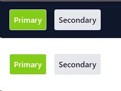
So all in all, I got what I wanted. Was it really that useful though?
The Good
- After initial setup, the results were pretty decent overall. They were not perfect but were close enough that with some additional prompting, I could get something that I could use.
- Surprising to me,
forwardRefand TypeScript usage was pretty good. - Telling the prompt to use a specific library was also pretty good (in this case,
clsx).
The Bad
- You can see how long my prompt got; this is not necessarily bad but at some point this becomes simpler to just do it myself!
- In addition to the above, the corner cases were hard to iron out. An example was trying to get the outputs to minimize the amount of props it added to the component. It never did this perfectly!
Summary
This was a really cool experiment with mixed results. I think it has a lot of promise in the future and with the right prompting, maybe sooner rather then later. In addition, I think using OpenAI's encodings API to fine tune a modal (once a coding modal is available for fine tuning) on TailwindCSS specifically could produce some interesting results!

Top comments (0)