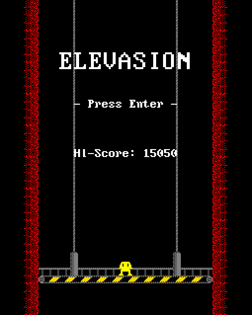
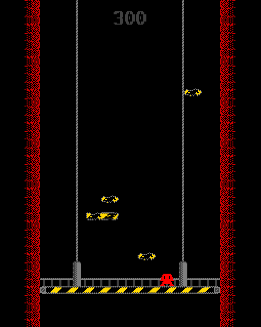
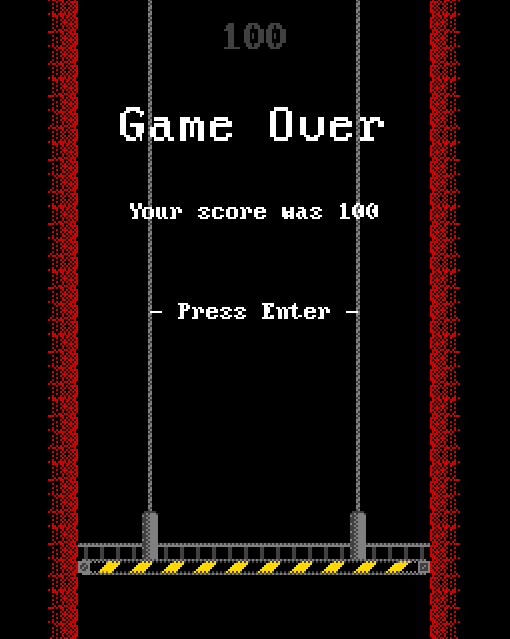
A while ago I released a game named Elevasion. It was created in Yoyo Games' Game Maker Studio (exclusively GML) over a week or so. The game has a ZX Spectrum-esque visual style and twitchy, rapid gameplay.

Platformer engine
Elevasion started life as a platformer. I had been playing the wonderful Ristar for SEGA Mega Drive at the time and was inspired by the fourth level, Planet Sonata. As you progress through the level, the denizens of the world join in with the music, forming a fantastically compressed choir. A similar mechanic with additive singing can be found in the equally amazing LocoRoco for PSP.
Anyway, my idea was to follow Ristar's lead and make a slower platformer in which defeating enemies would add voices to a digital choir in the game's background music. I built a simple pixel-platforming engine in GML with the basics- running, jumping, wall-jumps and platforms and felt good about my progress. I encountered my first problem early on though...
I don't do music
No really, I tried it before. Once again, I cracked out the trusty Bosca Soleil and tried to put together some basic melodies but unfortunately my tone-deaf ears only created what my partner and I call "Shem Music". Obviously with my lack of musical prowess and no budget for a musician, I couldn't achieve my game's basic concept. I had to readjust my idea into just a simple Mega Drive-style platformer instead.
Level design
My second challenge was before me- I had a platforming engine, but now I had to come up with appealing level designs to match it. At this point my game still had what we in the industry call "Shem Art" which made the slower platforming I had implemented rather boring and dull compared to a bright, frenetic game like Ristar. It was difficult to gauge how the game would feel without any basic graphics to work with. As I tried to work on some levels, I increased the speed of everything to make up for the lack of visual excitement. This changed the overall feel of the game once again. By this point, just a few days of deleted content later, I was already feeling overwhelmed by the incredible scope of having to create so many levels, mechanics and gimmicks, let alone graphics and music. I had never intended for it to be a long project and I knew I had to either change the scope or kill the project.
Minimising
I really liked the engine I had built. It was simple but effective and increasing the speed made it feel quite chirpy. The jumping especially had a heavy feeling that I really liked. I decided I would minimise the project as much as possible and the cuts began:
- The graphics were reduced to tiny sizes and a very limited colour pallette (inspired by the amazing Rock Boshers)
- The mechanics were reduced to simple running, jumping and wall sliding
- To facilitate the wall-sliding mechanic, I set the game within a very narrow playing field. A fast-moving elevator set the speed for the fast-paced gameplay perfectly
- In place of enemies (and potentially AI) I added falling debris for the player to avoid

Adding depth
Now that I had a basic game involving avoiding falling debris, I wanted to add some kind of mechanic to add some depth. Since there was almost no need for the wall-sliding and jumping in the gameplay yet, I built a simple multiplier which was earned by jumping over debris. More points were gained for jumping over several objects at once. Suddenly the player was encouraged to move up the wall and jump over falling obstacles. A perfect and simple risk vs. reward gimmick! In addition, I had the player colour change randomly every time a new game was started. Just a small detail to make every playthrough a little different. The pink robot is definitely the canonical colour though.
Final thoughts
Elevasion turned out to be a completely different and much smaller game than it was at its inception, which is often the case, especially for starting-out game devs. It's very important to understand realistic scopes from your projects. A gutted, smaller release is always much better than an unfinished one. Don't be afraid to go "too small" and build up from there and definitely don't get discouraged if you find even something "simple" to be out of scope. Once you feel a pang that there may be too much, it might be good to step back and look at the bigger picture. Just level design alone could take months.

In the end, I actually love how Elevasion turned out. It has plenty of character and is the definition of a complete package with no loose ends, game-breaking bugs (that's a challenge) or any sense of missing content. Except a mobile version. Why on didn't I port this to mobile? The world will never know and neither will I.


Top comments (1)
Even my dad was able to play a few rounds of Elevasion... that's an achievement in itself!