
This tutorial is the third part of our implementation of the Apple app of the day Animation in React native. Therefore, it is suggested to go through part one and two of this tutorial series in order to get the full insight into the app and make ourself comfortable with all the implementations. In the second part of this tutorial, we successfully implemented the enlarge-image animation when we click or press on any image. Here, we are going to add the text section to the enlarged pop-up animation and also close the animation.
The idea is to first complete the text section for the enlarged part and then implement the close animation of the enlarged image with content.
So, let us begin!
Adding Content Description
In the second part of the tutorial, we created two View components. One with flex value 2 and one with flex value as 1. In the upper View, we added the copied image which appears with enlarging animation when clicked. Now, we work on the second View component in order to add the content section.
First, we need to define an animation variable initialized to Animated value as 0 as shown in the code snippet below:
constructor(props) { super(props); ..... this.animation = new Animated.Value(0); this.state = { activeImage: null, }; }
Adding content and styles
In this step, we are going to add some content to the second View component by using the Text component and then add some styles to the View as well as the Text component. Then, we need to change the normal View component to the Animated View component. The code and styles required to implement this are provided in the code snippet below:
\<Animated.View style={{ flex: 1, backgroundColor: 'white', padding: 20, paddingTop: 50 }}\> \<Text style={{ fontSize: 24, paddingBottom: 10 }}\>Very Sure Developer\</Text\> \<Text\>Eiusmod consectetur cupidatat dolor Lorem excepteur excepteur. Nostrud sint officia consectetur eu pariatur laboris est velit. Laborum non cupidatat qui ut sit dolore proident.\</Text\> \</Animated.View\>
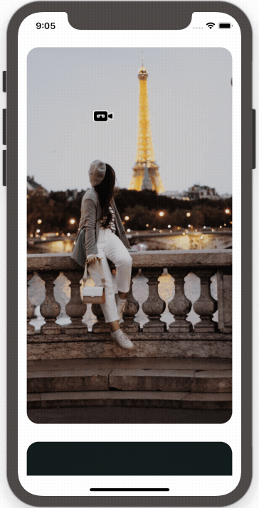
Hence, we get the following result on the emulator screen as we click on any image:

Adding Animation
In this step, we are going to add the fade-in animation to the Text section. The idea is make the text section appear from the bottom as fading in. In order to do this, we need to defined two animation styles which are opacity and translateYwhich will help to solve this animation effect. In order to configure animation, we are going to use interpolate method initialized to animatedContentY constant that takes an object with two properties: inputRange and outputRange as shown in the code snippet below:
const animatedContentY = this.animation.interpolate({ inputRange: [0, 1], outputRange: [-150, 0] })
To understand how the inputRange and outputRange work, let’s match the value from two properties as shown below:
- 0 and -150 where 0 = 0% means that animation does not start when position set to -150.
- 1 and 0 where 1 = 100% mean animation to finish and position will go back to original.
Next, we also initialize the interpolate method to animatedContentOpacity constant for the opacity effect as shown in the code snippet below:
const animatedContentOpacity = this.animation.interpolate({ inputRange: [0, 0.5, 1], outputRange: [0, 1, 1] })
Here, we want to display 100% opacity when animation reaches 50% so that the inputRange and outputRange work like a charm.
Now, we need to finish this section by adding both of animatedContentY and animatedContentOpacity constant to animatedContentStyle constant as an object. The animatedContentStyle constant is defined as an object which takes two animation values which are opacity and transform. The opacity is initialized to animatedContentOpacity and transform is initialized to an array of object with translateY value as animatedContentY as shown in the code snippet below:
const animatedContentStyle = { opacity: animatedContentOpacity, transform: [{ translateY: animatedContentY, },], };
Now, we need to add the animatedContentStyle constant to the style prop array as shown in the code snippet below:
\<Animated.View style={[{ flex: 1, backgroundColor: 'white', padding: 20, paddingTop: 50, }, animatedContentStyle,]}\> \<Text style={{fontSize: 24, paddingBottom: 10}}\> Very Sure Developer \</Text\> \<Text\> Eiusmod consectetur cupidatat dolor Lorem excepteur excepteur. Nostrud sint officia consectetur eu pariatur laboris est velit. Laborum non cupidatat qui ut sit dolore proident. \</Text\> \</Animated.View\>
Lastly, we need to activate the animation in openImage function that we defined in the previous part. The animation variable is provided as a parameter to timing function of Animated component with toValue as 1 and duration of 300ms as shown in the code snippet below:
Animated.parallel([........... Animated.timing(this.animation, { toValue: 1, duration: 300, }),]).start();
Hence, we get the following result in our emulator screen:
Finish Closing Animation
The last thing we need to add is the close animation to our pop-up enlarged image element. In order to do this, we need to define a new function named closeImage. The closeImage function is configured with all the Animated properties that are required to close the image element as shown in the code snippet below:
closeImage = () =\> { Animated.parallel([Animated.timing(this.position.x, { toValue: this.oldPosition.x, duration: 300 }), Animated.timing(this.position.y, { toValue: this.oldPosition.y, duration: 250 }), Animated.timing(this.dimensions.x, { toValue: this.oldPosition.width, duration: 250 }), Animated.timing(this.dimensions.y, { toValue: this.oldPosition.height, duration: 250 }), Animated.timing(this.animation, { toValue: 0, duration: 250 })]).start(() =\> { this.setState({ activeImage: null }) }) }
The idea of the implementation of closeImage function is to add the same animation properties from openImage function that we defined in the last tutorial. And then, we rewind the animation positions to the original positions by using the value that we stored in the oldPosition variable. Then, when the animation starts, we need to set the activeImage state to null.
Finally, we need to add the close button(X) to trigger the closeImage function. In order to implement the close button, we put a letter “X” inside of Text component wrapped by the Animated View component. Then, we need to add the TouchableWithoutFeedback component wrapping theAnimated View component in order to make the text clickable. Lastly, we add the closeImage function to the onPress event of the TouchableWithoutFeedback component. Then, we need to bind those components with some styles to make it appear at the top right corner. The code and the styles required to implement the close button is provided in the code snippet below:
\<TouchableWithoutFeedback onPress={() =\> this.closeImage()}\> \<Animated.View style={{ position: 'absolute', top: 30, right: 30 }}\> \<Text style={{ fontSize: 24, fontWeight: 'bold', color: 'white' }}\>X\</Text\> \</Animated.View\> \</TouchableWithoutFeedback\>
Hence, we get the following result in our emulator screen:

Now, we test the same thing with other images as well and the result is shown in the emulator simulation below:

Hence, we have successfully added the text section as well as implemented the close animation in our React Native app.
Conclusion
This tutorial is a third of part of our implementation of the Apple app of the day example on React Native. In this part of the tutorial, we learned how to add text and configure different animation properties. We also learned how to bind different styles to the components. Then, we finally implemented the close animation to our pop-up enlarged image element from the previous tutorial.
I am very grateful to Nathavarun from UnsureProgrammer for this great and interesting tutorial.
If you like this tutorial please leave feedback on the comment section and do not forget to share!
Credit
The content is acquired from the #3 Apple App of the day Animation by Unsureprogrammer.
And the image is acquired from Unsplash.
Disclosure
This post includes affiliate links; I may receive compensation if you purchase
products or services from the different links provided in this article.
The post React native Apple App of the day Animation #3 : Close animation appeared first on Kriss.

Oldest comments (0)