Imagine you’re a new user to Mastodon, the federated alternative to Twitter some of your friends are joining. You’re not the most technical person but you love checking out new stuff. You download the official app, or a third party app because your friends are big fans of the local timeline. Then you choose an instance, log in, and are presented with this page:
What does any of this mean?
None of these permissions are explained. There’s a green checkbox, and apparently the app has read and write access to these things, but what do these things do?
“Everything” sounds scary, can this app change my password or otherwise take over my account?
“Relationships” means the app can manage your following list or followers, or does it? Maybe it can also access my contacts on my device?
“Push notifications” is obvious I guess, but read and write? In this scenario I’m not a technical user, so is this app snooping on my notifications?
Oh, and “push notifications” is cut off at the bottom, implying that the list is scrollable or expandable, but it isn’t.
At the top of the page, buried in text, there’s a helpful note that says, “if you do not trust it, then you should not authorize it”. It’s not obvious and is going to get skipped over.
Why is this a problem?
Users should clearly understand what it means to authorize an app to their Mastodon account, with each permission clearly outlined and explained. They’re not going to check the docs or another page to try and figure it out. The terms used in the docs don’t even match what’s on the authorization screen.
I think this is even more important for a “decentralized” network and open API like Mastodon. With many different third-parties hosting instances and creating apps, it should be very clear what you’re allowing the app to do.
For contrast, here’s what Twitter does:
The page layout really needs some work, but the permissions are explained in detail - you know exactly what the app can do when you authorize it.
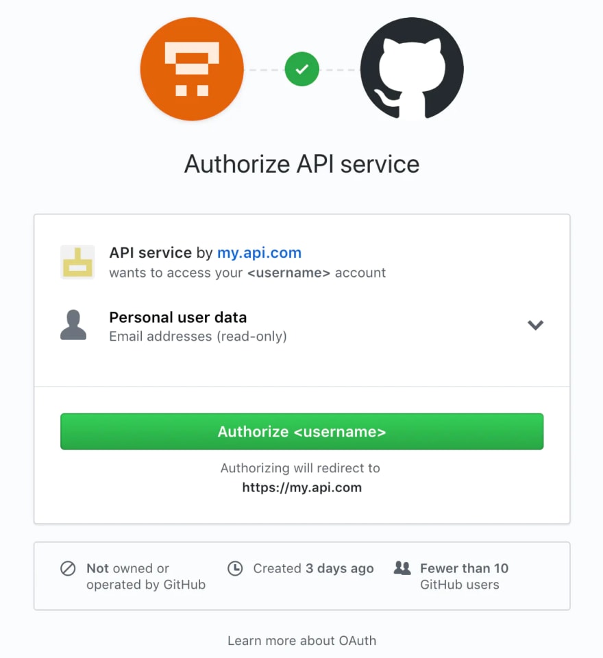
Here’s GitHub’s app authorization page:
Neat, I know that this app can find out what my email address is, it was created 3 days ago, and isn’t used by a lot of people.
And here’s Google’s app authorization page:
I like this one a lot because you can control what the app can access. “Personal info” needs to be explained better, but I do know the app can see my email address and can access my Analytics and Search Console data.
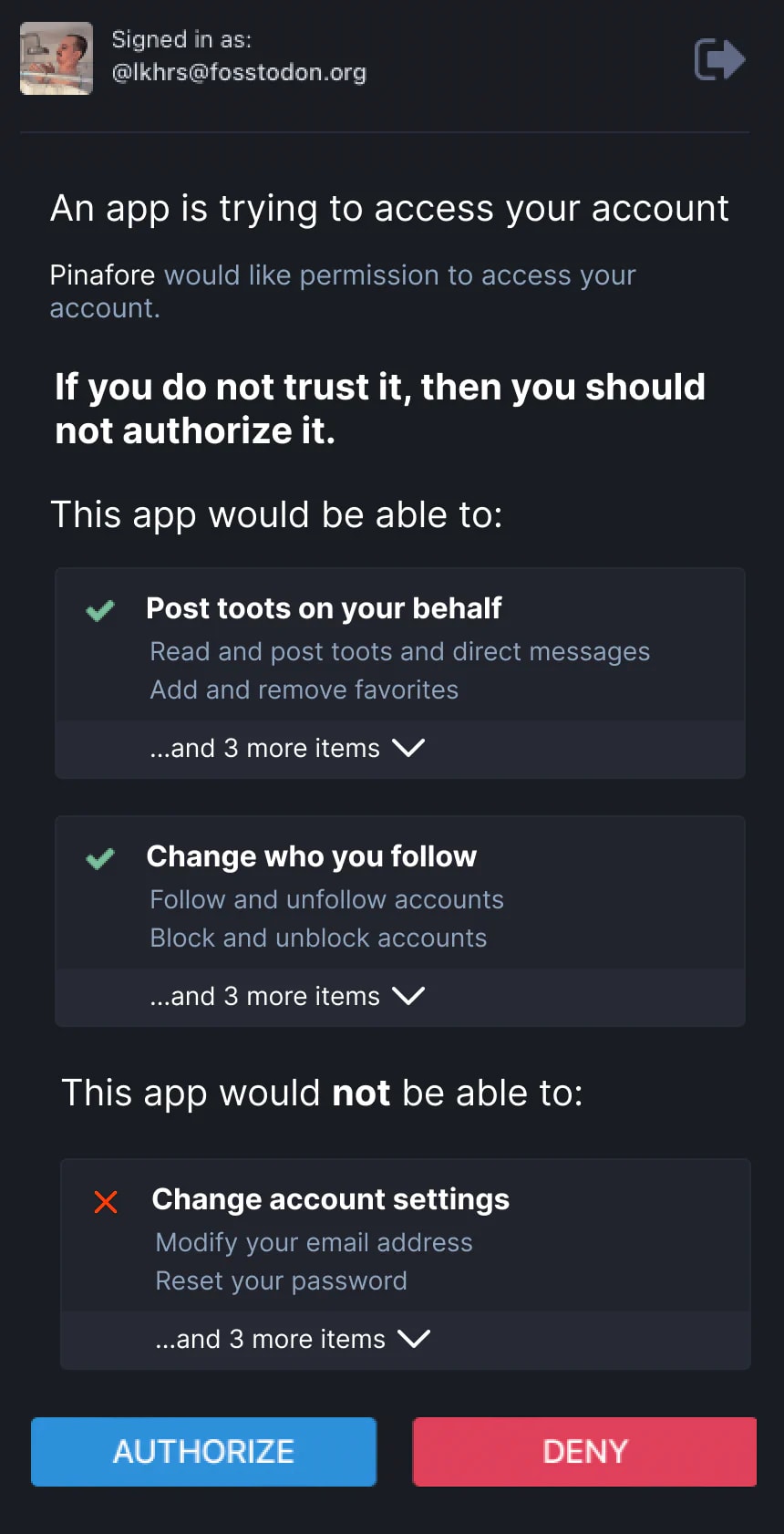
What I suggest instead
- The “If you do not trust it” notice should be displayed by itself and prominent
- Permissions labels should be more descriptive of what they do
- Change the permission block names to better highlight what they do (Post toots on your behalf, change who you follow)
- List the most destructive action first followed by the next most destructive option (read and post toots and direct messages, add/remove favorites)
- Expandable accordions to list all permissions in the group
- Authorize/deny buttons should always be at the bottom of the list so users have to read the permissions before authorizing
- Optional: list of what the app cannot do
This was a quick mockup I made in Figma. The ordering and specific labeling needs discussion, I’m just illustrating an example that I think better explains what authorizing an app does.


Top comments (1)