
Written by Chidume Nnamdi✏️
React is currently atop of the JavaScript food chain. Developers who participated in StackOverflow’s “2020 Developer Survey,” voted React as their preferred JavaScript framework.
Due to its popularity, many UI libraries have built custom React components to facilitate easy integration and improve the developer experience.
There are countless React UI kits and libraries today. In this guide, we’ll highlight seven of the most useful kits and libraries and show how you can use them in your next React app. A few of them are popular, some are more obscure, and any of them could help address the unique needs of your next React project.

1. Shards React
Shards React is a new UI library created by DesignRevision. It was built from scratch according modern development best practices and enables blazing-fast performance.
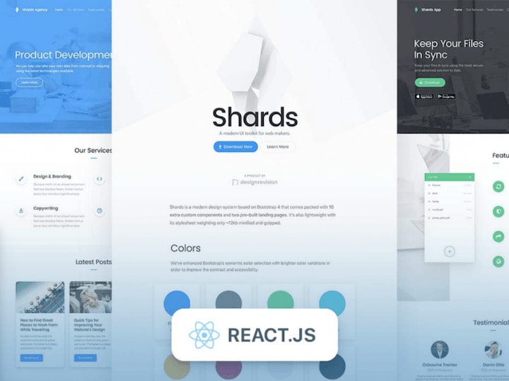
It’s very easy to get started with Shards React.
npm i shards-react
Now, we can import the components and the required styles:
import { Button } from "shards-react"
import "shards-ui/dist/css/shards.min.css"

function ButtonsEx() {
    return (
        <div>
            <Button>Primary</Button>
            <Button theme="info">Info</Button>
        </div>
    )
}
These commands will display two buttons, each styled with Shards UI.
As you can see, Shards is simple to use. See the documentation to learn more about Shards and its components.
2. React Suite
Another awesome React UI kit, React Suite is, as its name suggests, a suite of React components. It boasts of a sensible UI design and a friendly development experience and is designed for middle-platform and backend products.

Check it out on GitHub.
The kit is quite simple to use. First, install it via pm.
npm i rsuite --save
React Suite has a massive pool of components. To use one of them, simple restructure it from rsuite.
To use a component from its huge pool of componeonts, we just destructure it from rsuite.
import { Button } from "rsuite"
3. PrimeReact
PrimeReact is one of the most extraordinary React UI kits I’ve ever seen. It features a huge collection of more than 70 components to choose from and really accelerates frontend design and development.
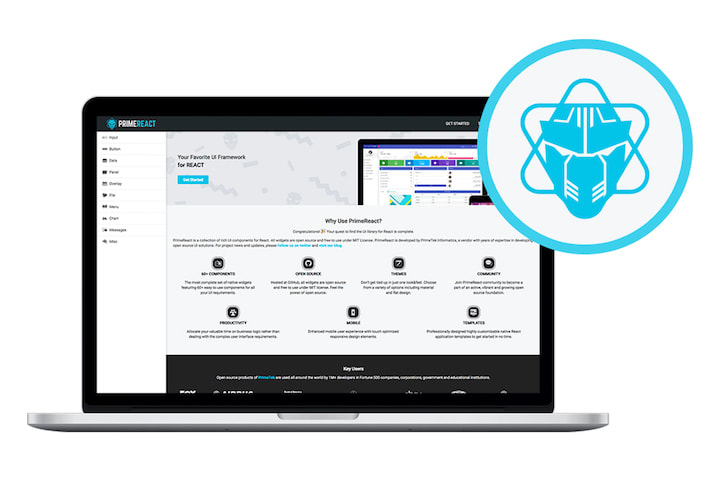
This UI kit was built by PrimeTek Informatics.
In addition to the wide variety of components, PrimeReact features custom themes, premium application templates, a11y, and responsive and touch-enabled UI components to deliver an excellent UI experience on any device.
For more details, check out PrimeReact on GitHub.
The kit is easy to install and use.
npm i primereact --save
For icons, you can download the PrimeIcons library.
npm i primeicons --save
To use a component, import it at the import section of the component’s documentation.
import { Button } from "primereact/button"

function PrimeButtonEx() {
    return (
        <div>
            <Button>Button</Button>
        </div>
    )
}
4. Grommet
Part-design, part-framework, Grommet is a UI library based on React. It features a nice set of components that make it easy to get started. The library also provides powerful theming tools that enable you to tailor the component library to align with your desired layout, color, and type.

The Grommet Design Kit is a drag-and-drop tool that makes designing your layout and components a breeze. It features sticker sheets, app templates, and icons galore.

To set up Grommet, run the following command in your React app.
npm i grommet
To use a component such as Button, destructure it from the "grommet" package.
import { Grommet, Button } from "grommet"

function GrommetButtonEx() {
    return (
        <Grommet className="App">
            <Button
                label="Button"
            />
        </Grommet>
    )
}
5. Onsen UI
If you want your web app to feel native, this UI library is for you. Onsen UI is designed to enrich the user experience with a mobile-like feel. It’s packed with features that provide the UI experience of native iOS and Android devices.
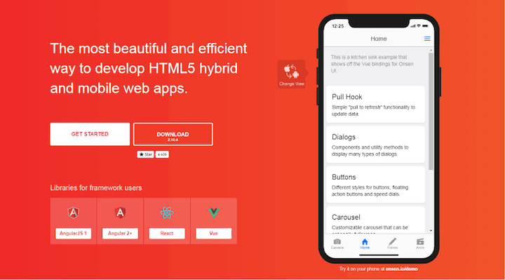
Onsen’s UI elements and components are natively designed and perfect for developing hybrid apps and web apps. The library enables you to simulate page transitions, animations, ripple effects, popup models — basically, any effect you would find in native Android and iOS devices.

It is quite easy to use Onsen in a React app. First, install the npm packages.
npm i onsenui react-onsenui --save
onsenui contains the Onsen UI core instance. react-onsenui contains the React components.
import { Page, Button } from "react-onsenui"

function OnsenButtonEx() {
    return (
        <Page>
            <Button> Click Me!!</Button>
        </Page>
    )
}
Then, import the onsen CSS.
import "onsenui/css/onsenui.css"
import "onsenui/css/onsen-css-components.css"
I fondly refer to Onsen UI as the native CSS of the web.
6. Material-UI
Material-UI is based on Google’s Material Design. It provides React components built with Material Design.

To install, run the following command.
npm i @material-ui/core
Next, import the component you want to use from the @material-ui/core.
import Button from "@material-ui/core/Button"

function MatButtonEx() {
    return (
        <div>
            <Button color="primary">
                Button
            </Button>
        </div>
    )
}
Material-UI also provides beautiful premium themes and templates you can purchase to jumpstart your project.
Find the source code on GitHub.
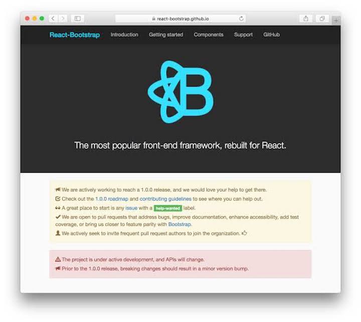
7. React Bootstrap
As the name suggests, React Bootstrap provides React components built with the world’s most popular CSS framework, Bootstrap.
React Bootstrap did well to remove most dependencies from the Bootstrap JavaScript, such as jQuery, and it was built with compatibility and a11y in mind. It also comes with a wide variety of components.
To install React Bootstrap in your project, run the command below.
npm i react-bootstrap
You can import individual components:
import Button from "react-bootstrap/Button"

function BootstrapButtonEx() {
    return (
        <div>
            <Button>
                Click Me
            </Button>
        </div>
    )
}
See the source code on GitHub.
Honorable mention
Below are some UI libraries that are less popular but worth mentioning.
Conclusion
In this guide, we covered a comprehensive list of React UI kits — everything from innovative newcomers such as Shard, to popular stalwarts such as Google’s Material Design and Twitter’s Bootstrap. We also listed other React UI kits that are not quite popular but still pack a huge punch.
Now you should have the basic, foundational knowledge you need to select the right UI kit for you next React project.
Full visibility into production React apps
Debugging React applications can be difficult, especially when users experience issues that are difficult to reproduce. If you’re interested in monitoring and tracking Redux state, automatically surfacing JavaScript errors, and tracking slow network requests and component load time, try LogRocket.
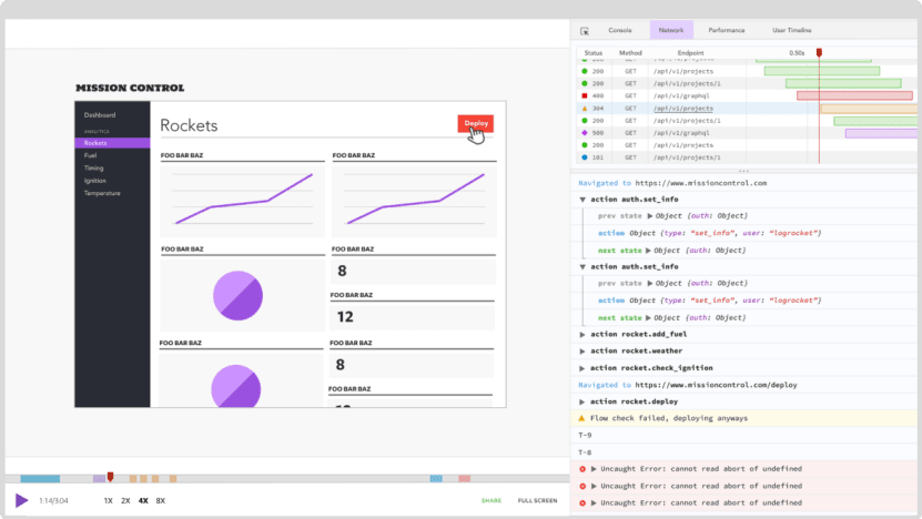
LogRocket is like a DVR for web apps, recording literally everything that happens on your React app. Instead of guessing why problems happen, you can aggregate and report on what state your application was in when an issue occurred. LogRocket also monitors your app's performance, reporting with metrics like client CPU load, client memory usage, and more.
The LogRocket Redux middleware package adds an extra layer of visibility into your user sessions. LogRocket logs all actions and state from your Redux stores.
Modernize how you debug your React apps — start monitoring for free.
The post Top 7 UI libraries and kits for React appeared first on LogRocket Blog.

Top comments (8)
What about Ant Design?
Nice article. You can include Chakra UI as well in the list.
Another honourable mention with a native feel is Framework7.
framework7.io/react/
Thanks. You can include Ant Design as well in the list.
Most libraries are quite similar, you master one you know the rest in most cases.
The last commit for Belle was a couple of years ago: github.com/nikgraf/belle
time to consider the project dead?
The last commit for Belle was a couple of years ago; time to consider the project dead?
This is nice
But would you please let me know how you sort and filter React UI Libraries?
What would be the criteria?