
The first CSS Grid Layout made it possible to divide the area of an element with horizontal and vertical lines. These lines dictated the size and position of its children.
But this is going to change.
To understand why, and most importantly, how, let's recap the way things worked in the first version of the grid.
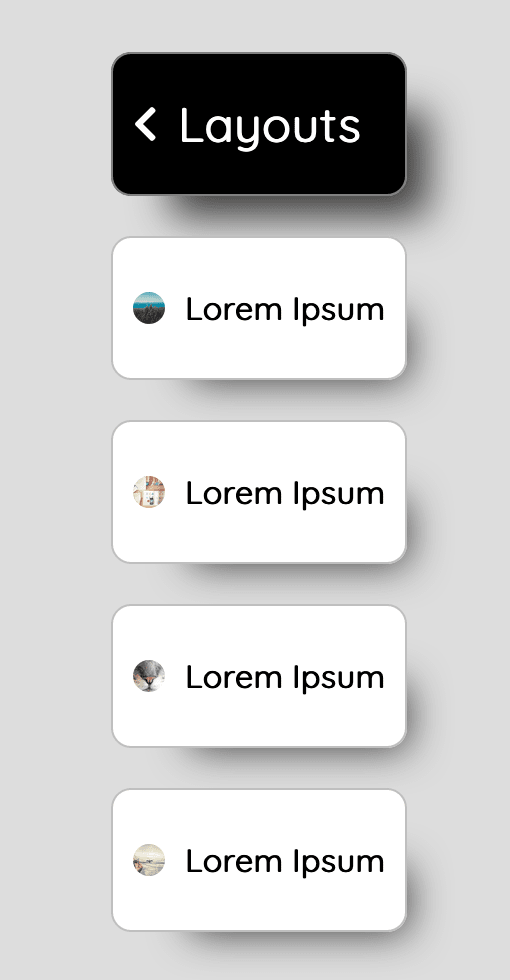
For instance, this card could be one grid:

The HTML code looks simple. It's just one parent with two children:
<div class="card">
  <img class="avatar" src="https://picsum.photos/id/10/200/200"/>
  <h2 class="card__text">Lorem Ipsum</h2>
</div>
The CSS code makes the parent element a grid:
.card {
  display: grid;
  grid-template-columns: max-content 1fr;
  grid-gap: 10px;
  align-items: center;
}
The grid lines are as follows:

Another card could be another isolated grid:

And the header could be yet another grid, built in the same way:

Let's put the previously discussed components together, just like that:
The parent element is yet another grid, just to define the spacing among the cards and the header:
.grid {
  display: grid;
  grid-gap: 20px;
}
It doesn't look bad.
However, it's quite optimistic to assume that in real life all the cards will have identical content. So let's make it a bit more realistic:

That's the problem I wanted to show you. As we can see, the texts are not really aligned with each other:

Luckily for us, the new CSS Grid Layout provides an elegant solution to this ugly problem!
We can define a single grid line that will be used to divide all the cards and the header together, on a higher level, above the individual elements:
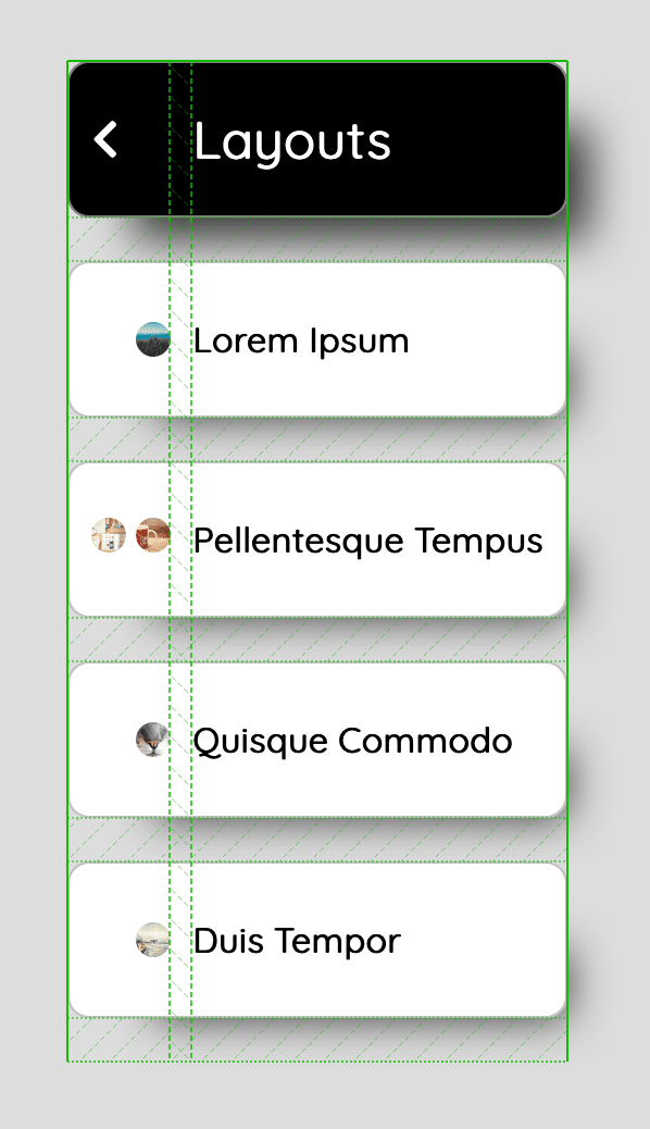
First, let's define one grid at the parent's level instead of defining multiple grids for each child:
.grid {
  display: grid;
  grid-template-columns: max-content 1fr;
}
Then it's enough that we use the new subgrid option. It means that both the .header and the .card elements don't define their own grid lines, but instead, they inherit them from their parent element:
.header {
  /* 1 / -1 to make it span across the whole container. */
  grid-column: 1 / -1;
  grid-template-columns: subgrid;
}

.card {
  grid-column: 1 / -1;
  grid-template-columns: subgrid;
}
And... that'd be it!

The complete code of this example may be found on CodePen.
Subgrids from CSS Grid Level 2 enabled us to define cross-component alignment rules that work well even for dynamic content.
Just to be fair, I got to say that designers have been talking about it for ages! Maybe they called it differently, like keylines in Material Design, but anyway, it's nothing new to them!
So is the new specification a spacing nirvana? Not yet. By looking at some ongoing discussions about possible extensions of the subgrid we can tell that there's still some room for improvement. But it's already a big step towards unifying the ways designers and developers think. Now when somebody says "We need to align these components to this line." we can actually code "this line".

Top comments (7)
This is a new upgrade to the CSS grid spec?
That's right! You can find more information about subgrids on MDN.
But it only works on FF 71...
So? Just a couple months ago it only worked on mobile Chrome. Firefox is usually next after Chrome, but Safari is usually far behind that. Not this time.
IMO, I think it's a bad practice to run a code that only works perfectly on certain browsers. But alas, only time will tell.
In my opinion, the latest several versions of every major browser - is pretty sufficient for certain features. Especially if you implement graceful degradation, so that browsers that don't support the feature can fall back on an older feature that is more widely supported.
Only render the feature if it's supported by the browser, render nothing or graceful degradation if it isn't.
It's common practice
Thanks for sharing this! I've been learning CSS Grid and this is really helpful.