
tl;dr In this blog post we built a shallow clone of Pentagram's beautiful portfolio site with Gatsby.js. Much page transition. Very headless CMS. So React.
https://gatsbygram-clone.netlify.com/
https://github.com/mattrothenberg/gatsbygram
Some say "imitation is the sincerest form of flattery."
Throughout my career as a designer/developer, I've tried to employ imitation as an educational tool, dissecting, analyzing, and recreating the images, websites, and applications that have had an impact on me.
Rest assured, this isn't some abstract rationalization of ripping off people's work. On the contrary, the intent behind my imitation has never been to pass off others' work as my own, but rather to use this work as a source of inspiration and education.
I bring this up because today we'll be "imitating" a few details of one of the slicker websites I've seen in the past few years: Pentagram.com. If you're not familiar with Pentagram, they're a design firm that does killer work for major clients.

Specifically, we'll be using Gatsby (the static-site generator we all know and love), to recreate those beautiful page transitions as you navigate from project to project, thereby learning a handful of valuable Gatsby skills:
- Scaffolding and configuring a project from scratch
- Styling a site with some of the latest hotness, i.e.
styled-components - Populating a site with data from a remote source (e.g., a headless CMS)
- Using Gatsby's built-in image component and plugin system to render optimized images
Fair warning: I will be sharing a lot of code. Don't feel like you have to copy it line for line. I've tried my best to chunk out the various "features" we'll be building as branches on the gatsbygram repo, and will be including links to the relevant commits/PRs and the bottom of each section.
Scaffolding our Gatsby project
Let's start off by installing the Gatsby CLI (if you haven't already), making a new project directory, and installing a few dependencies.
yarn global add gatsby-cli
mkdir gatsbygram
cd gatsbygram
yarn init
yarn add react-dom react gatsby
From there, we can add a few scripts to our package.json in order to run the development server locally and the build the project.
"scripts": {
  "develop": "gatsby develop",
  "serve": "gatsby serve",
  "build": "gatsby build"
}
Adding Pages
As of now, our site isn't very functional. That's because we haven't yet told Gatsby what pages to render.
In Gatsby land, the src/pages directory is special. JS modules in this directory represent discrete "routes" on our site (e.g., src/pages/index -> the "home" page, src/pages/about -> the "about" page).
For example, if we add a simple React component to src/pages/index.js, we'll see it rendered when we spin up our site by running yarn develop and visiting http://localhost:8000.
// src/pages/index.js
import React from 'react'

const Home = () => <div>Hello world</div>

export default Home
For our website, however, we won't have the luxury of being able to define our pages upfront. The projects in our portfolio all have different titles, different slugs, and as such we'll need to use a mechanism for dynamically generating these pages. Luckily for us, Gatsby offers a great solution for this problem. Enter gatsby-node.js.
gatsby-node.js
Gatsby gives plugins and site builders many APIs for controlling your site.
In gatsby-node.js, we can interact directly with such APIs. For our intents and purposes, we're going to be working with the createPages API. This API, as you might have already guessed, allows us to create pages dynamically (e.g., given data that we've fetched from a remote source).
In a future step, we'll return to this file and actually pull data from one such remote source (DatoCMS), but for now let's think about the schema of a "project" and hard-code the data structure that will power our portfolio site. Let's also keep it simple, in the interest of getting the site set up as quickly as possible.
// gatsby-node.js
const projects = [
  {
    title: 'Project #1',
    slug: 'project-1',
  },
  {
    title: 'Project #2',
    slug: 'project-2',
  },
  // etcetera
]
With our stub projects dataset complete, let's dive into how the createPages function actually works.
File: gatsby-node.js
You'll notice that we've destructured the arguments passed to createPages, picking out an actions object that itself contains a createPage (singular) function. It's this function that will perform the magic trick of translating our stub project dataset into actual pages.
Effectively, createPage expects a few values in order to perform such a translation.
- The
pathof the page you're trying to build (e.g.,/projects/project-1). - The
componentthat we want to render when users visit this path (think of this as a "template" into which we'll slot project data). - The
context, or props that will be passed into this component.
For instance, it might look like this...
// The path to our template component
const projectTemplate = path.resolve(`./src/templates/project.js`)

projects.forEach(project => {
  // Rudimentary way to get the "next" project so we can show a preview at the bottom of each project
  const next = projects[index === projects.length - 1 ? 0 : index + 1]

  createPage({
    path: `/projects/${project.slug}`,
    component: projectTemplate,
    context: {
      ...project,
      next,
    },
  })
})
...where our component, or template, is yet another simple React component.
import React from 'react'

const Project = ({ pageContext: project }) => <div>{project.title}</div>

export default Project
With our createPages script ready to go, we can restart the development server (via yarn develop) and navigate to http://localhost:8000/projects/project-1. Ugly, but it certainly gets the job done.
We now have dynamically generated pages! Time to bring the project page to life.
The Visual & Interaction Design
Onto the fun part! In this section, we'll install and configure our toolset for styling our website.
Personally, I'm a huge fan of Rebass and by extension, styled-components. Let's get these dependencies installed.
yarn add rebass gatsby-plugin-styled-components styled-components babel-plugin-styled-components
You'll note that one of the dependencies is gatsby-plugin-styled-components. Another great feature of Gatsby is its first-class plugin API that developers can hook into in order to extend the library's core functionality. Here, and I'm waving my hand a little, we're adding some code that adds configuration and support for styled-components. But installing the dependency is just one step in the process. We need to let Gatsby know to use it.
Enter gatsby-config.js.
gatsby-config.js
This is another "magical" configuration file (à la gatsby-node.js, as we saw in a previous step), but essentially it's a manifest of all the plugins that our Gatsby site is using. All we need to do here is specify our plugin and move on.
module.exports = {
  plugins: [`gatsby-plugin-styled-components`],
}
Layout
Most websites these days employ a familiar organizational structure, sandwiching arbitrary "main content" between a header and a footer.
// Layout.jsx
const Layout = () => (
  <>
    <Header />
    {
      // main content
    }
    <Footer />
  </>
)
We're going to follow a similar pattern, but for two specific reasons –
- Our visual/interaction design requires us to have a common
Headerbetween project pages - We need a component that initializes
styled-componentswith our site's theme, and passes this theme information downward to its children.
So, let's modify our hand-wavy Layout.jsx example from above thusly –
import React from 'react'
import { ThemeProvider } from 'styled-components'
import { Box } from 'rebass'

// A very simple CSS reset
import '../style/reset.css'

const theme = {
  fonts: {
    sans: 'system-ui, sans-serif',
  },
  colors: {
    grey: '#999',
    black: '#1a1a1a',
    red: '#e61428',
  },
}

const Layout = ({ children }) => (
  <ThemeProvider theme={theme}>
    <React.Fragment>
      <Box as="header">silly header</Box>
      <Box as="main">{children}</Box>
    </React.Fragment>
  </ThemeProvider>
)

export default Layout
As for our theme, I took a gander at Pentagram's website and pulled out a few design details –
- They use the beautiful Neue Haas Grotesk typeface, but we'll use a system font instead.
- The only real "colors" on their site are
black,grey, andred. The photos themselves convey most of the visual complexity.
ProjectHeader component
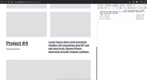
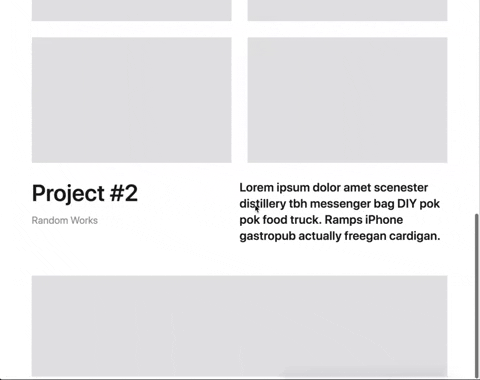
Each project page on Pentagram's website seems to be structured as follows –
const Project = () => (
  <>
    {/* Title + description + category + hero image */}
    <ProjectHeader />

    {/* Photo grid */}
    <ProjectPhotos />

    {/* Title + description + category + truncated preview of hero image of NEXT project */}
    <ProjectHeader truncated />
  </>
)
Note that ProjectHeader appears twice. Why does it appear twice, you may be asking? Well, to facilitate that lovely page transition you get when clicking on the preview of the next project (at the bottom of any project page). We will get into the specifics of this transition in a bit, but for now, let's note that our ProjectHeader will need to live in two states –
- A default state where the project's
title,description,category, andheroimage will be visible. - A
truncatedstate where we hide a good portion of theheroimage as a teaser of the next project in the list.
I'm thinking our ProjectHeader component will look something like this. We'll leverage the Flex and Box helper components from rebass, and use styled-components to give some visual styling (e.g., font-weight, font-size, and color) to the respective typographic elements on the page.
const ProjectHeader = ({ project, truncated }) => (
  <Box>
    <Flex>
      <Box>
        <Title as="h1">title goes here</Title>
        <Box>
          <Category as="h3">category goes here</Category>
        </Box>
      </Box>
      <Box>
        <Box>
          <Description as="h2">description goes here...</Description>
        </Box>
      </Box>
    </Flex>
    <Hero truncated={truncated} />
  </Box>
)
Notice, though, that we're passing our truncated prop all the way down to the Hero component, which, for now, renders a grey box in an 8:5 aspect ratio. Passing this prop down allows us to render our ProjectHeader in the two aforementioned states, default and "truncated."
const HeroWrap = styled(Box)`
  ${props =>
    props.truncated &&
    css`
      max-height: 200px;
      overflow: hidden;
    `}
`

const Hero = ({ truncated }) => (
  <HeroWrap mt={[4, 5]} truncated={truncated}>
    <AspectRatioBox ratio={8 / 5} />
  </HeroWrap>
)
Rest assured, we'll come back and tweak this component later in the tutorial. For now, though, we have what we need to get started.
Relevant Commit: 7f0ff3f
ProjectContent
Sandwiched between the two ProjectHeader components is, well, the project content!
Given we don't have any "real" project data to work with at the moment, we're going to fake out this section entirely. We'll wire up a beautiful grid of placeholder boxes thusly.
import React from 'react'
import { Box } from 'rebass'
import styled from 'styled-components'

import AspectRatioBox from './aspect-ratio-box'

const Grid = styled(Box)`
  display: grid;
  grid-template-columns: repeat(2, 1fr);
  grid-gap: ${props => props.theme.space[4]}px;
`

const ProjectContent = () => (
  <Box my={4}>
    <Grid>
      <AspectRatioBox ratio={8 / 5} />
      <AspectRatioBox ratio={8 / 5} />
      <AspectRatioBox ratio={8 / 5} />
      <AspectRatioBox ratio={8 / 5} />
    </Grid>
  </Box>
)

export default ProjectContent
Not bad!
Let's head back to our Project template component, add these elements, and commit this.
const Project = ({ pageContext: project }) => (
  <Layout>
    <ProjectHeader project={project} />
    <ProjectContent />
    <ProjectHeader project={project.next} truncated />
  </Layout>
)
The Transition
While we still have plenty to do, let's get started on the fun part: implementing the page transitions we see on Pentagram's website.
Before diving into the code side of things, let's try to map out what exactly is happening during this transition.
- The
ProjectContentfades out relatively quicly (in a few hundredms). - After the content has faded out, the truncated
ProjectHeaderfor the next project slides up to the "top" of the page, effectively transitioning into theProjectHeaderfor the page that's about to load.
Easy, right? The devil is surely in the details 😈.
But lucky for us, a lot of the hard work has already been done for us. Let's use a fantastic library called gatsby-plugin-transition-link, which:
[provides] a simple way of describing a page transition via props on a Link component. For both entering and exiting pages you can specify a number of timing values, pass state to both pages, and trigger a function for each.
yarn add gatsby-plugin-transition-link
And as we've seen before, let's add this plugin to our gatsby-config.js
module.exports = {
  plugins: [`gatsby-plugin-styled-components`, `gatsby-plugin-transition-link`],
}
Now, in order to get started with this library, we'll need to make some modifications to our Project template component.
Indeed, the way this transition plugin works is that it exposes a TransitionLink component that we can use in lieu of Gatsby's built-in Link component (which has some magic abilities but effectively provides a mechanism for routing between pages).
import TransitionLink from 'gatsby-plugin-transition-link'

const Project = ({ pageContext: project }) => {
  const nextProjectUrl = `/projects/${project.next.slug}`

  return (
    <Layout>
      <ProjectHeader project={project} />
      <ProjectContent />
      <TransitionLink to={nextProjectUrl}>
        <ProjectHeader project={project.next} truncated />
      </TransitionLink>
    </Layout>
  )
}
Notice that by wrapping our ProjectHeader component in a TransitionLink, we've effectively made it a hyperlink to the next project in our portfolio. And it works! But it certainly doesn't trigger the beautiful page transition that we saw in the GIF above. For that, we'll need some other tools.
The first thing we need is another component from gatsby-plugin-transition-link: TransitionState.
In a nutshell, what this component does is expose a transitionStatus prop that describes what state the transition is currently in, be it: exiting, exited, entering, or entered. This is useful because it gives us the information we need to declare how our transition should work. While this plugin also exposes hooks for performing our transition in a more imperative manner (e.g., with a library like gsap), I'm partial to this declarative approach for reasons that will become clear in the next couple of steps.
Let's refactor our Project template component in the following ways in order to start consuming this data.
- Move the presentational elements of our template to a functional component,
ProjectInner - Introduce
<TransitionState>, which takes a "function as a child" and passes to it atransitionStatusprop describing where the transition is in its lifecycle.
const ProjectInner = ({ transitionStatus, project }) => {
  const nextProjectUrl = `/projects/${project.next.slug}`
  return (
    <Layout>
      <ProjectHeader project={project} />
      <ProjectContent />
      <TransitionLink to={nextProjectUrl}>
        <ProjectHeader project={project.next} truncated />
      </TransitionLink>
    </Layout>
  )
}

const Project = ({ pageContext: project }) => {
  return (
    <TransitionState>
      {({ transitionStatus }) => (
        <ProjectInner transitionStatus={transitionStatus} project={project} />
      )}
    </TransitionState>
  )
}
And just like that, our ProjectInner can now use the transitionStatus prop to declare the transition steps we outlined at the beginning of this section (e.g., fading the content, sliding up the header).
As aforementioned, I'm a big fan of the declarative mindset that React pushes you towards. Coming from the days of jQuery, where we imperatively told our program to addClass here, or fadeOut there, React's approach of declaring what we want done and letting the library handle the rest is a breath of fresh air.
That being said, the declarative style can also be totally mind bending, particularly when it comes to animation. If you're anything like me, you might have learned animation with a tool like TweenMax from the Greensock library. By and large, TweenMax follows a very imperative (and powerful, to be sure) approach. For instance, we might be able to implement our transition with code like this:
// Fade out the main content
TweenMax.to(mainContentEl, 1, { opacity: 0 })

// Slide up the header
TweenMax.to(nextHeaderEl, 1, { y: nextYPos, delay: 250 })

// Profit 😎
Today, we're going to eschew this approach in favor of the declarative approach. And to that end, we're going to use one of my favorite React libraries, Pose.
Pose requires us to "declare" our transition with the following API.
const FadingBox = posed.div({
  visible: { opacity: 1 },
  hidden: { opacity: 0 },
})
We can then use FadingBox just as we would any other React component. The difference is, though, that FadingBox exposes a pose prop that we can pass a string value to. If this string value matches one of the keys defined on the Pose instance (in this case, visible or hidden), the component will automatically trigger a transition to that particular state.
<!-- Now you see me 👀 -->
<FadingBox pose="visible" />

<!-- Now you don't 🙈 -->
<FadingBox pose="hidden" />
So why the heck am I giving you all of this context? Well, you might recall that we now have a special transitionStatus prop inside of our ProjectInner component that effectively declares what state our transition is in. Let's use this prop to implement the first step in our transition, fading out the main content.
The first thing we'll do is build our Pose instance.
// Transition to {opacity: 0} when pose === 'exiting'
const FadingContent = posed.div({
  exiting: { opacity: 0 },
})
And then we'll wrap the current project's header and content in the instance.
<FadingContent pose={transitionStatus}>
  <ProjectHeader project={project} />
  <ProjectContent />
</FadingContent>
But you'll note that nothing actually happens yet. This is because we need to tell our TransitionLink component how long our respective entry and exit transitions should take, as well as describe what we want to happen when these transitions begin and conclude.
// For now, let's use this as a magic number that describes how long our transition should take
const TRANSITION_LENGTH = 1.5

const exitTransition = {
  length: TRANSITION_LENGTH, // Take 1.5 seconds to leave
  trigger: () => console.log('We are exiting'),
}

const entryTransition = {
  delay: TRANSITION_LENGTH, // Wait 1.5 seconds before entering
  trigger: () => console.log('We are entering'),
}

// Let's pass these hooks as props to our TransitionLink component
<TransitionLink
  to={nextProjectUrl}
  exit={exitTransition}
  entry={entryTransition}
/>
Save and refresh your browser. Congratulations, you just implemented the first (albeit janky) transition!
Let's move on to the next transition, which is admittedly a little bit trickier. First things first, we need to remove the text-decoration style that TransitionLink has added to our ProjectHeader at the bottom of the page, insofar as this header should look exactly like the one above, apart from the truncated hero image.
<TransitionLink
  style={{
    textDecoration: 'none',
    color: 'inherit',
  }}
/>
Next, let's define our pose for the sliding <ProjectHeader />.
const SlidingHeader = posed.div({
  exiting: {
    y: ({ element }) => {
      // This is an alternative API that allows us to dynamically generate a "y" value.

      // When scrolling back to the top, how far should we actually go? Let's factor the height of our site's header into the equation.
      const navbar = document.querySelector('header')
      const navbarDimensions = navbar.getBoundingClientRect()
      const distanceToTop =
        element.getBoundingClientRect().top - navbarDimensions.height

      // And return that aggregate distance as the dynamic "y" value.
      return distanceToTop * -1
    },
    transition: {
      ease: [0.59, 0.01, 0.28, 1], // Make the transition smoother
      delay: 250, // Let's wait a tick before starting
      duration: TRANSITION_LENGTH * 1000 - 250, // And let's be sure not to exceed the 1.5s we have allotted for the entire animation.
    },
  },
})
There's a lot going on in that code block. The main takeaway here is that you can dynamically generate your Pose transition states. You need not hard code those values, especially if you need to perform some sort of calculation (like our distanceToTop) before triggering the transition.
We need to cast a few other incantations as well, though.
First, let's wrap our truncated ProjectHeader in our newly created Pose.
<SlidingHeader pose={transitionStatus}>
  <ProjectHeader project={project.next} truncated={shouldTruncate} />
</SlidingHeader>
You'll note that instead of hard-coding a truthy value for truncated, we're now passing a variable called shouldTruncate. We're doing this because now, we only want to truncate the hero image of the next project once we've transitioned into the next page. For the duration of the transition, we want the truncated content to show, as it gives the transition a natural feel.
const shouldTruncate = ['entering', 'entered'].includes(transitionStatus)
Finally, we need to add a few small imperative details (hypocrite, I know) to our TransitionLink component in order to smooth over the actual transition.
const exitTransition = {
  length: TRANSITION_LENGTH,
  trigger: () => {
    if (document) {
      // Preventing overflow here make the animation smoother IMO
      document.body.style.overflow = 'hidden'
    }
  },
}

const entryTransition = {
  delay: TRANSITION_LENGTH,
  trigger: () => {
    if (document && window) {
      // Ensuring we're at the top of the page when the page loads
      // prevents any additional JANK when the transition ends.
      window.scrollTo(0, 0)
      document.body.style.overflow = 'visible'
    }
  },
}
And there we have it.
Adding Polish
In our haste to add these beautiful page transitions, we've neglected a few design details.
- Our
<header>is too small, doesn't fade in when the page loads, and still has the text "silly header" 🙈 - We omitted the "Next Project" heading above the truncated footer that fades when the transition begins.
Logo & Header Transition
Let's add a cheap, horrible copy of Pentagram's logo (sorry, Pentagram) to our project in /src/components/logo.svg. We can then import it and add it to our Layout component. While we're there, though, let's go ahead and rig up another Pose instance so that we can fade the header in & out as the page transitions.
import { Box, Image } from 'rebass'

const FadingHeader = posed.header({
  exiting: { opacity: 0 },
  exited: { opacity: 0 },
  entering: { opacity: 1 },
  entered: { opacity: 1 },
})

const Layout = ({ children, transitionStatus }) => (
  <ThemeProvider theme={theme}>
    <React.Fragment>
      <FadingHeader pose={transitionStatus}>
        <Box px={[3, 5]} py={4}>
          <Image src={Logo} alt="Gatsbygram Logo" height={32} />
        </Box>
      </FadingHeader>
      <Box as="main" px={[3, 5]}>
        {children}
      </Box>
    </React.Fragment>
  </ThemeProvider>
)
Wait a second...How did transitionStatus make its way as a prop to this component? Remember how we use the Layout component inside of our Project component template? From there, we can simply pass this value down as a prop and let Layout do whatever it wants with it.
<Layout transitionStatus={transitionStatus}>project content goes here</Layout>
'Next Project' heading and transition
Now that we're seasoned transition experts, let's show off our skills by adding an additional design element above the truncated ProjectHeader.
// next-project-heading.jsx

import React from 'react'
import { Box, Text } from 'rebass'
import styled from 'styled-components'

const Heading = styled(Text)`
  color: ${props => props.theme.colors.red};
  font-family: ${props => props.theme.fonts.sans};
  font-size: ${props => props.theme.fontSizes[3]}px;
  font-weight: normal;
`

const Rule = styled.hr`
  background: #e3e4e5;
  height: 1px;
  border: 0;
`

const NextProjectHeading = () => (
  <Box mb={5}>
    <Rule />
    <Heading pt={3}>Next Project</Heading>
  </Box>
)

export default NextProjectHeading
And finally, let's slot it in inside of our Project template component.
const FadingNextProjectHeading = posed.div({
  exiting: { opacity: 0 },
})

<TransitionLink
  style={{
    textDecoration: 'none',
    color: 'inherit',
  }}
  to={nextProjectUrl}
  exit={exitTransition}
  entry={entryTransition}
>
  <FadingNextProjectHeading pose={transitionStatus}>
    <NextProjectHeading />
  </FadingNextProjectHeading>
  <SlidingHeader pose={transitionStatus}>
    <ProjectHeader project={project.next} truncated={shouldTruncate} />
  </SlidingHeader>
</TransitionLink>

Remote Data via DatoCMS
One of my favorite CMS at the moment is DatoCMS. Why, you may ask?
- They have a generous free tier.
- They have a first-class Gatsby plugin (for sourcing data).
- It's compatible with Gatsby Preview
With a free account, we'll be able to replace the hard-coded set of project data with actual data from a headless CMS!
Once your account is created, log in and create a Project model with a schema that looks something like this.
const project = {
  title: 'single-line-string',
  description: 'multiple-paragraph-text',
  featuredPhoto: 'single-file',
  photos: 'multiple-files',
  slug: 'seo',
  category: 'link',
}

With your model in place, go ahead and add a few different projects. They don't need to be perfect. Just add a few, making sure to specify the title, description, category, and add photos.
Once you've added a few projects, we can turn our attention to building our Gatsby site with this remote data.
yarn add gatsby-source-datocms gatsby-transformer-sharp gatsby-plugin-sharp gatsby-image
Now, before we head into gatsby-config.js to add this plugin, we need to add an .env.development and .env.production file to our root directory, as well as ensure that these files are ignored from version control (so we don't accidentally leak our DatoCMS credentials to the world). Go ahead and get your Dato API key as well as your site URL and add these values to the respective .env files you created. For now, these credentials will be the same for both development and production, but you can always generate separate credentials.
DATO_API_TOKEN=""
Then, at the top of gatsby-config.js, let's require the dotenv library so that these environment variables get pulled into memory and become available in the module.
require('dotenv').config({
  path: `.env.${process.env.NODE_ENV}`,
})

module.exports = {
  plugins: [
    `gatsby-transformer-sharp`, // for eventual image manipulation
    `gatsby-plugin-sharp`, // for eventual image manipulation
    {
      resolve: `gatsby-source-datocms`,
      options: {
        apiToken: process.env.DATO_API_TOKEN,
        apiUrl: 'https://site-api.datocms.com',
      },
    },
    ...etcetera,
  ],
}
Now, the next time you run yarn develop, pay extra special attention to the output that reads
View GraphiQL, an in-browser IDE, to explore your site's data and schema
⠀
  http://localhost:8000/___graphql
Gatsby comes with a built-in GraphQL explorer (featuring all sorts of goodies, including a killer autocompletion), which we can use to build up a query for fetching our project data. Throw the following query in the left-hand side and watch your DatoCMS data appear before your eyes!
{
  projects: allDatoCmsProject {
    edges {
      node {
        title
        slug
      }
      next {
        title
        slug
      }
    }
  }
}
But our site isn't yet using this data to dynamically create our project pages. In order to wire that up, we'll need to head back into gatsby-node.js and make a few adjustments.
First things first, let's destructure graphql as an additional argument to our createPages method.
exports.createPages = async ({ graphql, actions }) => {}
Then, let's iterate on and save the GraphQL query from above as a local variable. Notice how we're not pulling all the information for each project (e.g., description, featured photo, etc?). I'm a big fan of deferring that sort of data fetching to our Project component template. More on that in a moment.
const query = `{
  projects:allDatoCmsProject {
    edges {
      node {
        title
        slug
        description
      }
      next {
        title
        slug
      }
    }
  }
}`
Finally, let's actually run that Graphql query and adjust our page creation logic to accommodate the new shape/structure of the data that DatoCMS returns back.
// Run the query
const result = await graphql(query)

// Abort if there were errors
if (result.errors) {
  throw new Error(result.errors)
}

const projects = result.data.projects.edges

const createProjectPage = project => {
  // Our GraphQL response actually tells us what the "next" node is, which is great! In the case of the last project in the list, let's default "next" to the very first project so we have a nice "carousel" of projects on our site.
  const next = project.next || projects[0].node

  createPage({
    path: `/projects/${project.node.slug}`,
    component: projectTemplate,
    context: {
      nextSlug: next.slug,
      ...project.node,
    },
  })
}

projects.forEach(createProjectPage)
If all is well, that should run without errors and you should be able to crack open your browser to http://localhost:8000/projects/SLUG, where slug is one of the auto-generated slugs that DatoCMS created from your project's title.

We're getting very close to the finish line! But we still need to fetch the remaining details about a project. Off to the Project component template we go!
You might be asking, "Wait, why don't we just fetch all of that data right here"? In my opinion, there's an even better place to get the rest of our project data than gatsby-node.js. Indeed, this file is meant moreso to build the "edges" of our website, enumerating what the different pages are without fetching all of the data we need for each of them. Think of what we just did as building the "shell" of our website. From here, we can return to our Project template component and fetch what we need to bring this page to life.
In project.js, let's go ahead and import Gatsby's built-in graphql function. And at the bottom of the file, let's go ahead and write + export another query that gets the remaining data we need.
import { graphql } from 'gatsby'

// component boilerplate
export const query = graphql`
  query($slug: String!, $nextSlug: String!) {
    project: datoCmsProject(slug: { eq: $slug }) {
      description
      category {
        title
      }
      featuredPhoto {
        fluid {
          ...GatsbyDatoCmsFluid
        }
      }
      photos {
        fluid {
          ...GatsbyDatoCmsFluid
        }
      }
    }
    next: datoCmsProject(slug: { eq: $nextSlug }) {
      title
      slug
      description
      category {
        title
      }
      featuredPhoto {
        fluid {
          ...GatsbyDatoCmsFluid
        }
      }
    }
  }
`
A few notes.
- I lied. We're actually writing two queries. One to get all of the the current project's data, and another to get the information needed to render
ProjectHeaderor the next project in the queue. Notice how these queries are aliased withproject:andnext:respectively? -
GatsbyDatoCmsFluidis a GraphQL fragment (effectively a shared piece of query logic) that comes fromgatsby-source-datocms. This fragment returns an object that slots in seamlessly to Gatsby'sImgcomponent, which is responsible for rendering images. Why use this library, you might ask? Well...
It combines Gatsby’s native image processing capabilities with advanced image loading techniques to easily and completely optimize image loading for your sites. gatsby-image uses gatsby-plugin-sharp to power its image transformations.
So, we've exported this verbose GraphQL query but still nothing is happening! That's because under the hood, Gatsby is injecting a data prop into our page component, project.js, but we're not actually doing anything with it. Let's go ahead and build up a real project – full of data from our remote DatoCMS – and pass this to ProjectInner.
const Project = ({ pageContext: projectShell, data }) => {
  const { project, next } = data // GraphQL results
  const aggregateProject = {
    ...projectShell,
    ...project,
    next,
  }

  return (
    <TransitionState>
      {({ transitionStatus }) => (
        <ProjectInner
          transitionStatus={transitionStatus}
          project={aggregateProject}
        />
      )}
    </TransitionState>
  )
}
Given that our project data structure has changed, we'll need to refactor a few presentational components accordingly. Let's start off with ProjectHeader.
Before, we were hardcoding the category, description, and hero image. For the first two values, we can simply pluck the fields off our project prop, e.g,
<Category as="h3">{project.category.title}</Category>
For our hero image, however, we'll actually need to pass project.featuredPhoto as prop and leverage the Img component from gatsby-image library to render the actual image.
const Hero = ({ photo, truncated }) => {
  return (
    <HeroWrap mt={[4, 5]} truncated={truncated}>
      <AspectRatioBox ratio={8 / 5}>
        <Img fluid={photo.fluid} />
      </AspectRatioBox>
    </HeroWrap>
  )
}
The next component we need to fix up is ProjectContent, as it's currently hard-coded to return a grid of 8:5 placeholders. We need to pass project.photos as a prop, iterate over the collection, and render Img components accordingly.
const ProjectContent = ({ photos }) => {
  return (
    <Box my={4}>
      <Grid>
        {photos.map((photo, index) => {
          return (
            <AspectRatioBox key={index} ratio={8 / 5}>
              <Img fluid={photo.fluid} />
            </AspectRatioBox>
          )
        })}
      </Grid>
    </Box>
  )
}
And just like that, our Project page is complete.
Adding a Home Page
The one thing that's missing from our website is a nice home page that lists out all of the projects. Luckily, by this point, we're Gatsby experts and should have no issue wiring up a home page to this end.
Let's start by writing a GraphQL query that will get us all of the data we need.
export const query = graphql`
  {
    projects: allDatoCmsProject {
      edges {
        node {
          slug
          title
          featuredPhoto {
            fluid {
              ...GatsbyDatoCmsFluid
            }
          }
        }
      }
    }
  }
`
And then it's simply a matter of iterating over our dataset and rendering some items on the page!
const Home = ({ data }) => {
  const projects = data.projects.edges
  return (
    <Layout>
      <Grid>
        {projects.map(project => (
          <ProjectGridItem key={project.node.title} project={project.node} />
        ))}
      </Grid>
    </Layout>
  )
}
const ProjectGridItem = ({ project }) => {
  return (
    <AniLink
      style={{ textDecoration: 'none' }}
      fade
      to={`/projects/${project.slug}`}
      duration={0.2}
    >
      <Box>
        <Img fluid={project.featuredPhoto.fluid} />
        <Box mt={3}>
          <Description>{project.title}</Description>
        </Box>
      </Box>
    </AniLink>
  )
}
This time around, I've opted to use the AniLink component from gatsby-plugin-transition-link.
AniLink is a wrapper around the TransitionLink component and provides four default transitions: fade, paintDrip, swipe, and cover.
Under the hood, it uses gsap for performing the actual transitions.
I would definitely recommend using AniLink over TransitionLink if you're looking to add simple page transitions to your site (or at least certain parts of it).
Commit: https://github.com/mattrothenberg/gatsbygram/commit/ffdcc67ad1aa02f2d6ca85ea58ebdc900bb2c0fc
Conclusion
Phew, that was fun! I hope our tour of setting up a Gatsby site from scratch gave you the confidence to go out and build a non-imitation site of your own!
Your feedback on how I can make this article even better/more helpful is most appreciated!
I'm also interested in hearing what other Gatsby topics you'd like me to write about!

Top comments (4)
Thank you very much.
I find your article extremely useful for having a proper view and a step by step explanations of how to think and code custom page transitions with Gatsby,
I couldn’t find many more quality articles or explanations in the documentation.
*And I love Pentagram!!
Thank u. I recognized u because of your statamic autocomplete field tutorial. And now I am building a artist side for a painter. And this tutorial is the blueprint. What would u suggest to use for the gallerie - when they click on a painting/photo it has to open wide and large and u are able to switch to the next and the image before.
Thanks for Sharing!
Exactly what I was looking for! Definitely need more like this!