Author of cover image is Wolfgang Hasselmann
What is accessibility?
User of old laptop with bad performance - accessibility. User of mobile app who have broken hand - accessibility. ASAP task that you need to do with bad Wi-Fi in a loud place - accessibility.
Accessibility is the ability of users to complete their tasks in a product in any condition: with broken hand, in loud place, even without internet. I plan to help you find easy ways to correct accessibility of your app/site and how to manage accessibility in future.
Why accessibility is important?
Yeah, we all heard that accessibility is mostly for screen-reader users, or that percent of users so low that we can neglect accessible UI. That is not really true. Imagine a user, who is trying to answer something really important via phone app with having grocery bags or even little child in one hand. Or user, who is working using your site, while being in train with continued tunnels on a way. Or even simpler, a user who turned on battery save mode, and because of that display lost its contrast. What do scenarios have in common? User without any disability became to have problem with access to a product, with usage of a product.
Accessibility is not only about people with disabilities. A product with accessibility-oriented design would help every user of your app. (And even to you, if you are a mouse-less user 😅). Some rules and core principals further in text will show, that accessibility is not about “how to design this particular component”, it’s more about “how to make system and every-day routine being more accessibility friendly without waste of time”.
I would even count performance of your product as an accessibility issue. I was in situation with 4Mb Internet, that constantly toggle its workability, and I got used to download everything that I need during night. And if your product works only with stable optic Internet, some users with bad devices, in places with bad Internet just can’t use it, so have no access to your product.
In web, Web Content Accessibility Guidelines (WCAG) helps designers and developers make accessible UI/UX. But the same rules work for Mobile/Desktop development.
Good practice of writing guides is base a guide on four principles, that WCAG provides: perceivable, operable, understandable, and robust. Let’s talk a little more about these principles.
Perceivable
This principle tells us that information of a product should be accessible via any comfortable for user way.
Of course, we can’t make this for a whole product, for 100% cases. But the interesting part is we don’t really need. Most of our app is a text, so we don’t need to bother with doing something with it - just put it to the proper tag: <h1/> - <h6/>, <p/>. It is easy with images, just add alt attribute to the image tag and that’s it. It is harder for tables and graphs, and to be honest, we can bother more with images too, but I will create separate article-helper for these content.
Next, we need to focus on visual representation of content:
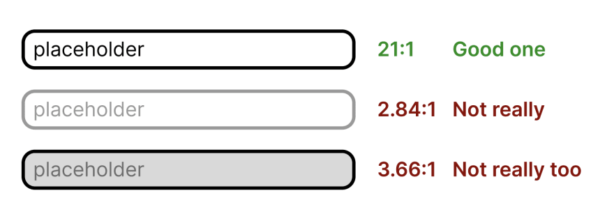
For large text, (18px) contrast should be 3:1, other text - 4,5:1.
But sometimes, for example, for disabled state, you can’t continue to use the best contrast and make input looks like disabled one.

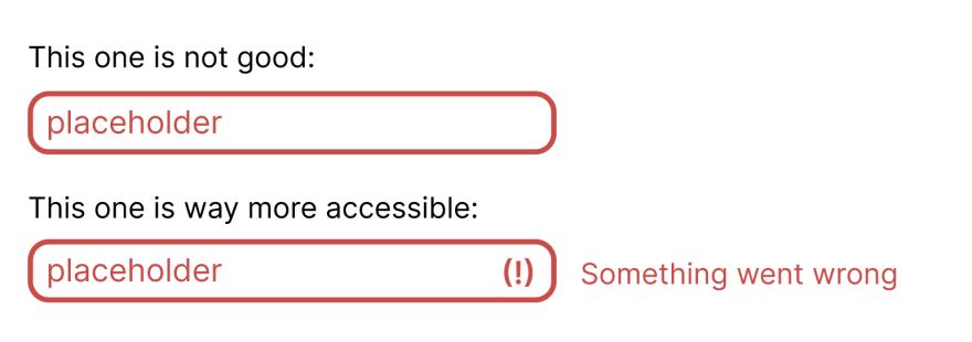
Text and colour should never be the only one source of information for user, add icons to buttons and links, add borders to information statements (pop-ups).

For form field, as input or textarea, use icons together with colour for validation state.
Operable
Users should have the ability to use a product with comfortable input devices. User can use mouse and keyboard, screen-reader or touch-screen and should be able to complete a scenario.
Make focus state visible is an easy way to support this. Together with keyboard navigation, it is a good start for accessible UI. And, as developer, you don’t really need to do a lot, don’t turn outline off, use semantic tags: inputs inside forms with labels, hierarchic headers, name parts of layout with <main />, <article /> and others. This isn’t asking for additional time in most cases, but you automatically add keyboard navigation, that means screen-readers support 😅
So, basically you need:
- Use HTML tags semantically.
- Add focus, hover, active and visited states for controls, links.
- Check that user can complete scenario with only keyboard: tab, enter, arrows.
- Make focus state be visible.
- Design complex controls using simple built-in ones (and check the guide).
Understandable
“Information and the operation of user interface must be understandable” - quite meaningless definition. But we can find few good thoughts here:
- Speak in user language. And this is not about English, French or Spain. If your user is not a lawyer - explain complex terms and simplify a text.
- Be consistent in UI - if you are using green button with “OK” text as agree-button, don’t suddenly use orange with “Agree” somewhere.
Robust
Your product should be accessible with assistants. Sounds scary, sounds like a lot of work. Nevertheless, this is pretty simple with few rules:
- Use
<a />for links, and<button />for interactive elements. If click changesURL– you need to use<a />. - Use
roleattributes, for examplerole="alert". This allows to certainly mark HTML element with its role for screen-readers. - Add
altattribute for images. This not only allows reading image content for screen-reader users, but also could show text in case of image loading error.
Wrapping this up
These simple rules don’t ask for “let’s plan next sprint for accessibility tasks and forget about it” and sounds easy enough to make your product accessible even without convincing your boss 🙂
Few additional tools, that can help you:
- https://developer.chrome.com/docs/devtools/#accessibility - Chrome developer tools allows testing accessibility right in browser.
- https://www.deque.com/axe/ - Axe tool has convenient browser extension for accessibility testing (also, you can use Axe with Jest).
- https://github.com/pa11y/pa11y - Tool for testing ally using node.js (it also has integration with Cypress).
- https://www.npmjs.com/package/eslint-plugin-jsx-a11y - ESLint plugin, that shows errors and warnings right in your editor.


Top comments (0)