In this post I'll cover some strategies to make your React application more responsive. I had a specific component in one of my projects that needed to be bypassed in order for my website to be optimal on mobile, and I will go through the steps I took to tackle that issue. Also, my Navbar component (referred to as "Menu" in Semantic UI) needed some work to look good on mobile, so I'll cover the changes I made to that component as well!

Making My Website Responsive
The main page of my nonprofit donation website, EffectiveDonate, is a world map that uses data visualization with the React D3 Library. While I was able to make the world map responsive on larger screen sizes using some D3 methods and an event listener for window resize, the map just would not look good on mobile screens. It would either be so zoomed in that the user could only see a few countries at a time, or way too zoomed out and small to click on a particular country.
Although I liked visually presenting project data through the world map component, I realized that I needed to explore new options to make my website user friendly on mobile. So I decided I would create a new simple landing page for mobile that would replace the map, which would just appear on desktop and tablet screens. The question then was - how do I do that??
Dynamic and Responsive Routing
I initially came across a feature in React called Dynamic Routing. The philosophy is that frameworks like Rails use static routing, where routes are declared before any rendering takes place. React wanted to change this style, so since v4 routing takes place dynamically as the app is rendering.
React also has a way to make routes responsive to different screen sizes. Similar to CSS media queries, React has a Media Component that listens for CSS media query responses and renders components if the query matches. This React Training gives an excellent example of how to dynamically redirect a user to a different component based on a responsive media query.
My Approach
Although the Responsive Routing I described above is a clean way to compose routes given different screen sizes, I realized the problem I needed to solve was a bit simpler. The training gave some sound advice: "Think about how to solve the problem with React’s declarative composability because nearly every 'React Router question' is probably a 'React question'". This made me think deeply about which React component I really needed to change to have my desired result on mobile.
It turns out that my LoginForm component is where the user gets redirected to the MapBrowser landing page, so that's where I zoomed in and made some changes. Previously, the user would be redirected to the MapBrowser page if they were successfully granted a jwt token upon login: this.props.history.push("/map") This is where I needed to build in some logic to redirect to the mobile landing page on small screens.

The existing map landing page
I found a helpful stackoverflow post that explained how to detect if the screen has changed to mobile in React. I created a new state in my LoginForm component called "mobile", and wrote a function that would set the state to true if the screen width is less than 760px:
resize() {
    let currentMobile = (window.innerWidth <= 760);
    if (currentMobile !== this.state.mobile) {
      this.setState({mobile: currentMobile});
    }
  }
Then, in the componentDidMount() function, I added an event listener for a window resize and then called resize():
window.addEventListener("resize", this.resize.bind(this));
this.resize();
This will ensure that whenever the component renders, the screen size will be accurately saved in state.
Next, in my login() function's fetch method, I added the following conditional logic:
if (this.state.mobile) {
    this.props.history.push("/mobile_landing")
} else {
    this.props.history.push("/map")
}
So the user will be redirected to the new mobile_landing route if they are on a mobile screen at login. Great!
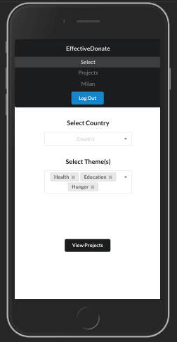
The new mobile landing page
Updating My Navbar Component
Now that the redirect from login was directed to the correct route on mobile, I had to make some changes to my Navbar component. I had attempted to use the Collapsable Menu React component with Semantic UI, since it is supposed to dynamically collapse on mobile screens, but I wasn't able to get it to look exactly like I wanted it to. Plus, my Navbar included a "Map" item, which I needed to change to "Select" on mobile, so I knew I had to find a way to customize the component and make it responsive.
I found out that the Grid Component includes an only prop that makes a Grid Row visible by adding breakpoints for certain screen sizes. I also wanted to make my mobile Navbar vertical. Semantic UI makes this super easy by just passing a vertical prop to the Menu component.
So now I could write a separate Grid Row that would only be visible for mobile screens, and would redirect to the new mobile landing page instead of the map. Here's a preview of what this separate row looks like:
    <Grid.Row columns={1} only='mobile'>
       <Grid.Column>
          <Menu size='massive' vertical inverted>
             <Menu.Item header>EffectiveDonate</Menu.Item>
             <Menu.Menu position='right'>
               <Menu.Item
                 name='select'
                 active={this.state.activeItem === 'mobileLanding'}
                 onClick={this.redirect} />
                 ...
So now the Navbar is responsive with the items that correspond to the correct routes for mobile / desktop! You can check out the two screenshots of the website above to see the different Navbars that render on different screen sizes.
Conclusion
It took some digging to find the best solutions to make my application responsive, but the approaches I took ended up being much more straightforward than expected. Both React and Semantic UI luckily make responsive design relatively easy with built-in components.
Although it would have been nice to have a visual map available on mobile as well, I've learned that the simplest solution from a UI perspective is often the best. It would get really messy to try to zoom/scroll in the map without clicking on a country.
This step felt like a big hurdle to cross in order to make EffectiveDonate fully responsive and ready to distribute more broadly. I still have lots of work to do to make each component mobile friendly, but the trickiest part is now over.
Thanks for reading!

Top comments (0)