
Exploratory Data Analysis (EDA) is the process of investigating and analyzing data to discover patterns, relationships, and anomalies. It is a critical step in any data science or machine learning project, as it helps to ensure that the data is well-understood and that any insights or models derived from the data are valid and reliable.
Data visualization techniques are used to EDA to create visual representations of the data, such as charts, graphs, and maps. These visualizations can help to identify patterns and trends in the data that would be difficult or impossible to see with the naked eye.
Some common data visualization techniques used in EDA include:
- Histograms: Histograms show the distribution of a continuous variable, such as height or weight.

- Scatter plots: Scatter plots show the relationship between two continuous variables.

- Box plots: Box plots show the distribution of a continuous variable, as well as the median, quartiles, and outliers. Bar charts: Bar charts show the distribution of a categorical variable.

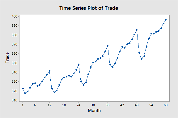
- Line charts: Line charts show the trend of a continuous variable over time.
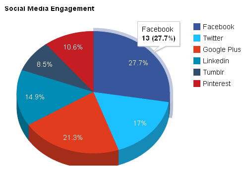
- Pie charts: Pie charts show the proportion of each category in a categorical variable.
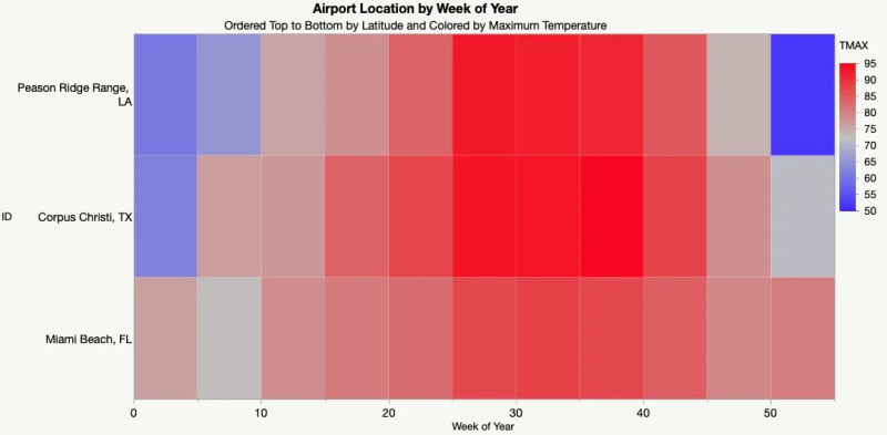
- Heatmaps: Heatmaps show the relationship between two variables, typically using a color scale to represent the strength of the relationship.
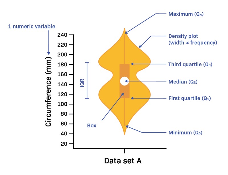
- Violin plots: Violin plots show the distribution of a continuous variable, as well as the median, quartiles, and outliers.
EDA is an iterative process, and data visualization techniques can be used at all stages of the process. For example, data visualization can be used to:
- Identify outliers and anomalies in the data.
- Identify patterns and trends in the data.
- Understand the relationships between different variables in the data.
- Generate hypotheses about the data.
- Test hypotheses about the data.
- Communicate findings to others.
By using data visualization techniques to EDA, data scientists and machine learning engineers can gain a deeper understanding of the data they are working with, and use this understanding to build more accurate and reliable models.
Here is an example of how data visualization techniques can be used in EDA:
Imagine that we are working on a project to predict customer churn. We have a dataset of customer data, which includes information such as customer demographics, purchase history, and customer support interactions.
We can use a histogram to visualize the distribution of customer tenure. This will help us to identify any patterns in the data, such as whether customers are more likely to churn after a certain period of time.
We can also use a scatter plot to visualize the relationship between customer tenure and purchase amount. This will help us to identify any trends in the data, such as whether customers who spend more money are more likely to churn.
By using these data visualization techniques, we can gain a better understanding of the data and identify any patterns or trends that may be associated with customer churn. This information can then be used to build a model that can accurately predict which customers are most likely to churn.

Top comments (0)