
We will start looking at the flex items property from here onwards.
We will use this codepen for our project.
Let’s start with the property to align a single item ie align-self.
We will use this basic setup.
<div class=”container”>
 <div class=”box box1">1</div>
 <div class=”box box2">2</div>
 <div class=”box box3">3</div>
 <div class=”box box4">4</div>
 <div class=”box box5">5</div>
 <div class=”box box6">6</div>
 <div class=”box box7">7</div>
 <div class=”box box8">8</div>
 <div class=”box box9">9</div>
 <div class=”box box10">10</div>
 </div>
.container {
 display:flex;
 border:10px solid mistyrose;
 height:100vh;
 align-items: flex-start;
}
.box {
 width:33.333%;
}
.box2{
 padding-bottom: 200px;
}
.box6{
 padding-bottom: 20px;
}
.box9{
 padding-bottom: 300px;
}
It will show as below-
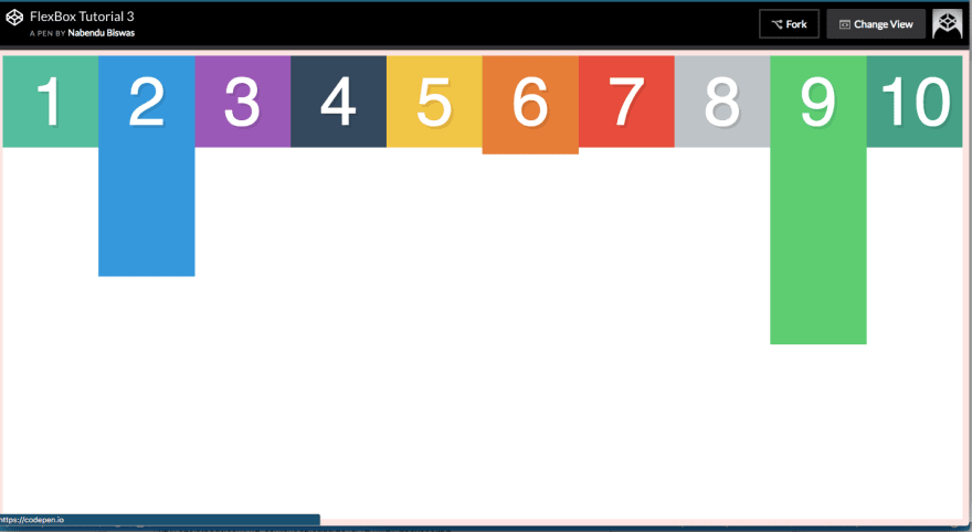 default settings
Now the align-self allows to overwrite the alignment along the cross axis for an individual flex item. We will see all main three vales in below example.
.box2{
 padding-bottom: 200px;
 align-self: flex-end;
}
.box6{
 padding-bottom: 20px;
 align-self: flex-start;
}
.box9{
 padding-bottom: 300px;
 align-self: center;
}
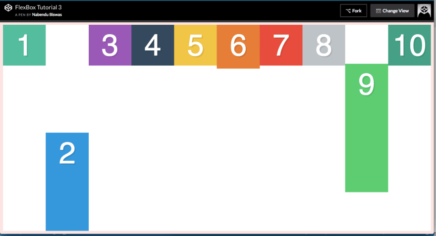 align-self
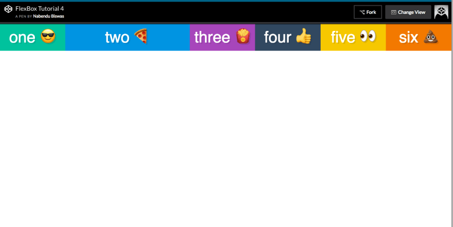
Now we will see the flex items property flex. This is actually a shorthand for flex-grow, flex-shrink and flex-basis combined, which we will see later.
The codepen for the same is here
The basic setup is -
<div class=”container”>
 <div class=”box box1">one 😎</div>
 <div class=”box box2">two 🍕</div>
 <div class=”box box3">three 🍟</div>
 <div class=”box box4">four 👍</div>
 <div class=”box box5">five 👀</div>
 <div class=”box box6">six 💩</div>
 </div>
.box {
 color:white;
 font-size: 50px;
 text-align: center;
 text-shadow:4px 4px 0 rgba(0,0,0,0.1);
 padding:10px;
}
/* Colours for each box */
.box1 { background:#1abc9c;}
.box2 { background:#3498db;}
.box3 { background:#9b59b6;}
.box4 { background:#34495e;}
.box5 { background:#f1c40f;}
.box6 { background:#e67e22;}
.box7 { background:#e74c3c;}
.box8 { background:#bdc3c7;}
.box9 { background:#2ecc71;}
.box10 { background:#16a085;}
.container {
 display:flex;
}
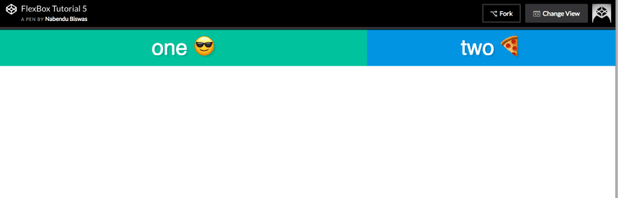
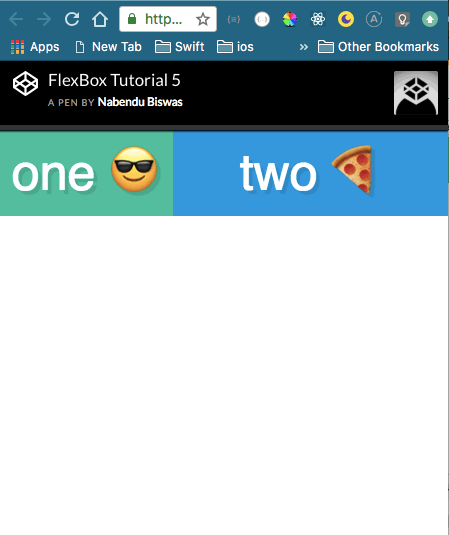
The output is -
 default setup
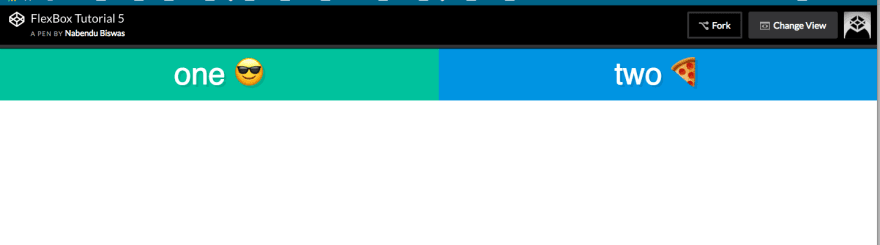
Now we can clearly, see there is some free space above. And the flex property decides how this free space will be distribute. Like if we give flex:1 to all items, the free space will be distribute equally among all flex-items.
.container {
 display:flex;
}
.box{
 flex:1;
}
 flex:1
If we give flex:2 to a single item in above scenario, it will take twice the free space as others.
.container {
 display:flex;
}
.box{
 flex:1;
}
.box2{
 flex:2;
}
 flex:2 to item2
We will learn the individual properties of flex-grow, flex-shrink and flex-basis next.
For this we will be using this codepen as basis.
<div class=”container”>
 <div class=”box box1">one 😎</div>
 <div class=”box box2">two 🍕</div>
 </div>
.box {
 color:white;
 font-size: 50px;
 text-align: center;
 text-shadow:4px 4px 0 rgba(0,0,0,0.1);
 padding:10px;
}
/* Colours for each box */
.box1 { background:#1abc9c;}
.box2 { background:#3498db;}
/* We start writing out flexbox here. The above is just page setup */
.container {
 display:flex;
}
.box1{
 flex:1;
}
.box2{
 flex:1 1 0;
}
Which will result in -
 basics
flex: 1 is shorthand for flex-grow flex-shrink flex-basis
So, as above we can write flex: 1 1 0
It means flex-grow: 1, flex-shrink: 1 and flex-basis: 0. We will learn more about them now.
flex-basis means the default size of the element before remaining space is distributed. If we give it alone, it will only take the pixels we give it. like below.
.box1{
 flex-basis: 400px;
}
.box2{
 flex-basis: 300px;
}
 flex-basis
flex-grow means how to distribute the free space between items. Like in above situation we have a lot of free space.
.box1{
 flex-basis: 300px;
 flex-grow: 2;
}
.box2{
 flex-basis: 300px;
 flex-grow: 1;
}
So, it means box1 will take twice the available free space and box2 will take in comparison with box1 single free space.
 flex-grow
flex-shrink means the ability of item to shrink in the proportion when less space is there. Will come into play when we go to mobile layout
.box1{
 flex-basis: 300px;
 flex-grow: 2;
 flex-shrink: 5;
}
.box2{
 flex-basis: 300px;
 flex-grow: 1;
 flex-shrink: 1;
}
The above means, when there is less space then shrink box1 5 times more then box2
 flex-shrink
This concludes the flexbox series. Hope you enjoyed it.

Top comments (0)