
The year is 2020 - the world is in disarray, everything is cake 🍰, and your website needs to be responsive.
Why
Let's start with some numbers. According to Internet World Stats as of this June 4.648 billion people are active internet users. That's 59.6% of the entire planet. Why is this such a big deal? Merely nine years ago it was half that number.
Well, okay, but what does this have to with responsive design? Consider that 58% of all Google searches are made from a phone. If you haven't taken this into account, and a user comes across your shiny new site while riding the train...oh no!

Not to worry though, we have a plan.
It is very possible to have a website that looks great on a desktop, and a phone, and tablet, and even on that fancy refrigerator screen.

Let's leverage the aptly named mobile-first approach.
To follow a mobile first strategy begin by building for a smaller screen width. Then add or rearrange components as device size increases, progressing naturally. Doing so, all of the content you created to make available is given to your end-user.
This is also known as progressive enhancement, the industry standard.
As opposed to designing a beautiful desktop website only to have to "shave off" components accommodate smaller devices. In the olden days this practice was known as graceful degradation.
The web’s moved beyond the desktop, and it’s not looking back. The number of devices we’re designing for is growing just as quickly as mobile traffic. - Ethan Marcotte
How
As with almost anything related to code or design within mobile-first lies much nuance. With that in mind, know that progressive enhancement begins with good fundamentals.
- Clean, semantic HTML
- Responsive CSS
- Accessibility
We will go over these points, and what they mean, but there is much more out there to learn. This is not meant to be a comprehensive guide.
HTML
In this respect nothing new is added, no special tags or attributes.
However, this is arguably your most important component. The foundation propping up strong, responsive design starts with the HTML tags we should all be familiar with.
Now, this may sound obvious, but the benefits here can't be understated.
- Codebase becomes easier to read and maintain
- Stylesheet organization is simplified
- First steps of accessibility. Just by keeping content within markup tags that describe it, so much has been achieved.
Some examples of semantic elements:
<article>
<aside>
<section>
<nav>
<header>
<footer>
<blockquote>
-
[HTML elements reference](https://developer.mozilla.org/en-US/docs/Web/HTML/Element) by Mozilla.

Keep in mind that semantic HTML is markup that presents meaning to the web page. In other words, describing *what* the content is not simply how it looks. This will be handled by the styling.
___
## CSS

As we begin to add styling to our HTML we will take full advantage of the cascading behavior of CSS. Beginning with (surprise!) our mobile styling rules first.

Taking it one step further, to set ourselves up for success we can consider defining **all** of our core design features in the first few lines. And later, modify elements as needed.

Here's an example of setting the tone for your mobile-first stylesheet.
css
body {
font-size: 16px; /* base font size /
margin: 0; / strip default margins /
width: 100%; / fill entire screen */
}
/* set font rules */
body { font-family: Verdana, sans-serif; }
h1, h2 { font-family: 'Times New Roman', serif; }
/* ##### begin mobile specific styles ##### */
/* set base font sizes */
h1 { font-size: 2.5rem; }
h2 { font-size: 1.85rem; }
h3 { font-size: 1.3rem; }
Wait, wait...there's more to it than that. Ah, yes I almost forgot.
css
header {
background-color: #8890ff;
padding: 2em;
}
article {
margin: 2em auto;
padding: 2em
}
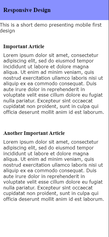
Voilà, a basic phone design.
___
___
Granted, this probably won't have investors begging to throw money at us. It will however get us to our first break point, but first let's talk about what this `em` and `rem` stuff is about.
Why not just use `px`?
A big part of creating layouts that respond to various screen widths is using relative lengths to express how space should be occupied.
By expressing sizes in relative, instead of fixed, length we allow our design some breathing room and flexibility. Fixed measurements can certainly be useful given the right circumstance, but overuse can create more work.
___
> Design is a funny word. Some people think design means how it looks. But of course, if you dig deeper, it’s really how it works. - Steve Jobs
___
Inevitably there will come a certain screen width falls apart. Usually quite literally as your content becomes stretched across the screen.
___

___
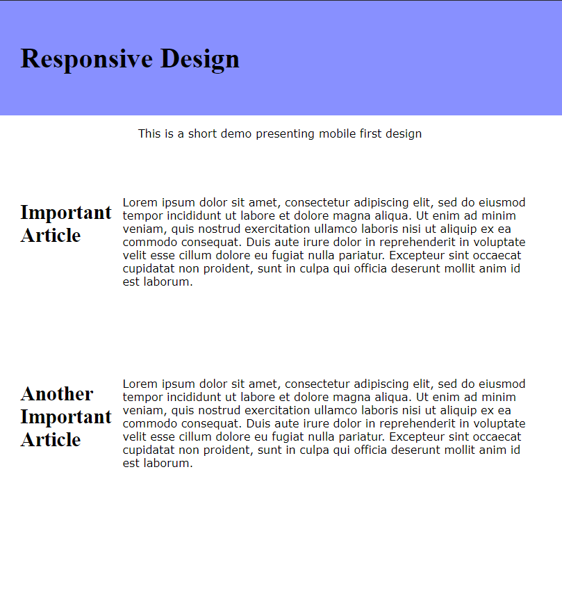
Aha! The moment we've been waiting for has arrived. By this point, we've built out well-structured, semantic HTML. We have tackled our baseline styles. Now, we add our first breakpoint.
A breakpoint is a rule we set to let the browser know how to handle certain scenarios, such as wider screens. We create breakpoints when our *design* fails, for whatever reason. This distinction is important. We are building around the design **not** the device.
To accomplish this goal we declare media queries by using the `@media` rule. Here's an example:
css
@media (min-width: 800px) {
#description { text-align: center; }
article { display: flex; }
p { margin: 1em; }
}
Nothing award-winning but our showcase does display the power of media queries.
___
___
Once more for the people in the back. The purpose of setting up our design like this isn't merely to create multiple designs for multiple devices. We're building for the public while keeping ourselves and other developers in mind.
By following the pattern of our design, we avoid creating arbitrary breakpoints to oblige the latest device on the market.
___
## Meta Tags
Giving the browser information on the code it is receiving is a vital step in communication to ensure our designs fall into place.
Without a couple simple tags parts of our page can possibly render quite differently than we expect.
Without going too much into pixels and retina displays. The most common way to instruct your browser to define width is by setting the viewport.
html
Mozilla delivers a [good explanation](https://developer.mozilla.org/en-US/docs/Mozilla/Mobile/Viewport_meta_tag) on why this is crucial.

Also, be sure to help out your browser and declare your charset.
css
@charset "UTF-8";
Check out this [article](https://bitsofco.de/meta-charset/) for more info.

## In Closing
Keep in mind there is much more to consider with designing a responsive website.
* Proper copy sizing
* Managing link sizes
* Bandwidth limits
* Responsive images
* **The entire world of JavaScript**

Examples were kept overly-simple to push that implication and encourage research.

If you are working with JavaScript there are several libraries and frameworks, like **[Pure.css](https://purecss.io/)**, or **[Bootstrap](https://getbootstrap.com/)** that can assist you with responsive elements. These are very powerful tools that can benefit extremely with a fundamental knowledge of the **mobile-first** approach.

For anyone looking for a quick start with some pre-made code I've added the [github repo](https://github.com/ncaudill27/responsive-example) to our above example. Feel free to use it how you see fit. Happy hacking!
___
You can't use up creativity. The more you use, the more you have. - Maya Angelou

Top comments (0)