
In the previous part of this series we got our setup of Stencil and Storybook up and running. This part goes a little deeper and we'll learn how to improve our stories by introducing Storybook's Knobs and Actions addons to our existing project.
Finally we'll learn how to simplify our stories by writing our Stencil Web Components directly in JSX rather than in plain JavaScript.
Note: If you are here to learn how to write your stories in JSX, you can skip to the end of this article: Use JSX to render your components in Storybook.
Adding Knobs and Action addons to the stack
To make a greater use of Storybook we first add the Knobs and Actions addons to our existing setup. The Knobs addon provides us a simple interface to modify the properties of our Web Components on the fly. The Actions addon logs all events from our Web Component, so that we can see which events are emitted.
First we install the addons:
npm i --save-dev @storybook/addon-knobs @storybook/addon-actions
And then add them to our storybook configuration:
// .storybook/main.js

...
module.exports = {
  stories: ['../src/**/*.stories.js'],
  addons: [
    '@storybook/addon-notes/register',
+   '@storybook/addon-knobs/register',
+   '@storybook/addon-actions/register',
  ],
  ...
}
Add a new component
To learn how to integrate the Storybook addons with a Web Component we start by creating a new button component called <my-button>. Again we use Stencil's built-in CLI here for creating a boilerplate for our new component:
npx @stencil/core generate


After the CLI has finished creating the new files for our component, make sure to run a quick build so that Stencil also adds a simple readme to this component:
npm run build
Since our new button component is pretty empty right now we give it more content by replacing it with the following content:
// my-button.tsx
import { Component, Prop, h, Event, EventEmitter } from '@stencil/core';

@Component({
  tag: 'my-button',
  styleUrl: 'my-button.css',
  shadow: true,
})
export class MyButton {
  @Event() onClick: EventEmitter;
  @Prop() label: string;

  handleClick(event: UIEvent) {
    this.onClick.emit(event);
  }

  render() {
    return <button onClick={this.handleClick.bind(this)}>{this.label}</button>;
  }
}
Our component now has a property label where we can define what text is shown on our button and an onClick event which is fired when the button is clicked.
Now we are ready to add a new story for this button by creating a new file called my-button.stories.js in the same directory:
src/
└── components/
    ├── my-component/
    └── my-button/
        ├── my-button.css
+       ├── my-button.stories.js
        ├── my-button.tsx
        └── readme.md
...
Inside of the file we now define our story:
// my-button.stories.js

import { storiesOf } from '@storybook/html';
import { withKnobs, text } from '@storybook/addon-knobs';
import { withActions } from '@storybook/addon-actions';

import readme from './readme.md';

storiesOf('My Button', module)
  .addDecorator(withActions('onClick'))
  .addDecorator(withKnobs)
  .add(
    'Default',
    () => {
      const buttonElement = document.createElement('my-button');
      // Knob property Label
      buttonElement.value = text('Click Me!', 'Label');
      // Event handler for onClick
      buttonElement.onClick = () => {
        console.log('Clicked');
      };

      return buttonElement;
    },
    {
      notes: {
        markdown: readme,
      },
    }
  );
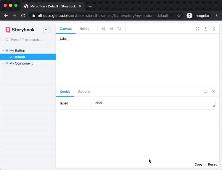
When we now start storybook we can now see that a new panel with our addons is added to the view:

Use JSX to render your Web Components in Storybook
Maybe you are wondering why we wrote the implementation of our Stencil components in JSX while our stories use plain JavaScript to initialize our components. Let's change that.
I saw the following tweet by Surma last week where he shows that with a little help of a babel transformer and 15 lines of code it is pretty easy to write DOM in JSX:
 Surma@dassurma
 Wait, is this news to anyone? Am I just late to the party? Am I missing something?
With this 15 line `h` function, you can use JSX for DOM ops w/ all the good stuff:
- Inline event handlers
- Custom elements
- Props and attributes (which React still can’t do, lol)
I dig it 🤨18:59 PM - 26 Feb 2020
66
482
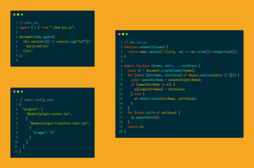
There is already a tiny library out there called jsx-dom so we don't have to copy the code from the screenshot.
In order to make it work, we need to add 3 new packages to our setup:
npm i --save-dev @babel/plugin-syntax-jsx @babel/plugin-transform-react-jsx jsx-dom
Then we add a .babelrc file to the root of our project:
// .babelrc

{
  "plugins": [
    "@babel/plugin-syntax-jsx",
    [
      "@babel/plugin-transform-react-jsx",
      {
        "pragma": "h"
      }
    ]
  ]
}
Now we are ready to rewrite the story for our button component in JSX. Simply make sure to add the pragma import { h } from 'jsx-dom'; to the top of every story that uses JSX. We then can bind the properties to variables or inline them directly:
// my-button.stories.js

import { storiesOf } from '@storybook/html';
import { withKnobs, text } from '@storybook/addon-knobs';
import { withActions } from '@storybook/addon-actions';
import { h } from 'jsx-dom';

import readme from './readme.md';

storiesOf('My Button', module)
  .addDecorator(withActions('onClick'))
  .addDecorator(withKnobs)
  .add(
    'Default',
    () => {
      const label = text('label', 'Label');

      return (
        <my-button
          label={label}
          onClick={() => {
            console.log('Clicked');
          }}
        ></my-button>
      );
    },
    {
      notes: {
        markdown: readme,
      },
    }
  );
Thanks for reading. There are still some features which are missing in this setup (e.g. Hot-Module-Replacement) which I hopefully can figure out in the coming weeks. So feel free to follow me here for more updates on this topic!
A live-demo of the Storybook is available here: https://ofhouse.github.io/storybook-stencil-example
If your are interested to try it out by yourself, you can check out the full repository on GitHub:
 ofhouse
/
storybook-stencil-example
ofhouse
/
storybook-stencil-example
Example project which uses Stencil components in Storybook.
Storybook Stencil Example
This is a starter project for building a Web Component library with Stencil and Storybook.
Getting Started
To start clone this repo into a new directory and run the following commands:
npm install
npm start
For a step-by-step tutorial how to recreate this from scratch you can follow this series of blog posts:


Features
Author

License
MIT - see LICENSE for details.

Top comments (2)
Very cool use of Surma's tweet! Great way to implement JSX in a micro way.
You should check out Storybook for Web Components too! It simplifies the setup process a bit and uses lit-html for the JSX-like syntax:
github.com/storybookjs/storybook/t...
Great article, thank you. Stencil is the future.
I dunno why all are still rewriting again and again all of the UI - react to Vue, angular to react, Vue 2 to Vue 3 when there is Stencil that allows you write once use everywhere - in Vue apps, Svelte apps, pure HTML...
Especially considering Stencils seamless integration with web workers.
Can you elaborate on how to publish components library to npm to be consumed via
"npm install mylibrary/button"
"npm install mylibrary/modal" etc.