Introduction
SVAR Svelte library, a collection of open-source, lightweight and high-performance UI components, has recently been updated to version 2.1. This release brings powerful enhancements to DataGrid and Gantt Chart, making them even more capable for enterprise-level data management.
Additionally, the SVAR team has expanded the library with three new components — Editor, Comments, and Tasklist — to provide Svelte developers with more ready-to-use UI blocks for building modern web applications.
Let’s explore what’s new in SVAR Svelte v2.1 and how these updates can enhance your development experience.
SVAR Svelte DataGrid
SVAR Svelte DataGrid is a lightning-fast, feature-rich solution for managing large datasets with ease. Optimized for speed and efficiency, it offers a comprehensive set of capabilities, covering all essential features expected from an advanced data grid.
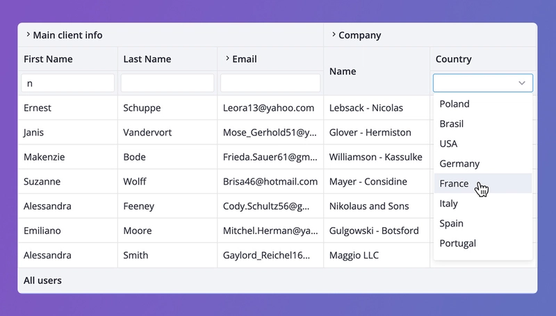
In version 2.1, SVAR Svelte DataGrid introduces enhanced accessibility, filtering features, and expanded customization options. Here’s a closer look at the key improvements:
- Improved accessibility: from now on the grid is compatible with WAI-ARIA standard. The widget provides screen reader support and improved keyboard navigation (new hotkeys added);
- Header Filters: now you can add built-in (Text, Richselect) or custom filters to the header, as well as use external controls as filters;
- Row reordering: the feature allows moving rows up and down with drag-and-drop. You can choose to show or not a drag handle. Only available for non-hierarchical data;
- Print support: users can print the data from the DataGrid by specifying the paper size and orientation; the printout will include all the data of datagrid organized in a well-structured manner;
- Custom HTML in the header/footer: now users are able to add custom content or SVAR Core controls to the header or/and footer;
- External editor integration: it is now possible to use external popup Editor for working with the content of a specific row;
- Improved UI for collapsible columns: you can add vertical placeholders for the collapsed columns; the column is expanded by clicking on the placeholder.
The DataGrid component can be installed via npm:
npm install wx-svelte-grid
SVAR Svelte Gantt
SVAR Svelte Gantt is an open-source project management tool that helps visualize project tasks, timelines, and dependencies. It can save you a lot of time if you need a project workflow tool for your Svelte app. The Gantt chart offers interactive and customizable UI, fast performance, and essential features for planning and scheduling.
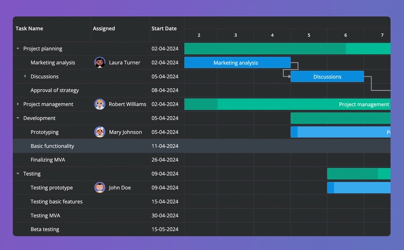
In version 2.1, SVAR introduced minor but valuable enhancements to its Gantt chart library:
- Custom HTML in column cells: now you can add custom html to cells, e.g. add avatars of the team members responsible for carrying out specific tasks. Check the demo that illustrates this feature.
- Zoom and scale improvement: inner zoom and scale logic was optimized for better precision and smoother navigation.
The component can be installed via npm:
npm install wx-svelte-gantt
New SVAR Core Components
SVAR Svelte Core is a lightweight library that contains basic UI elements and controls for creating nice-looking Svelte apps: button, checkbox, radio, select, tabs, pager, etc. Check the full list of the available elements in Core demos.
In SVAR Svelte v.2.1, the Core library was extended with new components:
- Comments — a component that helps add a comment section to your app. It allows editing, adding and deleting comments, and has two in-built views (bubbles and flow), as well as dark and light skins.
- Tasklist — allows adding a simple to-do functionality to your project. Supports CRUD operations with tasks and marking the tasks as completed.

The components can be installed via npm. Note: you need to install the Core controls first.
npm install wx-svelte-core
npm install wx-svelte-tasklist
npm install wx-svelte-comments
SVAR Editor
In version 2.1, SVAR introduced SVAR Svelte Editor, a UI component for creating editing forms for structured data on a web page. Whether for data grid rows, cards, or user profiles, it can be adapted to various use cases with customizable fields and controls.
The editor supports multiple form inputs of SVAR Core library, basic validation, real-time updates or save modes, and can be displayed as a popup, sidebar, or inline form with one or two-column layouts.
The component can be installed via npm. Note: you need to install the Core controls first.
npm install wx-svelte-core
npm install wx-svelte-editor
Check Out SVAR Svelte v.2.1
You can find all SVAR Svelte components on the SVAR GitHub page together with the licensing details. Most components are available under the MIT license, with SVAR Gantt being the only exception (GPLv3).
Above we highlighted the key innovations introduced by SVAR in its version 2.1. With enhanced data handling capabilities, improved accessibility, and new ready-to-use components, SVAR offers Svelte developers more tools to build modern web applications in less time. Whether you’re managing complex datasets, visualizing project timelines, or simply need reliable UI controls, check out SVAR Svelte 2.1!

Top comments (0)