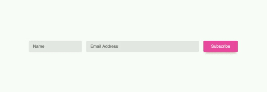
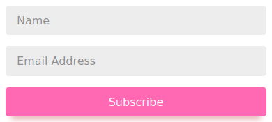
Do you always need media queries to make a website responsive? With flexbox and grid you can make responsive layouts without having to define fixed breakpoints with media queries. Adam Argyle recently showed us a tweet-sized example of this in action, where just 13 lines of CSS give you 4 separate layouts.

 4 layouts for the price of 1, thanks flex 👍
css`
form {
display: flex;
flex-wrap: wrap;
& > input {
flex: 1 1 10ch;
margin: .5rem;
&[type="email"] {
flex: 3 1 30ch;
}
}
}
`
view source on Codepen 👇
codepen.io/argyleink/pen/…22:34 PM - 14 Jan 2020
How does it work? The HTML is surprisingly simple. No wrappers or extra elements:
<form>
  <input type="text" placeholder="Name" />
  <input type="email" placeholder="Email Address" />
  <input type="submit" value="Subscribe" />
</form>
If you want to use this in production, make sure all of these input fields have associated label elements.
The CSS that does the heavy lifting is very small too:
form {
  display: flex;
  flex-wrap: wrap;

  & > input {
    flex: 1 1 10ch;
    margin: 0.5rem;

    &[type='email'] {
      flex: 3 1 30ch;
    }
  }
}
That's 13 rows, blank rows included!
What's that
&doing there?
Adam wrote this using postcss-preset-env, which is "Babel for CSS". It lets you write CSS using upcoming specs (like nesting) and compiles it to regular CSS.
So what does this CSS do?
The styling for the form and input elements work in tandem to create the different layouts, so we'll go through their CSS properties one by one. Lets start with the form element.
The form
The form is set to display:flex so has a flex layout. By default, that's a horizontal flex layout where all items fit a single row.
By adding flex-wrap: wrap, you specify that the flex layout can wrap to multiple rows if the elements don't fit a single row. Each of those rows will behave as their own flex layout, which this code uses to its advantage.
The inputs
The meat of this technique lies in the flex property on the inputs. The flex property takes three values (e.g. 1 1 10ch;) and is shorthand for three CSS properties:
flex-growflex-shrinkflex-basis
flex-grow applies when there is more space in the surrounding element (the form in this case) than the elements need. It take a positive number (or 0). The number indicates what part of the total an element takes.
The "part of the total" is best illustrated with an example. Say there are two elements, both having
flex-grow: 1. They will both be equally wide at 1/2 of the total width. But if the second element hasflex-grow: 2, the total number of parts is 1 + 2 = 3. The first item will then be 1/3rd of the total width, and the second element will be 2/3rd of the total width.
flex-shrink works much in the same way, except that it is used when there is less space than the elements would normally take up. Here, a higher number means it ends up being smaller.
In flexbox terminology, if the elements combined take up more space than available, their flexibility is set to shrink. Otherwise it is set to grow. This is not something you set explicitly, but is useful to know when working with flex layouts.
In our 4-layout example flex-wrap is set to wrap, which means that the flexibility will never be set to shrink. Instead, elements will wrap to the next row if they don't fit.
At this point, I have to admit that the calculation example I gave for the flex-grow value was a little simplified. It works that way only if the last property, flex-basis, is set to 0. Normally, flex-basis is set to auto, which makes things a little more complicated.
When flex-basis is set to auto, the number set for flex-grow and flex-shrink also take into account the width of the element, either the implicit width (called the 'content size') or an explicit width. So two elements that both have flex-grow:1 might not end up being equally wide, if one of them has much more content.
You can also set flex-basis to a value. In that situation, the initial size of an element is set to that value. In this layout, the "name" field and the button both get a value of 10ch, and the "email" field is set to 30ch.
What's a
ch?
Onechis equivalent to the width of the "0" character in a font.
The effect of this is that the name input and the button are initially 10ch wide, and the email field is 30ch wide. Because we are in a flex layout, that flex-basis value is used as the starting point for the flex-grow or flex-shrink value. Think of them as multipliers for the flex-basis value.
In this layout the "name" field and the button both have a flex-grow of 1, a flex-shrink of 1 and a flex-basis of 10ch. The e-mail field has a flex-grow of 3, a flex-shrink of 1 and a flex-basis of 30ch.
In other words, the email field starts out 3 times as wide as the other field, grows three times as fast but shrinks at the same rate.
How does that get us to 4 layouts?
That's where the flex-wrap comes into play. When elements do not naturally fit side-by-side, they go to the next row. Let's go layout-by-layout from small to large and see what happens.
The smallest layout
The three elements are stacked vertically. Here's what happens:
- There is not enough space to have all three elements side-by-side (their total is 50ch wide, 10 + 30 + 10), so elements will wrap to the next row.
- Two of them together (either name and email, or email and button) also don't fit, so the end result is that all of them are on their own row.
- We end up with three rows.
- Each row is it's own smaller flex layout, and each element on a single row is smaller than the total width.
- All of them have a positive
flex-growvalue, and don't share their row with other element, so all of them grow to the full width of their own row.
The second layout
The name field takes the full width, and the email and subscribe button are on row together. Here's what happens:
- There is not enough space to have all three elements side-by-side, so elements will wrap to the next row.
-
Things get sneaky. Even though the name field and the button have the same flex values, a
buttontype element has a slightly different content size, so ends up being slightly smaller than a regular input field. Browsers, right? - Name + email don't fit on a single row so email wraps to the next row. Because of the tiny difference, email + button do fit on a single row.
- We end up with two flex rows.
- The first row has just the name, so that takes full width because of
flex-grow. - The second row is wider than both the email field and button combined, so flex-grow is used to make them fill up the width, the email field at a much bigger ratio compared to the button.
If the last element was not a button, this layout wouldn't be possible.
The third layout
The name field and email field are shown side by side, with the button below it. What happens:
- There is not enough space to have all three elements side-by-side so elements can wrap to the next row.
- The name and email fields fit side by side, so it's just the button that wraps to the next row.
- Name and email fill out the first row in their flex-grow/flex-basis ratio, and the button fills out the second row completely.
The fourth layout
This is the simplest layout. The total width is wider than all elements, so they're distributed on a single row in their respective ratio.
But what about that button? You'd expect it to be as wide as the name field, since they have the same flex value. But here's where the sneaky thing from the second layout comes into play again: the content size of the button is less wide and so ends up being smaller.
Responsive websites without media queries?
Recreating this layout with media queries is possible but would take you 3 breakpoints at set widths and only works when the form is the full width of the page.
With this flexbox solution you can place the form element anywhere and it will fit the element it's in, giving you even more flexibility than just media queries would give you.
Using modern layout algorithm like flexbox and grid give you a lot of extra flexibility when it comes to the way your elements are laid out without needing to explicitly define them. As you can see, they let you do some pretty powerful things!
Want to develop responsive designs (with or without media queries) with easy? Check out Polypane, the browser/developer tool that I'm building that helps you build high quality websites and apps twice as fast.


Top comments (0)