
Whilst working on my latest Flutter project, it took me a long time to figure out how to change the annoyingly large text representing the date range display on Flutter's DateRangePicker (input mode) from Flutter. In this mini blog I'll share how you can change the font size and style of the text elements within Flutter's DateRangePicker UI.
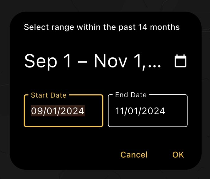
As you can see below, for my date range field, the default DateRangePicker UI displays text with a font size that is far too large, and overruns into the adjacent Calendar icon.
To address this, you need to include a Builder in your showDateRangePicker function. This is also useful when you want to customise an app theme that differs from Flutter's own default style. The builder lets you override the default styling by supplying your own custom Theme to the widget.
Here's my code for building the date range picker widget including the builder to override the default styling (we haven't changed any font sizes yet). In the builder I return a theme which contains my desired colour scheme.
 return showDateRangePicker(
    context: context,
    initialEntryMode: DatePickerEntryMode.input,
    helpText: 'Select range within the past 14 months',
    firstDate: DateTime.now().subtract(const Duration(days: 30 * 14)),
    lastDate: DateTime.now(),
    initialDateRange: DateTimeRange(
      start: initialStart,
      end: initialEnd,
    ),
    builder: (context, child) {
      return Theme(
        data: ThemeData.dark().copyWith( // custom theme
            colorScheme: const ColorScheme.dark(
              primary: Colors.amber,
              onPrimary: Colors.black,
              surface: Colors.black,
              onSurface: Colors.white,
              secondary: Color.fromARGB(255, 99, 98, 85),
            ),
           ),
        child: child!,
      );
    },
  );
Now that you have the builder, you can use its textTheme property to access the TextStyle of each UI element that controls font sizes and styles. In the code below, I've included the properties of textTheme that are required to set the font size of text elements within the date range picker (input mode) specifically. These also work within the calendar mode option.
            textTheme: TextTheme(
              headlineLarge: TextStyle(
                  fontSize: 20,
                  fontWeight: FontWeight.bold),
              bodyLarge: TextStyle(
                  fontSize: 14,
                  fontWeight: FontWeight.bold),
              bodySmall: TextStyle(fontSize: 12),
              labelLarge: TextStyle(
                  fontSize: 16,
                  fontWeight: FontWeight.bold),
            )),
So that's four properties within textTheme that allow you to change the font size within the date range picker UI:
-
headlineLarge: controls the "Date Range" text preview -
bodyLarge: controls the field start and field end label text boxes -
bodySmall: controls the error text -
labelLarge: controls the help text and confirm/cancel text
Note: since you have access to TextStyles, you can change not only font size but also properties such as font weight (bold, italic, etc), font family, spacing, shadows etc.
Here's how this translates visually, using the dateRangePicker properties to illustrate which part of the UI they are found in.
Note: the text showing "Date Range" can't be set programmatically like the others as it can only take a DateTimeRange - its style is controlled using the "headlineLarge" text theme property.

Here's the full code, including the relevant properties within showDateRangePicker that we later control with the textTheme:
  return showDateRangePicker(
    context: context,
    initialEntryMode: DatePickerEntryMode.input,
    helpText: 'helpText',
    confirmText: 'confirmText',
    cancelText: 'cancelText',
    fieldStartLabelText: "fieldStartLabelText",
    fieldEndLabelText: "fieldEndLabelText",
    errorInvalidText: "errorInvalidText",
    errorInvalidRangeText: "errorInvalidRangeText",
    errorFormatText: "errorFormatText",
    firstDate: DateTime.now().subtract(const Duration(days: 30 * 14)),
    lastDate: DateTime.now(),
    initialDateRange: DateTimeRange(
      start: initialStart,
      end: initialEnd,
    ),
    builder: (context, child) {
      return Theme(
        data: ThemeData.dark().copyWith(
            colorScheme: const ColorScheme.dark(
                primary: Colors.amber,
                onPrimary: Colors.black,
                surface: Colors.black,
                onSurface: Colors.white,
                secondary: Color.fromARGB(255, 99, 98, 85),
                error: Color.fromARGB(255, 233, 111, 102)),
            dialogTheme: const DialogTheme(backgroundColor: Colors.black),
            textTheme: TextTheme(
              headlineLarge: TextStyle(
                  fontSize: 20,
                  fontWeight: FontWeight.bold), // date range text
              bodyLarge: TextStyle(
                  fontSize: 14,
                  fontWeight: FontWeight.bold), // field start & field end label text
              bodySmall: TextStyle(fontSize: 12), // error text
              labelLarge: TextStyle(
                  fontSize: 16,
                  fontWeight: FontWeight.bold), // help text and confirm/cancel text
            )),
        child: child!,
      );
    },
  );
Summary
And there we have it! An easy way to find how to change the font size and style of text elements within the dateRangePicker widget from Flutter. Now that I've learned which textTheme properties are linked to which dateRangePicker text field properties, I can control the UI in a way that fits the means of my app design.
The same concepts will apply to other widgets, but I've focussed on the date range picker in this blog. If there was another really obvious way of changing the font size that I've missed, please let me know in the comments!
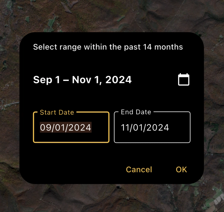
The final date range picker for my app with corrected font size!

Top comments (2)
Nice posting
I'm interested in talking to you. Could you share your email?