Button with Amazing Hover Effects
In this blog, we are going to learn “How to Create a button with hover effects Using HTML & CSS Only.”
](https://res.cloudinary.com/practicaldev/image/fetch/s--eidP13j5--/c_limit%2Cf_auto%2Cfl_progressive%2Cq_auto%2Cw_880/https://cdn-images-1.medium.com/max/2560/1%2A5BTB91DDFsmou08JLdyAow.png)
Points to be discussed
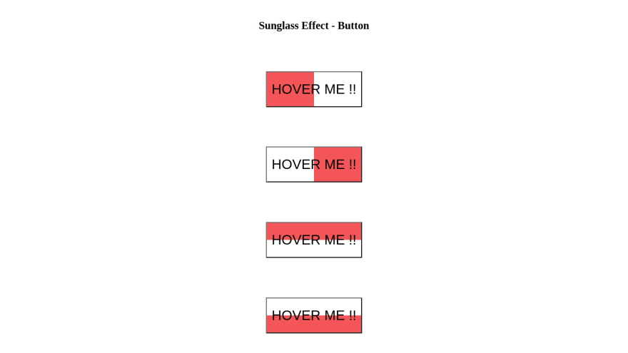
Preview
YouTube Tutorial
HTML Code
CSS Code
References
Preview :
A live demo of the website can be viewed by clicking here.
YouTube Tutorial :
HTML CODE :
index.html
<!DOCTYPE html>
<html lang="en">

<head>
  <meta charset="UTF-8">
  <meta http-equiv="X-UA-Compatible" content="IE=edge">
  <meta name="viewport" content="width=device-width, initial-scale=1.0">
  <title>Button Hover Sunglass Effect</title>
  <link rel="stylesheet" href="style.css">
</head>

<body>
  <div class="main">
    <h1>Button Hover Sunglass Effect</h1>
    <button id="btn_1"> Hover Me !!</button>
    <button id="btn_2"> Hover Me !!</button>
    <button id="btn_3"> Hover Me !!</button>
    <button id="btn_4"> Hover Me !!</button>
  </div>
</body>

</html>
CSS CODE :
style.css
* {
  margin: 0;
  padding: 0;
  box-sizing: border-box;
}

.main {
  width: 100vw;
  height: 100vh;
  display: grid;
  place-items: center;
}

/* Common CSS Code for all buttons */
button {
  background: transparent;
  font-size: 2.5rem;
  padding: 1rem 0.5rem;
  position: relative;
  transition: all 0.5s linear;
}

button::before {
  content: '';
  position: absolute;
  background-color: rgb(245, 86, 86);
  transition: all 0.4s linear;
  z-index: -1;
}

button:hover {
  color: white;
}

/* Code According to effect */
/* btn_1 */
#btn_1::before {
  width: 0%;
  height: 100%;
  top: 0;
  left: 0;
}

#btn_1:hover::before {
  width: 100%;
}

/* btn_2 */
#btn_2::before {
  width: 0%;
  height: 100%;
  top: 0;
  right: 0;
}

#btn_2:hover::before {
  width: 100%;
}

/* btn_3 */
#btn_3::before {
  width: 100%;
  height: 0%;
  top: 0;
  right: 0;
}

#btn_3:hover::before {
  height: 100%;
}

/* btn_4 */
#btn_4::before {
  width: 100%;
  height: 0%;
  bottom: 0;
  right: 0;
}

#btn_4:hover::before {
  height: 100%;
}
References :
GitHub Repository: https://github.com/rutikkpatel/HTML-CSS/tree/main/Button%20Hover%20Sunglass%20Effect

Top comments (0)