Do you want to make button components with React, but aren't sure where to start? Interested in making them fully versatile and functional for the widest possible audience? Does User Experience and Accessibility matter to you? Well you've come to the right place. I will show you step by step how to make reusable, accessible toggle buttons with React. After reading this post you'll also be able make inclusive button elements that you can reuse in all of your React projects.
We'll be covering how to make the Button Component, How to use and re-use the Button Component in the App Component, and How to style the components for Accessibility using CSS.
Estimated reading time: 11 minutes
Why make Accessible Toggle Button With React?
React is a generally easy to use Javascript Library that allows developers to create reusable, interactive elements for user interfaces. React is exploding in popularity, yet I don't see much focus in online tutorials for making React components accessible.
Building for accessibility with HTML alone is time consuming, and error prone. With React, you have the capability to make easy to reuse, plug and play components. Starting off with accessibility at the forefront seems to be the wise choice.
What are toggle buttons?
Not all buttons are created equally. Or in some cases they have multiple states of being, but generally perform only one task or another. Buttons like on/off switches, send message buttons, or next/previous buttons are all considered toggle buttons.
Toggle buttons should respond to the user to inform them of its current state. If you, as the web developer, don't relay the current state of a toggle button to the user, the user will have no idea if the button performed its task. For a send button, a user might ask themself, did I hit send?
Therefore, you need to relay the message of state to your user. As a developer, you have to consider that not all users will be able to see. Those that are may have difficulty understanding the state you're trying to communicate. In this tutorial, I'll show you how to make buttons that are easy to understand for a wide range of users.
Key Concepts
Easing Cognitive Load - We use color, iconography, and styling for easier understanding and better comprehension.
Buttons, Semantic Structure, and Labeling- Learn how to build buttons the way they were meant to be built.
👀 See how Semantic HTML5 works for labeling buttons.
Visual Feedback - This refers to communication from the Web Application to the user after the user has performed some action. Most of us are familiar with visual feedback, like hover or focus color changes on buttons and links. Something to keep in mind is that non-visual feedback should also be provided since some users will not be using a visual interface. In this article we provide visual feedback through the styling of the aria attributes and with the use of icons.
👀 See how to style toggle buttons inclusively.
👀 See how to incorporate Font Awesome Icons for visual understanding.
Audio Feedback - Learn how easy it is to provide audio feedback for toggle buttons.
👀 See how I provide audio feedback to non-visual users.
Let's start!
Starting off, below is an image of the project. You can see the build here, on Github Pages. Also, check out the source code here so you can see the complete picture.

Making The Button Component Accessible
Because we are building this component to be reusable, let's start by adding some props to the button component. The button will only need two props. A label, and the fontIcon. I'll go into the font icon more below.
Creating the Button Component:
Inside the App.js file, I have created the Button Component. This allows me to pass all of my button functionality down as props.
const Button = ({label, fontIcon}) => {
}
    return <button className={label} ref={buttonRef} onClick={onButtonClick} type="button" aria-pressed={ariaPressed}>{faIcon}{label}{faIcon}</button>;
}
Labeling Accessible React Toggle Buttons
The great thing about using semantic HTML, and therefore a button element, is that the button element will tell the browser what its role is a button, and needs no additional labeling besides the text inside the button. Another benefit to the HTML button element is that this label will be translated by translation services in the browser. This makes the toggle buttons even more inclusive.
The button element below has a type="button" attribute and a label prop that will allow us to reuse this component as needed. For the text of the button, and for the className attribute we use the label prop. This allows our classes to be generated dynamically and speeds up our development process.
    return <button className={label} ref={buttonRef} type="button">{label}</button>;
}
Providing Audio Feedback
You can tell screenreader's the role of your toggle button using the Aria-Pressed attribute. The user is only told that the button is pressed, so long as the aria-pressed attribute is true. And this is how we provide audio feedback to our non-visual users.
Below I've added an aria-pressed attribute. Then we connect it to a piece of state. I've also added an onClick function called onButtonClick:
return <button className={label} ref={buttonRef} type="button" aria-pressed={ariaPressed}>{label}</button>;
Next, I'll add this state to my inclusive button component:
const Button = ({label, fontIcon}) => {
    const [ariaPressed, setAriaPressed] = useState(false);
Here's how we use the ariaPressed state in our onButtonClick function:
const Button = ({label, fontIcon}) => {
    const [ariaPressed, setAriaPressed] = useState(false);
    const [faIcon, setFaIcon]           = useState(fontIcon);
    const buttonRef = useRef(null);

        //enter button events
const onButtonClick = () => {
    if (ariaPressed === false){
        setAriaPressed(true);
        setFaIcon(<FontAwesomeIcon icon={faThumbsUp} />);
        setTimeout(() => {
            setAriaPressed(false);
            setFaIcon(fontIcon);
        }, 1555);
 console.log("button clicked");
    } else {
        setAriaPressed(false);
        setFaIcon(fontIcon);
    }
}
As you can see, in the if statement above I've added a setTimeout function. This function will only allow the pressed state to last for about 1.5 seconds. If I send an email and my aria-pressed=true state is left true (or pressed) I may not be able to send a message again.
The Button Component
const Button = ({label, fontIcon}) => {
    const [ariaPressed, setAriaPressed] = useState(false);
    const [faIcon, setFaIcon]           = useState(fontIcon);
    const buttonRef = useRef(null);

        //enter button events
const onButtonClick = () => {
    if (ariaPressed === false){
        setAriaPressed(true);
        setFaIcon(<FontAwesomeIcon icon={faThumbsUp} />);
        setTimeout(() => {
            setAriaPressed(false);
            setFaIcon(fontIcon);
        }, 1555);
 console.log("button clicked");
    } else {
        setAriaPressed(false);
        setFaIcon(fontIcon);
    }
}
    return <button className={label} ref={buttonRef} onClick={onButtonClick} type="button" aria-pressed={ariaPressed}>{faIcon}{label}{faIcon}</button>;
}
Reusing the Inclusive Button Elements in The App Component
Because I created a state and onClick function for my label and font awesome icons inside of my Button component, I am able to reuse these buttons endlessly in my App Component.
Creating The App Component:
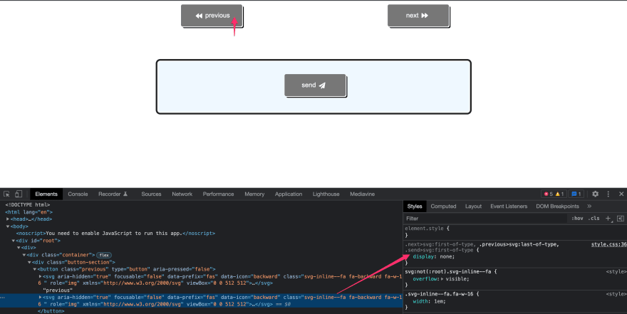
Below I have two containers. The first contains the next and previous toggle buttons. The second contains the Send button.
Each label is set in the Button component attributes and the icons that are set correspond with the purpose of the button. The aria-pressed attribute is set to false when the component first renders.

The App Component:
const App = () => {
    return (
        <div className="wrapper">
        <div className=" button-section container">
            <Button fontIcon={<FontAwesomeIcon icon={faBackward} />} label="previous" />
            <Button fontIcon={<FontAwesomeIcon icon={faForward} />} label="next" />
            </div>
        <div className="container two">
            <Button fontIcon={<FontAwesomeIcon icon={faPaperPlane} />} label="send" />
        </div>
        </div>
            );
}

export default App;
How To Style Accessible React Toggle Buttons
Truly inclusive button elements will provide users comprehensive understanding of the user interface in split seconds. In other words, don't make your users think! Make the feedback to the user as easy to understand and informative as possible by planning your elements ahead of time.
What Is Cognitive Load?
According to Wikipedia, cognitive load refers to the used amount of working memory resources. I like to imagine we each wake up each day with a cognitive load fuel tank that may or may not be full. The amount of fuel you have is your available cognitive ability. Users with sensory processing, mental health disorders, or difficulties with executive function are going to expend more of this cognitive fuel tank than others would. So, it's our job as developers to be as "fuel efficient" as possible for our users.
Styling the toggle buttons inclusively
Color queues can help increase the "fuel efficiency" of our accessible toggle buttons. Targeting the various states of the toggle button can help the user know if they haven't pressed the button yet, that they pressed the button, and that they had pressed the button.
Button not pressed:

The Button pressed (aria-pressed=true):
Ths user pressed the button at some point:

Color alone cannot account for all users. Many users experience color differently. To build our toggle buttons inclusively, we need to first ensure our contrast ratio's pass, and second include icons for better visual comprehension.
We start with the basic button styles. We ensure that our background and foreground colors are passing the contrast ratio test, linked above:
button {
    font-size: inherit;
    border: 0.125rem solid transparent;
    padding: 1rem 1.5rem;
    border-radius: 0.25rem;
    min-width: 150px;
    background: #595959;
    margin: 3% 5%;
    color: #fff;
}
For the user interaction styles,
- First, we add a style for
[aria-pressed]; this sets up how the button will appear to be "pressed" when the :focus element is active. - Next, we add a style for the
[aria-pressed]:focuselement so that a user sees a change and knows the button was pressed at some point, but is ready to use. - Finally, we add our
[aria-pressed=true]:focusstyle; which appears to depress the button as well as changes the color to a passing contrast of green and white.
/**User interaction styles**/
[aria-pressed] {
    position: relative;
    top: -0.25rem;
    left: -0.25rem;
    box-shadow: 0.125em 0.125em 0 #fff, 0.25em 0.25em #000;
}
[aria-pressed]:focus {
    outline: 2px solid transparent;
    box-shadow: 0 0 0 0.25rem #222;
    color: #ffffff;
    border: 2px solid #ffffff;
    background: #595959;
    transition: background-color ease-in-out 500ms,
    color ease-in 200ms, border-color ease-in 200ms,
    box-shadow ease-in 200ms;
}

[aria-pressed='true']:focus {
    box-shadow: 0 0 0 0.25rem #222,
    inset 0 0 0 0.15rem #595959,
    inset 0.25em 0.25em 0 #fff;
    background-color: #006600;
}
Iconography for Visual Understanding
First, you’ll want to install Font Awesome in your React App. Start here.
Starting back at my Button component
I import the Font Awesome react library and import the thumbs up icon.
import { FontAwesomeIcon } from '@fortawesome/react-fontawesome';
import { faThumbsUp } from '@fortawesome/free-solid-svg-icons';
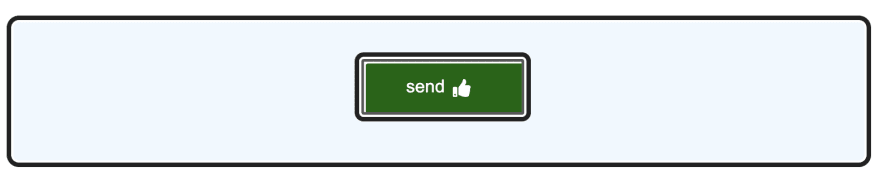
This icon is a part of my onButtonClick function. It tells the user that so long as aria=pressed is true, they receive a thumbs up letting them know the process was successful.
const onButtonClick = () => {
    if (ariaPressed === false){
        setAriaPressed(true);
        setFaIcon(<FontAwesomeIcon icon={faThumbsUp} />); //so long as aria-pressed is true show a thumbs up
        setTimeout(() => {
            setAriaPressed(false);
            setFaIcon(fontIcon);
        }, 5555);
 console.log("button clicked");
    } else {
        setAriaPressed(false);
        setFaIcon(fontIcon);
    }
}
We can see that the aria-pressed attribute is true and the button has a thumbs up icon:

Back in my App component
I'm going to add icons to help the user understand what the button does.
At the top of my file, I import the Font Awesome React components I need:
import { FontAwesomeIcon } from '@fortawesome/react-fontawesome';
import { faForward } from '@fortawesome/free-solid-svg-icons';
import { faBackward } from '@fortawesome/free-solid-svg-icons';
import { faPaperPlane } from '@fortawesome/free-solid-svg-icons';
And within each button component, I've included the font awesome component and icon I need:
  <Button fontIcon={<FontAwesomeIcon icon={faBackward} />} label="previous" />
  <Button fontIcon={<FontAwesomeIcon icon={faForward} />} label="next" />
Styling the icons
Because my button component has two instances of the font icon, I need to be sure I hide the unnecessary duplicate icon.
/**Icon styles**/

.next > svg:first-of-type,
.previous > svg:last-of-type,
.send > svg:first-of-type {
    display: none;
}
.svg-inline--fa {
    padding-left: 7px;
    padding-right: 7px;
    margin-bottom: -2px;
}
.next > svg:last-of-type {
    margin-bottom: -1px;
}
Here we can see that, while there are two svg elements within this button, only the arrow to the left shows for the previous button while the right arrow is set to display:none;
Wrapping Up
In this article, we built a Button Component that can be used and re-used in the App Component for anything you can think of. We learned how to provide audio feedback using semantic HTML and the aria-pressed attribute. How to also use iconography and the aria-pressed attribute to style our buttons to ease cognitive load. Hopefully, now you have a pretty solid understanding of how to build accessible toggle buttons with React.
If you're interested in learning how to make more React Components Accessible, check out this post on making an Accessible To Do list with React.
Photo by Ferenc Almasi on Unsplash

Top comments (3)
I like this. I didn't know about the audio feedback with
aria-pressedbefore.Can I add a couple of suggestions?
You can syntax-highlight your code blocks by adding the language (in this case probablu
jsorcssto the triple-backticks you use to start the block. You can also add alt text descriptions to images in Markdown by writing it between the square brackets.I notice you use font icons on the "previous" and "next" buttons. I'm not 100% sure how it works, but I imagine that in right-to-left reading languages, the concepts of "left" for "go back" are reversed. It might be a good idea to pass through another prop to allow for this.
A final thought: you use semantic HTML for the
Buttonbut you then wrap it in an unuseddivelement, introducing non-semantic, er... "stuff"... to the component. It will allow you to add extra styling some time in the future, but I can't imagine anything concerning the button itself you couldn't style with just the button element - so if it's there for future styling then it's probably not ever going to be used, and ditching it would be fine.Thanks for your thoughts! I'll take those into consideration!
Hey, thanks again for your suggestions, I made a couple of tweaks to my post based on your feedback!