
A caveat - I am learning while writing. My own homepage & portfolio need work too!
I don't think anyone can know absolutely everything there is to know about web accessibility, because it covers the whole breadth of humanity and how we all go through life - offline and online - in different ways.
But, we can pledge to keep our minds open to inclusivity, and easily make reasonable accommodations in our code that can really help people out.
Apply accessibility methods as you learn
Some of us developers start looking into accessibility and maybe have a little panic about the things we've been doing poorly, and the people we might therefore have inconvenienced, or shut out of the content we have been serving. There is a lot to take in. The temptation is to just carry on and pretend we didn't read that very confronting article making it clear we need to Do Better.
I mean, yes, we do. But also, remember how we learn to code - step by step - many things are overwhelming until they aren't, and it's the same with a11y. We'll get there, keep improving the things we do as we go along, with awareness of all this humanity of which we are also a part :)
This article is intended to be only a brief overview that covers a11y issues with:
...this is not at all an exhaustive list, but it's a good start. Let's go:
Page structure
Do you use Word? If yes, do you remember when you discovered the automatic headings and styles, with automatic numbering at various heading depths, from which you could just wave a magic wand and create a Table of Contents of your whole essay or report? I like to think that a well structured page on a website would also make a sensible ToC after scraping the page's HTML.
Semantic HTML
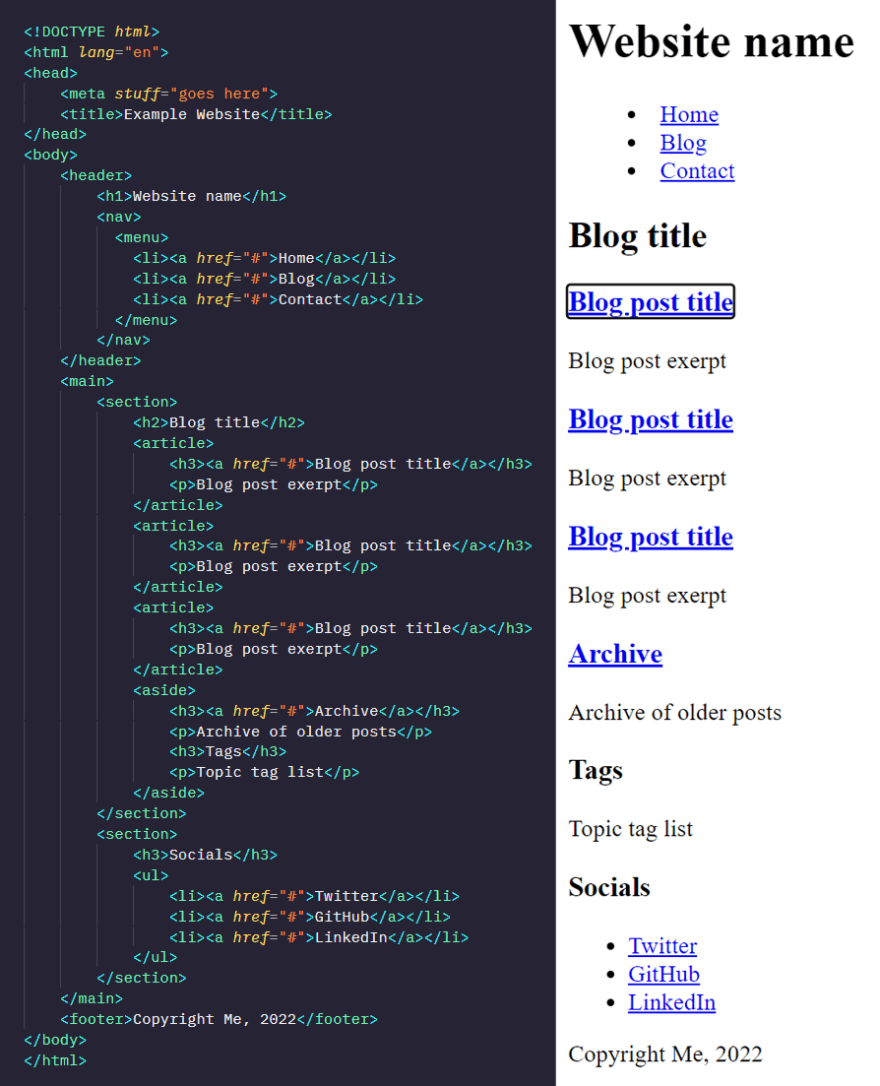
Not only can we use various levels of heading (<h1> to <h6>) like in word-processing software to convey meaning and show which headings are sub-headings of others, HTML also has many tags which make clearer the broad nature what is inside of them - an example using these tags is below - not one <div> in sight:
<!DOCTYPE html>
<html lang="en">
<head>
    <meta stuff="goes here">
    <title>Example Website</title>
</head>
<body>
    <header>
        <h1>Website name</h1>
        <nav>
          <ul>
            <li>Home</li>
            <li>Blog</li>
            <li>Contact</li>
          </ul>
        </nav>
    </header>
    <main>
        <section>
            <h2>Blog title</h2>
            <article>
                <h3>Blog post title</h3>
                <p>Blog post content</p>
            </article>
            <aside>Interesting extra info</aside>
        </section>
        <section>
            <h3>Comments</h3>
            <article>First!</article>
            <article>Great post!</article>
            <article>Very informative!</article>
        </section>
    </main>
    <footer>Copyright Me, 2022</footer>
</body>
</html>
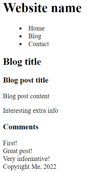
And the automatic output in the browser is already readable, if not very pretty:
Screen readers & Reader mode
These semantic tags are better picked up by screen readers for the visually impaired, and if the site has the right properties*, a stripped-back 'reader mode' may be unlocked (depending on the browser), so that users can choose to read it in their chosen style and colour of font and background.
*What exactly is needed for a browser to offer up reading mode on a website is somewhat unclear, unfortunately. Articles speak of semantic HTML, but that seems to be not all that is required. Any more information on this is welcome!
Commenting out or disabling the CSS (or other methods of styling) on your site to see what is generated by the bare HTML, is good way to get a baseline idea as to whether your site is readable for those not seeing all the styling and layout for any reason.
It's worth having a play with your OS screen reader (in Windows it's called Narrator, VoiceOver on iOS and macOS, TalkBack on Android) or downloading a popular free one like NVDA. If the readers jump around erratically, miss out chunks of text, link or button names, or include things you wish to be hidden - then you know immediately which sections you need to work on.
There are more tools that let us check out how well-structured and accessible our sites are, which I'll go into in more depth in the next blog post in this series :)
Focus order
Later, after you add links, buttons, and other functionality, they need to be focusable by the browser for someone not using a mouse or a touch screen. It's worth returning to the plain unstyled, unformatted mode to check that the Tab key goes to each focusable element on the page in a sensible order.
If this is OK, the next job is to see that it still retains that order once all the styling and any JavaScript functionality is reapplied.
Responsivity to font size
Hopefully you've already designed your page to work well on mobile devices, so changing the font size on your desktop monitor or laptop to 200% doesn't destroy your website - but this is worth checking.
How about on a smaller device? Do you allow zooming? And if you change the mobile browser font size to 200%, how does that change your pages? What about flipping the phone into landscape mode?
Contrast levels
Generally we only hear about contrast levels in terms of a 'high contrast mode' for people with visual impairments, who sometimes need it to see elements and text more clearly. But, this is really only a very small part of the whole story.
It can actually be rather tiring on the eyes to read completely black text on a completely white background. Many websites use a shade of grey for the text, and/or a light grey for the background (vice-versa for dark mode). In some cases a too-high-contrast can even trigger pain in some people.
In fact reader modes are often a variation on this theme by default; an off-white background with not-quite-black text. We think of physical book pages as black and white, but in real life we have shadows. A book printed on very white paper is actually quite difficult to read in blazing sunshine. The dev.to editor's text colour has a lightness of over 40% up from solid black.
Migraines
@Tiia made me aware of a study of migraine sufferers where their aversion to contrast and the movement of a grating pattern was tested. A very brief summary of the results is tabulated below:
Table 1: Mean (standard deviation) percent contrast of the grating at which the participant chose to abort the trial. The data are shown separately for migraineurs and controls for each type of grating (static, drifting and vibrating).
| Static | Drifting | Vibrating | |
|---|---|---|---|
| Control (N=25) | 90.69 (15.87) | 65.40 (27.26) | 70.00 (27.78) |
| Migraine (N=18) | 82.82 (16.27) | 49.95 (22.88) | 54.03 (24.49) |
It's a little unclear to me how their calculated contrast percentages line up with other contrast metrics we use online.
What is clear however, is that the more something moves the less contrast we like, both for people who get migraines and people who don't. I find it interesting that drifting is less tolerated at higher contrasts than vibrating - especially as we usually scroll down websites, in a rather drifty sort of way.
Case study: Ravelry
Ravelry is a very popular website with knitters and crocheters. It's an impressive database into which people put their projects; the yarn they're using, what colour it is, the stitch style, the pattern (instructions), photos of progress and finished articles - the joy of looking for a pattern and seeing how hundreds of other people have made the same article is great!
However, they got into some hot water a while ago, when they launched a redesign.
Ravelry is no stranger to (political) controversy, however this time there was uproar, with many users complaining of pain and sickness upon viewing the site. Some speculate that the turbulent times surrounding the redesign may have made people more sensitive to the changes:
It was mid-June, about three months into the pandemic and three weeks after the killing of George Floyd. The redesign, meant to lift the spirits of its users and improve the low-vision and mobile-user experience, was not well received by all. Some longtime users reported that the site was now triggering seizures and migraines.
(This is from an article in the New Yorker - for the redesign-specific text, start from the bottom and scroll up to the paragraph starting with the large L.)
Whether this is true or not, Ravelry did go from having soft, muted-grey 3D buttons and table borders, to a more Neubrutalistic style with dark, solid borders and solid black shadows on a white background:
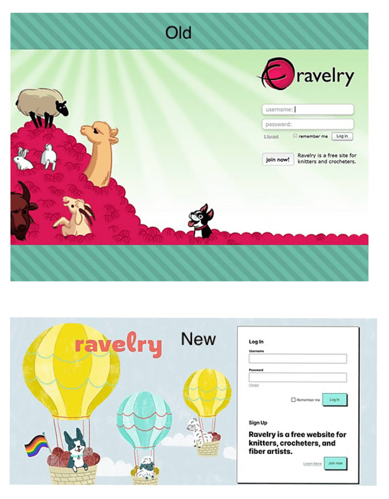
And when scrolling through hundreds of projects as one does when using Ravelry, we start to see that maybe all these hard black lines moving up the page might start to resemble a high-contrast drifting grating, as used in the migraine study:

More before and after images can be seen here on Imgur.
The intention may have been to use such a high-contrast on purpose for those with visual impairments, however it clearly - however much the responses were wrapped up in the heightened feelings felt worldwide at that time - isn't comfortable viewing for all.
I've mentioned Neubrutalism or Neo-Brutalism in web design - a quick google will show you lots of eye-popping design! There's definitely a place for pushing the boundaries, as long as people are given the choice not to have their eyes popped, and to be able to view the content without discomfort or pain. Methods for how to offer this choice is something I'll come to later in this series of articles.
Anxiety-inducing design
We come to the last aspect of accessibility I intend to cover in this article, which while new to me is at the same time so very unsurprising:
Some user interfaces can heighten anxiety and panic in users.
Sometimes accidentally. Sometimes on purpose.
Accidentally anxious
In most cases I believe this to be unintentional.
Designers and developers are usually just trying to deliver information in what they believe to be the best way possible, or in other cases they're in a hurry building an MVP (a Minimum Viable Product, that's "good enough for now") and haven't thought through the whole UX (User eXperience) yet.
Such a website might include:
- High density of information
- Endless scrolling (of which you can never get to the 'end')
- Glitchy animations
- Unclear paths
That last part, unclear paths - this is when it can really get frustrating and even worrying for people.
Imagine navigating the path to a purchase, maybe an expensive one - and you're not perfectly sure that you chose all the correct options (i.e. dates for travel, number of people and their details, anything else that might make the purchase wrong in some way). Then imagine that the purchase flow isn't assuring you that you'll get a chance to confirm or change all the details before committing to the spend.
I've certainly cancelled payment in order to go back and double-check before. This can often confuse the payment systems depending on how they have been invoked. We need such paths to be crystal clear and reassuring.
Anxiety aware: Dark patterns
What I mean by this is not that the designers of the site are aware of anxiety and trying to mitigate it, but quite the opposite.
Imagine a website that involves booking things - trips, hotel rooms, experiences, etc. Maybe there are a limited number of these things available. Maybe, if the user is made to feel like they are running out of time, or that the availability is low, they might pay more. There are plenty of sites that leverage these anxieties to score a sale.
The methods use range from quite innocent descriptions, to outright stressful UX:
- "Only 3 left!"
- "In the baskets of 10 other users"
- "You have 5 minutes to complete your purchase"
- "5 other users are considering this booking"
- Countdown timers on the contents of the basket
- Pop-ups and modal windows - "Wait, before you go!"
Some of these even appear just as you mouse up to the tab:

These are all designed to make a person anxious, in order to complete a sale, and are examples of several different kinds of "dark pattern" often seen on the web. Look out for them - the more you know that even friendly looking sites are looking to trick you into divulging information or giving them money, the more often you can see the tricks for what they are.
How is this related to accessibility?
Whether they have and haven't been clinically diagnosed as anxious, many people will avoid certain websites or completing certain higher-stakes or higher-cost actions online, for fear of being conned, doing something wrong, or having their payment details stolen.
This is common - and if someone is too frightened to access a service, then clearly it is just as big an a11y problem (if not worse than) as poor semantic HTML!
Conclusion
Like I said near the top - this is no exhaustive list, but I hope it's given you something to chew on.
Generally if anything on a page is even slightly uncomfortable for a user with no known disabilities, then there will be people for whom that page is unusable.
That's not to say that all apps and websites need to be calm, zen-like spaces - many people gravitate to things that look more exciting! For example, if we consider a design showcase that offers no services, then there is rather less of a reason to tone it down. Some games are known for eliciting a fear response, designed to make your heart race, this is art - like a good horror movie.
But we really don't need our daily tools and services to cause us headaches and stress.
References, a.k.a. Further reading:
- Why Offering A Low Contrast Mode Makes You More Accessible, Not Less
- Cortical hyperexcitability in migraine and aversion to patterns
- How Politics Tested Ravelry and the Crafting Community
- Neubrutalism is taking over the web
- A web of anxiety: accessibility for people with anxiety and panic disorders

Top comments (0)