
I think that each competent project manager heard about a system of the "flexible" approaches to software development. It is about the "Agile methodologies" based on the values of the "Agile Manifesto" and the 12 principles that underlie it.
Kanban is one of the most popular approaches to implementing agile principles in software development (and not only). It assumes discussion of the problems in real time and full transparency of all work processes.
All tasks are displayed on a special Kanban board. It is used to visualize, analyze and optimize the workflow. This approach allows the team members to check the status of each individual task at any stage of development. Besides, you will be able to assess the progress of the project as a whole.
In this article, I want to tell you about one of the complex widgets of the Webix library, which implements the key principles of the kanban approach. We'll talk about such a project management tool as JavaScript Kanban and discuss its key features. Let's figure out how everything works.
What is Webix Kanban
Webix Kanban Board is a convenient and intuitive tool for managing "agile projects". Using this component you can visualize and track your team's workflows, as well as monitor the specific project tasks.
How It Works
The widget operating principle is based on special cards arranged in columns and rows on the Kanban board. Each card is a separate task with a specific name, description of details, assigned performers, deadlines, and other equally important attributes. Each column represents a certain stage of the readiness of a particular task.
Using this approach, the technical and service teams can understand how much work they need to take on. They can do the assigned tasks while adhering to the principles of continuous improvement.
It's worth noting that Webix Kanban is fully written in JavaScript and CSS. You can easily determine the appearance of the board and its structure. You will also be able to customize the widget for the specific features of your project.
Functionality
The widget has a fairly large set of flexibly customizable features. They'll help you to manage the team's workflow more efficiently, taking into account even the smallest nuances.
In particular, you can manage the tasks (kanban cards) in the following way:
- create, edit, copy, and delete tasks
- move tasks between columns (thus changing their status)
- set tags and the priority of task execution
- assign responsible users
- customize and style the card content
- sort and filter the tasks according to certain parameters
- add images to cards, attach extra files and discuss nuances in the comments.
The widget interface is also configurable quite flexibly. You can create any number of tasks and distribute them into the corresponding columns, as well as define the internal structure for each of them. Below I will talk about this in detail.
If the built-in functionality isn't enough for you, you can create a custom one using special templates. They allow you to configure both the app interface and its behavior.
Creating Kanban with Initial Functionality
JavaScript Kanban is one of the complex widgets of the Webix library. It can be purchased along with the Pro version of the library, as a part of one of the licensed packages. Details can be found on the licensing page.
You can assess in practice all the advantages and flexibility of working with Kanban (and not only). For this, you need to download the trial Pro version of the library. It includes all complex widgets and is available free for 30 days.
Now let's see how to include the required sources and initialize the widget on a regular HTML page.
Considering that Kanban is built on the Webix components, to initialize it you should first include the main library sources.
<!-- Webix -->
<script type="text/javascript" src="codebase/webix.js"></script>
<link rel="stylesheet" href="codebase/webix.css" type="text/css">
Next, you need to specify the corresponding paths to the .js and .css files of the Kanban Board.
<!-- Kanban Board -->
<script type="text/javascript" src="codebase/kanban.js"></script>
<link rel="stylesheet" href="codebase/kanban.css" type="text/css">
After including the necessary sources, you can initialize the widget. To do this, you should call the webix.ui() constructor, by passing an object with the necessary configurations as a parameter.
To make sure that the widget code starts executing after the page is fully loaded, call the widget constructor inside the webix.ready(function(){/* a widget constructor */}) method.
<body>
  <script>
    webix.ready(function(){
      webix.ui({
        view:"kanban",
        cols:[...],
        data:"cards_data"
      });
    });
  </script>
</body>
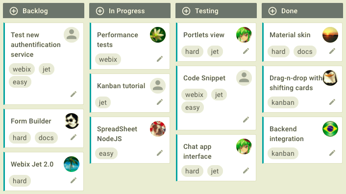
Now you can use the basic functionality of the Kanban and further customize it as you see fit. In the browser you may see the following result:

Configuring Kanban
Kanban Board, like many other complex Webix widgets, is a kind of layout constructor. It can be made up of several separate components. Each of them has its own methods and properties. With their help, you can customize the interface elements and their behavior.
Besides the internal API, the widget has built-in parameters. They allow you to configure the component and manage its functionality. It would not hurt to remind you that you need to use a declarative approach to set the Webix widgets. It means that all properties and their values are specified in a regular JSON object.
The component itself is declared via the view: "kanban" expression. After this, you should specify the column parameters the kanban cards will be placed into, as well as the corresponding data for each task. These are the minimum settings required for the widget to start.
Now let's see how to set some more advanced configurations.
Layout Structure
Webix Kanban is a kind of layout app. You can define any suitable structure you need, guided only by the project requirements and common sense :). The widget allows you to create as many cards and columns as you want to manage your team's tasks more effectively. Let's take a look at several quite possible options of the Kanban Board layout for your project.
Progress columns
Traditionally, any Kanban board should consist of at least 3 columns, which are used to determine the status of project tasks:
- Backlog - scheduled tasks
- In progress - tasks in progress
- Done - completed tasks.
To configure the Kanban columns, you need to understand the basic principles of building the Webix layouts. In particular, Kanban has a special cols property for working with columns. In the array of this parameter, you can set the desired configurations for each column.
The layout of the above-mentioned structure will look like this:
cols:[
  {
    header: "Backlog",
    body: { view: "kanbanlist", status: "new" }
  },
  {
    header: "In Progress",
    body: { view: "kanbanlist", status: "work" }
  },
  {
    header: "Done",
    body: { view: "kanbanlist", status: "done" }
  }
]
For each column, you can specify a header via the header property and its general settings in the object of the body property. Here you should define the desired structure for displaying cards by setting the view property to one of the following parameters:
- "kanbanlist" - cards in columns are arranged as a list (see live demo)
- "kanbandataview" - depending on a free space, the cards in columns are arranged as a list, which can consist of several rows (see live demo)
- custom option. You can split your list by adding a new layout with columns/rows or use tabview to switch through the lists (see live demo).
To distribute the cards into corresponding columns, you need to specify a special key via the status property. The same key needs to be stored in the card data.
Column headers
Kanban provides an option to define a stylish and functional header for any desired column. To implement this, you need to use such an entity as kanbanheader.
The standard header collapses when clicking on the corresponding column (as an accordion). The kanbanheader allows you to add new cards and can be displayed with a specific style. The layout of a column with such a header will look like this:
cols:[
    { // column parameters
      rows:[
          {
            view: "kanbanheader", // declare the kanbanheader component
            label: "Backlog", // define the header title
            link: "new", // bind the header to the list via its status
            type: "sub" // add a compact styling
          },
          {
            id: "new", // define the list ID
            view: "kanbanlist", // declare the kanbanlist component
            status: "new" // set the list status
          }
        ]
    },
    ...
]
To add cards, use the round icon next to the header name.
Nested columns
Such a layout system allows you to create a structure of any complexity and nesting level. For example, in one of the columns, you can create nested columns, which can contain some extra columns. See an example below:

Swimlanes
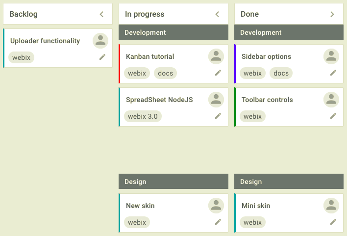
Let's say you are engaged in software development. The teams of designers and programmers are working tirelessly on your project to make it successful. To separate the area of responsibility of each team, you can add corresponding sections to the desired kanban columns.
To implement these swimlanes in the Kanban Board, you need to set the status property to a complex value.
For example, let's see how to add such sections to the "In progress" and "Done" columns. It helps you to see what tasks designers and programmers are involved in at the current time, and what tasks have already been completed. The layout structure will be as follows:
...,
{
    header: "In progress",
    body: {
      rows: [
        { view: "kanbanheader", label: "Development", type: "sub" },
        { view: "kanbanlist", status: { status: "work", team: 1 } },
        { view: "kanbanheader", label: "Design", type: "sub" },
        { view: "kanbanlist", status: { status: "work", team: 2 } }
      ]
    }
},
{
    header: "Done",
    body: {
        rows: [
        { view: "kanbanheader", label: "Development", type: "sub" },
        { view: "kanbanlist", status: { status: "done", team: 1 } },
        { view: "kanbanheader", label: "Design", type: "sub" },
        { view: "kanbanlist", status: { status: "done", team: 2 } }
      ]
    }
},
data:cards_data
To define the column swimlanes, you need to specify its status property to the complex value. Besides the status itself, you can also specify the key of the corresponding team (Development or Design) via the team property.
The same keys should be specified in the data object of each card:
const cards_data =[
    { id:1, status:"work", team: 1, text:"Kanban tutorial",... },
    { id:2, status:"work", team: 2, text:"New skin",... },
    { id:3, status:"done", team: 1, text:"Sidebar options",...  },
    { id:4, status:"done", team: 1, text:"Toolbar controls",... },
    // other data
];
In the browser you will see the following result:
Card Parameters
And now let's talk about the kanban cards, which intend to manage tasks on your project. Each card can contain a different set of elements depending on its data and the widget parameters.
Besides the task name, you can specify the following elements for the card:
- tags
- priority
- comments
- assigned performers
- attached files.
Tags
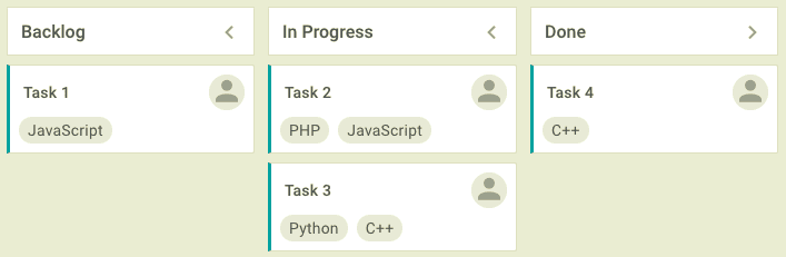
There are cases when a task relates to several internal projects or requires using certain technologies. To keep track of such nuances, you can mark the tasks with special tags and then filter cards by them (if necessary).
To create tags, you need to specify the tags property in the configuration object and set it to an array with the corresponding data:
{
  view: "kanban",
  ...,
  tags: [
      { id: 1, value: "JavaScript" },
      { id: 2, value: "PHP" },
      { id: 3, value: "Python" },
      { id: 4, value: "C++" }
  ],
  data: cards_data
}
In the card data you need to set the tags property to an array with the IDs of the required tags:
const cards_data = [
  { id: 1, status: "new", text: "Task 1", tags: [1] },
  { id: 2, status: "work", text: "Task 2", tags: [2,4] },
  ...
];
In the browser you will see the following result:
You can also specify tags in the card data directly. In this case, they will not be displayed in the card editor and you will not be able to delete or change them.
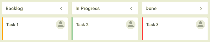
Priority
To meet the project deadline, it is very important to prioritize the tasks. Webix Kanban makes it possible with the vertical colored lines on the left edge of the cards.
Let's suppose you want to divide the priority of tasks into three levels of urgency:
- high - red line
- normal - green line
- low - orange line.
To do this, set the colors property to an array with data objects for each color:
colors: [
  { id: 1, value: "Urgent", color: "red" },
  { id: 2, value: "Normal", color: "green" },
  { id: 3, value: "Low", color: "orange" }
],
data: cards_data
You can also specify the initial priority of each card by setting the required color in its data object via the color property:
const cards_data = [
  { id: 1, status: "new", text: "Task 1", color: "orange" },
  { id: 2, status: "work", text: "Task 2", color: "green" },
  { id: 3, status: "done", text: "Task 3", color: "red" },
  ...
];
In the browser you will see the following result:
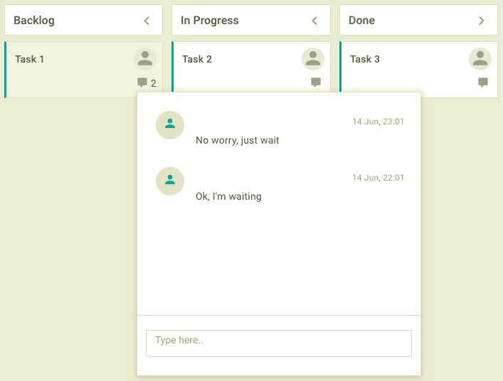
Comments
Your project may include the tasks in which several specialists take part at once. For an efficient collaboration of all participants of such tasks, the widget provides an ability to write comments.
To enable commenting, you should set the comments property to true. If you need to display comments just after the widget initializing, specify the corresponding data in the array of the comments property of the card data object:
const cards_data = [
  { id: 1, status: "new", text: "Task 1", comments: [
     { id: 1, user_id: 4, date: "2018-06-14 23:01", text: "No worry, just wait"},
     { id: 2, user_id: 5, date: "2018-06-14 22:01", text: "Ok, I'm waiting"}
    ]
  },
  { id: 2, status: "work", text: "Task 2" },
  { id: 3, status: "done", text: "Task 3" }
];
In the browser you will see the following result:
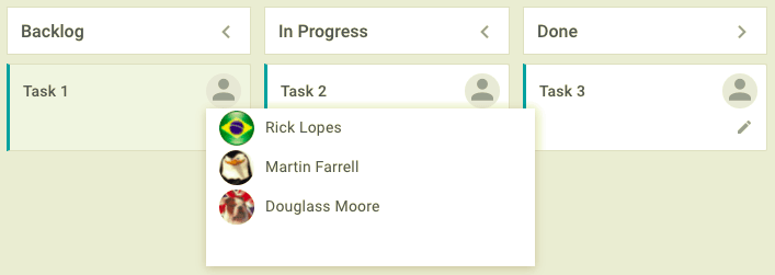
Assignments
You can assign an employee to work on each task. It is worth noting here that the widget has a limit on the number of assignments. Based on this, you can assign only one performer to one task.
To add employees into your project, in the widget configuration object you need to specify the users property and set it to the array with the data of the corresponding users:
users:[
  { id: 1, value: "Margaret Atwood", image: "imgs/matwood.jpg" },
  { id: 2, value: "Fannie Flagg", image: "imgs/fflagg.jpg" },
  { id: 3, value: "Irvine Welsh", image: "imgs/iwelsh.jpg" }
]
Now you can assign workers to the particular task via the card editor. But there is an easier way. To assign users directly in the card, you should specify the userList: true expression in the configuration object.
In the browser you will see the following result:
Attachments
Sometimes there are situations when you need to attach the additional files to the card. It can be a detailed instruction or a picture with an interface design. The widget allows you to attach such files via the card editor.
To implement it, you should specify a path to the script for uploading files via the attachments property:
{
  view: "kanban",
  attachments: "server/upload",
  ...,
  data: cards_data
}
In a card editor, you will see a special interface for uploading files. The already uploaded items will be displayed at the bottom of the editor. The number of the attached elements will be displayed on the card.
You can display the initial attachments just after the widget initializes. To do this, provide the corresponding data in the array of the attachments property in the card data object:
const cards_data = [
  { id: 1, status: "new", text: "Task 1", attachments: [
        { id: 2, link: "./server/files/image001.jpg", size: 85919 },
        { id: 3, link: "./server/files/image002.jpg", size: 105981 }
    ]
  }
];
In the browser you will see the following result:

Card operations
You can perform some operations with a card via its context menu, namely: open an editor, copy or delete a card. The menu icon is not displayed by default. To show it, specify the cardAction: true expression in the configuration object.
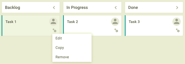
You can also define the custom operations with cards. Read more about this in the corresponding documentation article.
Card Editor
The parameters of any kanban card can be changed using a special editor. It opens when you double-click on the card or click on the edit icon.
By default, the editor is disabled. To enable it, you should set the editor property to true. The editor fields will depend on the widget settings. For example, if you specify the tags, users, attachments and colors properties in the configuration object, the corresponding fields will appear in the editor.

You can also change the order of the built-in fields or create custom ones. For this, you need to define them in the array of the editor property. It should be noted that the names of the controls must match the names of the properties of the Kanban data items.
editor: [
  { view: "text", name: "text", label: "Task" },
  { view: "multicombo", name: "tags", label: "" },
  {
     view: "richselect", name: "user",
     options: [
         { id: 1, name: "China Mieville" },
         { id: 2, name: "Helen Walsh" },
         { id: 3, name: "Jeff Noon" }
     ]
  }
]
Read more about the editor customization in the corresponding documentation article.
Loading Data
In the widget settings you can specify an array of the card's data that you want to display during initialization. Depending on where the data are stored (client or server), you can use either the data or url properties, as well as the parse() or load() methods. Let's take a closer look at each of these approaches.
Parsing Client-Side Data
Like any other Webix widget, Kanban accepts data in the JSON format by default. If the data are stored on the client side, you can parse it in two ways:
- via the
dataproperty in the widget's constructor - via the
parse()method.
The data object should contain the fields in which you need to describe certain parameters of the card.
Each data element requires a unique ID. Besides, you can specify a set of the following parameters:
- status - a status of the element, which defines a card's belonging to the corresponding column (required parameter)
- text - a title of the element (task)
- tags - a comma-separated list of tags or an array of their IDs ( if data for tags are presented in a separate data set)
- $list - an index of the list, the element will be placed into
- comments - a list of comments or an array of their IDs (if the comments data are stored in a separate data set)
- color - a priority color
- user_id - an ID of the user the task is assigned to
- attachments - a list of files attached to the card.
A card data object may look something like this:
const cards_data = [
{
    "id": 2,
    "status": "in progress",
    "text": "Performance tests",
    "tags": [1],
    "$list": 1,
    "comments": [2,3],
    "color": "#FE0E0E",
    "user_id": 5,
    "attachments": [
        { id: 2, link: "./server/files/image001.jpg", size: 85919 },
        { id: 3, link: "./server/files/image002.jpg", size: 105981 }
    ]
},
{...}
];
You can set the data property to this object in the widget constructor:
{
  view: "kanban",
  data: cards_data
}
or parse data via the parse() method:
{
  view: "kanban",
  id: "kanban_id"
}

$$("kanban_id").parse(cards_data);
Loading Server-Side Data
If you want to load server data, you need to set url property to the path to the required file or script:
{
  view: "kanban",
  url: "cards_data.js"
}
or you can call the load() method, by passing a path to the file as a parameter:
{
  view: "kanban",
  id: "kanban_id"
}

$$("kanban_id").load("cards_data.js");
And here it should be borne in mind that the widget can take data in various formats. For example, if you want to load data in XML format, you should specify this format directly via the datatype property:
{
  view: "kanban",
  id: "kanban_id",
  url: "cards_data.xml",
  datatype: "xml"
}
or pass it to the load() method as a second parameter:
$$("kanban_id").load("cards_data.xml", "xml");
Kanban Localization
A significant advantage of all Webix widgets is the ease of its localization. By default, all Kanban labels are displayed in English. But you have an opportunity to change the current locale before the widget initialization or create a custom one. In the object of the custom locale you can specify the labels in the language you need. Let's take a look at both of these options.
How to Modify the Current Locale
The labels of the current locale are stored in the webix.i18n.kanban object. You can specify the needed translations for the following elements:
- buttons and labels in the card editor
- options in the context menu.
The current locale object has the following structure:
webix.i18n.kanban = {
    "copy": "Copy",
    "dnd": "Drop Files Here",
    "remove": "Remove",
    "save": "Save",
    "confirm": "The card will be deleted permanently, are you sure?",
    "editor": {
        "add": "Add card",
        "edit": "Edit card",
        "assign": "Assign to",
        "attachments": "Attachments",
        "color": "Color",
        "head": "Editor",
        "status": "Status",
        "tags": "Tags",
        "text": "Text",
        "upload": "Upload"
    },
    "menu": {
        "copy": "Copy",
        "edit": "Edit",
        "remove": "Remove"
    }
};
If you want to modify the labels of the current locale, you should specify the corresponding values in the webix.i18n.kanban object. The widget will change them in the interface.
How to Create a Custom Locale
In the second option, you need to create a new locale with a similar structure via the webix.i18n.locales[localeN].kanban expression. In this object you can set the corresponding keys to the new translations:
webix.i18n.locales["ru-RU"].kanban = {
    "copy": "Копировать",
    "dnd": "Бросайте файлы сюда",
    "remove": "Удалить",
    "save": "Сохранить",
    "confirm": "Вы собираетесь навсегда удалить эту карточку. Вы уверены?",
    "editor":{
        "add": "Добавить карточку",
        "edit": "Редактировать карточку",
        // other labels
    },
    // other labels
};
To apply a new locale, you need to call the setLocale() method of the webix.i18n object before the widget initialization. It takes an object with translations as a parameter:
webix.i18n.setLocale("ru-RU");
Conclusion
In this article, I have tried to introduce you to the JavaScript Kanban widget, its main usage and functionality. As you can see, it is a very functional and highly customizable component. You can easily integrate it with any framework or library you need, as well as connect to the backend.
This publication covers only a small part of all the widget's capabilities. To learn more about configuring and customizing JS Kanban, visit its documentation.

Top comments (0)