I recently completed a full-stack project at The Collab Lab and developed a shopping list app with 3 other developers. Throughout this journey, I gained a profound appreciation for the importance of accessibility in web development. It is crucial for front-end developers to have accessibility awareness in mind so the apps we are building can be user-friendly to all. While I don't claim to be an accessibility expert, below are the 6 simple low-hanging fruit that you can grab to significantly enhance your site's accessibility.
1. Use Semantic Labels
Since we are all well-acquainted with HTML, this is an intuitive one. Utilize semantic labels such as <button>, <section>, <li> as opposed to overusing <div> tag all the way throughout the code.
However, it is easy to overlook this aspect when you are using third-party component libraries such as Daisy UI and simply copying example code from documentation without a second thought. This happened in our project where I used the Daisy UI accordion component and later found out the screen readers wouldn't announce the content because Daisy UI uses an <input> element without <label>. This is also a valuable lesson for me to choose external libraries with built-in accessibility to avoid potential pitfalls down the road.
2. Test Screen Readers
You can press Command + F5 to activate Voiceover screen reader on a Mac. While testing, navigate through your web page using only the keyboard by pressing tab to move forward and shift+tab to go backward. Ensure screen readers announce all necessary content, and the layout is structured in a logical and tabbable order. Also test across different browsers (Chrome, Firefox, Safari) to ensure consistent performance.
3. Utilize Aria-Label and Aria-Live
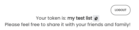
Include aria-label as an attribute of any interactive element such as a <button> so screen readers can convey the purpose of the button. One use case in our app is we have an icon button used for copying tokens.
Since this button lacks a textual label, we need to include an aria-label like below:
<button aria-label="copy to clipboard" onClick={copyToken}>
    <ClipboardDocumentIcon />
</button>
You can read more on the MDN Docs aria-label.
On the other hand, aria-live serves a different purpose. It is used to announce live updates such as a state change. By wrapping your content inside an aria-live <div>, whenever the content changes, the screen readers will reread.
<div aria-live="polite">your content</div>
You can read more on the MDN Docs aria-live.
4. Maintain Input Field Focus
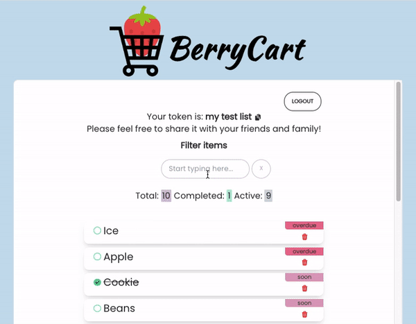
If you have an input field, ensuring the focus remains on the input can be helpful. In our app, we have an input field that allows users to filter items by name. After they clear the field, notice how the focus is brought back to the input field so they can start typing again without manually clicking into the input field again.
You can achieve this in React using the useRef hook and ref attribute in <input>.
import { useRef } from 'react';
const filterInputRef = useRef(null);
<input
    type="text"
    name="filter"
    id="filter"
    value={inputItem}
    onChange={handleInput}
    ref={filterInputRef}
    placeholder="Start typing here..."
/>
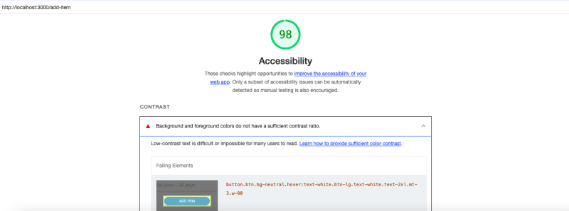
5. Ensure Sufficient Color Contrast
When picking your color palette, it is crucial to maintain enough color contrast between the text and background so users with low vision can still read the content clearly.
You can use a Color Contrast Analyzer or install a Google Chrome extension called Lighthouse to generate an accessibility report.
6. Reduced Motion
Some users may have sensitivity to motion effects or prefer slower animations. In our app, we use Toastify to display notifications, and the default transition mode bounce might be too fast for slow-motion users, so we've adjusted it to Slide instead.
import { ToastContainer, toast, Slide } from 'react-toastify';
<ToastContainer position="top-center" transition={Slide} />
Those are the 6 accessibility lessons I learned from building this project. What are some other good tips to ensure your web app can serve everyone? Let me know in the comment below!
If you found this post helpful, please give me a 💜

Top comments (2)
Thank you for putting this together! I appreciate it as a frontend beginner!
Glad you found it useful! Happy coding~