
I have spent the past few months designing and developing websites and here are some of the important insights that I would like to share about it. Web development has undergone a drastic change since it was made there are no limits what we can do in it. There are hundreds of tools that are used just to design the website and a few more to develop it. It is necessary for you to know how to use both of such tools in order to become a successful web developer. In this blog, I will be sharing designing a website step by step and the tools, libraries that I personally use.
1.Brainstorming your idea:
Sometimes we have very perfect ideas in our minds but when we try to explain it to others, we could not. We miss a lot of details or sometimes the whole idea. So the best solution for this is designing wire-frames, illustrations, and swimlane diagrams. Listen to the client’s requirements and draw him some illustrations and ask for the confirmation. In this way, neither you lose your idea nor the client.
Tools: Sketch, Figma, Lucidchart, sometimes paper-pen are best.
2.Choosing the right assets
Here, you need to be creative. This stage includes choosing color schemes, pictures, videos and typography. Different colors represent different meanings, understand those, crosscheck them with the intent of your website. For example, yellow represents cheerfulness, joy. So, if the website that you are designing is about food, yellow is your color. Pare the color for other good contrasting colors for your texts. White and black are the universal picks. They go with any color you choose. If it’s too hard for you then do check out the following websites which will definitely sort your problem:
https://coolors.co/
https://colorsinspo.com/
You also need good fonts that will serve the intent of your website. The best place to get free and attractive fonts for your website is Google-fonts. Pictures and videos are provided by the client but you can not use them as they are sent to you. They may not be in right resolutions or may not go with the color that you have chosen. So, you need to edit them accordingly. And the best editor that I find for this purpose is Adobe Lightroom and Adobe Photoshop. But as you know they are not free to use and certainly not cheap, but don’t worry I got you covered. There are some free alternatives for them with the same features (just 1 or 2 less).
Pixlr: http://pixlr.com
Gimp: http://www.gimp.org
Sometimes, the images you are provided are not enough. Sometimes, you need something that you can animate. For example, SVGs and when you need this I know exact place where you can get it https://undraw.co/ is the free library where you can find the best yet free SVGs to use in your projects.
Tools:
Photo Editing: Adobe Lightroom, Adobe Photoshop, pixlr, gimp
Free image and SVG libraries: pexels.com, undraw.co.
3.Designing the website
So, now you have the right colors, right fonts, right images. What’s next? Now, you have to put them together create designs place them in the right format. And where do we do it? Adobe Xd, Adobe Illustrator, or some other open-source applications like Figma or sketch (This is what I prefer).
Your designs have to be unique, creative, and attention-grabbing. Here are some key rules while designing that you must follow if you want to be a good designer:
- Always name the elements that you use. This is helpful later in the developing process
- Create layers. Don’t just put everything on a single frame. (Don’t forget to name the layers.)
- According to me, there are 2 types of designs: first is one with edges and another is one with curves. Choose one. Keep consistency in your design.
Remember, here you are illustrating the look and feel of the website so think about both UI as well as UX. Before, we have talked just about UI, the interface (looks) but that is not all, you have to consider user experience (feel) too. This includes the behavior, animations, and responses of the website. And thanks to these tools we can do them very easily. So, what do I mean by behavior? Well… the way you scroll, the way text and images occur, the dependency of different elements on each other, etc. Responses include pop-ups, page-transitions, etc. Just remember, it is not necessary to animate everything but it is a good practice to keep animations unidirectional especially when it is applied to same type of element.
Now, are we good to go for development or are we missing something? What about the responsiveness of our design? A good designer always keeps in mind that he has to keep his designs responsive for any device to be used. So, now, design all of the previous again for smaller devices like phones, notebooks, and tablets. But keep in mind, the theme of the website that you have designed for the bigger devices should not change. Neither the behavior nor the animations.
This was just about designing we still have not got into development yet. We will cover the development topic too. Stay tuned but for now, let’s conclude the ongoing topic of designing. So, to make a good design, the key factor is consistency. How, colors flow through your designs, how animations appear, are they consistent or they break? If not consistent, your design has definitely some improvements to be made. Again, these are my ideas, my experiences, yours might be different. I would definitely like to talk about it. So, leave comments, let’s discuss.
Thank you. I will be back with a different topic soon.
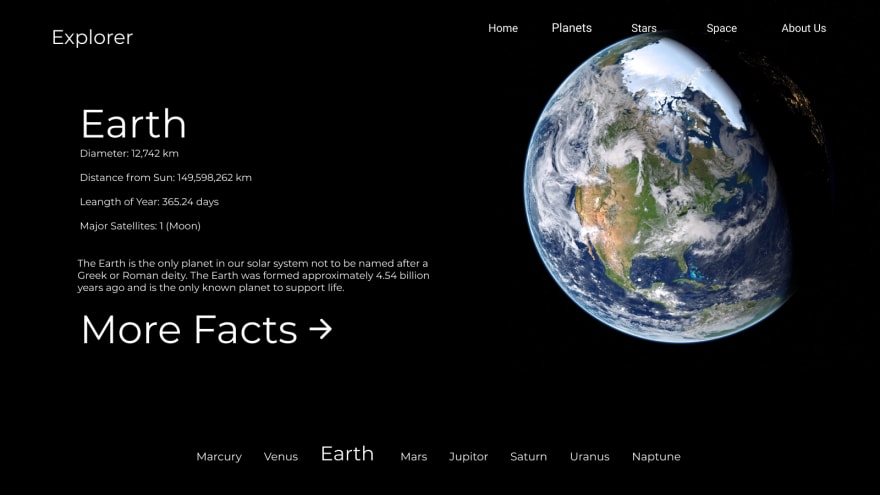
Here is one of my design:
About the design: Explorer is an educational/ informative website about wonders in space.
The desktop | notebook | tablet view:
The mobile view:


Top comments (0)