
I'm a huge fan of Cloudinary for media, and this was the first time I set it up on a site using Eleventy. In typical fashion, I wasn't satisfied with the existing solutions I found, so I decided to write my own.
Originally, I did not set up Cloudinary on my blog because I used to have just a handful of images, and I would create srcsets and formats manually using ImageMagick and cwebp. But then I got excited about using structured data for SEO, and the image generation job got a lot more complicated with more sizes and cropping.
In this post, first I'll go over how I think about serving responsive, performant images. Then, I'll show you how I implemented Cloudinary image hosting in Eleventy.
What's in an <img>?
Let's take a look at a "fully-loaded" image tag in HTML:
  <img src="pug_life.jpg"
    srcset="pug_life_600.jpg 600w, pug_life_300.jpg 300w,"
    sizes="(min-width: 760px) 600px, 300px"
    alt="Pug wearing a striped shirt"
    width="600"
    height="400"
    loading="lazy"
  >
Why did I include all those attributes? Let's take a look at each...
-
src- the image to display (required!) -
srcset- for modern browsers, a set of candidate images and their widths in pixels -
sizes- for modern browsers, how wide the image will be displayed at various screen widths -
alt- description of the image -
width- the image width -
height- the image height -
loading- optionally lazy-load images and iframes, caniuse
srcset and sizes
For modern browsers, we can give a set of images and instructions for how wide they will be displayed using srcset and sizes. This allows the browser to make the best decision on which image to load based on the user's screen width and device pixel ratio (DPR). For example, those nice Retina screens (DPR of 2) need images twice as wide as the slot we're putting them in if we still want them to look good.
The sizes attribute can be tricky to write correctly by hand. My favorite way of getting it (a.k.a, the lazy way), is to first give the image a srcset, then run the page through RespImageLint. RespImageLint is a nifty bookmarklet that will let you know how far off your images are in their size, and will also give us suggestions for the sizes attribute.
Layout Shift
To prevent layout shift once the image loads, we need to provide the browser with an aspect ratio. Currently, the way to do that is to set a height and width on the image in HTML. Use the original image's dimensions since the actual size doesn't matter, just the aspect ratio. Your CSS will control the actual height and width.
To prevent weird stretching, set an auto height in your CSS:
img {
  height: auto;
}
Jen Simmons recorded a great short video on this trick.
Lazy loading
We now have partial support for lazy loading images and iframes! If you set the loading attribute to lazy, the browser will use the IntersectionObserver to detect if a user scrolls near the image or iframe and only load it at that time.
At the time of writing, 78% of my blog's visitors are supported for images, so I'm implementing it now. Note that you should not lazy-load images that are in the viewport on initial load ("above the fold"), as this can negatively impact your performance scores.
The code
Now that you know how I think about images, I can explain my rational behind my solution. Some of the existing alternatives were Eleventy shortcodes that provided the full image tag based on the filename, alt, and a few other attributes. I wanted the ability to also provide all the attributes previously mentioned plus others like class.
The shortcode quickly became unwieldy with this many parameters, and I realized that the HTML itself was only marginally longer. Why not just use HTML? The onerous part of building responsive images, especially when hosting through Cloudinary, is setting the image urls and generating the srcsets.
Why not just use HTML?
Hence, I created shortcodes that do only that - generate the src and srcset, and everything else can be set as needed in the HTML:
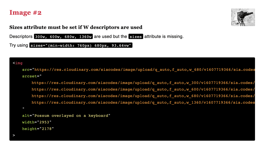
  <img src="{% src "possum_film_director.jpg" %}"
    srcset="{% srcset "possum_film_director.jpg" %}"
    sizes="(min-width: 760px) 680px, 93.64vw"
    alt="Possum directing a movie"
    width="2953"
    height="2178"
    loading="lazy"
    class="super-great-style-class"
  >
I don't need a <picture> tag because Cloudinary can automatically serve the best image format based on the user's browser through the f_auto transformation.
If you found this article helpful, you can sign up for a free Cloudinary account with this link, and I'll get a few extra Cloudinary credits per month.
Shortcodes
For the shortcodes, I gave them smart default widths based on the styles for my site, but I allow an optional parameter to set them when I invoke the shortcode.
// _11ty/shortcodes.js
const CLOUDNAME = "[your Cloudinary cloud name]"
const FOLDER = "[optional asset folder in Cloudinary]"
const BASE_URL = `https://res.cloudinary.com/${CLOUDNAME}/image/upload/`;
const FALLBACK_WIDTHS = [ 300, 600, 680, 1360 ];
const FALLBACK_WIDTH = 680;

function getSrcset(file, widths) {
  const widthSet = widths ? widths : FALLBACK_WIDTHS
  return widthSet.map(width => {
    return `${getSrc(file, width)} ${width}w`;
  }).join(", ")
}

function getSrc(file, width) {
  return `${BASE_URL}q_auto,f_auto,w_${width ? width : FALLBACK_WIDTH}/${FOLDER}${file}`
}

module.exports = {
  srcset: (file, widths) => getSrcset(file, widths),
  src: (file, width) => getSrc(file, width),
}
The last step is to add the shortcodes to our Eleventy config:
// .eleventy.js
const { srcset, src } = require("./_11ty/shortcodes");

eleventyConfig.addShortcode('src', src);
eleventyConfig.addShortcode('srcset', srcset);
Voilà!
How do you use Eleventy with Cloudinary? I haven't turned this into a plugin yet. Should I?
This article was originally published on sia.codes. Head over there if you like this post and want to read others like it, or sign up for my newsletter to be notified of new posts!

Top comments (0)