
This article talks about building a react notification component using @redux-toolkit and styled-components in react.
In this article, I assume that you are well acquainted with those two libraries if not, I suggest you check them out at @redux-toolkit and styled-components.
Why create a notification component yourself? You might ask me.
Well, three reasons.
Pure curiosity on how UI libraries go about creating notification alert components.
Having full control over the behavior, appearance, and placement of the notification alert component.
Easy integration into the redux workflow.
You can check out the finished product that we shall be creating here. Or the full source code at Codesandbox here.
Now on to the fun stuff. The actual code. I have broken down the tutorial into sections as follows.
- Initial setup. (Redux, Components)
- Alert (Notification) Component
- Alert Slice (Reducers and Actions)
- Using the Alert notification
Initial setup. (Redux, Components)↑
The project is set up using create-react-app which you can check out here.
it will give you a folder structure as follows
.
├── README.md
├── package.json
├── public
│   ├── favicon.ico
│   ├── index.html
│   ├── logo192.png
│   ├── logo512.png
│   ├── manifest.json
│   └── robots.txt
├── src
│   ├── App.css
│   ├── App.js
│   ├── App.test.js
│   ├── index.css
│   ├── index.js
│   ├── logo.svg
│   ├── serviceWorker.js
│   └── setupTests.js
└── yarn.lock
Install 3 more packages that we shall need for the tutorial.
npm i @reduxjs-toolkit react-redux styled-components
Add the store.js file in the src folder with the following content.
// src/store.js

import { configureStore } from "@reduxjs/toolkit";
import { AlertSlice } from "./Alert/AlertSlice";

const reducer = {
  notifications: AlertSlice.reducer
};

const store = configureStore({
  reducer,
  devTools: process.env.NODE_ENV !== "production"
});

export default store;
The beauty of @reduxjs-toolkit is that it abstracts away most of the boilerplate redux is infamous for, meaning at the minimum we can just create a slice that shall have both reducers and actions.
...
const reducer = {
  notifications: AlertSlice.reducer
};
...
The AlertSlice created using createSlice returns a reducer which can be used to create a reducer as see above.
Alert Slice (Reducers and Actions) ↑
Next let us create a few files for the alert component such as the Alert.js, AlertSlice.js inside the src folder
 src
│   ├── Alert
│   │   ├── Alert.js
│   │   ├── AlertSlice.js
│   │   ├── Wrappers.js
│   │   └── index.js
// src/Alert/AlertSlice.js

import { createSlice } from "@reduxjs/toolkit";
import { extraAction } from "../extraAction";
export const AlertSlice = createSlice({
  name: "alert",
  initialState: {
    alerts: []
  },
  reducers: {
    createAlert: (state, action) => {
      state.alerts.push({
        message: action.payload.message,
        type: action.payload.type
      });
    }
  },
  extraReducers: {
    [extraAction]: (state, action) => {
      state.alerts.push({ message: action.error.message, type: "error" });
    }
  }
});

export const actions = AlertSlice.actions;

export default AlertSlice;
Here we declare the alerts state field, which shall be an array that holds the alert objects whenever an alert action is dispatched.
...
initialState: {
    alerts: []
  },
...
CreateAlert is a reducer that shall be responding to actions dispatched for alerts. It shall add an alert action to the alerts array every time an alerts action is dispatched.
...
reducers: {
    createAlert: (state, action) => {
      state.alerts.push({
        message: action.payload.message,
        type: action.payload.type
      });
    }
  },
...
Under extraReducers, we can add extra reducers to react to actions from other events for example reacting to asynchronous responses.
...
extraReducers: {
    [extraAction]: (state, action) => {
      state.alerts.push({ message: action.error.message, type: "error" });
    }
}
...
Alert (Notification) Component ↑
// src/Alert/Alert.js

import React, { useEffect, useState } from "react";
import { useSelector } from "react-redux";
import Icon from "../Icon";
import { successIcon, errorIcon, closeIcon } from "../icons";
import { Wrapper, Content, Message } from "./Wrappers";

const Alert = () => {
  const { alerts } = useSelector(state => state.notifications);
  const [alert, setAlert] = useState({ type: "", message: "" });
  const [show, setShow] = useState(false);

  useEffect(() => {
    if (alerts.length > 0) {
      setAlert(alerts[alerts.length - 1]);
      setShow(true);
      setTimeout(() => {
        setShow(false);
      }, 3000);
    }
  }, [alerts]);

  const onClose = () => {
    setShow(false);
  };

  const color = alert.type === "success" ? "teal" : "tomato";
  const iconUrl = alert.type === "success" ? successIcon : errorIcon;

  return show ? (
    <Wrapper className={`${alert.type || "error"}`}>
      <Content>
        <Icon icon={iconUrl} color={color} size="20px" />
        <Message>{alert.message || ""}</Message>
      </Content>
      <Icon
        icon={closeIcon}
        color={color}
        size="24px"
        onClick={onClose}
        style={{ cursor: "pointer" }}
      />
    </Wrapper>
  ) : null;
};

export default Alert;
We shall be using CSS animation to move the notification component from above the screen (out of view) to a visible position and then back out of view. We do this by creating a wrapper component with the CSS using styled-components.
// src/Alert/Wrappers.js
...
export const Wrapper = styled.div`
position: fixed;
top: -60px;
animation: enter-leave 3s ease-in-out;
left: calc(50% - 300px);
width: 600px;
height: 42px;
@keyframes enter-leave {
0% {
top: -60px;
}
7.5% {
top: 16px;
}
92.5% {
top: 16px;
}
100% {
top: -60px;
}
}
...
```
Then also use the (show) local state value to control whether the component is rendered in the dom or not.
```javascript
...
const [show, setShow] = useState(false);
...
```
We shall also be reading from the redux state for the alerts array.
We also set two local state values to control what our alert component shall display, and when to show or hide the component. by setting the alert and show state values respectively.
```javascript
...
const { alerts } = useSelector(state => state.notifications);
...
```
The `useEffect` function shall be used to listen for changes in the alerts variable from the redux store which symbolizes that a new notification has been added and therefore the notification component needs to be updated. We do this by picking the last item in the alerts field and setting it to the local component state and then setting show to true. We also control how long the notification will show by waiting for 3 seconds after which we hide it.
And that's it, all we have to do now is to dispatch the create alert action from the AlertSlice or add an extra reducer to the AlertSlice in order to show a notification.
### <a name="using"></a> Using the Alert notification [↑](#top)
We can dispatch a notification inside the App.js file by adding on click listeners to the buttons that dispatch a createAlert action.
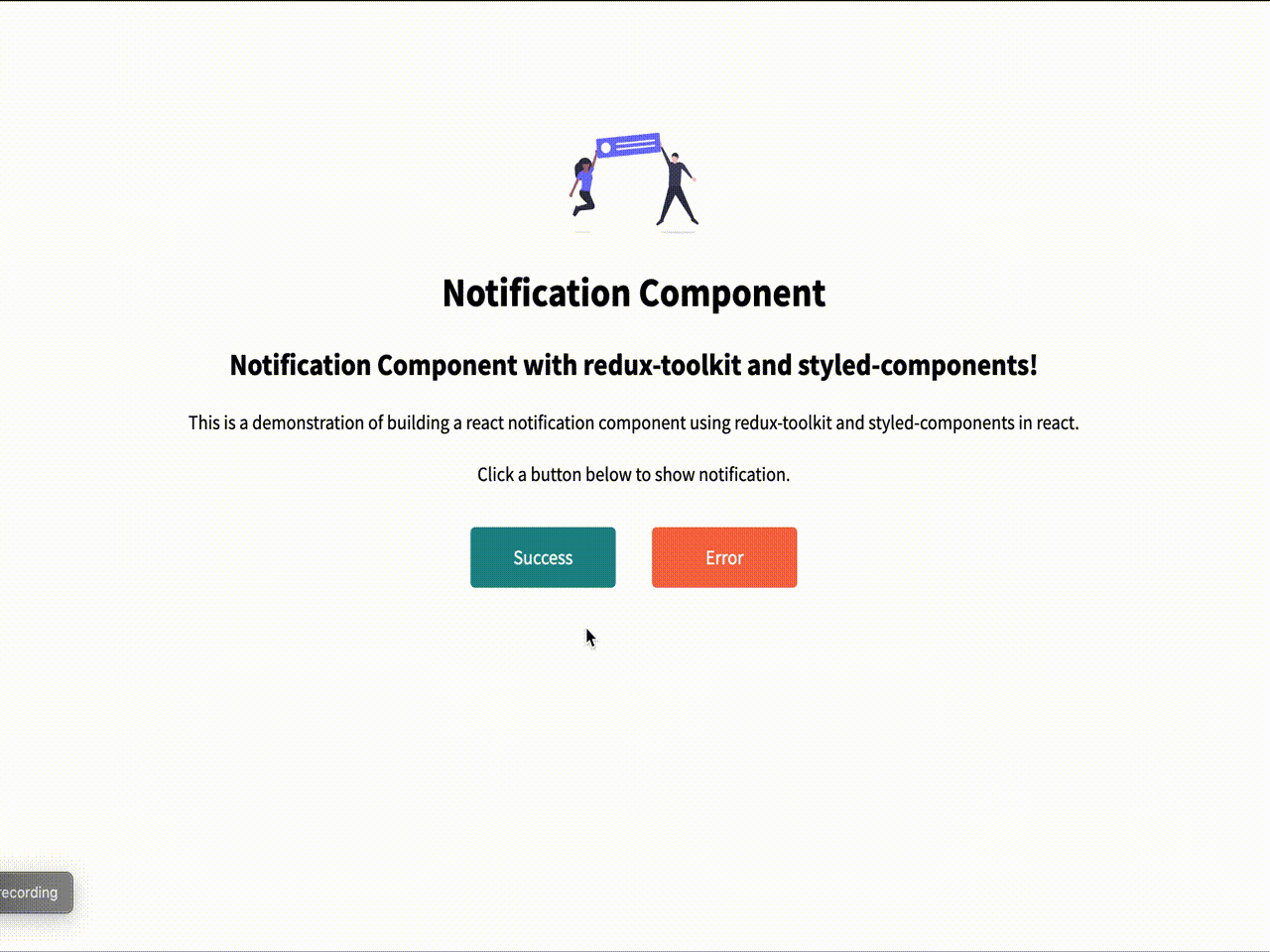
```javascript
// src/App.js
import React from "react";
import styled from "styled-components";
import { useDispatch } from "react-redux";
import "./styles.css";
import Alert, { alertActions } from "./Alert";
import happyImage from "./illustrations/happy.svg";
const Button = styled.button`
width: 8rem;
font-family: "Source Sans Pro", sans-serif;
font-size: 1rem;
color: white;
border: none;
height: 3rem;
cursor: pointer;
border-radius: 4px;
margin: 1rem 1rem 1rem;
&.success {
background: teal;
}
&.error {
background: tomato;
}
`;
const Img = styled.img`
margin-top: 6rem;
`;
export default function App() {
const dispatch = useDispatch();
const onSuccess = () => {
dispatch(
alertActions.createAlert({
message: "We are off to a good start! 🤗",
type: "success"
})
);
};
const onError = () => {
dispatch(
alertActions.createAlert({
message: "Something went wrong! 😩",
type: "error"
})
);
};
return (
<>
<Alert />
<div className="App">
<Img src={happyImage} alt="happy people jumping" height="80" />
<h1>Notification Component</h1>
<h2>
Notification Component with redux-toolkit and styled-components!
</h2>
<p>
This is a demonstration of building a react notification component
using redux-toolkit and styled-components in react.
<br />
<br />
Click a button below to show notification.
</p>
<div>
<Button className="success" onClick={onSuccess}>
Success
</Button>
<Button className="error" onClick={onError}>
Error
</Button>
</div>
</div>
</>
);
}
```
<br/>
<br/>
Congrats for making it this far. I hope this was of value to you.
Please do let me know in case of any feedback in the comments section.

Latest comments (3)
Hi,
Can I get full source code of this notification component ?
@tibetegya these two links are broken, can you find some time in your schedule to create a GH repo for this post?
Great article George.