Introduction
The goal of this article is to show how Unsupervised Learning can be used in analyzing datasets. This article is a part of the MSP Developer Stories initiative by the Microsoft Student Partners (India) program.
What is Unsupervised Learning ?
Generally, when we talk about Machine Learning, we say a model trained on some X and corresponding Y values to predict Y on unknown X's. This form of ML Algorithms is called Supervised Learning. Now, what if you are given with only X. Confused right? This kind of data is called unlabelled data and working with this kind of data is called "Unsupervised Learning".
Importance of Unsupervised Learning
In the real world, most of the data is available in an unstructured format. Hence, it becomes extremely difficult to draw insights from them. Unsupervised Learning helps to draw similarities between the data and separate them into groups having unique labels. In this way, the unstructured data can be converted into a structured format.
Due to this cognitive power to draw insights, deduce patterns from the data, and learn from those, unsupervised learning is often compared to human intelligence.
Types of Unsupervised Learning Applications
This area of Machine Learning has got wider applications and is often considered as the real use of Artificial Intelligence. Some of these use cases are:
- Clustering
- Reinforcement Learning
- Recommender Systems
In this article, we will consider the first use case i.e. Clustering.
Clustering - Divide and Rule
Clustering as the name suggests is grouping up of similar objects in groups. All elements in a group have similar properties. In the case of data, these objects are data points plotted in multi-dimensional space.
Here we will take a famous dataset the "California House Pricing Dataset". Our task will be to break the region into various clusters to gain some insights. So, let's get coding.
KMeans
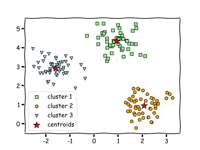
KMeans is a popular clustering algorithm. K-Means as the name suggests determines best k-center points (or centroids). After iteratively determining the k points, it assigns each example to the closest centroid thus forming k-clusters. Those examples nearest the same centroid belong to the same group.
Let us say we have a dataset when plotted looks like this:

The k-means algorithm picks centroid locations to minimize the cumulative square of the distances from each example to its closest centroid.
The dataset will be separated in the following manner using KMeans:
In this article, we will take a look on how KMeans can be used to analyze the housing dataset. The dataset will be clustered in two formats:
- With respect to Regions.
- Finding out locations that have high housing prices.
The entire project will be done on the Microsoft Azure Notebooks.
Setup Azure Notebooks
The first and foremost thing is to get the environment ready for work. For this Microsoft Azure Notebooks is the right place to perform all Data Science projects.
- Open Microsoft Azure Notebooks.
- Create a new project
Click on the project name and a project window will appear.
- To upload any kind of additional file, get to this section.

Upload the dataset (.csv file) here
- To create a notebook, folder, etc check this section.

Create a Jupyter notebook here with the following specifications.

- Click on "Run on Free Compute". Here, if you need more computation.

- A Jupyter Notebook console will appear showing all the files.

All set Let's get started.
Implementation
The clustering will be done in two parts:
- Divide all the geolocation points of California into two regions
- In each region cluster points that have housing prices higher than the rest.
At first, we start by exploring the dataset.

The dataset contains (latitudes, longitudes) and some feature columns that affect a house price.
Next, we scatter plot all the points from the datasets.

Wohoo! As one can see the plot clearly resembles the map of California.
Load Fit & Predict
The K-Means is loaded from sklearn package. The number of clusters (value of k) is set to two since we are trying to divide the location points into two regions. Next, fit the data and call .predict().

Let's examine the result now:
Since the k value was set to 2, we will have two centroids which can be viewed using the .centroid() attribute.

The cluster labels can be viewed using .labels_() attribute, in this case, we will have two labels starting from 0.
The labels are then stored in a column in the DataFrame and on doing value_count, the output turns out to be this.

This shows that 6620 data points have been grouped as 0 and remaining as 1.
Let's plot the points and label each cluster point with their cluster color.
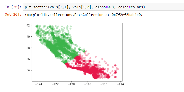
It is to be noted that RED indicates Cluster 0 (Region B) and GREEN indicated Cluster 1 (Region A).
All the geolocation data points have been successfully divided into two clusters and the original dataset has also been split into two and stored in two data frames.

With this, the first part of the Clustering process is done. Now let us consider the points cluster by cluster.
Cluster by house prices
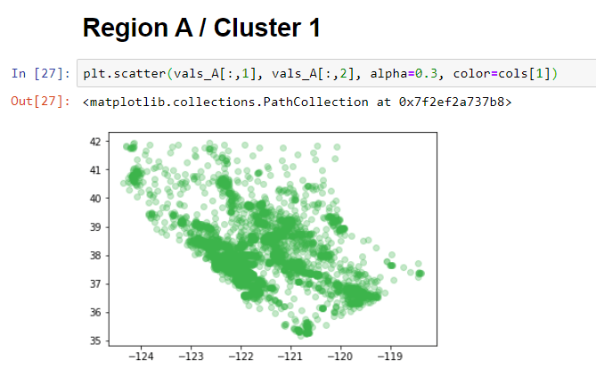
Rather than clustering the house prices of the entire dataset, one can take a small demographic area. As there was no way in figuring out the demographic, the previous cluster helped in dividing the entire dataset into two.
The region that we are now considering is the GREEN Region or CLuster 1:
Similarly, region B can also be plotted like this:

The target is to mark regions where house prices are higher than the rest. The median_house_value column will serve as the data points that need to be clustered.
Before fitting this data to the model, we need to normalize the values so that the model doesn't get biased to values having a higher variance. This can be done using StandardScaler() from sklearn.
StandardScalar() scales the values in such a way that the mean value is 0 and the standard deviation is 1.

This scaled data is now fitted into the model and the prediction function is called. The number of clusters (k value) is set to two as the intention to divide into low and high prices.
The results thus obtained is here.

This shows the number of values in each cluster but this does not give any insight into which one signifies the cluster with high prices and which one low price. To make sense of this data the median value of the house prices in each cluster is calculated. This will show the central point of the range of values irrespective of the outliers.

Thus, it is clear that the data points in cluster 0 are at higher house prices as compared to cluster 1. A Scatter plot of the result will look like this:

A direct inference from this would be that the coastal areas are way more costly than the inner areas. This entire process is repeated for the other region and the results obtained are quite similar.

In this way, clustering helps in analyzing a dataset. Various other interpretations can be drawn using the other columns. Hence it's open for experimentation.
Creating an interactive plot
Plots are extremely important when doing data analysis. Folium is an excellent library in python which allows us to plot geolocation points that are manipulated in python and plotted on an interactive leaflet map.

The Microsoft Azure Notebook does not have Folium pre-installed so install it using the pip command.
To get started first create the base map, the base map defines the region you will be working with. Here, let us take the mean of latitude and longitude respectively as the starting coordinates and plot the base map.

Folium allows us to save any html generated using .save function.

On the Map above, the location points will be marked using the function below:

The resultant map will look like this:

Finally, we need to highlight the locations that have higher prices.

In this way, a dataset can be analyzed using unsupervised learning.
Conclusion
Unsupervised Learning is a great way of dealing with datasets that are not structured, clustering thus helps in segregating the dataset based on common features. This dataset can further be used as a labeled dataset for Supervised Learning. In this article, the k-value has been fixed to 2 since the problem statement demands so but there are ways to determine the optimal value of k. Two such ways are the Elbow method and the Silhouette Score method. An example has been shown in the notebook.
To work around with the code access it from here. Project Link
Happy Learning!

Top comments (3)
Nice and informative blog.
Thanks, glad you liked it. Feel free to share :)
Cool use of Folium for map scatter plots. The src link refers to visualstudio.microsoft.com/vs/feat..., would you mind updating it if possible?