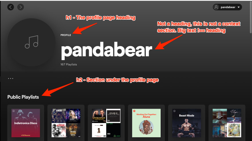
It's important to create a logical heading hierarchy on pages so users of assistive tech like screen readers can more easily understand and navigate around (screen readers can jump between headings) the page. Big text doesn't always mean the text should be a heading:
Avoid associating the size of text with its status as a heading.
Spin up a screen reader like VoiceOver, Jaws or NVDA and see for yourself if the headings actually make sense.
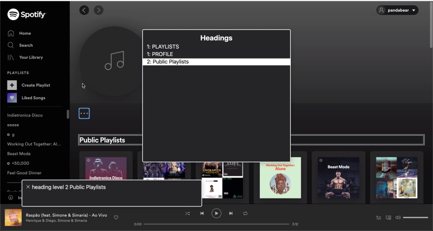
In VoiceOver, a screen reader user will be presented with this in the rotor headings menu

Check out Screen Reader Basics: VoiceOver from the A11ycasts series on YouTube. It's great!
"heading level 2 Public Playlists" is announced right after "heading level 1 PROFILE" making it clear that Public Playlists is a subsection on the profile page.
One of the best things you can do imo as developer getting into accessibility is learning how people actually user assistive technologies like screen readers. This helps you answer a lot of your own question around accessibility.
Big text !== heading


Top comments (0)