 Launching a SaaS product is one of the most exciting yet challenging experiences any entrepreneur can face. I recently launched Lalye| lalye.com, a product management platform that combines tasks, OKRs, KPIs, Kanban boards, and more, all designed to help teams track their progress and stay aligned. But as thrilling as it was to see the project come to life, the journey didn’t go exactly as I had planned.
Like many new entrepreneurs, I thought that building a great product would be enough to attract users. However, I quickly learned that there was so much more to it — especially when it comes to design, messaging, and marketing.
In this article, I’ll share why I changed my design approach for Lalye, the mistakes I made with my first landing page, and how I adapted to make my SaaS more engaging and user-friendly.
The Early Struggles: Why My First Landing Page Failed
When I first launched Lalye, I was excited. The product was functional, clean, and delivered value in terms of task management, OKRs, and KPIs. But there was one major issue — I underestimated the power of the landing page.
Vague Messaging
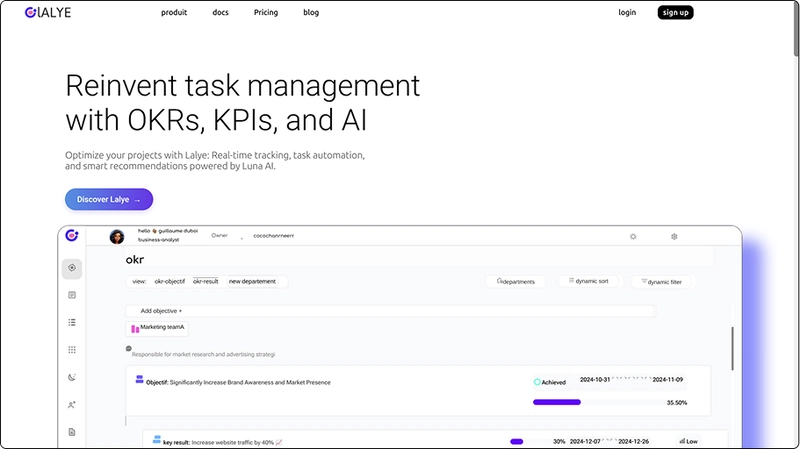
My initial landing page had a generic tagline: “A powerful tool to manage your projects.” It didn’t convey the specific problem Lalye solved or what made it different from other tools like Asana, Trello, or Monday.com. The message didn’t resonate with potential users. Instead of clearly explaining the unique benefits of Lalye, it was a broad statement that could apply to any project management software.Too Much Text, Not Enough Visuals
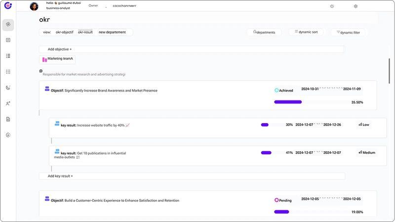
One of the biggest mistakes I made was overloading the landing page with text. I thought that explaining every feature and benefit in detail would convince people to sign up. But in reality, people are often looking for quick, digestible information. I didn’t use enough visuals or product screenshots to show the app in action. Without visuals, users couldn’t see how the tool would actually look or feel.Poor Call-to-Action (CTA)
Another major flaw was that my call-to-action — “Sign Up” — wasn’t visible enough. It was buried at the bottom of the page, making it difficult for visitors to know what action to take next. A strong CTA needs to be front and center, guiding users toward conversion.
The Pivot: How I Changed My Approach
After realizing these mistakes, I decided to revisit the landing page and redesign it. Here’s what I focused on:
- Clear and Specific Messaging Instead of using a vague tagline, I refined the messaging to focus on the unique value proposition: “Lalye is a product management platform that helps teams track OKRs, KPIs, tasks, and more — all in one place, without the complexity.”
By clearly stating what Lalye does and the problems it solves, I could immediately communicate the value to my target audience.
Incorporating Visuals and Demos
I swapped out much of the text for visuals. I included animated product demos and screenshots showing how Lalye works in real-time. This allowed users to get a better sense of the app’s interface and functionality, making it more relatable and engaging.Improved CTA and User Flow
I moved the call-to-action to a more prominent location. It was no longer hidden at the bottom of the page but placed in the header and repeated throughout the page. The CTA was now clear: “Start Using Lalye”. This made it easier for visitors to sign up and try the product without any friction.
The Result: Early Wins and Lessons Learned
Since making these changes, I’ve noticed a significant improvement in the number of people signing up for Lalye. While it’s still early days, the response has been promising. But even with these improvements, I’ve learned that building a successful SaaS isn’t just about having a great product; it’s about constantly learning, iterating, and refining based on user feedback.
Some key lessons I’ve learned along the way:
Messaging is Everything — Clear, specific messaging is critical. Users want to understand exactly what your product does and how it can benefit them.
The Power of Visuals — People want to see the product in action. Demos, screenshots, and videos help bridge the gap between abstract features and practical use.
The Importance of a Strong CTA — Don’t hide the action you want users to take. Make the signup process as seamless as possible.
SEO and Marketing Matter — Building the product is just the beginning. I still need to refine my SEO strategy and explore better ways to engage users through content and other channels.
Final Thoughts: Keep Pushing Forward
Building Lalye has been a huge learning experience, and while it’s been difficult at times, I’m committed to making it work. Like any entrepreneur, I’ve had my moments of doubt. But with each step, I’m getting closer to building something that truly delivers value to users.
If you’re working on a SaaS or side project, my advice is simple: don’t give up. The road is long, but every setback is a chance to improve and get better. Keep iterating, keep learning, and keep pushing forward. The success you’re looking for will come, even if it takes longer than expected.
If you’re interested, you can try Lalye at lalye.com. I’d love to hear your thoughts or feedback on how I can make it even better!
Join the Conversation
Have you faced similar challenges while building your SaaS? What’s worked for you in terms of design, messaging, and marketing? Feel free to share your experiences or ask any questions in the comments!


Top comments (0)