
| TL;DR |
|---|
| I saw an gif animation on AWS website. And i remade it with css and javascript. Link of the page that contains animation: |
Recently I got an email from AWS about Innovate Online Conference on AI and Machine Learning. I followed link and came across this page:
AWS Innovate Online Conference – AI and Machine Learning Edition
Since it's not about my profession directly, i would usually close the page and move on. But the animation just below the header had caught my attention and I wondered If I could make it with CSS. As you can see it is a quite simple animation.

To separate it from other parts of the banner I took the original image from its source, it has 2000px in width and 600px in height.
At first look, we can see a rectangle with a gradient background containing moving circles in two corners (upper right and lower left). Let's imagine the set of these circles as a disc. The disc contains circles of different colors.
Rectangle with gradient background
Let's give a class name 'animation' to the rectangle. Here is the first line of your HTML code:
<div class="animation"></div>
We can remake the rectangle background with online CSS gradient tools like cssgradient.io

cssgradient.io gradient background tool
This tool converts color, position and some other parameters to CSS linear-gradient code. For more detailed information take a look at linear-gradient().
After applying background code and dimension values, CSS code should be like this:
.animation {
        width: 2000px;
        height: 600px;
        background: linear-gradient(
          53deg,
          #cd4e57 0%,
          #b83133 22%,
          #a12c2d 48%,
          #700a16 100%
        );
      }
Discs
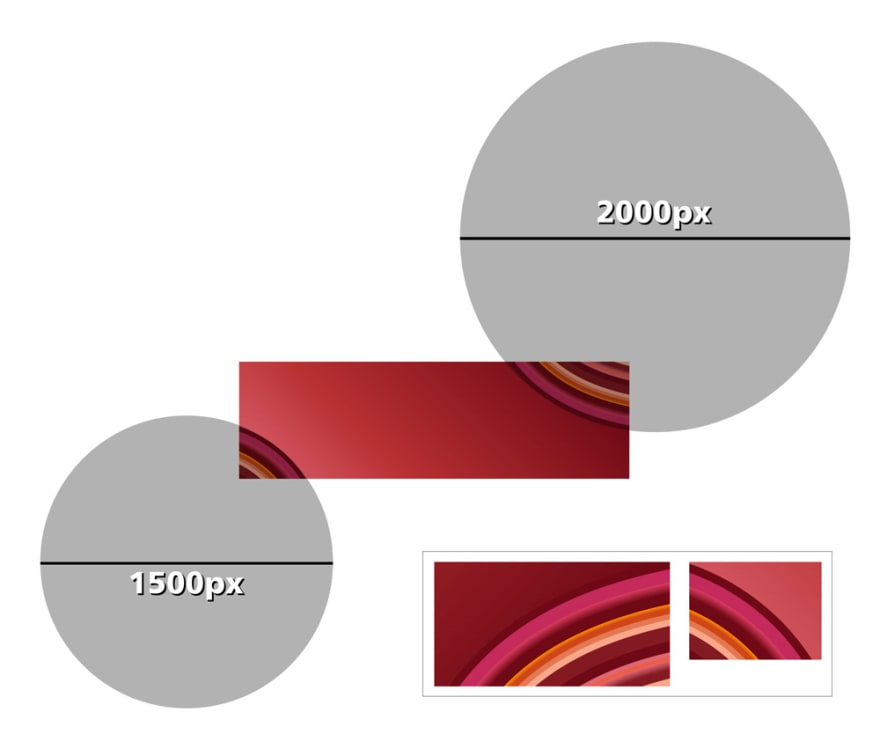
We have two different discs here. The bigger one, being on the right side. As we take a closer look and compare the two disks, we can see that the thickness of the colored rings is almost equal. Keep this information in mind, for now, we will use it when creating the smaller disc.
Let's start with the bigger disc, and put it inside animation div.
  <div class="animation">
    <div class="circle-w2000"></div>
  </div>
We gave it a class name only. It will be our container for the big colored circle. Firstly we must set width and height. Then temporarily, we give it a border, background, and border-radius to convert it into a disc.
.animation {
        width: 2000px;
        height: 600px;
        background: linear-gradient(
          53deg,
          #cd4e57 0%,
          #b83133 22%,
          #a12c2d 48%,
          #700a16 100%
        );
}
.circle-w2000 {width: 2000px;height: 2000px;border-radius: 50%; background:#fff;}

We have a big white circle in the rectangle.
Since the width of the animation is too big for my monitor I set the browser zoom to 50% to be able to see the entire work.
Now we start to create concentric circles to form the disc pattern. We give the name 'circle-0' to the first circle. We can find any circle's diameter by subtracting ring thickness from the previous circle's diameter.
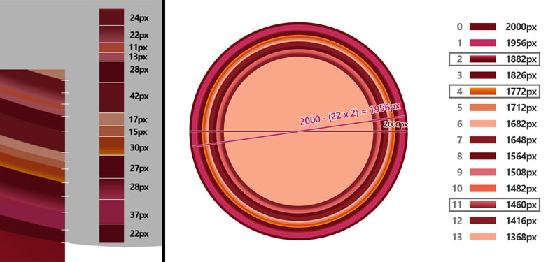
fig.2
width of circle-0 : 2000px
width of circle-1 : (2000 - (22x2))px = 1956px
width of circle-2 : (1956 - (37x2))px = 1882px
.
.
.
width of circle-13 : (1416 - (24x2))px = 1368
After adding html elements and applying css styles your code should be like this:
/*CSS*/
      .animation {
        width: 2000px;
        height: 600px;
        background: linear-gradient(
          53deg,
          #cd4e57 0%,
          #b83133 22%,
          #a12c2d 48%,
          #700a16 100%
        );
      }
      .circle-w2000 {width: 2000px;height: 2000px;border-radius: 50%; background: #fff;}
      .circle-w2000 div {border-radius:50%}
      .circle-w2000 .circle-0 {width: 2000px;height: 2000px;background-color: #6f0915;}
      .circle-w2000 .circle-1 {width: 1956px;height: 1956px;background-color: #c42a5b;}
      .circle-w2000 .circle-2 {width: 1882px;height: 1882px;background: #6f0915;}
      .circle-w2000 .circle-3 {width: 1826px;height: 1826px;background-color: #6f0915;}
      .circle-w2000 .circle-4 {width: 1772px;height: 1772px;background-color: #cf4618;}
      .circle-w2000 .circle-5 {width: 1712px;height: 1712px;background-color: #e37852;}
      .circle-w2000 .circle-6 {width: 1682px;height: 1682px;background-color: #f9a789;}
      .circle-w2000 .circle-7 {width: 1648px;height: 1648px;background-color: #831a22;}
      .circle-w2000 .circle-8 {width: 1564px;height: 1564px;background-color: #6f0915;}
      .circle-w2000 .circle-9 {width: 1508px;height: 1508px;background-color: #dd6674;}
      .circle-w2000 .circle-10 {width: 1482px;height: 1482px;background-color: #eb5e46;}
      .circle-w2000 .circle-11 {width: 1460px;height: 1460px;background-color: #841b22;}
      .circle-w2000 .circle-12 {width: 1416px;height: 1416px;background-color: #841b22;}
      .circle-w2000 .circle-13 {width: 1368px;height: 1368px;background-color: #f9a789;}
<div class="animation">
      <div class="circle-w2000">
        <div class="circle-0">
          <div class="circle-1">
            <div class="circle-2">
              <div class="circle-3">
                <div class="circle-4">
                  <div class="circle-5">
                    <div class="circle-6">
                      <div class="circle-7">
                        <div class="circle-8">
                          <div class="circle-9">
                            <div class="circle-10">
                              <div class="circle-11">
                                <div class="circle-12">
                                  <div class="circle-13"></div>
                                </div>
                              </div>
                            </div>
                          </div>
                        </div>
                      </div>
                    </div>
                  </div>
                </div>
              </div>
            </div>
          </div>
        </div>
      </div>
    </div>
All the CSS code we added was for applying size and background to the circles. Except for this one:
.circle-w2000 div {border-radius:50%}
This one converts all divs in .circle-w2000 div, to circle.
Let's see how it looks.

As you can see, there is a problem. Circles aren't concentric. We will use flex. Just update circle div's style as below
.circle-w2000 div {border-radius:50%;display: flex;align-items: center;justify-content: center;}
With this, we aligned all circles
display: flex;align-items: center;justify-content: center;

Some Circles are bit different

Three circles with different style
Unlike other circles these three circles backgrounds aren't solid color. We already set their base colors. For inner glow effect we will use box-shadow. circle-2, circle-4 and circle-11 have inner glow effect. Their new styles are as below
.circle-w2000 .circle-2 {width: 1882px;height: 1882px;background: #6f0915;box-shadow: 0 0 18px 14px inset #d83b5e;}
.circle-w2000 .circle-4 {width: 1772px;height: 1772px;background-color: #cf4618;box-shadow: 0 0 12px 8px inset #ff9500;}
.circle-w2000 .circle-11 {width: 1460px;height: 1460px;background-color: #841b22;box-shadow: 0 0 16px 10px inset #e0656c;}
Positioning
We need to make some adjustments(CSS) on container and disc.
.animation {
        width: 2000px;
        height: 600px;
        background: linear-gradient(
          53deg,
          #cd4e57 0%,
          #b83133 22%,
          #a12c2d 48%,
          #700a16 100%
        );
        position: relative;overflow: hidden;
      }
.circle-w2000 {width: 2000px;height: 2000px;position: absolute;left: 1132px;top: -1638px;}
We gave position:relative property to the container(.animation) so we can freely set the disc's X(left) and Y(top) properties. Since we don't want to show the disc outside the container set container's overflow property as hidden. Disc's position property has to be absolute to freely move it on X(left) or Y(top) axis.

We can create second disc with same way. but this time disc's diameter is 1500px. Width values for inner circles will be as below:
width of circle-0 : 1500px
width of circle-1 : (1500 - (22x2))px = 1456px
width of circle-2 : (1456 - (37x2))px = 1382px
.
.
.
width of circle-13 : (916 - (24x2))px = 868px
Now we can add our html and css code for the little disc.
/*CSS*/
/*animation and circle-w2000 styles*/
.circle-w1500 {width: 1500px;height: 1500px;border-radius: 50%;
      background: #fff;position: absolute;left: -1036px;top: 269px; }


      .circle-w1500 div {border-radius: 50%;display: flex;align-items:
       center;justify-content: center;}
      .circle-w1500 .circle-0 {width: 1500px;height: 1500px;background-color: #6f0915;}
      .circle-w1500 .circle-1 {width: 1456px;height: 1456px;background-color: #c42a5b;}
      .circle-w1500 .circle-2 {width: 1382px;height: 1382px;background: #6f0915;
       box-shadow: 0 0 18px 14px inset #d83b5e;}
      .circle-w1500 .circle-3 {width: 1326px;height: 1326px;background-color: #6f0915;}
      .circle-w1500 .circle-4 {width: 1272px;height: 1272px;background-color: #cf4618;
       box-shadow: 0 0 12px 8px inset #ff9500;}
      .circle-w1500 .circle-5 {width: 1212px;height: 1212px;background-color: #e37852;}
      .circle-w1500 .circle-6 {width: 1182px;height: 1182px;background-color: #f9a789;}
      .circle-w1500 .circle-7 {width: 1148px;height: 1148px;background-color: #831a22;}
      .circle-w1500 .circle-8 {width: 1064px;height: 1064px;background-color: #6f0915;}
      .circle-w1500 .circle-9 {width: 1008px;height: 1008px;background-color: #dd6674;}
      .circle-w1500 .circle-10 {width: 982px;height: 982px;background-color: #eb5e46;}
      .circle-w1500 .circle-11 {width: 960px;height: 960px;background-color: #841b22;
       box-shadow: 0 0 16px 10px inset #e0656c;}
      .circle-w1500 .circle-12 {width: 916px;height: 916px;background-color: #841b22;}
      .circle-w1500 .circle-13 {width: 868px;height: 868px;background-color: #f9a789;}
<!--html-->
<div class="animation">
      <div class="circle-w2000">
          <!-- Inner circles -->
      </div>
      <div class="circle-w1500" >
        <div class="circle-0">
          <div class="circle-1">
            <div class="circle-2">
              <div class="circle-3">
                <div class="circle-4">
                  <div class="circle-5">
                    <div class="circle-6">
                      <div class="circle-7">
                        <div class="circle-8">
                          <div class="circle-9">
                            <div class="circle-10">
                              <div class="circle-11">
                                <div class="circle-12">
                                  <div class="circle-13"></div>
                                </div>
                              </div>
                            </div>
                          </div>
                        </div>
                      </div>
                    </div>
                  </div>
                </div>
              </div>
            </div>
          </div>
        </div>
      </div>

</div>
We managed to make still version of the animation

Adding animation
We need to analyze gif image that we downloaded.
First we will open it with photoshop.

As you can see this is a 20fps(1/0.05) animation with 121 frame. This means our animation will be 6 second length.
Let's start with the little disc. You can see it moves a bit circular. We will set the transform-origin property to change axis of rotation. And we will use animation with @keyframes to animate it.
   .circle-w1500 {width: 1500px;height: 1500px;border-radius: 50%;
      background: #fff;position: absolute;left: -1036px;top: 269px;
      transform-origin: 1118px 95px;
      animation: animation2 6s infinite;}

   /*circle1500 animation*/
      @keyframes animation2 {

        0% {transform:rotate(0deg);}
        50% {transform:rotate(-25deg)}
        100% {transform: rotate(0deg);}

      }
We can admit the big disc's movement as both linear and circular. We are going to add css code for it too.
  .circle-w2000 {width: 2000px;height: 2000px;border-radius: 50%;
   background: #fff;position: absolute;left: 1132px;top: -1638px;
   transform-origin: 50% 100%;
   animation: animation1 6s infinite;}

   /*circle2000 animation*/
      @keyframes animation1 {
        0% {  top: -1638px;}
        50% {  transform: rotate(-10deg);  left: 1232px;  top: -1800px;}
        100% {  transform: rotate(0deg);}
      }
Almost done!
Final touches
Our animation is finished and close enough to the original. But It overflows the window. We must make it responsive. So, It can fit the window. We will use javascript with css for doing this. First We will put the animation into another container div to manipulate it easily. We will give class name 'animation-container' to outer div.
   <div class="animation-container">
      <div class="animation">
        <div class="circle-w2000">
          <!--Inner circles-->
        </div>
        <div class="circle-w1500">
          <!--Inner circles-->
        </div>
      </div>
    </div>
We will use scale. Scale function enlarges or shrinks the object according to the parameter we give. Normally this function take object's center as reference point. We must set transform-origin top left to prevent this.
/*CSS*/
      .animation {
        width: 2000px;
        height: 600px;
        background: linear-gradient(
          53deg,
          #cd4e57 0%,
          #b83133 22%,
          #a12c2d 48%,
          #700a16 100%
        );
        transform-origin:top left;position: relative;overflow: hidden;
      }
At last we are adding a function that resizes animation according to the window width.
<script>
      // Variable presents outer container
      var animationContainer = document.querySelector(".animation-container");
      // This function updates animation width and height depends on window width
      function resizeAnimation() {
        // Get window width
        var animationContainerWidth = animationContainer.getBoundingClientRect()
          .width;
        // Calculate ratio between animation and window
        var ratio = animationContainerWidth / 2000;

        // Scale animation by ratio
        document.querySelector(".animation").style.transform =
          "scale(" + ratio + ")";
        // Update outer container height
        document.querySelector(".animation-container").style.height =
          600 * ratio + "px";
      }
      // When page first load or it resizes run resizeAnimation function
      window.addEventListener("load", resizeAnimation);
      window.addEventListener("resize", resizeAnimation);
</script>
RESULT
All done!
Thanks for reading...

Top comments (0)