
What is LitElement
LitElement is a simple base class for creating fast, lightweight web components.
LitElement makes it easy to define Web Components. Use your components anywhere you use HTML: in your main document, a CMS, Markdown, or a framework like React or Vue.
Why use LitElement?
- It is simple and familiar;
- It is extremely fast;
- Follows the Web Components standards;
- Work with any framework.
import { LitElement, html, property, customElement } from 'lit-element';

@customElement('simple-greeting')
export class SimpleGreeting extends LitElement {
  @property() name = 'World';

  render() {
    return html`<p>Hello, ${this.name}!</p>`;
  }
}
<simple-greeting name="Everyone"></simple-greeting>
Check out the Documentation or Github to learn more.
Creating a universal navigation bar
Install dependencies
yarn add lit-element
Install dev dependencies
yarn add -D @babel/core @babel/plugin-proposal-class-properties @babel/plugin-proposal-decorators polymer-cli rollup rollup-plugin-node-resolve
package.json
{
  "name": "bar-service",
  "version": "0.0.2",
  "description": "",
  "main": "build/index.js",
  "module": "build/index.es.js",
  "jsnext:main": "build/index.es.js",
  "scripts": {
    "test": "echo \"Error: no test specified\" && exit 1",
    "start": "polymer serve",
    "build": "rollup -c"
  },
  "license": "ISC",
  "devDependencies": {
    "@babel/core": "^7.9.0",
    "@babel/plugin-proposal-class-properties": "^7.8.3",
    "@babel/plugin-proposal-decorators": "^7.8.3",
    "polymer-cli": "^1.9.11",
    "rollup": "^2.6.0",
    "rollup-plugin-node-resolve": "^5.2.0"
  },
  "dependencies": {
    "lit-element": "^2.3.1"
  }
}
rollup.config.js
import resolve from "rollup-plugin-node-resolve";

export default {
  input: ["my-element.js"],
  output: {
    file: "build/index.js",
    format: "es",
    sourcemap: true,
  },
  plugins: [resolve()],
};
babel.config.js
const plugins = [
  "@babel/plugin-proposal-class-properties",
  ["@babel/plugin-proposal-decorators", { decoratorsBeforeExport: true }],
];

module.exports = { plugins };
my-element.js
import { LitElement, html, css } from "lit-element";

class MyElement extends LitElement {
  static get styles() {
    return css`
      ul {
        list-style-type: none;
        margin: 0;
        padding: 0;
        overflow: hidden;
        background-color: #333;
      }

      li {
        float: left;
      }

      li a {
        display: block;
        color: white;
        text-align: center;
        padding: 14px 16px;
        text-decoration: none;
      }

      li a:hover:not(.active) {
        background-color: #111;
      }

      .active {
        background-color: #4caf50;
      }
    `;
  }
  render() {
    return html`
      <ul>
        <li><a href="#home">Noticias</a></li>
        <li><a href="#news">Agenda</a></li>
        <li><a href="#contact">Serviços</a></li>
        <li style="float:right"><a class="active" href="#about">Perfil</a></li>
      </ul>
    `;
  }
}
customElements.define("bar-service", MyElement);
index.html
<!DOCTYPE html>
<html lang="en">
<head>
    <meta charset="UTF-8">
    <meta name="viewport" content="width=device-width, initial-scale=1.0">
    <title>Document</title>
    <script type="module" src="my-element.js"></script>
</head>
<body>
    <bar-service></bar-service>
</body>
</html>
Build and Publish to NPM
yarn build
npm publish
Publish Demos:
All the demos are using the publish package from npm **yarn add bar-service"
React Demo
React Demo
Vue Demo
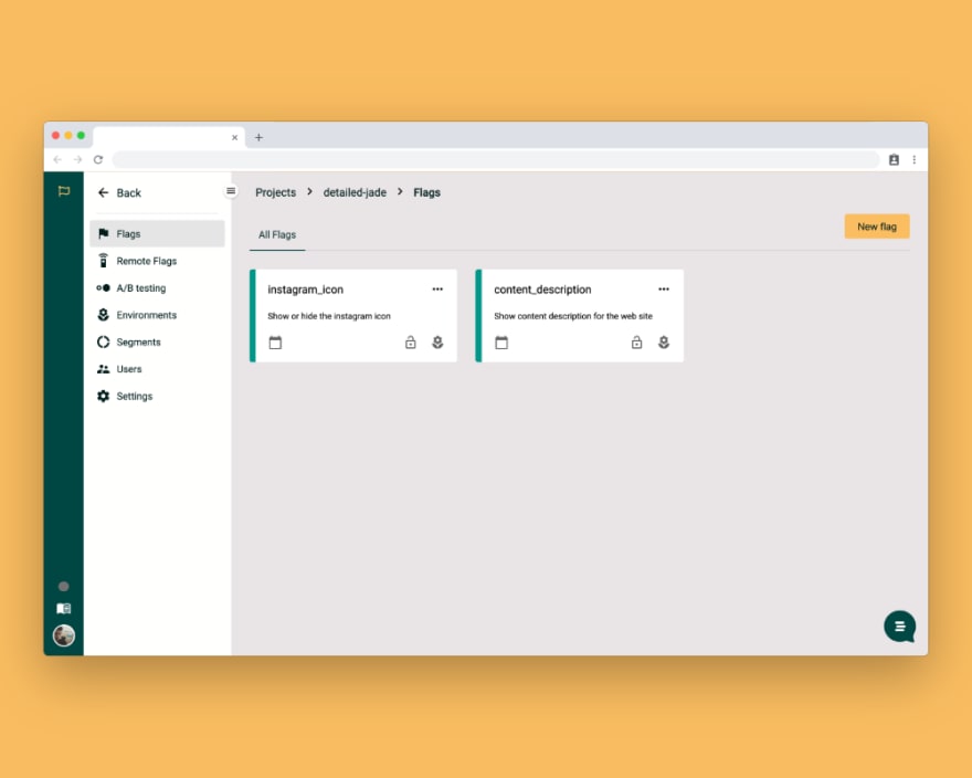
What is UpStamps?
UpStamps is a Feature Flag Management Platform to separate code from different environments and projects.
UpStamps helps teams manage their projects using feature management with a Central control to progressively deliver features to users with confidence.
🛳 Ship when you're ready
🚀 Accelerate feature release
🙈 Hide unfinished features
Useful links about UpStamps:

Top comments (0)