Visualizing time-series data - such as financial charts, project timelines, or event trackers - often requires contextual markers like weekends or holidays to improve insights. CanvasJS charts offer the flexibility to dynamically highlight specific date ranges using stripLines.
Why Highlight Weekends/Holidays?
Highlighting weekends or holidays on a chart can serve various purposes:
- Weekends often have predictable patterns (e.g., reduced sales or web traffic).
- Holidays can cause atypical spikes or drops in data.
- Highlighting these days helps users understand whether fluctuations are seasonal or exceptional.
StripLines to Highlight Weekends
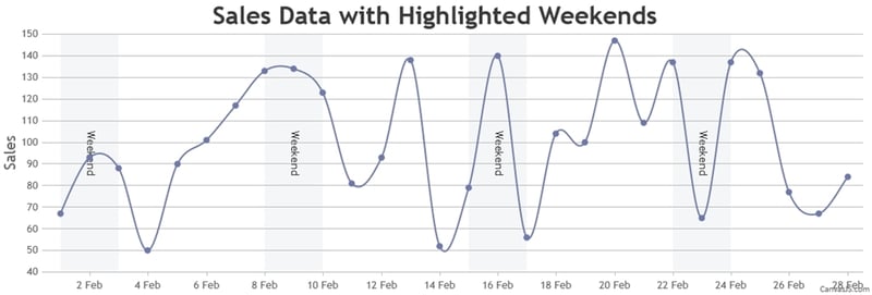
CanvasJS provides a flexible way to highlight specific regions on a chart using stripLines, which are vertical or horizontal bands drawn across an axis. For a date-time axis (typically axisX in time-based charts), stripLines can be configured with value and endValue properties to span specific time ranges, such as an entire day.
- Determine the Date Range: Identify the minimum and maximum dates from your data or the visible viewport.
- Identify Special Days: Calculate weekend dates (Saturdays and Sundays) or retrieve holiday dates from a list.
- Add StripLines: Use stripLines to shade these days with customizable colors and opacity.
For most use cases, adding all stripLines initially is sufficient, as CanvasJS efficiently renders only those within the visible range. However, for large datasets or specific requirements, dynamic updates can optimize performance.
function addWeekendStripLines(chart, axis) {
    var startDate = chart.axisX[0].get("viewportMinimum"),
        endDate = chart.axisX[0].get("viewportMaximum"),
        currentDate = new Date(startDate);

    var stripLines = [];

    while (currentDate <= endDate) {
        if (currentDate.getDay() === 6) {
            // Saturday
            var weekendStart = new Date(currentDate.getFullYear(), currentDate.getMonth(), currentDate.getDate(), 0, 0, 0);
            var weekendEnd = new Date(currentDate.getFullYear(), currentDate.getMonth(), currentDate.getDate() + 1, 23, 59, 59);

            stripLines.push({
                startValue: weekendStart,
                endValue: weekendEnd,
                color: "#ECEEF0",
                opacity: 0.5,
                label: "Weekend",
                labelAlign: "center",
                labelFontColor: "#333",
                labelBackgroundColor: "transparent"
            });
        }

        currentDate.setDate(currentDate.getDate() + 1);
    }

    axis.set("stripLines", stripLines);
}
You can apply a similar technique for holidays by maintaining a list of holiday ranges and pushing stripLines for those periods.
Customization Tips
- Opacity: Adjust the alpha channel in colors (e.g., #FFD1D180 → 80 = 50% opacity).
- Labels: Add labelPlacement: "inside" to display labels within striplines.
- Priority: Order striplines array to overlay holidays on weekends.
Using StripLines in CanvasJS, you can dynamically highlight weekends, holidays, or any date range to add context to time-series data. This method keeps your chart clean while emphasizing critical periods. Try adjusting colors and transparency to match your dashboard’s theme!

Top comments (0)