Users have higher expectations than ever before. At the same time, the customer experience is increasingly the top priority because of its far-reaching implications with respect to customer activation and retention.
The easiest way to kill a good customer experience is with a bad bug. That's where tests come in.
Tests are instrumental to delivering a good customer experience – they spot bugs before the customer ever has a chance to.
Some technologies like static typing and linting can help get you part of the way there, but ultimately, you should be writing tests to ensure your business logic and the corresponding customer experience work as you'd expect them to.
At walrus.ai, we help teams automate their most annoying integration tests. We've outlined some of the most frequent bugs that our customers have experienced that you can write simple tests to prevent.
What are the most common bugs you should be writing tests for?
Unresponsive interactive elements
Unresponsive elements are deadly. Often they manifest themselves in onboarding experiences (continue buttons, input forms, etc.), and can prevent the customer from taking a valuable action, such as signing up, or in the instance below, getting a car loan!
Form validation
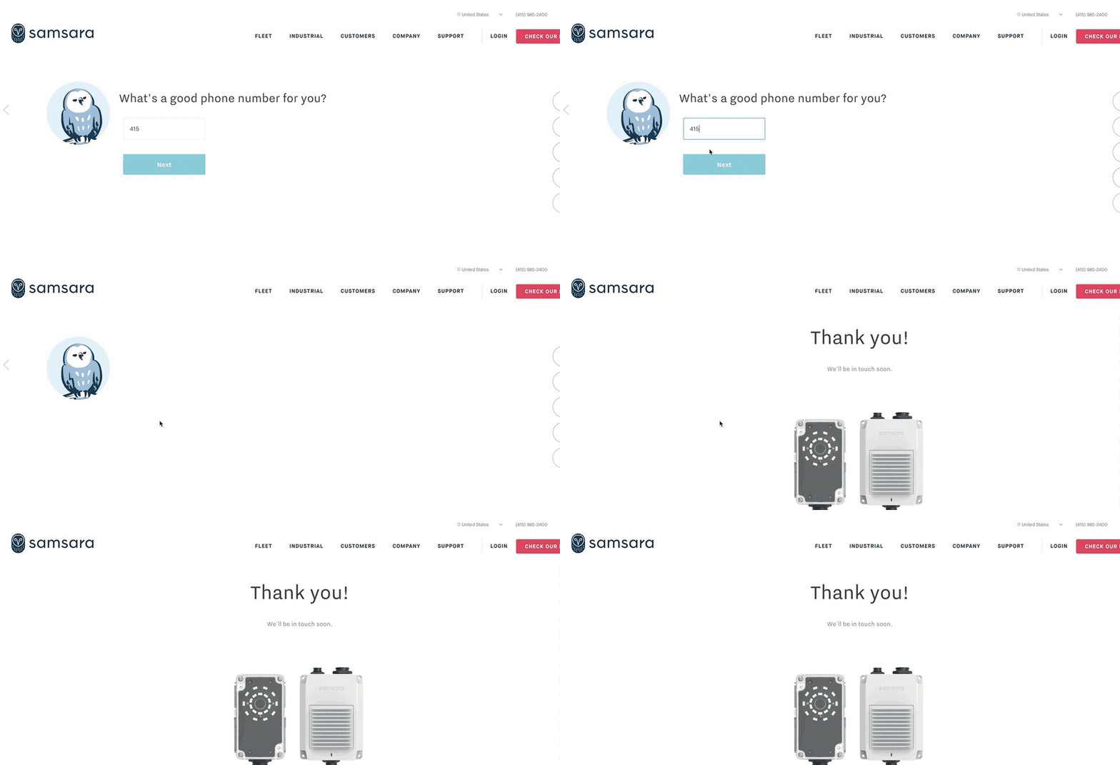
Forms are where you collect the most important business data from your customers. Whether it's their credit card information, or information that will be used to engage the customer (such as email and phone number, the quality of this data is certainly important to the business, and can have a meaningful impact on the customer experience (for example, when you are scheduling a demo and enter an incorrect phone number!).
Asynchronous data
User actions that have asynchronous dependencies are particularly prone to bugs, and can have significant implications for the business. For example, if you don't evaluate whether someone has previously claimed a promotion code fast enough, your system provides a window for coupon fraud.
Empty data
Empty data errors occur when users expect certain results (like search results, or data represented in a report), but the frontend doesn't render any real results, despite the data existing. These bugs are particularly frustrating for the user, because it isn't even clear that an error is occurring.
Multiple popups or modals
Modals are a great way to engage users — whether it's introducing them to a new feature in your product, or merchandising a discount. But not both at the same time.
Not only are overlapping modals problematic with respect to ADA compliance, they also dilute the call-to-action for the end-user, and generally make your product look untrustworthy.
Writing tests sucks. How can I make it painless?
It's hard to write tests because computers don't think like humans do.
A human thinks about what the user is trying to accomplish in a particular experience (say, checkout), and wants to make sure that the user can successfully accomplish that task. But computers require much more specific instructions — make sure this button is green and contains specific text, for example. Writing tests requires humans to think like computers.
But there are new ways of writing tests!
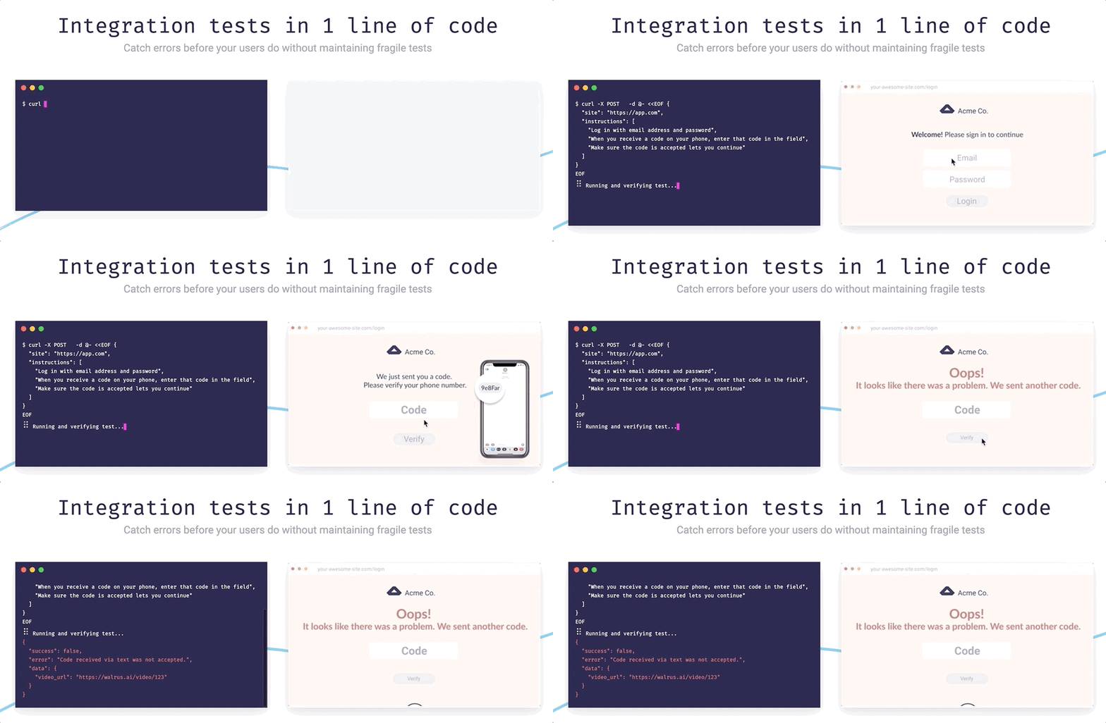
With walrus.ai, you can write complex integration tests with one line of code, in plain english.


Top comments (4)
"Modals are a great way to engage users"
Talking with my user-hat on: personally, I find them very, very, very^+ (transitive closure of very) annoying. When they appear, I aim directly for the x without even trying to look at them, while mildly cursing the site.
But maybe it is just me.
wow! pretty good
Thanks Mohamed!
You are welcome